이 프로젝트는 아모레퍼시픽 크리에이티브 센터의 선행디자인 프로그램인 Creative Partners 를 통해 제안한 아이디어에서 시작되었습니다.
Braille Tag for Blind - Collaboration with the Korea Tourism Organization(KTO)
시각장애 고객을 위한 실리콘 점자 TAG (한국관광공사 협업)
AMOREPACIFICMay 01, 2025
Summary
2021년 CP 프로젝트로 시각장애인을 위한 점자 태그를 제작 하였고 제작된 수량 300여개를 국립맹학교 학생분들과 시각장애인 유튜버 분들께 선물로 보내드린 적이 있습니다.
이번 프로젝트는 당시 진행했던 프로젝트의 연장선으로 진행되었습니다.
This article has been translated by an AI.
In 2021, as part of the CP project, we created Braille tags for the visually impaired and carried out a project to gift them to
students at the National School for the Blind and visually impaired YouTubers.This project was carried out as an extension of
the project we conducted back in 2021.
Design story
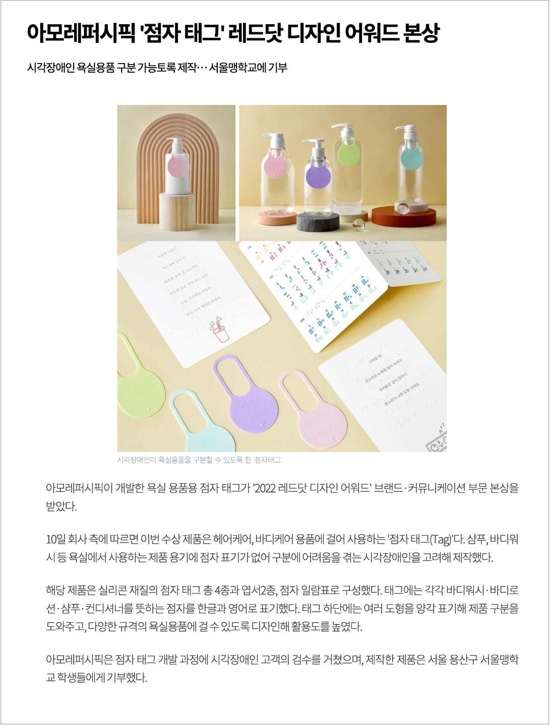
2024년 가을, 한국관광공사측에서 한통의 메일이 도착 했습니다.
2021년에 진행 하여 레드닷 어워드를 수상했던 점자 기부 프로젝트의 기사를 보시고 해당 제품과 유사한 제품을 만들고 싶은데 조언을 구할 수 있는지 문의 하시는 내용이었습니다.
In the fall of 2024, we received an email from the Korea Tourism Organization (KTO). They had seen our Braille donation project from 2021,
which won a Red Dot Award, and were inquiring if they could seek advice on creating a similar product.
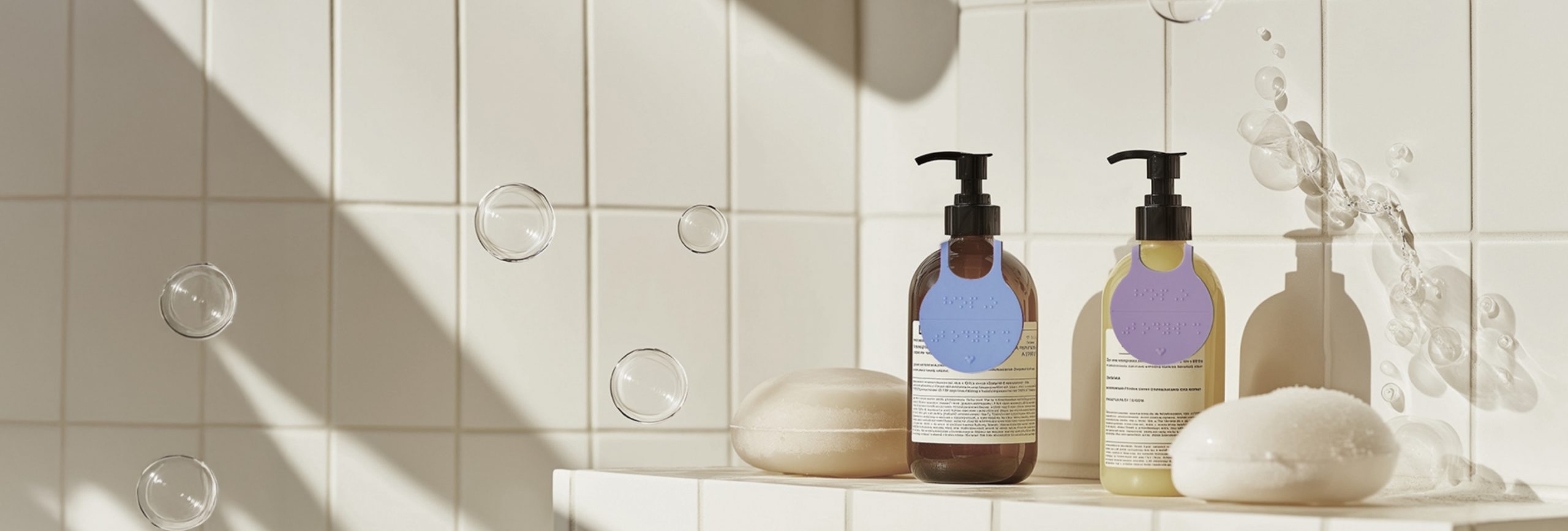
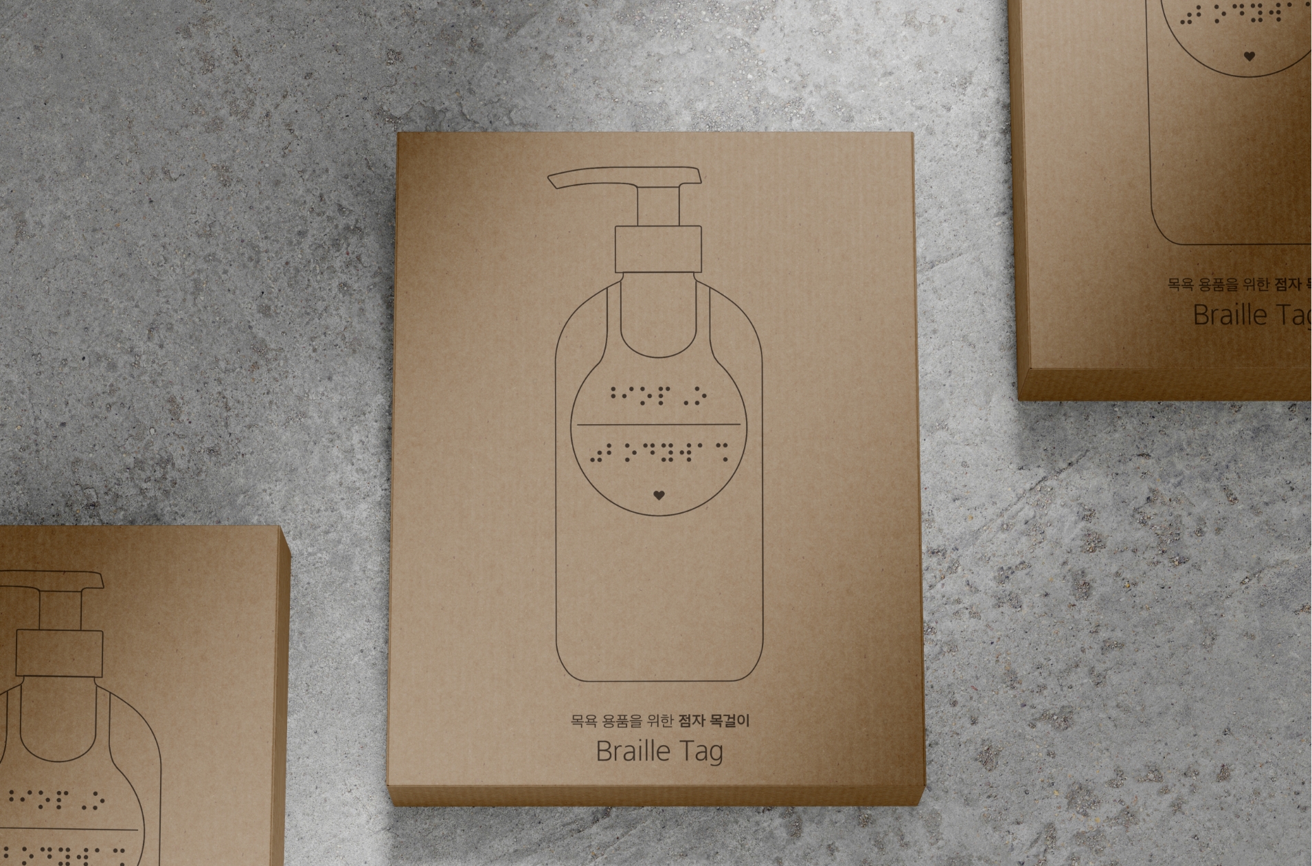
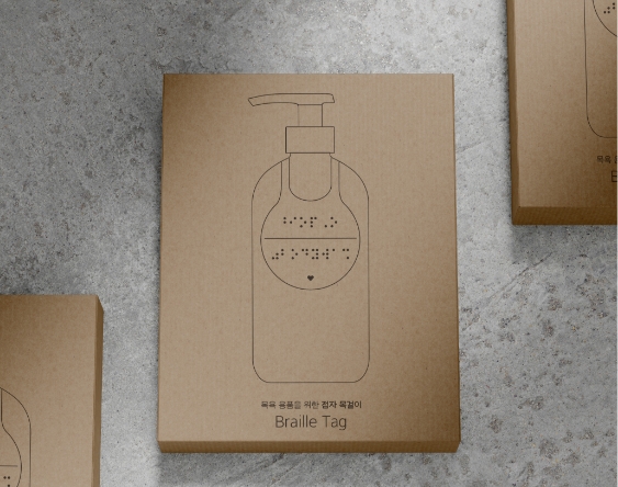
한국관광공사에서 보신 제품은 위의 기사에 나와 있는 실리콘 재질의 점자 태그 4종으로 태그에는 각각 바디워시·바디로션·샴푸·컨디셔너를 뜻하는
점자가 한글과 영어로 표기되어 있습니다. 태그 하단에는 점자를 읽지 못하는 시각장애인도 구분이 쉽도록 여러 도형을 양각 표기해 제품
구분을 도와주고 있습니다.
The product that the Korea Tourism Organization saw is the set of four silicone Braille tags mentioned in the
article above. Each tag is labeled in Braille, both in Korean and English, to indicate body wash, body lotion,
shampoo, and conditioner. The bottom of each tag features embossed shapes to help visually impaired individuals
who cannot read Braille easily distinguish the products.
해당 프로젝트가 물론 어워드 수상이라는 좋은 결과로 마무리가 되긴 했지만 당시에도 보완하고 싶은 부분들이 있었기에 광광공사측에 신규 제작을
하는 것 보다 현재의 디자인을 수정, 보완 해 보시는게 어떨지 의견을 드렸고 수정에 대한 부분은 제가 디자인 하겠다고 제안 드렸습니다.
Although the project concluded successfully with an award, there were aspects I wanted to improve at the
time. Therefore, I suggested to the Korea Tourism Organization that instead of creating a new product,
they consider modifying and enhancing the current design. I also proposed that I would handle the
design modifications.
디자이너가 이미 완료 되어 마무리 된 디자인을 다시 수정 할 수 있는 기회는 흔치 않습니다. 그런데 이번 기회를 통해
지난번 디자인에 대한 부족한 부분을 채울 수 있는 기획가 생겼고, 또 예산으로 인해 300분에게 밖에 드리지 못했던
제품을 더 많은 분이 사용 할 수 있게 되었다는 점에서 즐거운 마음으로 디자인을 진행 할 수 있었습니다.
It is rare for a designer to have the opportunity to revise a completed design. However, this
chance allowed me to address the shortcomings of the previous design. Additionally, I was excited
to work on this project because it meant that more people could use the product, which was previously
limited to only 300 recipients due to budget constraints.
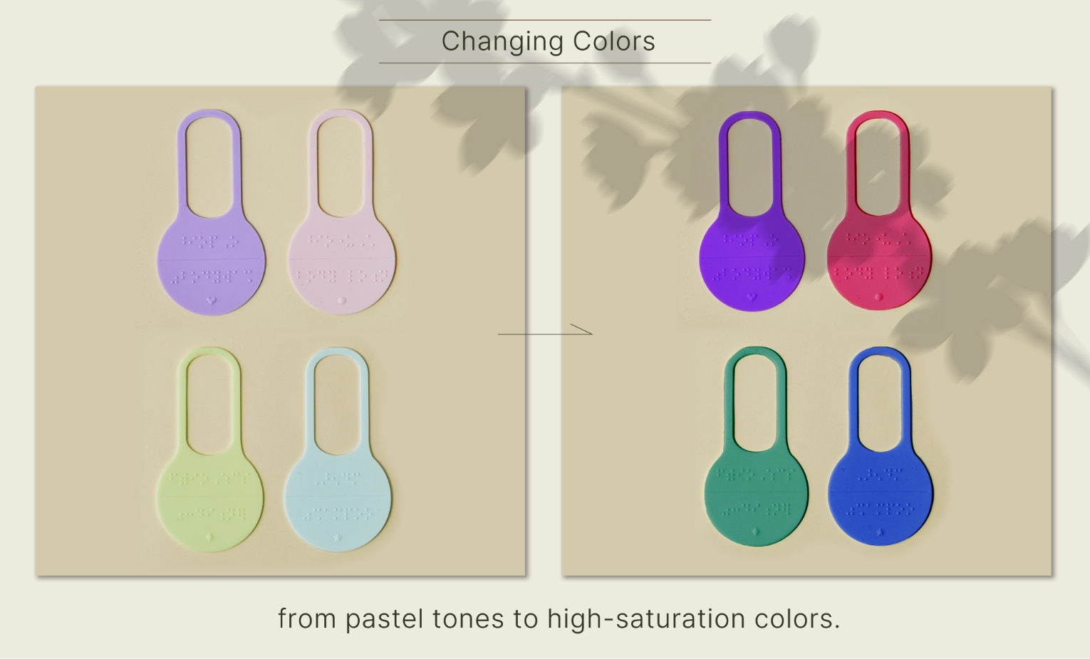
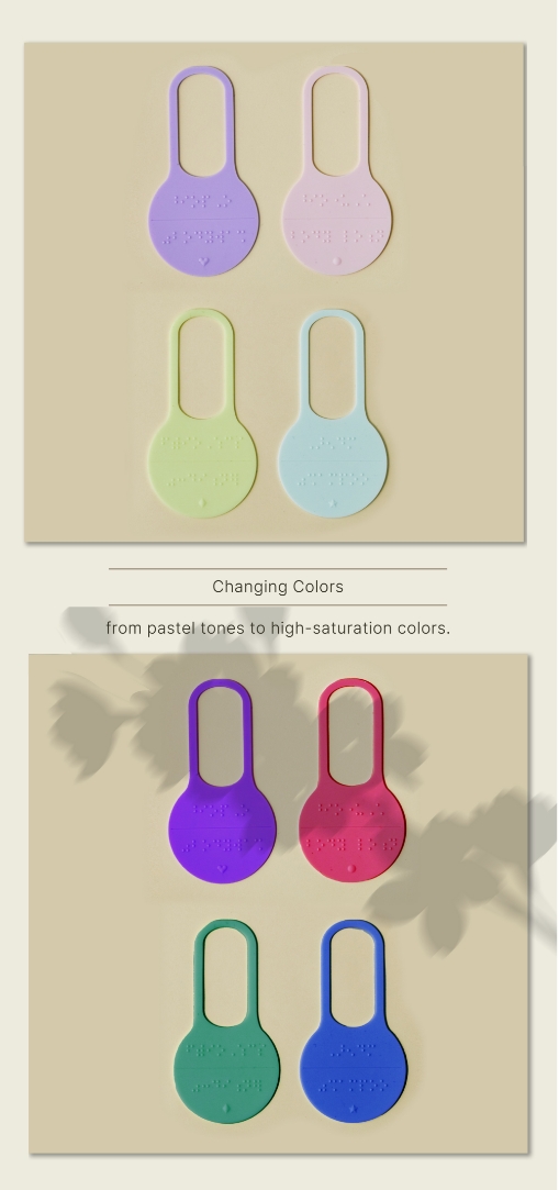
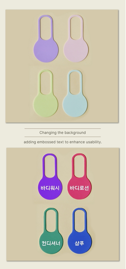
지난번 디자인과 가장 큰 차이는 색상입니다.
기존 디자인의 경우 ‘마음이 따듯해지는 프로젝트이니 따듯한 컬러를 사용해보자.’ 라는 단순한 의도로 파스텔 톤의 컬러를 적용 했었는데, 막상 제작 완료 후
시각장애인분들의 이야기를 들어보니 “4개의 테그를 굳이 만져보지 않아도 구분이 될 수 있게 만들어 주면 좋겠다. 완전히 시력을 잃지 않은 저시력자들도 있는데
이들에게 이 네개의 컬러는 모두 흰색으로 보인다.” 라는 의견을 주셨습니다.
이 부분까지 고려하지 못한것이 너무 부끄러웠던 기억으로 남아 있어서 이번 기회에 꼭 그 부분을 수정하고 싶었습니다.
The biggest difference from the previous design is the color. Initially, we used pastel tones with the simple
intention of creating a ‘heartwarming project.’ However, after the project was completed, we received feedback
from visually impaired individuals. They suggested that it would be better if the four tags could be distinguished
without having to touch them. They mentioned that some people with low vision, who haven’t completely lost their sight, see all four colors as white.
I felt quite embarrassed for not considering this aspect, and I was determined to address it this time.
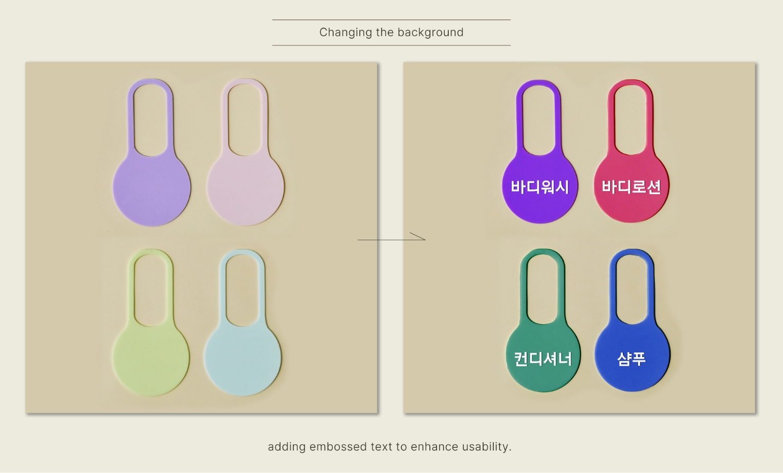
두번째는 뒷면의 글자 적용입니다.
시각장애인들 뿐 아니라 목욕제품의 구분이 어려운 노인분들, 아이들을 위해 큼직하게 글씨를 표기 해 둠으로써 유니버설 디자인이 될 수 있도록 수정을 하였습니다.
저렴한 인쇄기법이 아니라 금형을 수정하여 음각으로 표기함으로써 수분이 많은 화장실에서도 지워지지 않고 사용 할 수 있습니다.
The second improvement involves the application of text on the back. To make it a universal design, we enlarged the text
to help not only the visually impaired but also the elderly and children who may have difficulty distinguishing bath
products. Instead of using a cheap printing method, we modified the mold to emboss the text, ensuring it remains
legible even in the moisture-rich environment of a bathroom.
이번에 새롭게 제작된 제품은 2000여 세트가 제작되어 국내 202개의 호텔에 비치된다고 합니다.
제품 패키지의 후면에는 ‘누구든 떠날 자유, 모두가 누릴 행복’이라는 문장이 새겨져 있는데요, 이 글처럼 세상의 모든 사람들이 행복을 누리며 자유롭게 여행할 수 있는 날이 오길 기대해 봅니다.
The newly produced product consists of around 2,000 sets and will be placed in 202 hotels across the country. The back of the product package is
engraved with the phrase, ‘Freedom to travel for everyone, happiness for all.’ Just like this message, I hope for a day when everyone in the
world can enjoy happiness and travel freely.