Median plaque care 2023 AD
Summary
We conducted a renewal project for the MEDIAN Tartar Care line. The process was integrated from product design through to visual planning and the final product detail pages, with the goal of visually
communicating both the daily-use nature of tartar care and the product’s functional performance. By increasing the use of silver—a color that evokes a clinical feel and the image of clean teeth—we
created a more modern and organized design. We also concentrated key recognition elements at the top of the packaging to make the product more intuitive and eye-catching.
Product Design
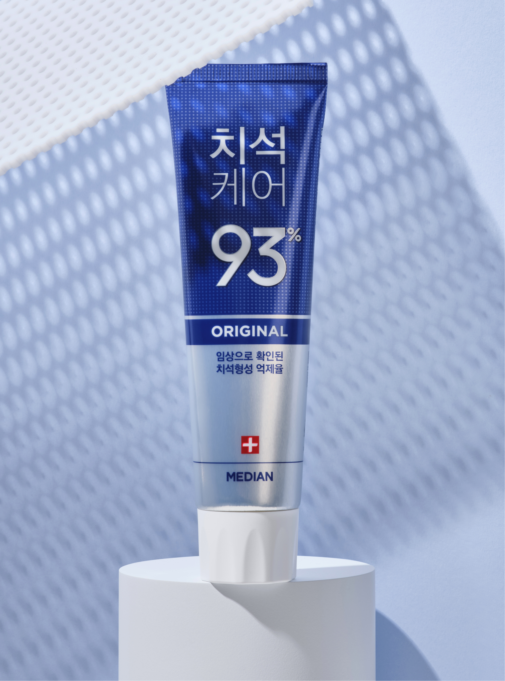
Given that the Tartar Care line accounts for over half of all MEDIAN toothpaste sales, the design goal was to maintain a degree of similarity with the previous version, conveying a sense of ‘familiar newness’ to existing customers.
To achieve this, we kept the existing circular pattern—a metaphor for the zeolite granules that are core to the Tartar Care identity. However, we reduced the pattern’s size and prominence to improve text readability and allow the product’s functional claims to stand out.
The clinically proven ‘tartar formation inhibition rate’ was moved to the top of the package for quick and easy recognition. The signature color for each product in the line, which previously covered large areas of the tube, was also consolidated at the top to focus the eye and prevent visual distraction.
Visual Design
The Tartar Care line is a reasonably priced, daily-use functional line with an accessible, mass-market dental image. Our goal for the new visuals was to express these dual attributes of ‘functional’ and ‘daily’.
We moved away from the traditional, somewhat dated image of the previous line by using a bright blue to evoke a refreshing, minty feel. The functional aspect of the zeolite granules was reinterpreted as clean, graphic dot objects for an upgraded look. To effectively convey the ‘daily’ feeling, we also incorporated human elements to add a familiar, lifestyle-oriented touch.
We moved away from the traditional, somewhat dated image of the previous line by using a bright blue to evoke a refreshing, minty feel. The functional aspect of the zeolite granules was reinterpreted as clean, graphic dot objects for an upgraded look. To effectively convey the ‘daily’ feeling, we also incorporated human elements to add a familiar, lifestyle-oriented touch.


- Amorepacific Creatives
- Design
- Koo Hyewon
- Visual
- Koo Hyewon, Shim Seyeong
- Photography
- Lee Yunjin, generalgraphics
- BM
- Cho Jaemin