MEDIAN SCIENCE AD
Summary
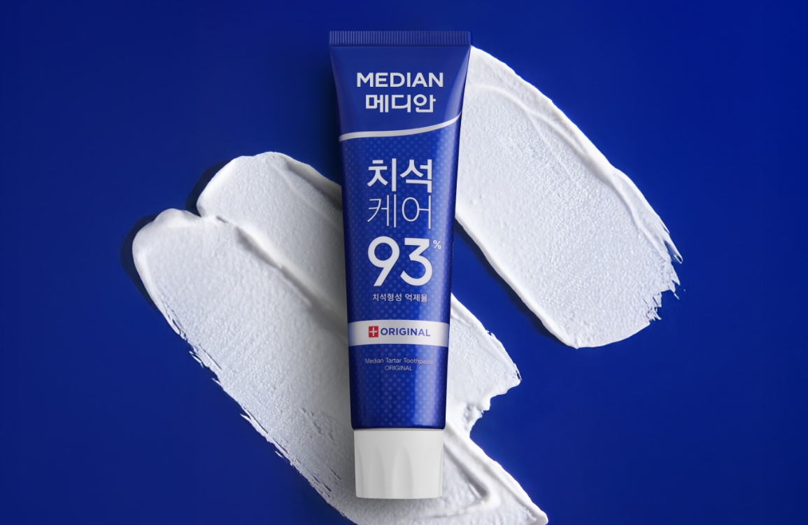
MEDIAN Science Line AD, which integrates gums, bad breath, and whitening, was developed for efficient operation of MEDIAN’s functional lines.
In order to match the positioning of a high-performance premium toothpaste that effectively customizes oral problems and symptoms of people with specific oral diseases, we considered the balance of consumer appeal and product features to develop the product package and digital graphic visuals.
In order to match the positioning of a high-performance premium toothpaste that effectively customizes oral problems and symptoms of people with specific oral diseases, we considered the balance of consumer appeal and product features to develop the product package and digital graphic visuals.

Professional clinic care at home
PACKAGE
To streamline the management of the Median Science Line, we integrated gum care, bad breath, and whitening into a single AD campaign.
We designed product packaging and digital graphics that balance consumer appeal with product functionality, positioning the line as a
high-performance premium toothpaste brand offering customized solutions for specific oral concerns and symptoms.
VISUAL
To convey the concept of ‘professional clinic care,’ the visuals utilize a clean, white-and-gray color palette with high-contrast lighting to create a minimalist feel.
We styled the shots with metallic and transparent objects reminiscent of dental tools, and overlaid graphic elements to enhance the scientific and professional nature of the product line.
Gum Science – Toothpaste, Toothbrush


The ‘Gum Science’ line, consisting of a toothpaste and toothbrush, uses a transparent mouthpiece in its visuals to intuitively connect with consumers concerned about gum health.
The functionally designed toothbrush is shot in a technical layout, reminiscent of high-end electronic devices, to emphasize its professional quality.
Whitening Science


Here, we used a gradient of shadows to metaphorically
express the gradual brightening of teeth after using the product.
express the gradual brightening of teeth after using the product.


Here, we used a gradient of shadows to metaphorically
express the gradual brightening of teeth after using the product.
express the gradual brightening of teeth after using the product.
Bad Breath Science


This line, which includes a toothpaste and mouthwash, uses a deep gray color to represent bad
breath, which is then contrasted with a vibrant mint color to visually emphasize a refreshing user
experience. The use of water in the visuals intuitively depicts the problem being coolly washed away.
breath, which is then contrasted with a vibrant mint color to visually emphasize a refreshing user
experience. The use of water in the visuals intuitively depicts the problem being coolly washed away.


To build credibility, we used direct, clear images of the plant extracts instead of just listing
them as text. By incorporating these images into a design with clinic-inspired graphic
elements, we aimed to intuitively reinforce the product’s professional concept.
them as text. By incorporating these images into a design with clinic-inspired graphic
elements, we aimed to intuitively reinforce the product’s professional concept.


To build credibility, we used direct, clear images of the plant extracts instead of just listing them as text.
By incorporating these images into a design with clinic-inspired graphic elements,
we aimed to intuitively reinforce the product’s professional concept.
MOTION GRAPHIC
We used 2D motion graphics to explain the complex efficacy and technology behind the ‘Gum Science’ and ‘Whitening Science’ products.
The concept was to deliver this information in a clear and approachable manner, with the helpful, authoritative feel of a textbook explanation.
MOTION GRAPHIC
We used 2D motion graphics to explain the complex efficacy and technology behind the ‘Gum Science’ and ‘Whitening Science’ products.
The concept was to deliver this information in a clear and approachable manner, with the helpful, authoritative feel of a textbook explanation.
- Amorepacific Creatives
- Product Planning
- Koo Suyeon, An Yoonjung,
Koo Hyewon - BM
- Jung Youjung
- Visual Directing
- Koo Suyeon, Koo Hyewon
- Photography
- Shin Sangwoo
- Motion Graphic
- generalgraphics


