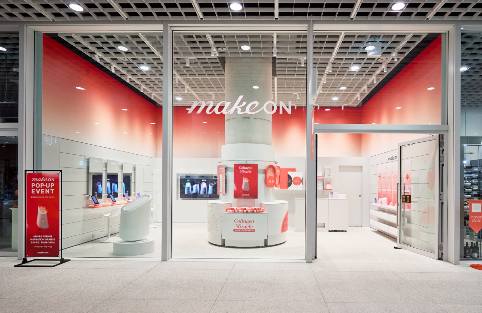
The start of the connected beauty
| MAKEON Skin Light Therapy
Summary
Makeon’s Skin Light Therapy, the Beauty device brand, is back in its third version with Pro-Tightening mode that employs EMS technology and a galvanic function to enhance skincare absorption.
Skin Light Therapy III continues to embody Makeon’s the minimal dedication to form, offering improved grip and design quality for better usability.
In addition, it redefines Makeon’s brand value and applies a new package design, which is minimalist yet richly detailed, showcasing the brand’s commitment to elegant and thoughtful design.


“A beauty device crafted by
a beauty master,
an emotional device driven
by the passion for beauty.”
a beauty master,
an emotional device driven
by the passion for beauty.”
Brand Core Value
Amidst a flood of beauty devices in the market, Makeon stands out by communicating its functions with clarity and creating new beauty habits through simple and effortless usability.
The design expresses the four key physical energies — Light, Heat, Ion, and Motion — in a way that is intuitive and visually comprehensible.
From past to present, Makeon has consistently been distinguished by its sensory yet minimalist design.
Unlike conventional beauty devices that highlight technological complexity, Makeon embraces essential functionality and refined form, stripping away unnecessary elements to achieve pure, sculptural beauty.
Even when not in use, it remains an object of aesthetic presence, seamlessly elevating the atmosphere of everyday life.
Through app connectivity, Makeon also offers a holistic beauty experience — providing skin diagnostics, personalized skincare combinations, and interactive content — serving as a driver for a new beauty ritual that blends technology with emotion.


Refined design that embodies
the value of simplicity.
the value of simplicity.
Background
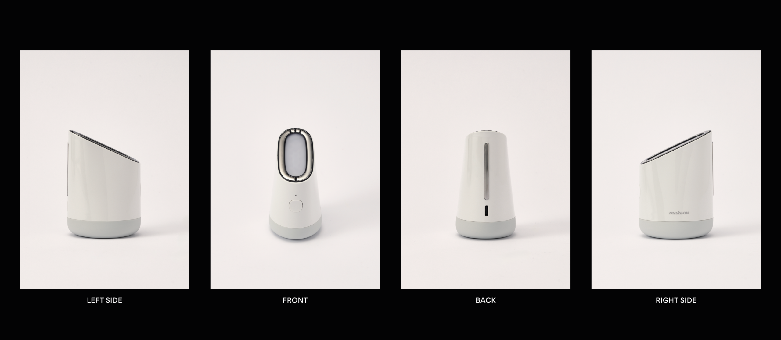
With the addition of EMS and galvanic functions, the electrode area on the upper part of the device was expanded.
The galvanic function now activates only when the user’s fingers touch the metal surface on the back, depending on the selected mode.
To accommodate these changes in usability, the overall balance and proportion of the product were redefined, and a simple,
refined form was proposed — one that feels complete and sculptural, like a single objet d’art.


Product Design
Building on Makeon’s minimalist design philosophy, which emphasizes usability through clean, self-standing form and a subtly angled light head for ergonomic convenience, the new design focuses on enhancing the tactile grip.
In collaboration with Kim Ji-yoon Studio, numerous prototypes were created and tested to achieve an optimal hand feel.
The resulting form reflects the functional essence of Skin Light Therapy III, realized through the seamless transition of an elliptical upper section into a circular lower body, ensuring a comfortable and stable grip in one hand.
The overall form — clean, precise, and free of excess — embodies restraint and sophistication, expressing Makeon’s vision of a refined lifestyle elevated through design.


Compared to the second-generation design, the diagonal parting lines and button lighting system have been refined to achieve a more sophisticated and cohesive finish.
The lower section of the device, where the hand naturally rests, features a rubberized material that not only enhances grip but also conveys a premium tactile impression.
The button lighting has been repositioned to the upper area, allowing for clearer and more intuitive color distinction within a simpler, more minimalist interface.
The button area itself is slightly scooped inward, enabling users to locate and operate the controls effortlessly by touch alone, without the need for visual confirmation.
In terms of color, the cold, clinical white tone of the previous model has been replaced with a warmer white hue infused with soft beige, expressing a gentler, lifestyle-oriented sensibility that harmonizes seamlessly with everyday environments.


“Perfect simplism for the light”


Package Design
In the package design, the diagonal graphic elements previously applied across all Makeon products were eliminated, replaced instead by embossed contours that capture the product’s silhouette—reinterpreting the distinct visual identity of Skin Light Therapy.
The glossy pearl paper and gold foil accents of earlier designs were removed, opting for uncoated paper to convey a more emotional and everyday sensibility.
This approach reflects the brand’s intention to reveal unadorned beauty by stripping away unnecessary decoration.


By showcasing only the product silhouette on the box, the design evokes curiosity about the contents within.
The gradually expanding lines symbolize the radiant skin improvement achieved through light, reinforcing the product’s core benefit.
The brand and product names, once separated across different areas, have been recentered to focus the viewer’s attention.
The dot element, representing the lighting function, is expressed in subtle silver foil, conveying a refined premium feel through simplicity, delicacy, and restraint.


Through the newly evolved Skin Light Therapy III, which aligns with Makeon’s refreshed brand direction, we aspire to ignite diverse experiences of beauty.
Looking ahead, Makeon will continue to go beyond beauty devices, offering innovative, sensorial beauty experiences that redefine the relationship between technology and emotion.
- Amorepacific Creatives
- Product Design
- Sun Hwajung, Kim Jiyoun Studio
- Photography
- Shin Sangwoo
- Visual Directing
- Sun Hwajung
- BM
- Jeon Hayoung