Sustainable Symbol Design
Summary
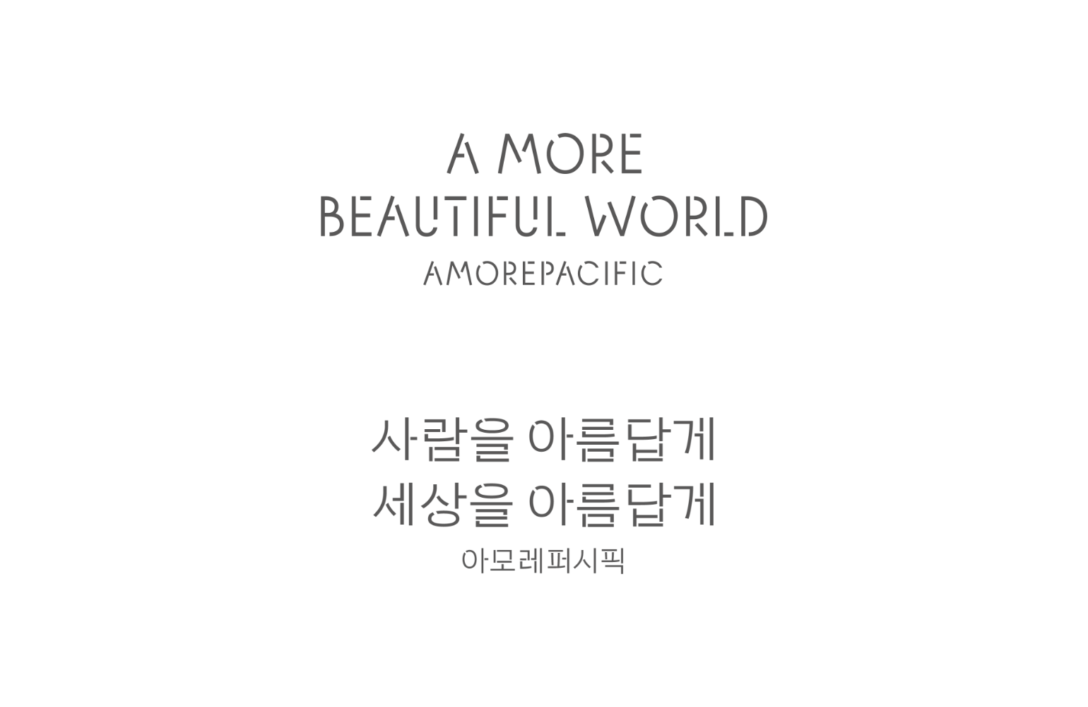
Amorepacific is committed to achieving its 2030 sustainable management vision, “A MORE Beautiful Promise,”
and continues to make dedicated efforts toward this goal.
In particular, to coexist with nature, we have established a comprehensive plastic strategy and packaging goals focused on reducing plastic usage and ensuring 100% recyclability, reusability, and compostability of plastic packaging materials. To communicate these initiatives to customers, we also developed and officially adopted a sustainable symbol design. This plastic strategy is structured around the 3R principles (Reduce, Reuse, Recycle) and the “Bottle to Bottle” approach, which reuses collected Amorepacific empty bottles to create new products. The key challenge in the design process was to visually incorporate the meaning of each principle into the symbol.


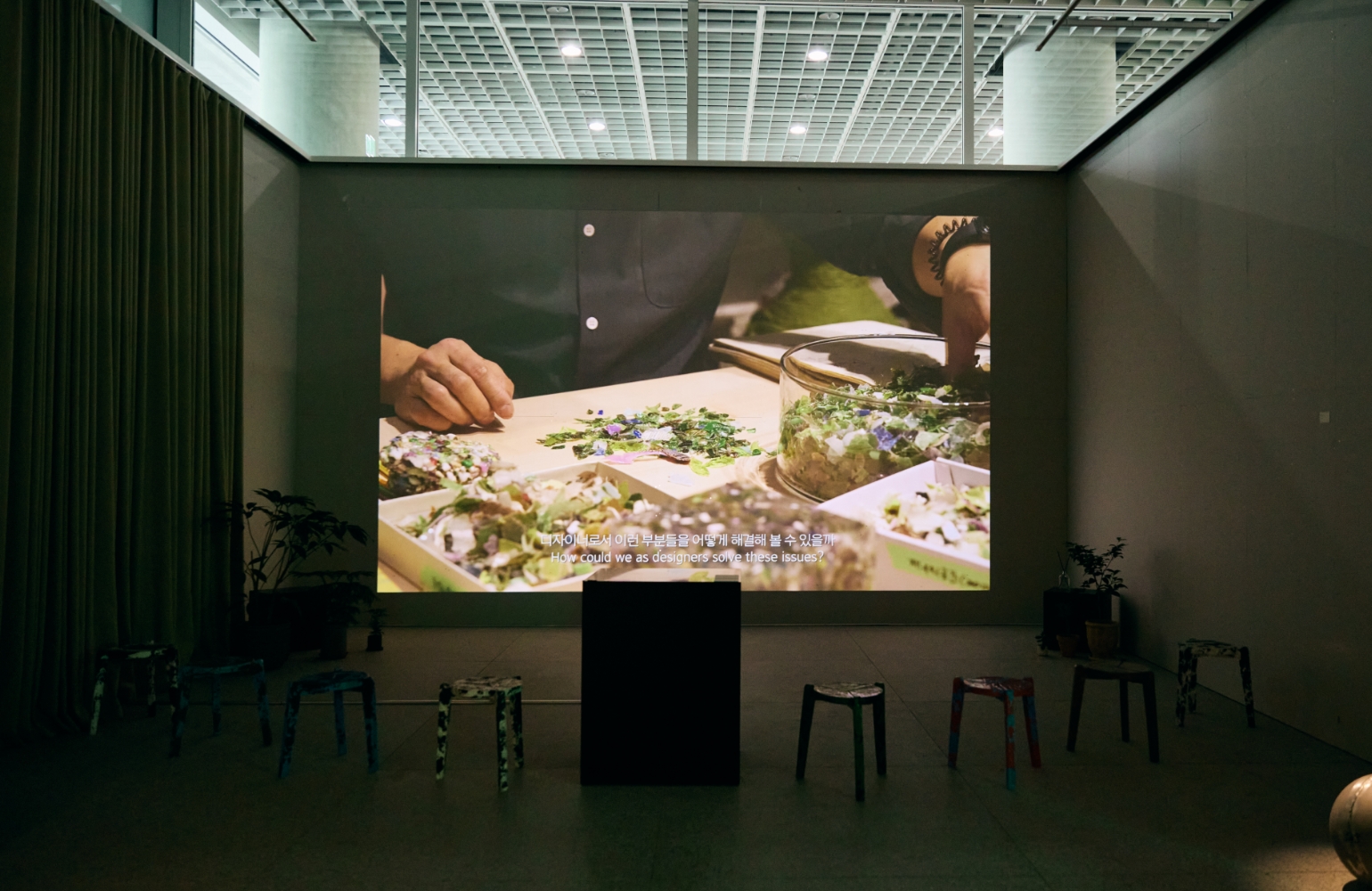
We began the symbol design process by researching communication examples from various brands that addressed recycled plastics.
At the initial stage, we created a unified framework and guidelines to ensure consistency while effectively organizing and refining existing intuitive symbols. The symbol design focused on intuitively conveying specific numerical data and material information related to sustainable achievements. Throughout the process, our goal was to utilize existing resources efficiently and strengthen communication with customers. We also took legal considerations into account to prevent any misinterpretation of the symbols. To differentiate them from third-party marks, we applied elements derived from the product’s own shape to the design.
At the initial stage, we created a unified framework and guidelines to ensure consistency while effectively organizing and refining existing intuitive symbols. The symbol design focused on intuitively conveying specific numerical data and material information related to sustainable achievements. Throughout the process, our goal was to utilize existing resources efficiently and strengthen communication with customers. We also took legal considerations into account to prevent any misinterpretation of the symbols. To differentiate them from third-party marks, we applied elements derived from the product’s own shape to the design.

Symbol design
_
3R(Reduce, Reuse, Recycle) / Bottle to Bottle


Symbol guide
_


Symbol design uses
_

*Example of “Bottle to Bottle” symbol application

*Example of “Recycle” symbol application
- Amorepacific Creatives
- Symbol design
- Cheon Nari
- Photography
- Lee Yunjin