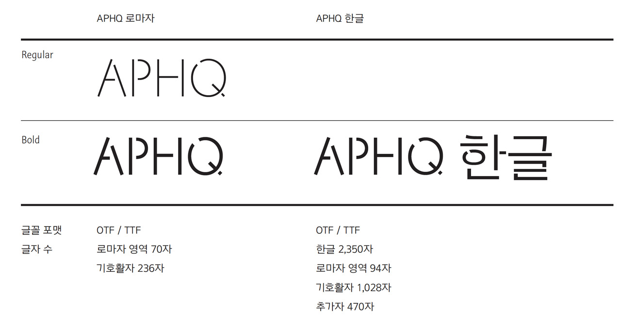
APHQ
아모레퍼시픽 세계본사 건물의 사이니지를 위해 만든
APHQ 폰트를 소개합니다.
Introduce
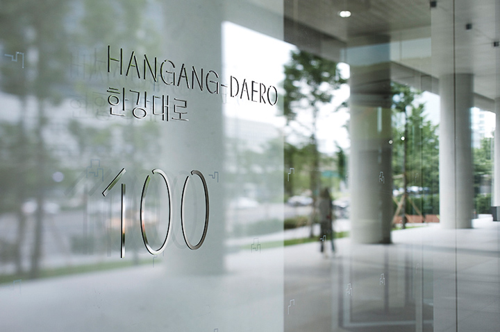
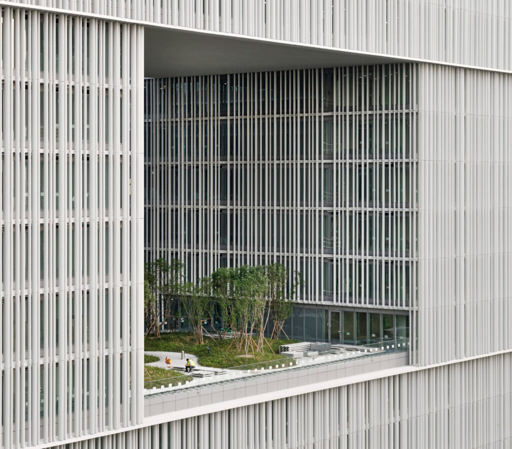
APHQ서체는 아모레퍼시픽 세계 본사 건물
직육면체 외형과 기하학적 구조, 한글의 특징을 담아낸 글꼴입니다.
APHQ Typeface is a font inspired by the rectangular form and geometric structure of the Amorepacific global headquarters building, while capturing the unique characteristics of the Korean alphabet, Hangul.
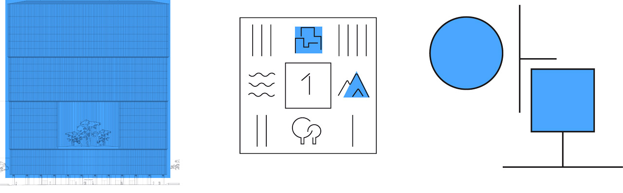
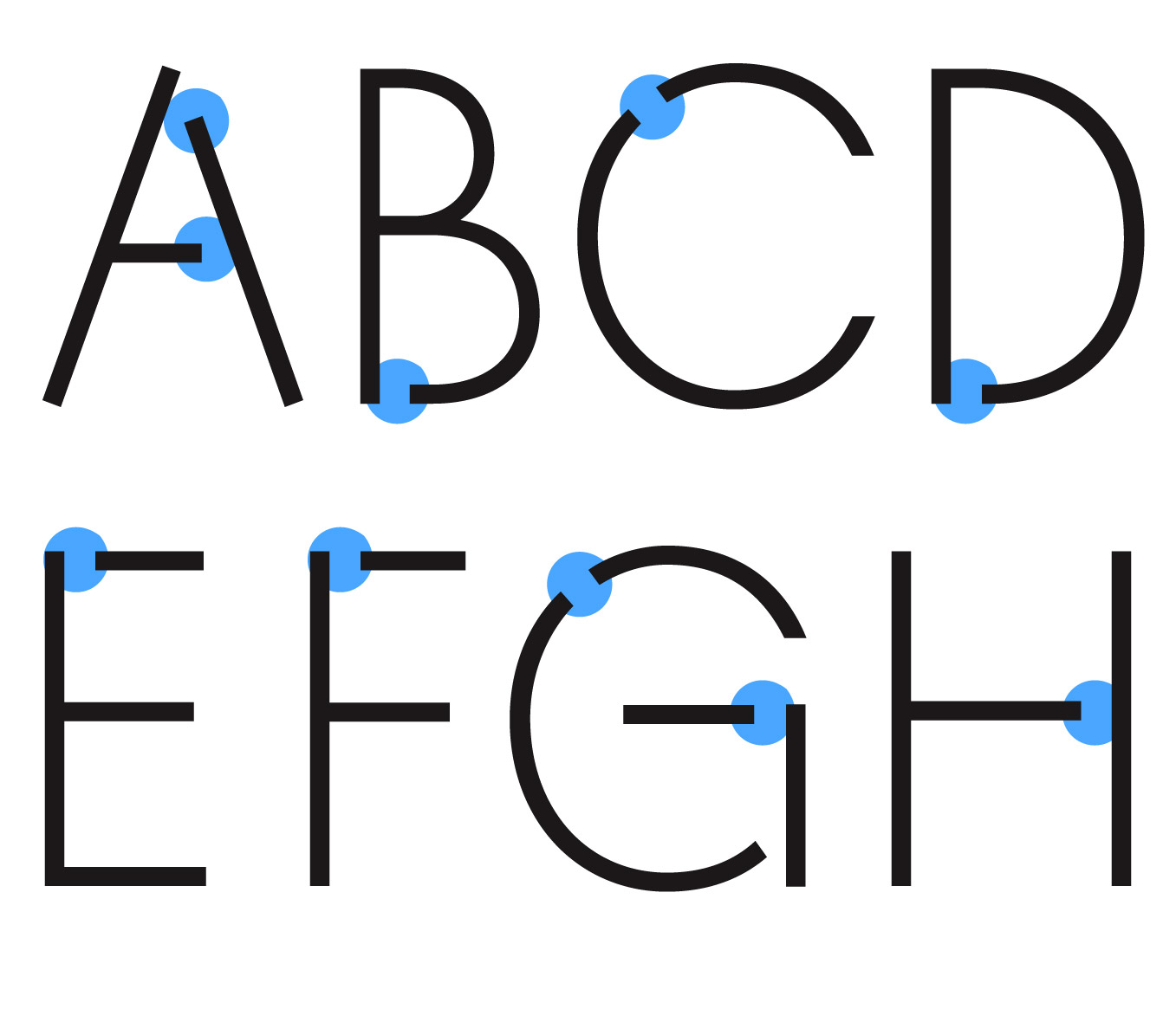
APHQ는 아모레퍼시픽 세계 본사 건물 직육면체 외형과 기하학적 구조와
한글의 필획의 순서에 따라 끊어짐이 표현되어 있으며
각 획 안에 속 공간이 존재한다는 부분을 타이포그래피 요소로 반영하여 제작되었습니다.
APHQ was designed by reflecting the rectangular form and geometric structure of the Amorepacific Global Headquarters building. The typeface expresses the natural breaks that occur according to the stroke order of Hangul, and incorporates the internal spaces within each stroke as a key typographic element.
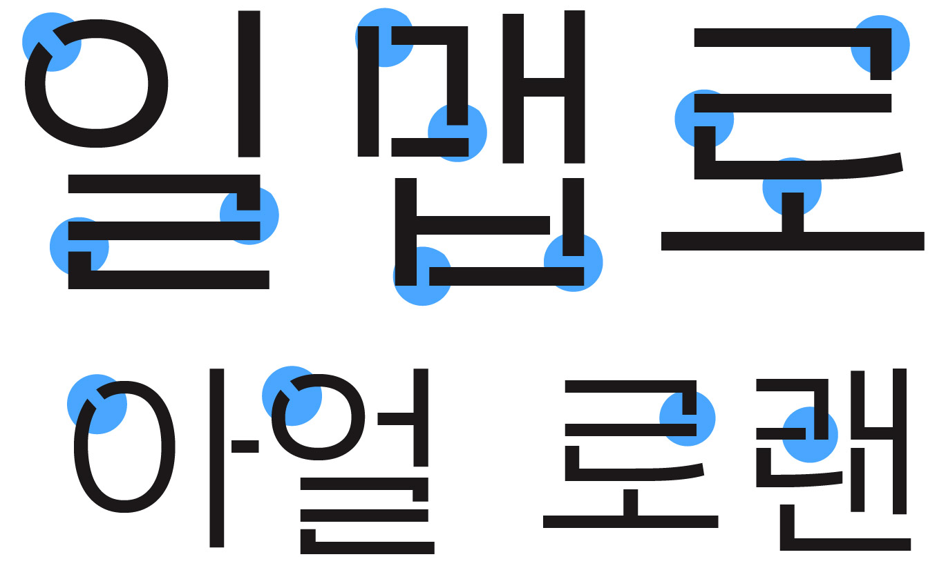
한글의 주로 글씨를 쓰는 순서인 필획의 순서에 따라 한 획 한 획 끊어짐이 반영되어 있는 글꼴입니다.
The typeface reflects the natural breaks that occur in each stroke, following the typical writing order of Hangul.
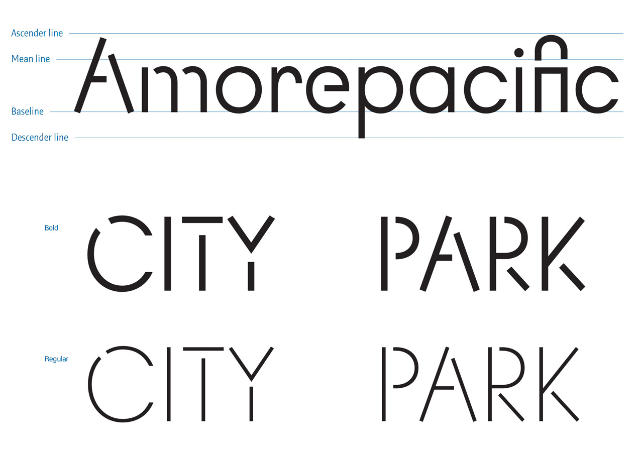
국문과 중문이 정방형의 그리드를 항상 유지한다는 점에서 본사 내에 사용 될 때는
반드시 대문자로 사용 중입니다.
Since both the Korean and Chinese characters are designed to maintain a square grid, the typeface is always used in uppercase when applied within the headquarters.
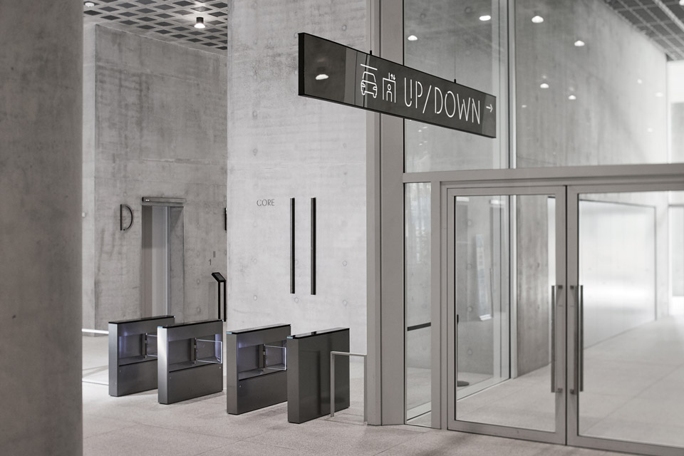
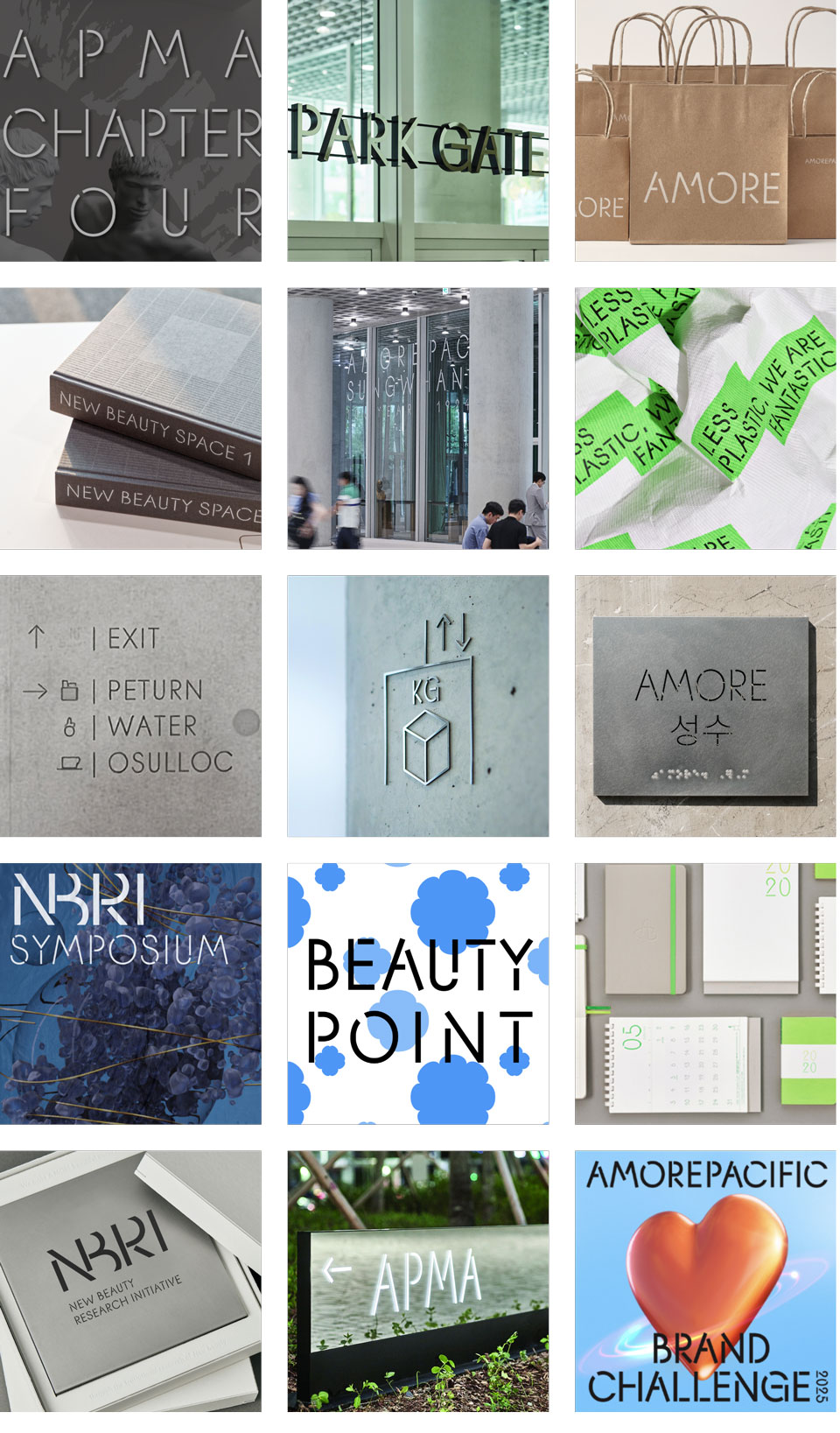
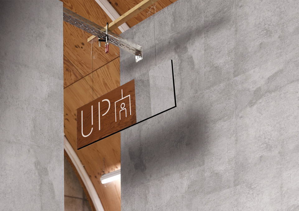
사이니지 외에도 다양한 기업 아이덴티티를 발신 하는 곳에 적용하며,
기업의 철학이 담긴 공간과 고객을 만나는 접점에서 사용하고 있습니다.
eyond signage, our identity system extends across diverse applications that express the essence of our brand.
It defines spaces that reflect our corporate philosophy and shapes the experiences where we connect with our customers.