AMOREPACIFIC NEW BEAUTY INNOVATION CHALLENGE
Summary
To drive open innovation with startups, Amorepacific conducts the ‘TIPS Selection Competition’ twice a year.
Open innovation refers to a strategy where companies actively utilize external ideas, technologies, and knowledge alongside internal resources to achieve innovation throughout the process of developing and launching products and services.
This initiative is operated under the title ‘Amorepacific NEW BEAUTY Innovation Challenge’ and is steadily expanding in scale.
In September 2025, marking the occasion of the investment competition targeting tech-based beauty startups, we undertook the project of refining and proposing the Brand Identity and main graphic design.
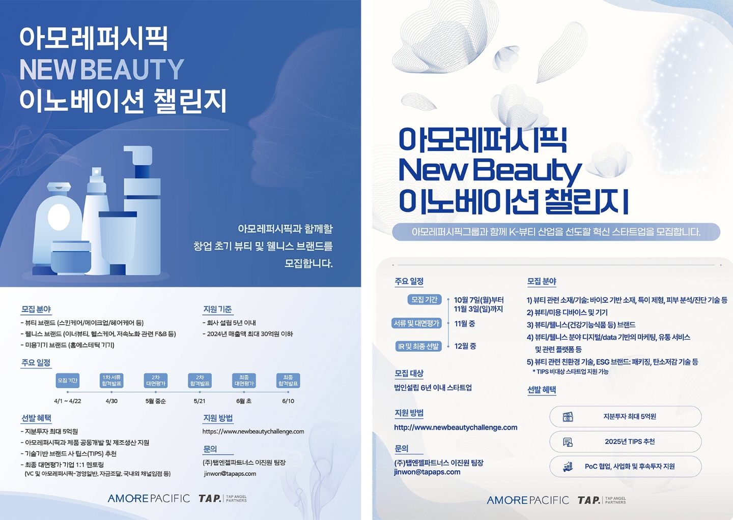
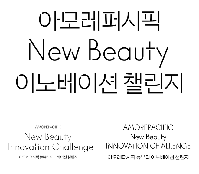
First, upon reviewing previous competition posters, we identified inconsistencies in how the competition name was displayed.
The inconsistent mix of Korean and English, combined with the length of the title, compromised readability.
First, upon reviewing previous competition posters, we identified inconsistencies in how the competition name was displayed.
The inconsistent mix of Korean and English, combined with the length of the title, compromised readability.
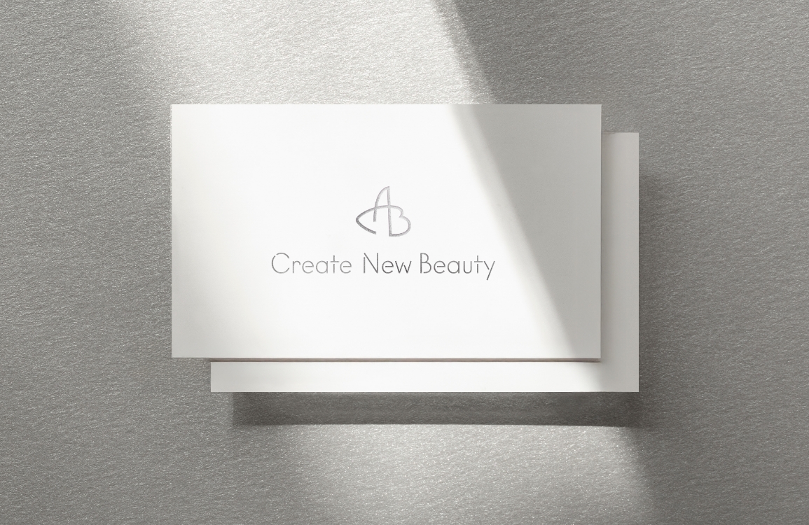
Accordingly, we aligned our design with the current trend of unifying Amorepacific’s corporate identity under the ‘APHQ’ typeface and adopted the notation style of the existing slogan, ‘Create New Beauty.’
We concluded that displaying the full Korean and English titles separately created visual clutter;
therefore, we determined that blending the two languages—as done previously—is the most effective approach for ensuring readability.


The main graphic of the poster was developed with innovation, diversity, and future-orientation as its core values.
We focused on visually materializing keywords derived to reflect the expanding horizons of the beauty industry.
Transcending mere visual elements, we aimed to clearly communicate the philosophy of open innovation championed by Amorepacific.
Transcending mere visual elements, we aimed to clearly communicate the philosophy of open innovation championed by Amorepacific.

In the initial phase, we explored a diverse range of concepts.
The first approach visualized the evolution and connectivity of ideas through organic patterns resembling molecular structures;
by adding dynamic movement, we sought to capture the vitality of innovation.
The second concept utilized light waves radiating from the center and color gradients to embody the diffusion of innovation, emphasizing a futuristic and energetic atmosphere.
Finally, we proposed a design where two planes—symbolizing distinct ideas and companies—converge to form a single line, capturing the essence of collaboration and connection.


Ultimately, the graphic concept featuring ‘two planes converging into a single line’ was selected, as it most intuitively embodies the essence of open innovation:
‘connection and synergy between diverse entities.’ Based on this core motif, the design was applied across webpages, posters, and X-banners.
Throughout the design process, we aimed to transcend simple graphic elements.
Our focus was on visually communicating the dynamic tension and harmony of collaboration, as well as the precise moment new value is created, through the interplay of lines and planes.


- Amorepacific Creatives
- Graphic Design
- Kim Dooyeon
- CVC
- Han Jaeho