2nd Exhibition, Mamonde : Heading to the whole process of experience
마몽드, 디자인, 경험의 전체를 향하다
MAMONDEJul 29, 2014
Mamonde: Design, Embracing the Full Brand Experience
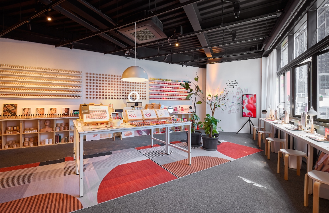
Since its launch in 1991, Mamonde has led Korean beauty trends across generations. In response to the global environment of 2012, we undertook a rebranding project tailored to a broader international audience. We gave thoughtful consideration to what elements of our brand identity should be retained and what needed to evolve—especially our brand logo. Under the concept “Inspired by Flowers, Mamonde,” we chose to preserve the core values of FLOWER, EXPERT, and FEMININE, while redefining our brand’s signature color: yellow. These became the central keywords of our rebranding initiative.
We place great emphasis on how we communicate our new brand identity. For certain products or services, customers experience all brand touchpoints simultaneously. They don’t perceive the packaging, store, and website as separate entities. As the saying goes, “One must not miss the forest for the trees.” That’s why we focus on the overall brand design rather than just individual components. We strive to design everything our customers see, hear, and interact with in our stores—from the visuals to the atmosphere and overall experience. To do this, we’ve asked countless questions and transformed the answers into carefully crafted scenarios.