Pleasia Dental Brand Launch
Summary
Pleasia is a dental care brand that prioritizes safety. Developed under the concept of offering customers the joy of choosing from a variety of toothpastes made with natural ingredients, Pleasia promotes both oral health and a pleasant daily routine. The brand’s tone and manner are reflected across the entire package design and brand identity (BI), emphasizing the value of “natural flavors and aromas” while conveying a cheerful and refreshing brand personality.


Concept
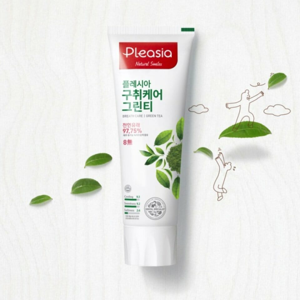
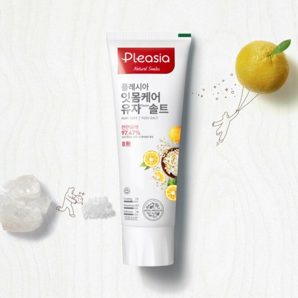
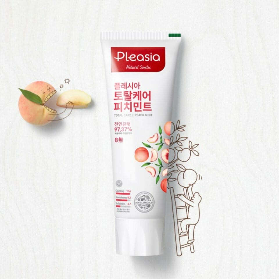
The logo type and BI holding shape are designed to resemble a toothpaste form. The rounded font, symbolizing a relaxed and open space, reflects Pleasia’s bright and friendly character, while also representing the fun of selecting from a wide range of toothpaste options. The vibrant red used in the BI embodies the brand’s “Pleasant & Healthy” philosophy and adds an energizing touch. In a market dominated by blue and green tones, this bold red color helps Pleasia stand out and enhances brand visibility.
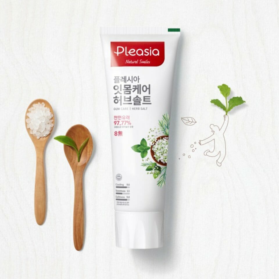
The packaging features bold triangular patterns unique to Pleasia and showcases product ingredients in a collage style. These illustrations maintain a natural aesthetic while also appearing realistic, reinforcing a lively and approachable brand image. To highlight both the sensory enjoyment and the product’s functional benefits, the front of the package includes clear pictograms that convey key information such as safety, flavor intensity, and formula-specific functions.
The packaging features bold triangular patterns unique to Pleasia and showcases product ingredients in a collage style. These illustrations maintain a natural aesthetic while also appearing realistic, reinforcing a lively and approachable brand image. To highlight both the sensory enjoyment and the product’s functional benefits, the front of the package includes clear pictograms that convey key information such as safety, flavor intensity, and formula-specific functions.
- Amorepacific Creatives