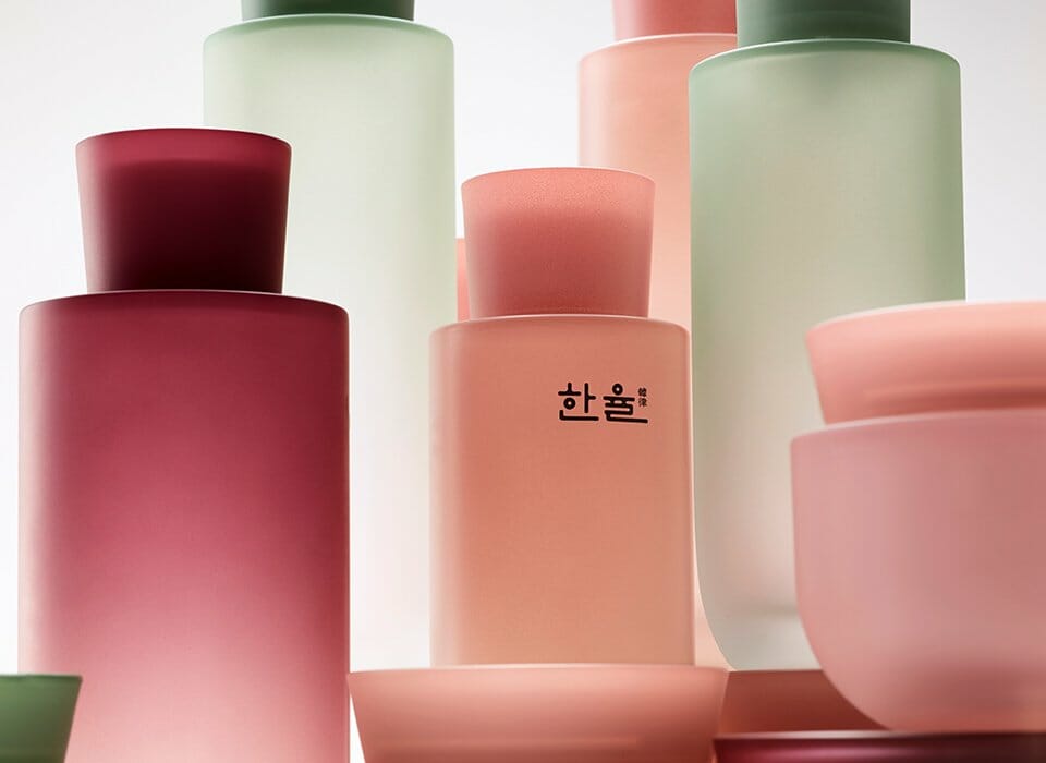
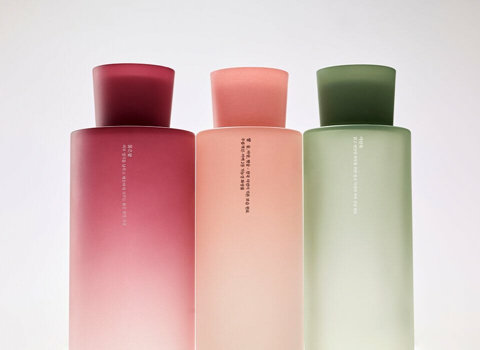
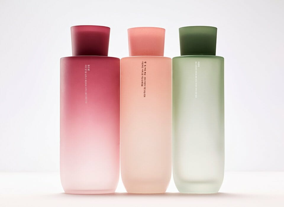
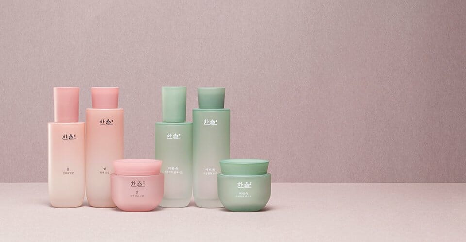
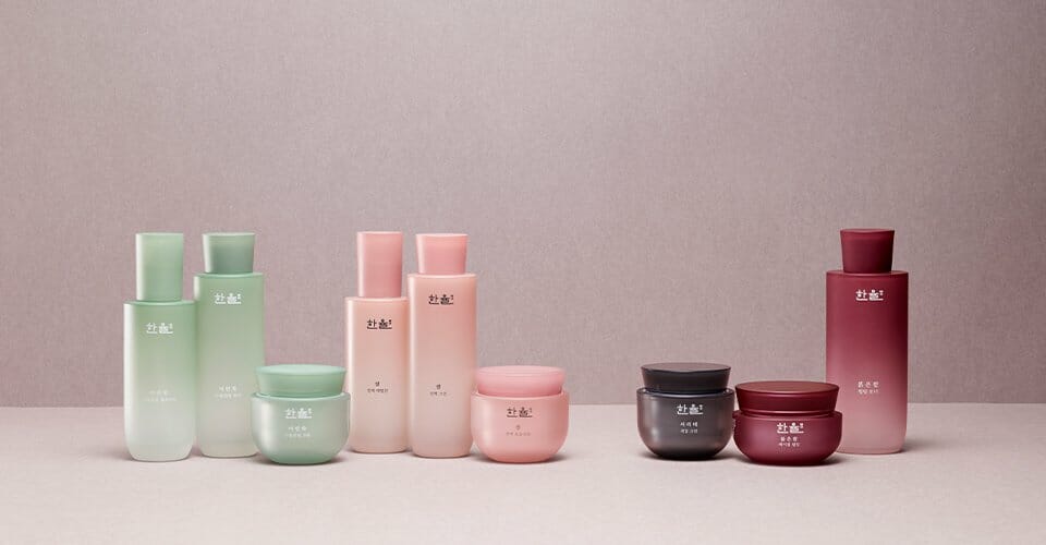
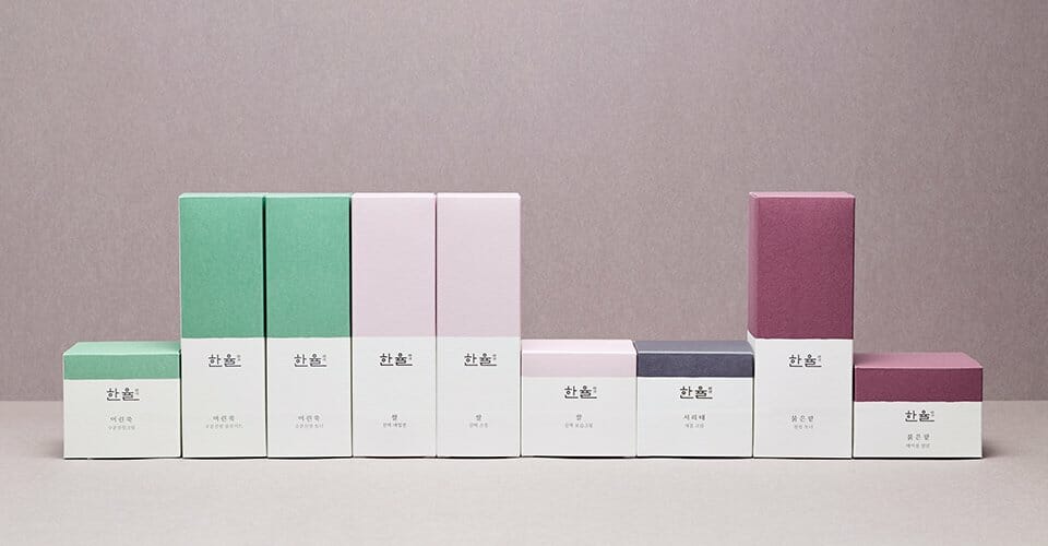
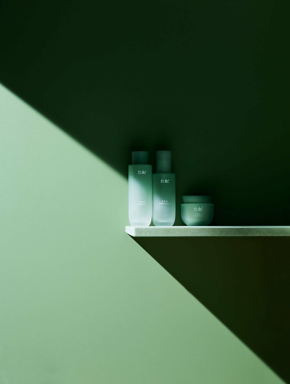
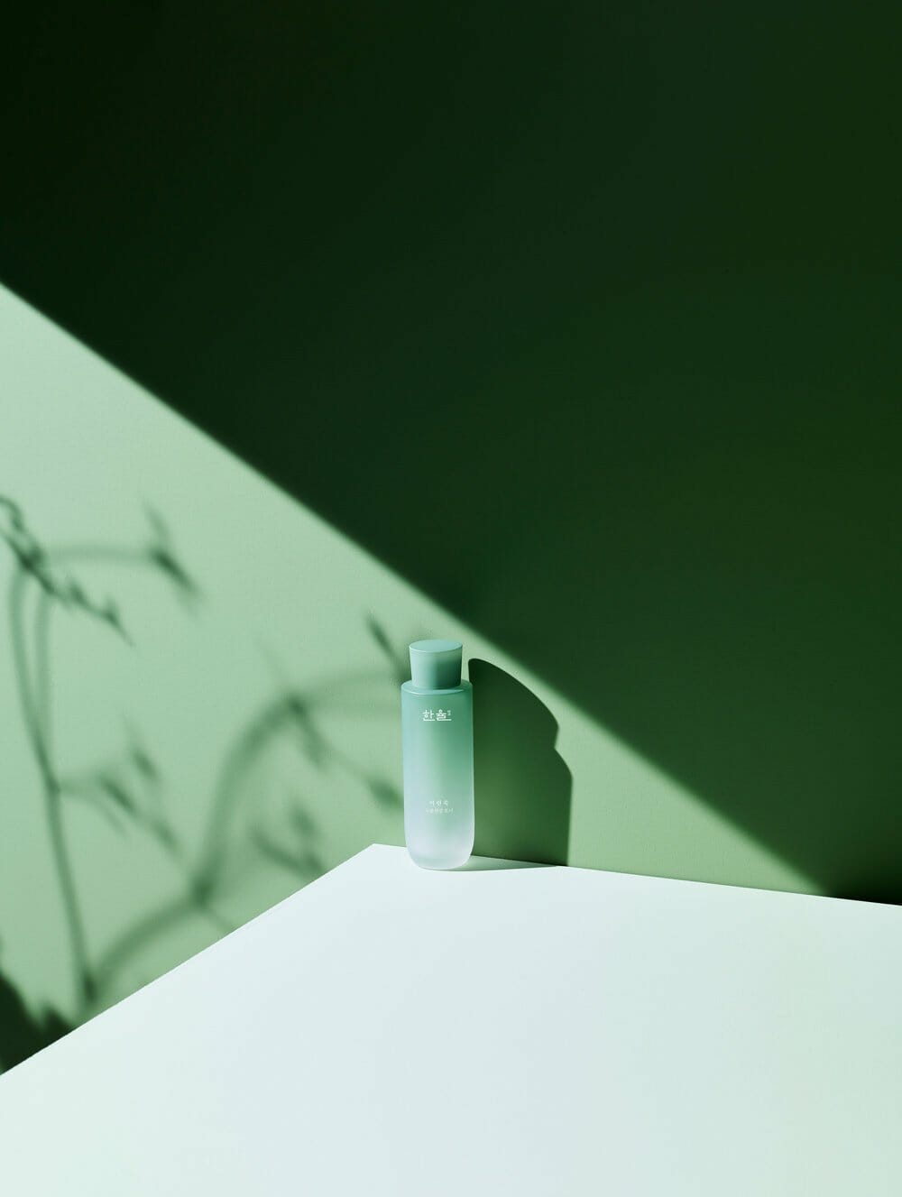
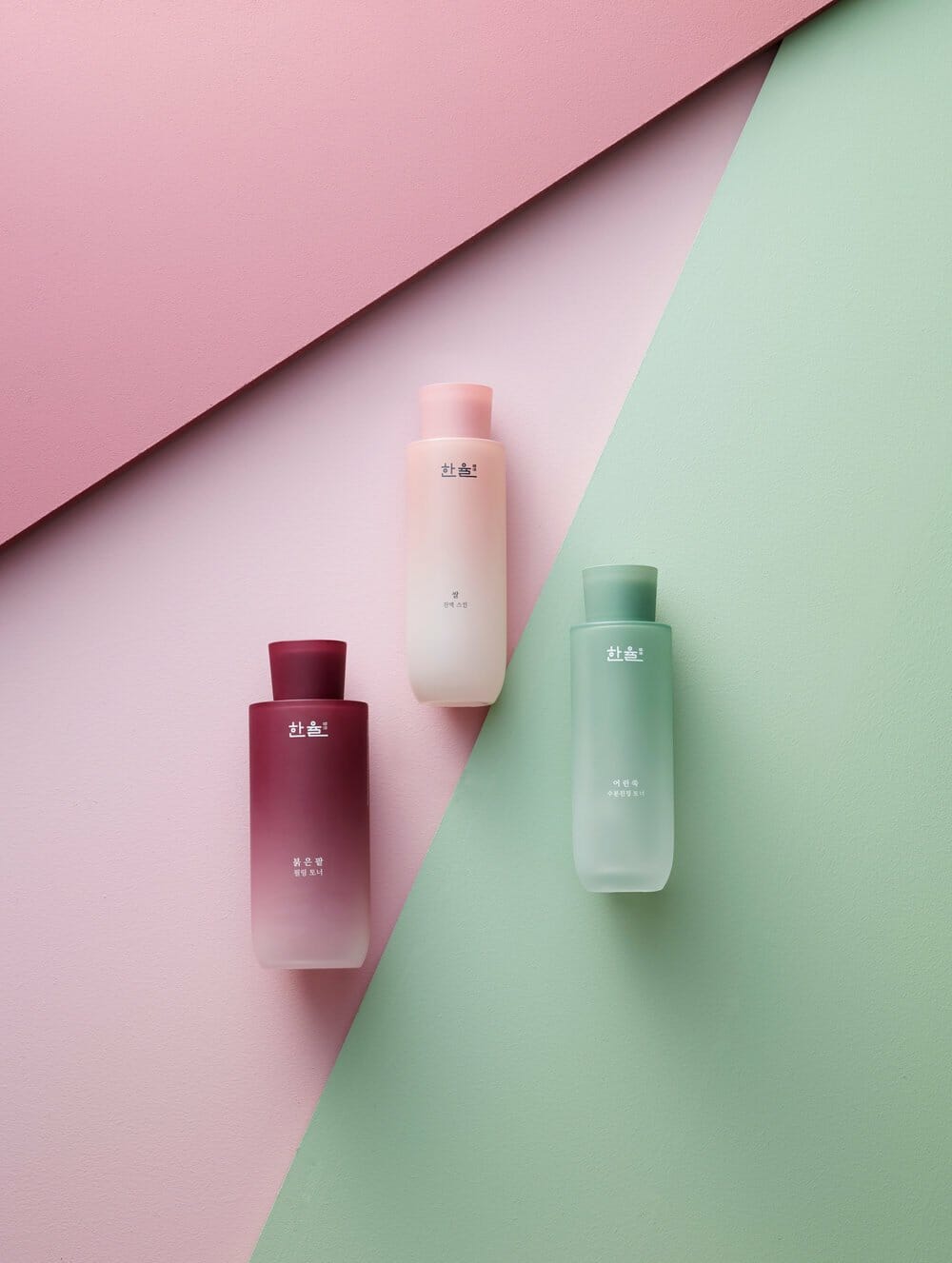
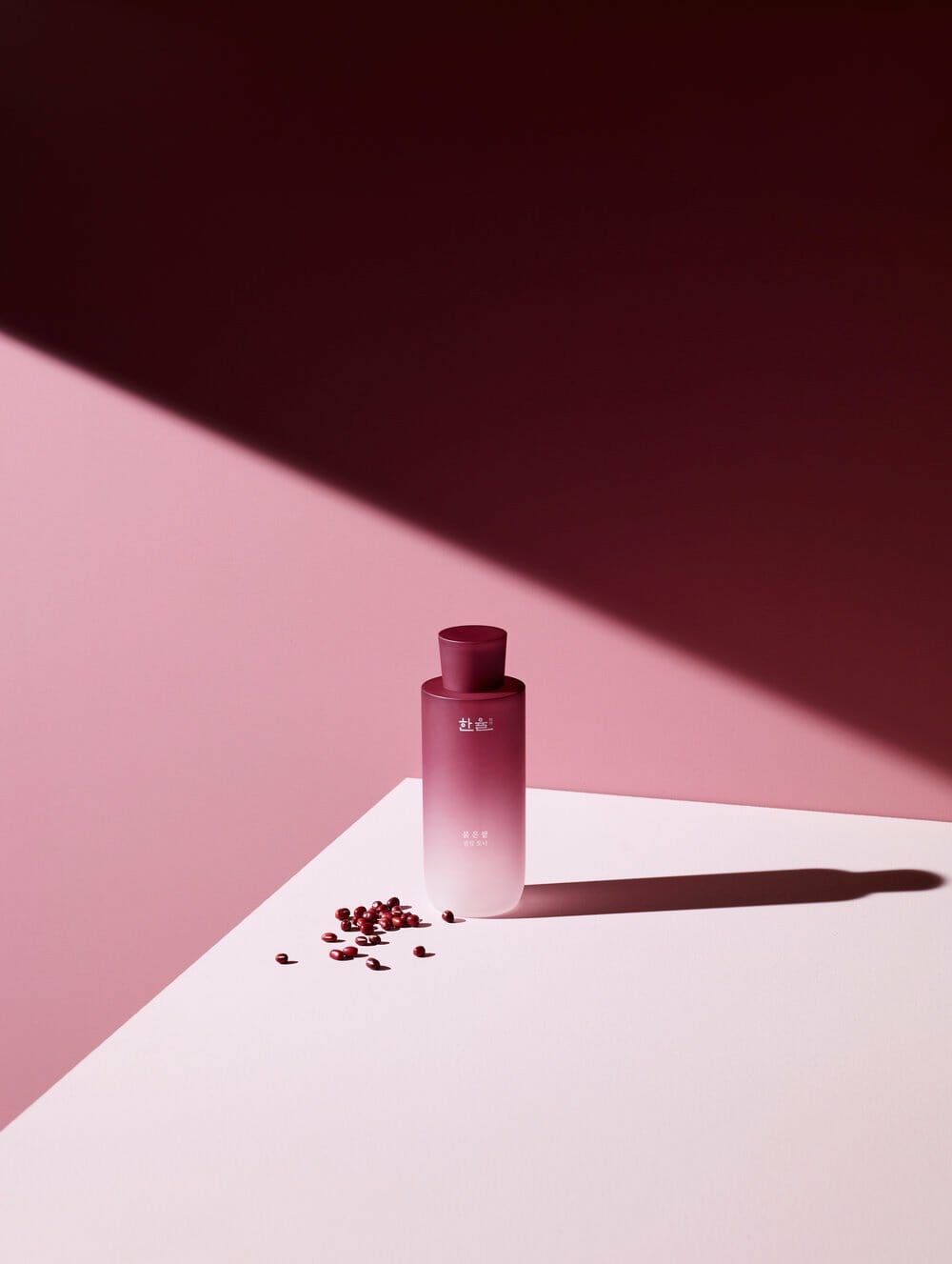
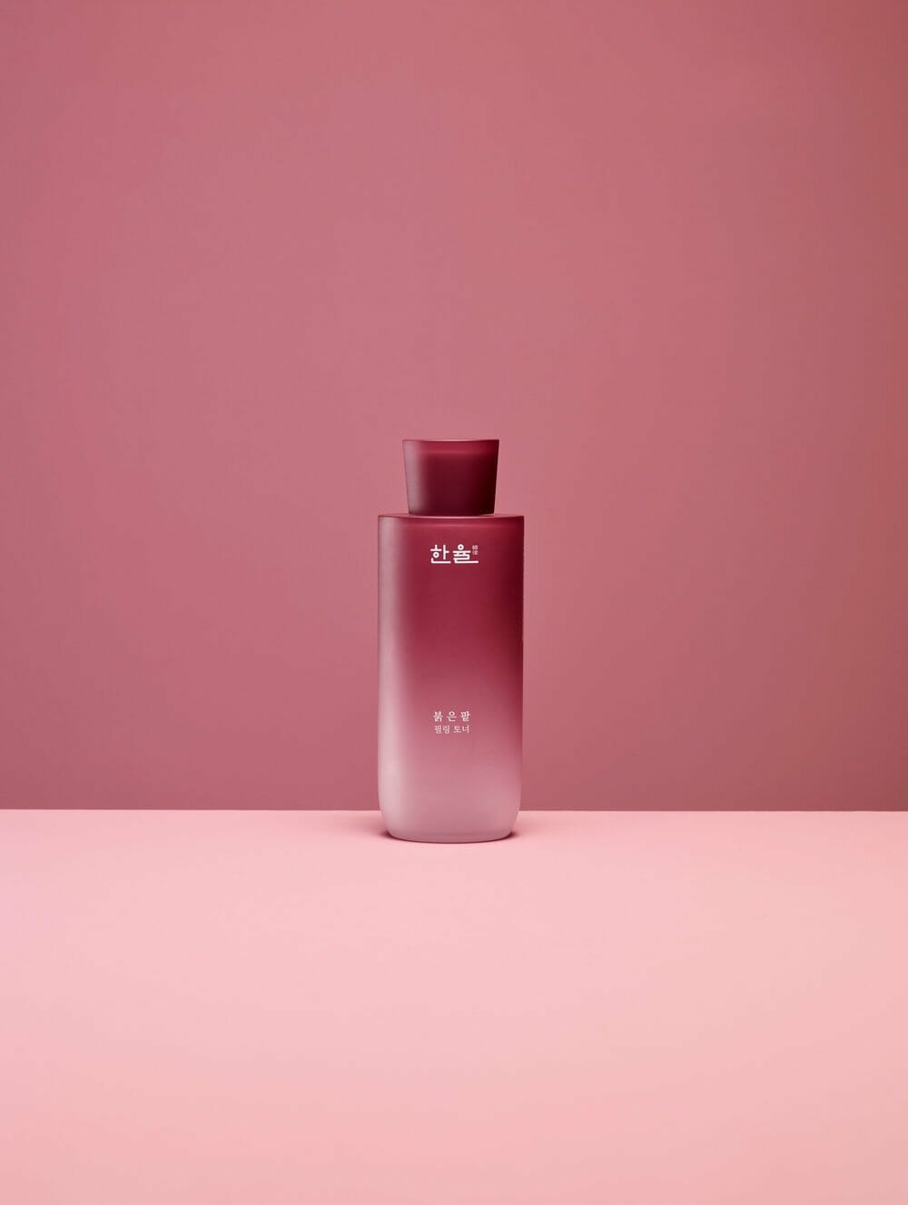
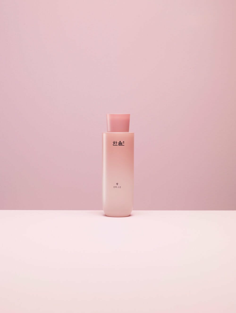
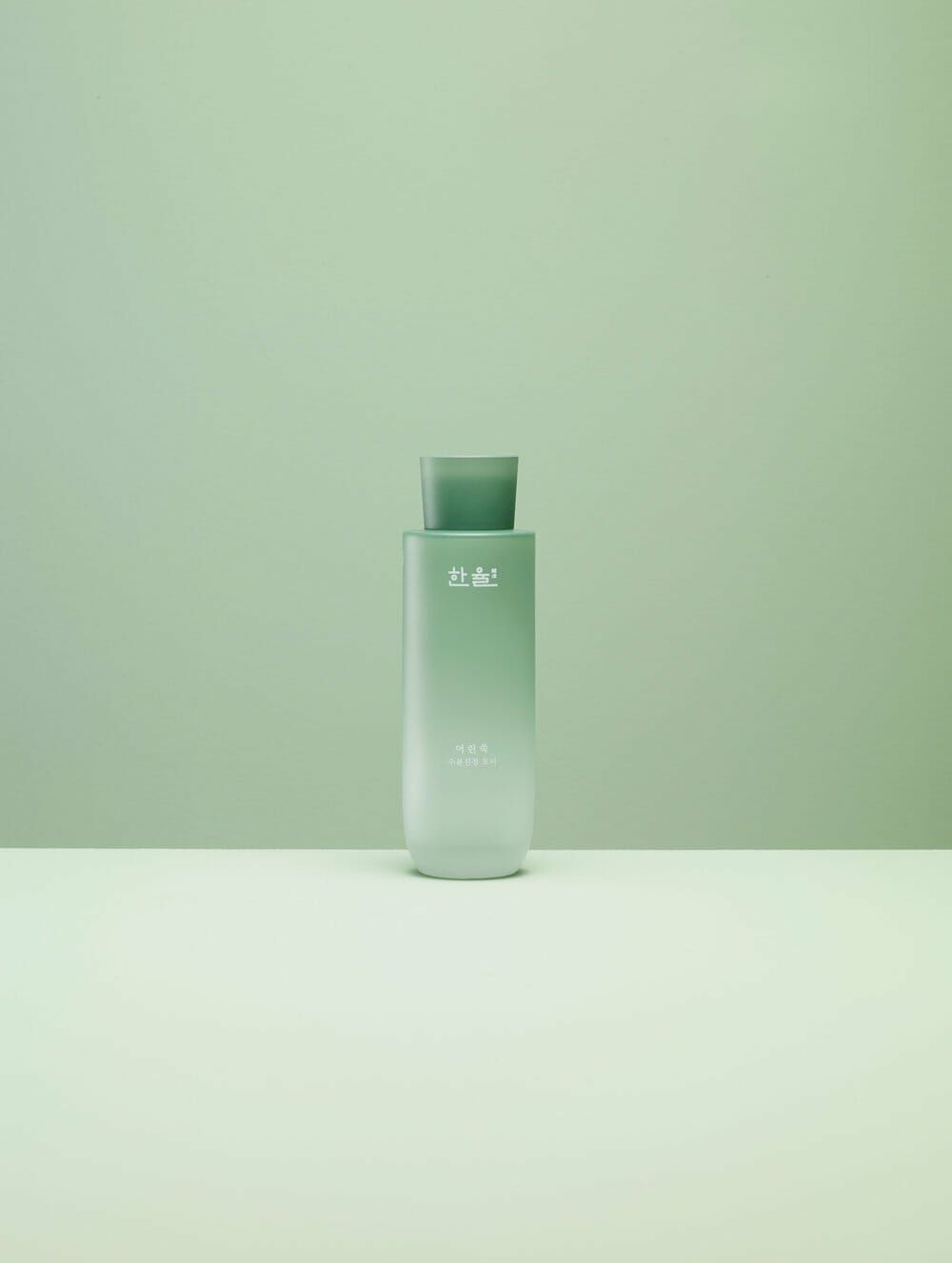
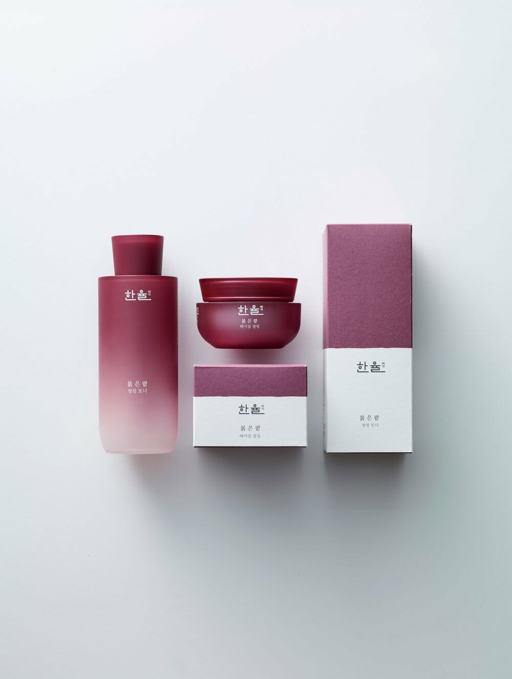
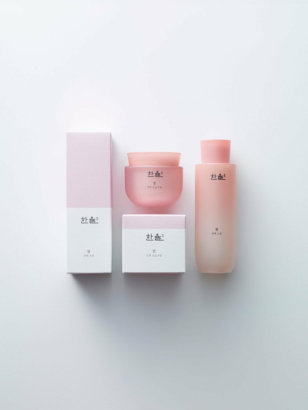
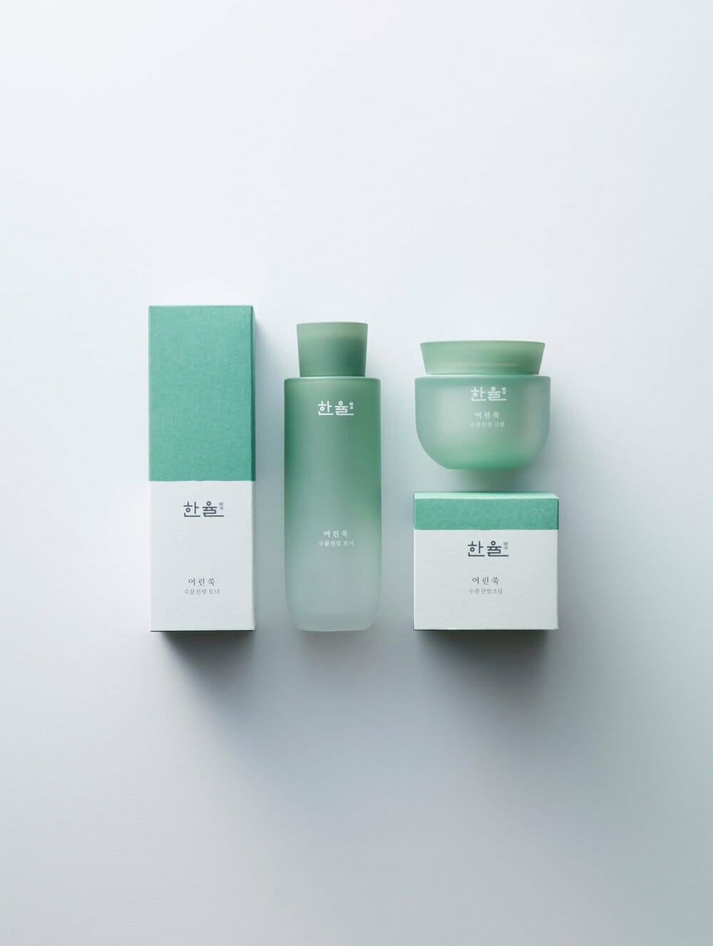
Hanyul initiates change among herbal brands through Korean naturalism. The traditional dark brown associated with herbal medicine is replaced by a palette of natural colors. This shift reflects a return to essence, inspired by the motif of Yakho—a ceramic container once used to store natural ingredients in Korean households. On the packaging boxes, horizontal lines resembling Korean topography are expressed in a modern style.
Concept
Hanyul is a brand rooted in the benefits of Korean nature, and its design reflects this identity. Based on familiar ingredients harvested from Korean landscapes, the packaging colors are drawn from raw ingredients at their healthiest and most vibrant states in nature. When product boxes are placed side by side, the horizontal connection of lines and colors creates a distinctive visual identity for the brand. These horizontal lines also represent the gentle slopes of Korea’s low mountains—regions where Hanyul’s ingredients are cultivated. Hanyul’s design bridges the past and present. The wisdom of using extraordinary benefits found in everyday ingredients is expressed visually. The containers are inspired by traditional vessels that once held precious natural substances, reinterpreted with modern lines to convey timeless Korean wisdom in a contemporary form.