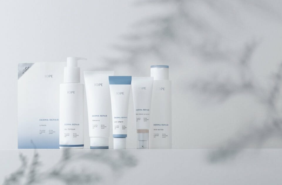
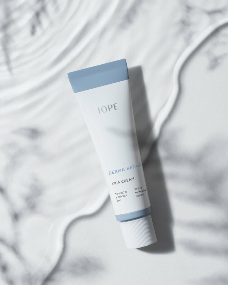
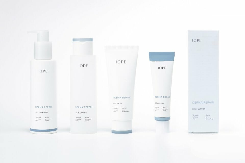
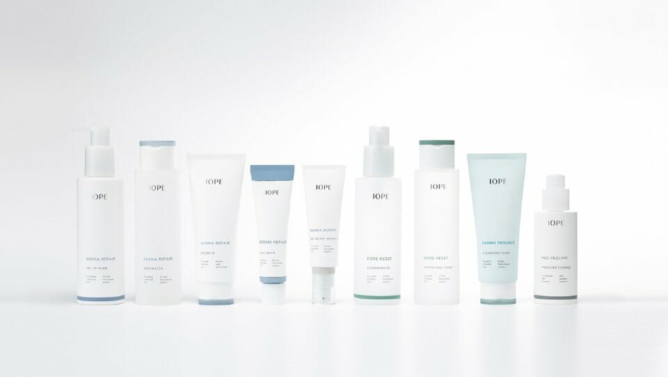
To launch new solution lines incorporating the technology and expertise of the plant science brand IOPE, a representative color is assigned to each line, allowing customers to intuitively understand the characteristics of each product. The graphics on the product body are designed to improve readability by clearly indicating the user’s skin type and the product’s benefits. The top of the cap highlights the functional aspect of each item. Colors corresponding to specific skin concerns help users easily select the product that suits their needs. On the sides and back of the packaging, infographic elements such as graphs and checkboxes are used to enhance trust in the product’s skin safety.
Concept
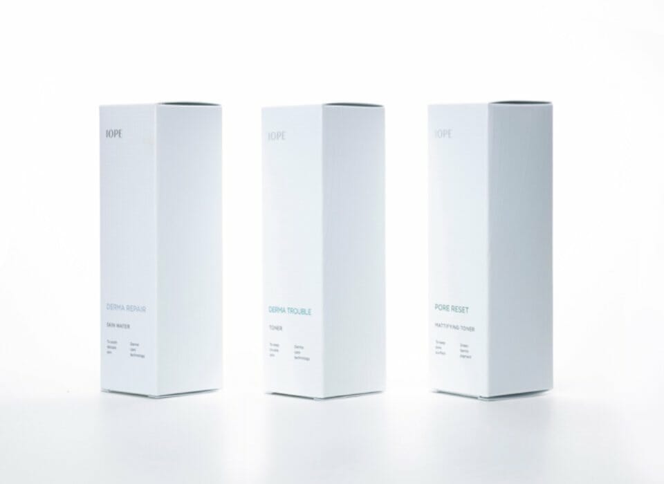
IOPE, guided by the philosophy of “DISCOVERY OF PLANT BIOLOGY,” offers two main lines: the basic line and the special solution line. The special solution line is developed to address various skin concerns using IOPE’s skincare expertise, with a strong focus on functionality. To reflect this, the container features clean, linear shapes and a matte finish that conveys purity and cleanliness. The front of the box showcases a rational layout with linear dot patterns to represent scientific innovation, while the side panels include organic plant-based patterns to visually express the concept of PHYTO ENERGY.