Amorepacific Design CenterDesigner Lee Yoon Jung
Designer Lee Yoon Jung – Adding a Personalized Edge to Blank Spaces! Uncovered makeup, which reveals and expresses one’s personality just as it is—rather than relying on heavy makeup—is on the rise. In line with this trend, the Blank Launch Project is drawing attention for its unique blend of simplicity and trendiness. We spoke with designer Yoon Jung Lee, who brought these two seemingly contrasting concepts together, to learn more about how Blank was created.
Editor Urbanbooks Lee Bom, Ho Eun Hye
Photographer Amorepacific Shin Sang Woo
Videographer Lee Jun Hyeok
Support Amorepacific Yeo You Mi
Designer Lee Yoon Jung, who was responsible for all stages of the Blank Launch Project
Please introduce yourself briefly.Hello, I’m Lee Yoon Jung from the Corporate Design Team, in charge of product design for Blank. I’ve been working on the overall branding for the launch of the Blank project — from package design to video production.
Please introduce the Blank Project, which you are in charge of launching.The BM team planned to create a new makeup brand to respond to Amorepacific’s Ariakeum and multi-brand shop channels. We proceeded with branding and design based on a concept that expresses uniqueness and novelty. The most notable aspect of the Blank launch project is the brand name itself. The word “Blank,” meaning an empty space, embodies the brand’s unique identity—encouraging individuals to discover their own style, even when using the same makeup. It effectively communicates the brand’s concise concept, one that resists being defined by a single word.
Blank has established a positive and proactive brand identity while paying attention to subtle and refined details.
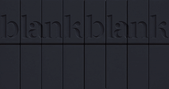
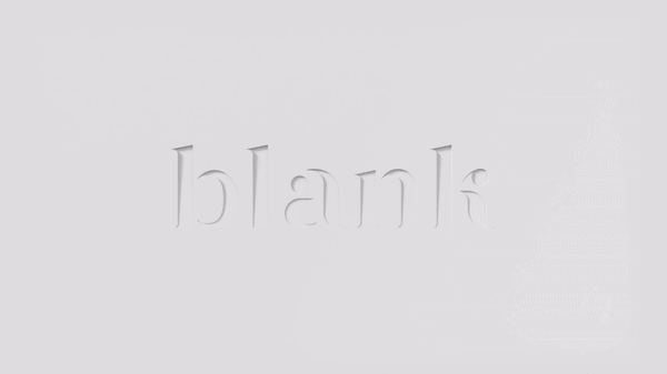
Blank embodies the idea of establishing one’s own style without being confined by form. The logo harmoniously blends sharp lines with a soft, refined mood.
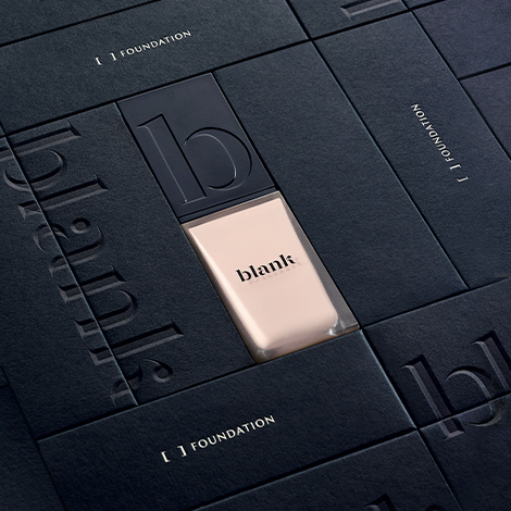
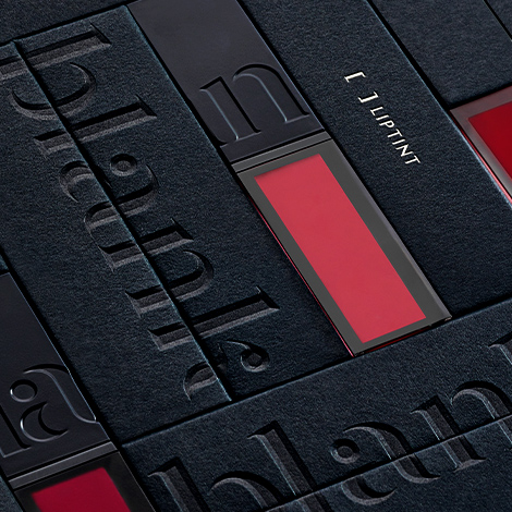
Blank emphasizes uncovered makeup that reveals one’s individuality. What aspects did you focus on in the design to convey this natural concept?Blank is not just about covering flaws, but about encouraging users to express their individuality. We wanted the design to reflect that philosophy. That’s why we introduced a bracket design element — the space within the brackets is intentionally left blank to be filled by each user’s unique color and personality. Additionally, instead of including a separate instruction manual, all explanations are written inside the package, while the front is kept minimal, displaying only essential information.
Blank is also a cruelty-free brand that does not test on animals.We aimed to design product packaging for consumers who are conscious of both the environment and ethics. Sustainability is a hot topic in the beauty industry these days, and how environmentally friendly a product is has become an important benchmark. While personal consumption is a matter of individual choice and taste, it is also increasingly tied to social issues. That’s why we wanted Blank to be a brand that takes ethical responsibility throughout the entire process — from manufacturing to production. Blank hopes to make cruelty-free cosmetics more accessible and to raise awareness of ethical issues in the industry.
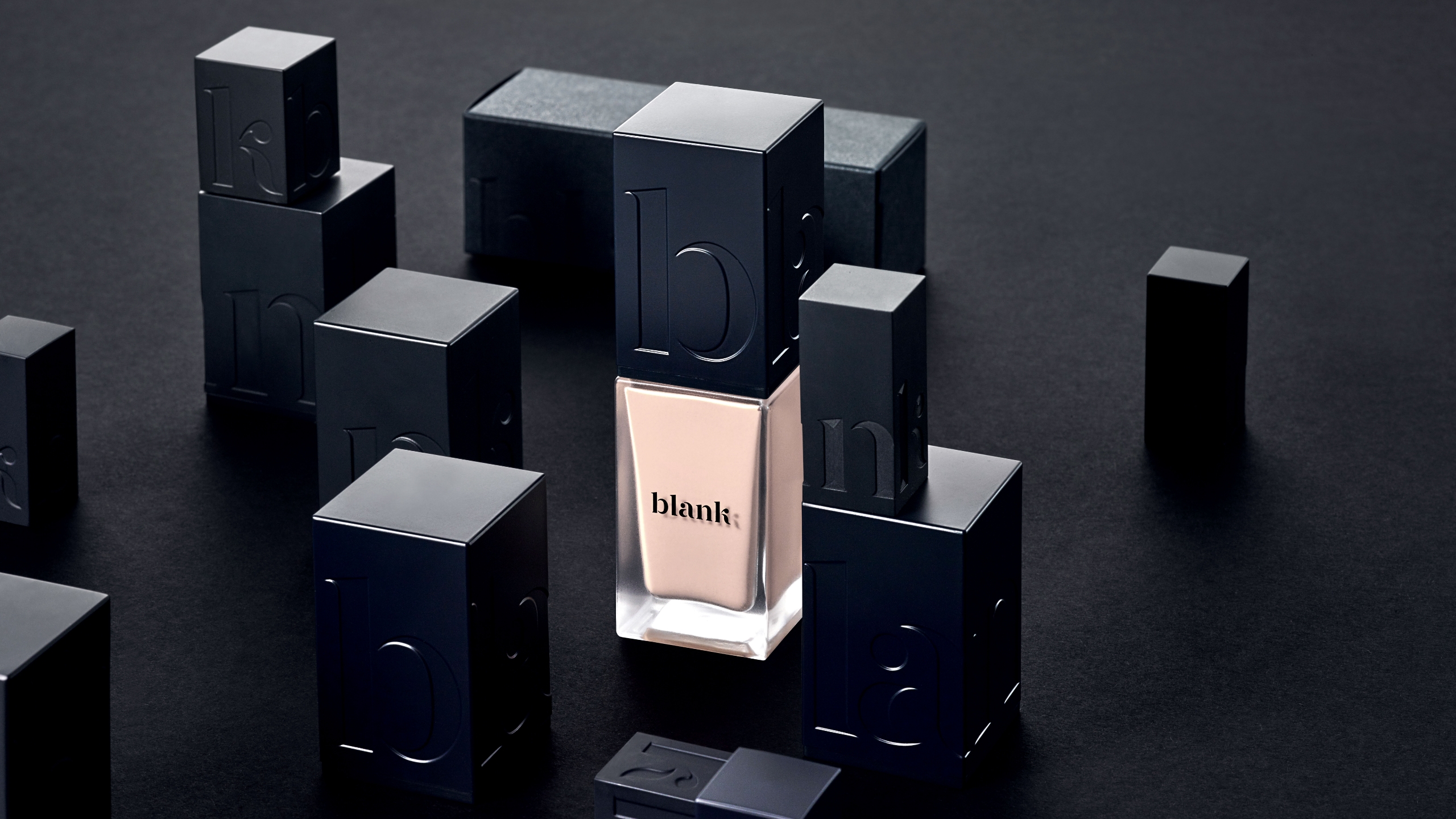
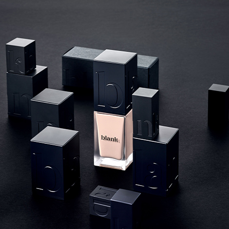
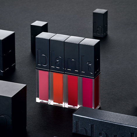
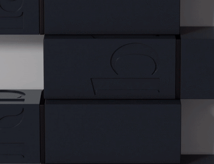
Blank product packaging was developed as part of the Blank launch project. When the products are arranged together, the Blank logo becomes clearly visible.
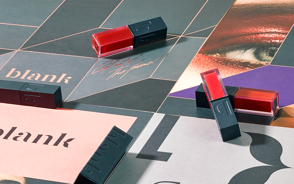
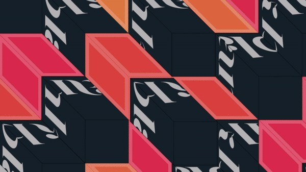
A visual video created in collaboration with MYKC. We developed and incorporated graphic elements to highlight the packaging design.
The symbol development and graphic work were carried out in collaboration with the design studio MYKC. Could you tell us more about the reason for collaborating with an external designer?We decided to proceed with the collaboration to incorporate the premium quality expressed in MYKC’s creative designs and further establish the brand identity. The collaboration between Amorepacific and MYKC was an experience that allowed us to enhance each other’s brand power.
It took about a year to produce the campaign. What were the most challenging aspects of the launch process?Blank signifies emptying one’s lifestyle and filling it with new values, so we had to carefully consider how far we could take the design to effectively convey that message. We experimented with stripping away all graphics and text to find the right balance. However, due to the nature of the product, we couldn’t eliminate everything, so we had to strike a compromise between various design concepts. Although the process was challenging, the sense of accomplishment upon completing the final product was immense.
We created a storyboard to define the Blank muse—someone with a proactive personality who expresses their social beliefs—and incorporated this character into product development.
What personal and professional achievements do you think you have made through this project?I think creating a unique identity in the saturated makeup market, establishing an emotional brand, and making various design attempts were meaningful achievements for me.
Finally, what are Blank’s future strategies?We plan to continue creating consistent content this year, focusing on increasing brand awareness. Specifically, we aim to actively promote Blank’s values through pop-up stores and social media. As part of this effort, Blank products will be available in multi-brand stores starting this year, expanding our presence in offline spaces.
Side Interview
MYKC
Kim Yong Chan Graphic Designer Please introduce yourself and describe your role in the Blank Launching Project.
I’m Kim Yong Chan, co-CEO of MYKC, a graphic design studio. For the Blank Launching Project, I collaborated with Amorepacific’s Corporate Design Team to develop the Blank logotype and symbol, as well as typefaces and visual content.
Graphic designer Kim Yong Chan of MYKC, who collaborated on the blank launch project
What was the focus when establishing the direction for blank design?
We focused on creating an overall design mood that aligns with the brand’s personality of expressing “another side of oneself,” including the logo type, font, and color palette. To evoke this concept, we added three-dimensional design elements to the rendering of the word “blank” and the key visual video. After experimenting with various graphic concepts, we finalized the design using 2D line graphics and isometric work to create a three-dimensional appearance.
The package design, which evokes a single phrase as it is stacked, adds an element of fun.
Since Blank is sold in multi-brand retail environments, it needed strong visual appeal to stand out. The Corporate Design Team proposed incorporating graphic elements into the package design to enhance its visibility. We designed the logo to wrap around all four sides of the package, creating an engaging effect where the Blank logo becomes clearly visible when products are displayed side by side. Building on this concept, we developed the package design and produced a key visual video to effectively communicate the overall concept.
I am curious about the achievements you felt while working on this project.
I was deeply impressed by the close collaboration with the Corporate Design Team throughout the project. Thanks to our active communication, we quickly aligned on the direction, and the final outcome was very satisfying. Although it was a year-long project with its share of challenges, it was a meaningful experience to work on the design of a makeup brand—something I had always wanted to try—and to be involved from the brand’s inception to completion.
Blank is a lip makeup brand launched in August 2019.
With a look that reveals everything without hiding anything,
the brand embraces the concept of “Uncovered Beauty.”
It pursues a philosophy of minimalism and cruelty-free, ethical consumption.
Blank ProjectA makeup brand for the Uncovered Beauty generation. We conducted a branding project that visualizes brackets to represent the idea of adding your own edge to empty spaces. By incorporating three key concepts—neutrality, modernity, and Janus-like duality—into the BI, color palette, packaging, visuals, and brand video, we created a cohesive and unified brand identity.
Design Key PointsThe main color, “Eclipse Navy,” is a monochromatic shade that evokes a soft impression, while the engraved finish applied to the product container caps serves as a key design element. Each product features a distinct color and is designed to stack like LEGO pieces, forming the Blank logo. The minimalist packaging, which presents only essential information, further emphasizes Blank’s sleek and refined aesthetic.