AESTURA is an original derma brand that has accumulated medicinal heritage since 1982 and is the best solution for skin concerns in cosmetics.
By expanding distribution from clinic-only to commercial channels, we have been expanding the points of contact with customers, and ATOBARRIER365 Cream and CICA365 Serum have been established as Olive Young’s representative derma products. This package renewal project for market-only packaging solidified the brand identity of Actual Derma AESTURA and reorganized the brand’s overall BI elements and graphic layout to reflect global standards in the derma market.
DESIGN concept
We moved the brand logo to the top of the package for stronger brand presence. The graphic layout was redesigned to facilitate easier customer
self-selection by reorganizing the information hierarchy: Product Name -> Key Ingredient -> Key Benefit -> Skin Type. Additionally,
we developed a system of line-specific colors and new icons that reflect each product’s core benefit, allowing customers to intuitively understand the function of each item.
visual contents
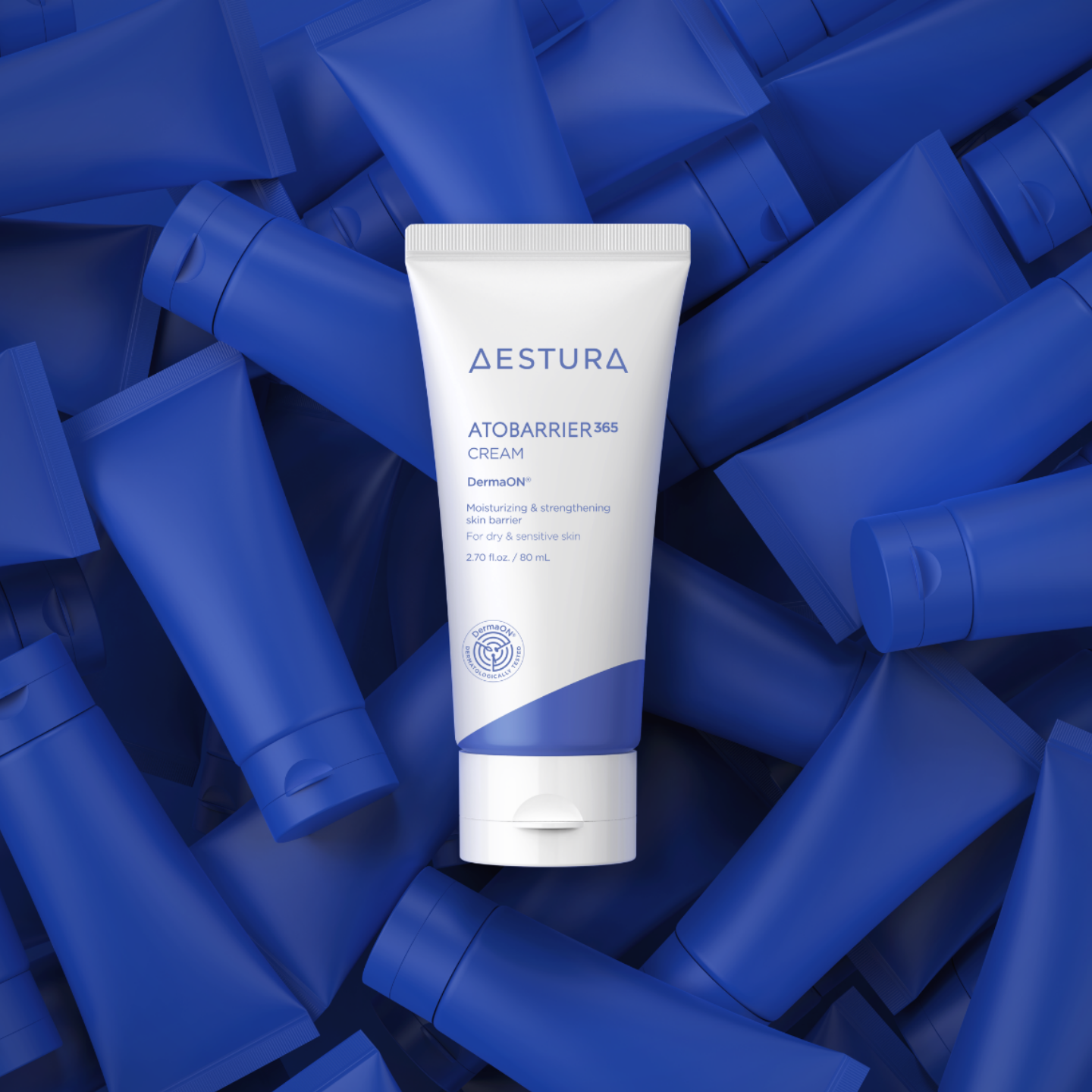
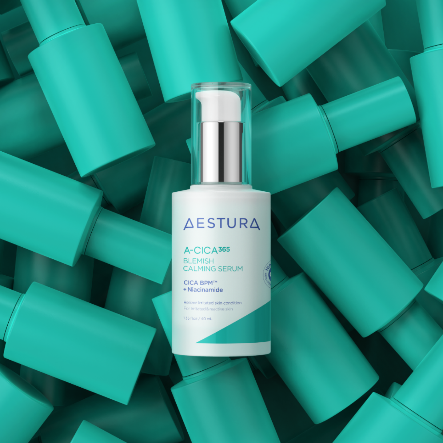
To support the new packaging, we developed key visuals featuring our hero products: ‘ATOBARRIER365 Cream’ and ‘A-CICA365 Serum.’
The new visuals use deep, solid background colors drawn from each product line’s signature color. This was designed to intuitively
communicate the design renewal and to express the confidence of an authentic derma brand with a true pharmaceutical origin, differentiating AESTURA from its competitors.
For the new packaging, we developed a system of symbols for each product line that encapsulates its key ingredients, skin benefits, efficacy, and safety credentials.
These are displayed prominently on the front of the packaging to emphasize each line’s function. We photographed the hero products to showcase these changes and brought the new icons to life through motion graphics.