2022–2023 Risabae Project: Developing the Design Identity of the New Brand “Two Slash Four”
AMORE PACIFIC X RISABAE
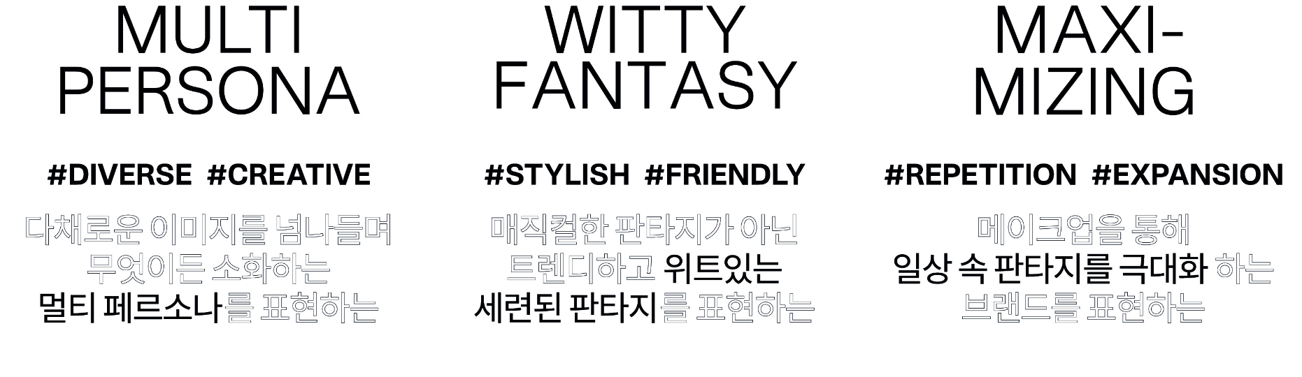
1. DESIGN CONCEPT _ Make Up your Fantasy


2. B.I DESIGN
WARDMARK
The name ‘TWO SLASH FOUR’ is inspired by professional makeup artist and beauty creator RISABAE,
who is not just a master of technique but a guide for beauty concerns.
The name carries a dual meaning:
– ‘TWO SLASH FOUR’ (2/4) promises to cut your daily beauty routine in half.
– ‘TWO FOUR’ (24) signifies that beauty supporter RISABAE is with you 24/7.
The wordmark uses all uppercase letters and was designed to be highly versatile, adapting to the extreme format variations of cosmetic packaging—from long, thin tubes to the wide surfaces of compacts. The full name ‘TWO SLASH FOUR’ can be flexibly arranged in either a single-line or a three-line lockup. The logotype itself was designed to evoke a witty and charming image by emphasizing the unique character of each letterform. With its high-contrast strokes and a harmonious blend of circles, straight lines, and diagonals, it adds a trendy, kitschy edge to the brand.


SYMBOL
The TWO SLASH FOUR symbol is a monogram that cleverly utilizes the brand’s core elements: the numbers 2 and 4, and a slash (/).
It leverages the graphic similarity between ‘2’ and ‘4,’ arranging them symmetrically. The slash (/) is then artfully revealed
in the negative space between them. This abstract representation of the brand’s name creates a unique and symbolic mark for TWO SLASH FOUR.

3. PACKAGE DESIGN
The packaging expresses the concept of ‘maximizing change’ through the bold, repetitive use of an exaggerated logo pattern,
conveying the brand’s product power and story. The brand’s color palette is inspired by a ‘mirror’ reflecting a new version of oneself.
‘Mirror Blue’ is the main color, representing a multi-faceted persona, while two sub-colors (purple and blue)
are used across both the paper packaging and the containers.
Single-box design
We created a ‘maximalist’ artwork by patterning the logo to completely fill the sides of the carton.
The color scheme for each product is different: shades that provide full color payoff on their own
(Nu Red, Nu Coco) use a solid color background, while the ‘color-changer’ shades meant for mixing
(Nu Black, Nu Lavender) are distinguished by a gradient background.

Container Design
Following the same logic, the layering ‘changer’ products use the brand’s core ‘Mirror Blue,’ while the products with distinct,
standalone colors use purple. The high-gloss body of the container evokes the glossy formula within. The cap features a slanted
slash (/) motif, and the brand’s symbol is embossed on top for a tactile, three-dimensional effect.


- Amorepacific Creatives
- Project Planning
- Two Slash Four Team
- Design Directing
- Kim Jihyun, ORKR