Summary
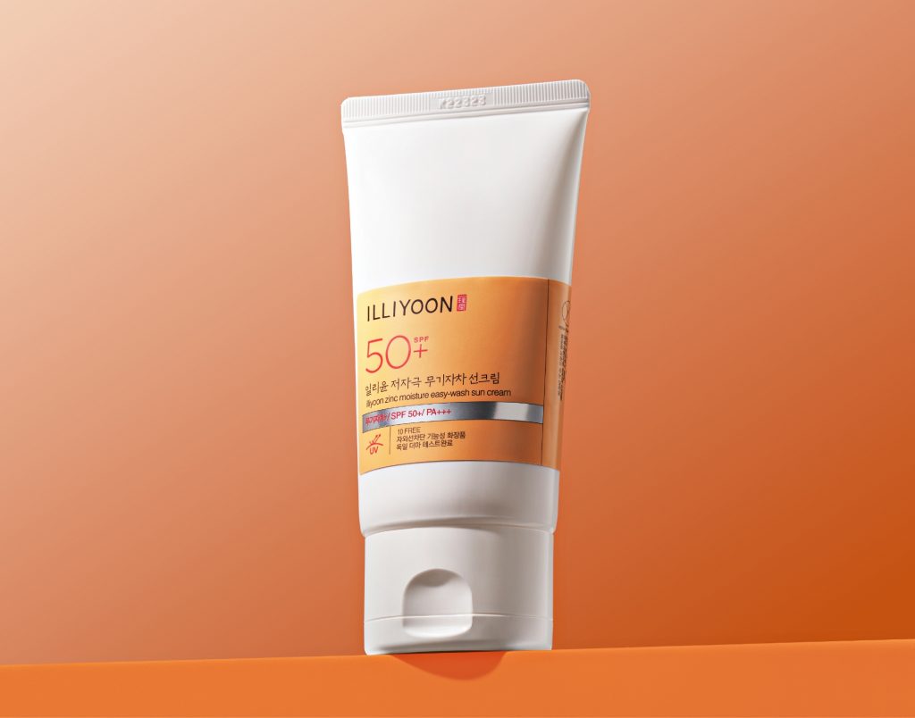
Introducing the new designs for ILLIYOON’s Hypoallergenic Mineral Sunscreen and Hypoallergenic Easy-Wash Sunscreen.
For this redesign, we used an intuitive yet refined color palette to highlight each product’s attributes and emphasized their functionality within ILLIYOON’s signature layout.

Concept
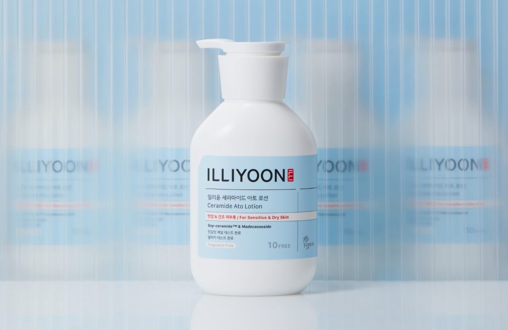
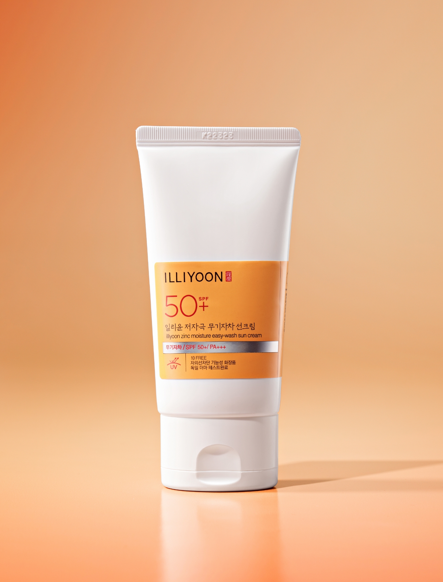
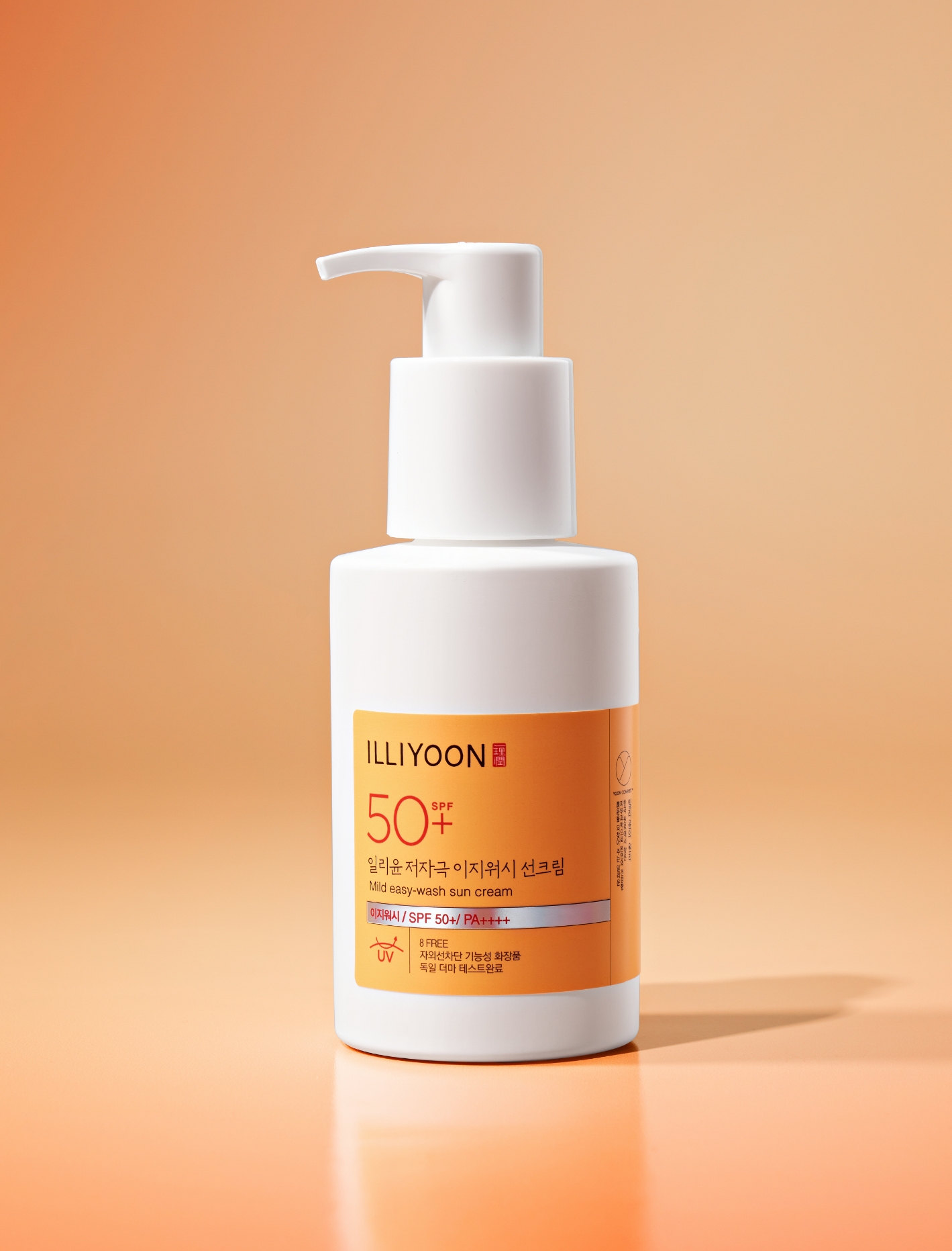
To emphasize the gentle formula and moisturizing application, we used a clean white as the primary color, with selective glossy accents.
Orange was chosen as a secondary color to make the products instantly recognizable as sun care. Key functional details, such as the SPF rating,
were highlighted in an accent red to convey that the product is both “gentle and effective.” Finally, the silver metallic label,
a consistent feature across ILLIYOON’s functional lines, lends a clinical, rational mood and symbolizes the brand’s technological expertise.


ILLIYOON: Gentle Ingredients and Eco-Friendly Commitments
1. Rigorous Safety Testing: Both formulas have completed extensive safety testing.
Hypoallergenic Easy-Wash Sunscreen: German Derma test, dermatologist test, hypoallergenic test, primary irritation test for sensitive skin, and eye irritation alternative test.
Hypoallergenic Mineral Sunscreen: Sensitive skin panel test, eye irritation alternative test, allergy test, and dermatologist test.
2. Anti-Residue Special Container: The Easy-Wash Sunscreen uses ILLIYOON’s special ‘anti-residue’ container. This dual-pouch design blocks air intake, allowing the pump to dispense the lotion to the very last drop and reducing resource waste.
3. Reduced Packaging: Unlike the previous versions that came in an outer paper carton, the new design eliminates the box entirely. The product is now protected only by a transparent film, significantly reducing packaging volume.


- Amorepacific Creatives
- Design
- 김연서, 김태은
- BM
- 김가영
- Development
- 송혜강