The all-new Mamonde aims to evolve into “a beauty brand that creates your own naturalness through hyper-flora technology and boundaryless innovation.”
Launched in 1991, Mamonde continues to honor its heritage of promoting independent and empowered women, reflecting the values of the time, Mamonde
has been rebranded as a new beauty brand, reflecting the contemporaneity of 2023.
Product Concept
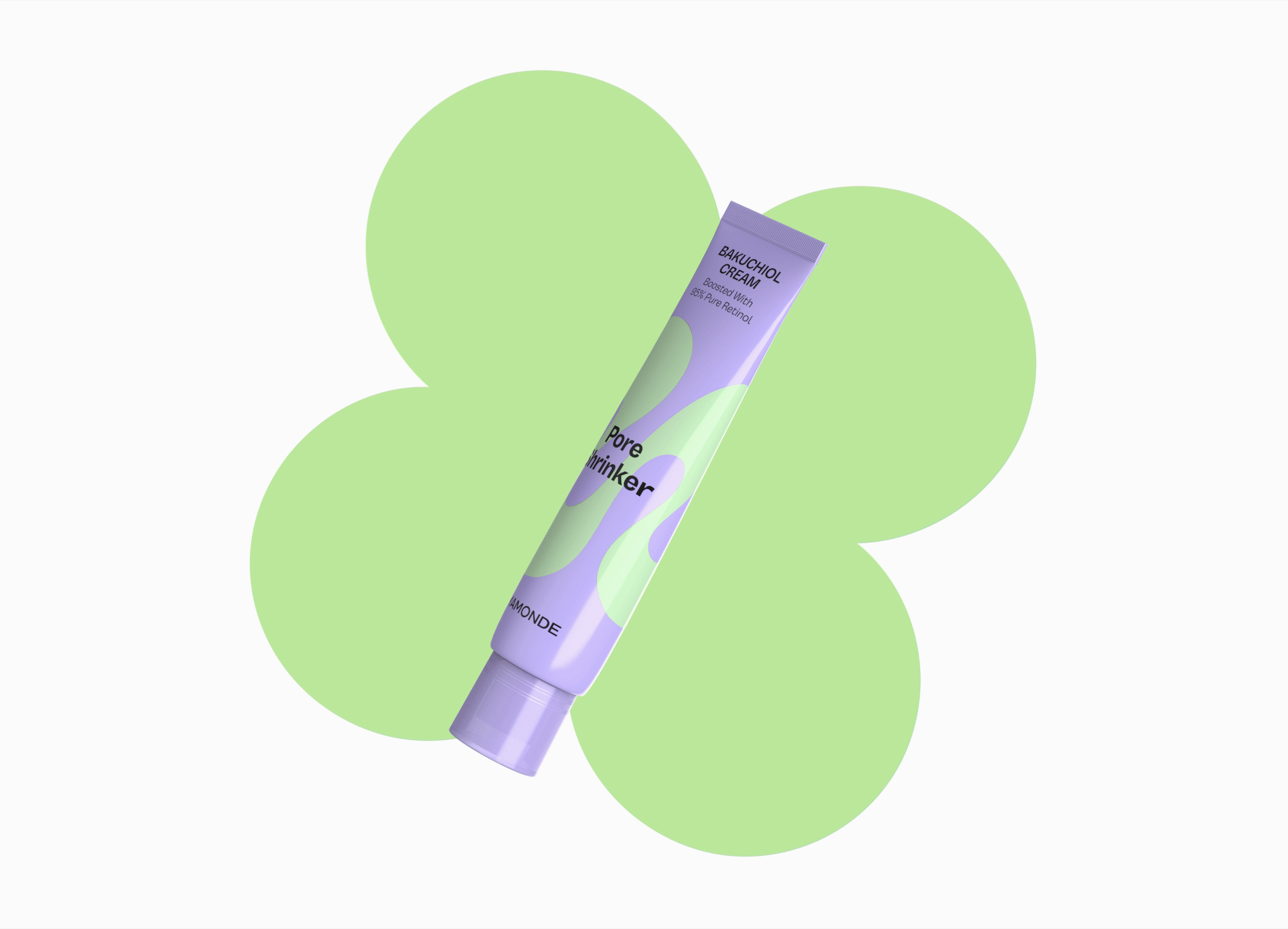
Marking the brand’s new beginning, the first product launched is the Pore Shrinker Bakuchiol Cream.
Containing pure retinol, it emphasizes early anti-aging benefits for a new generation of consumers.
This product is crafted with Mamonde’s ‘Hyper Flora™’ technology—born from 32 years of sincere dedication to floral
research—and embodies the brand’s mission to “break the boundaries of beauty and empower everyone to let their life blossom in their own way.”
‘Hyper Flora™’ is a skin solution that creates optimal synergy by combining potent active ingredients from flowers with effective skincare boosters.
It is based on this cutting-edge technology and a genuine exploration of beauty without boundaries that Mamonde presents its unique new direction.
Primary Packaging
The ‘Supergraphic,’ an M-shaped pattern derived from the brand symbol, is a key design asset that consistently communicates the Mamonde identity across all touchpoints.
On product packaging, the Supergraphic is applied freely across all surfaces, stimulating the imagination and allowing for diverse stylistic expressions.
This graphic is paired with Mamonde’s unique color system, which is designed to represent our ‘Hyper Flora™’ technology.
The system features a ‘Navigating Color’ representing the core floral ingredient (like Bakuchiol) and a ‘Boosting Color’ symbolizing the high-performance active ingredient (like Retinol).
The strong two-tone contrast of this system creates a youthful and vibrant image.
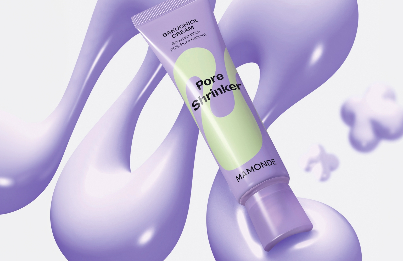
To visually evoke the product’s main benefit—enhanced pore elasticity—and create a lasting impact, we maximized the visual effects in our campaign imagery.
This was achieved by using voluminous 3D renderings with rich textures and by experimenting with new, bold compositions to create a dynamic, ‘hyper-stylized’ visual world.
Secondary Packaging
On the front of the packaging, we minimized explanatory text, allowing the Supergraphic to unfold freely as the main visual element.
A clean, high-impact layout emphasizes only the most crucial information—the product name and its key benefit—so consumers can instantly understand the product’s function.
Our commitment to inclusivity and sustainability is reflected across the entire line.
We have implemented universal design principles by including the product type in Braille to enhance accessibility for a broader range of consumers.
Furthermore, our products are certified vegan and feature green packaging that utilizes FSC-certified paper and soy-based ink.
Through these various initiatives, we will continue striving to create designs that are truly for everyone.