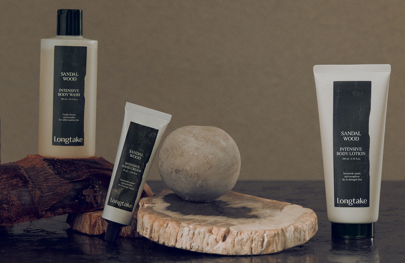
As spa-like practices such as therapeutic bathing and exfoliation move into the home, daily body care rituals are becoming more sophisticated.
SKIN U is meeting this trend by offering a complete body care routine—shower gel, body scrub, and body lotion—for ‘scent enthusiasts,’ expanding
its product line and solidifying its position as a fragrance-focused brand.
By integrating the real-world habits of scrub users with SKIN U’s brand message, this project proposes a unique body scrub ritual. The goal is
a design that not only delivers soft skin and a lingering scent after use, but also ensures the entire process of using the scrub is a gentle and thoughtful experience.
Concept
SKIN U: Body care that
leaves a lingering scent and softness.
To propose a body routine that was uniquely differentiated for SKIN U, we analyzed the current body scrub market and user behaviors.
Our goal was to embody the core brand value of ‘softness’ in the design itself.
We looked beyond the formula’s after-benefits—soft skin and a lingering scent—and considered the entire user experience from both a
visual and a contextual perspective. We sought to solve potential pain points in the process, allowing us to not only visualize
‘softness’ but to ensure the user could physically feel it through a gentle and seamless application. By mapping the product
journey into stages (purchase, use, storage), we designed every step of the scrub ritual from a user-centric point of view.
Insight
To identify problems that design could solve, we mapped the product journey from the initial purchase impulse to final storage,
brainstorming the context of each stage. A key issue emerged with jar-type scrubs: in a steam-filled bathroom, users repeatedly
dip wet hands into the container to apply the product all over their body. This process allows water to continuously contaminate
the formula. This insight led us to develop a more detailed user scenario based on personal experience. In a steamy bathroom,
you feel a sense of urgency to close the jar quickly, but after scooping out the product, you have no free hand to do so.
You worry about the formula degrading from contact with water and steam. Since scrubs aren’t used daily,
you might look at the remaining product with suspicion each time you use it.
From this, we defined SKIN U’s concept of ‘softness’ as “minimizing the uncomfortable feelings that arise during the usage process,
allowing the user to relax and focus completely on the scent and the gentle application.” Our design tells this story: with a single
dip, you can scoop out enough scrub for your entire body and place it on the dish-like lid. This minimizes contact between water
and the formula. By closing the lid immediately, you eliminate the worry of product degradation. This is the unique, ‘soft’ body care ritual of SKIN U.
Product Design
We translated this user-centric insight into the container’s design, refining the form through sketches, modeling,
and mock-ups while regularly meeting with the development team to confirm mass-production feasibility.
Throughout this process, we carefully considered usability, manufacturability, and cost.
From a design perspective, the unique cap needed to be emphasized.
We gave it a sense of depth to visually communicate its role as a dish for dispensing and holding the product, and designed it to appear distinct from the container.
This created a dynamic silhouette where the jar and cap meet, resulting in an iconic and memorable form. The proportions were then finalized to match the product volume.
The container’s color inherits the deep brown of the ‘Innocent’ line with a semi-translucent finish, and the design is completed with a cap that has a soft, matte touch.