
Exhibition <The Voice that Beautifies the World: ARITA>
Summary
‘Arita’ is a font that Amorepacific has been developing since 2004, and has been distributed since 2006.
The exhibition <The Voice that Beautifies the World: Arita> was held to introduce the project, which has
expanded to include not only Korean, Chinese, and English fonts, but also typeface research, books, and
font manuals.


The tree illustration shown here is from the book <Arita Font Journey.>
Beneath the tree lie roots that are far deeper and stronger than what is visible above ground.
The process of creating Arita holds a story as solid as the font itself, carefully documented through extensive archival records.
While compiling the book, we were once again reminded of this truth and began to contemplate how to share
that story beyond the limited medium of print — how to communicate it through different methods and formats.


At this point, we also reflected on the current status of the Korean language.
In 2017, a U.S. diplomat listed Korean as one of the most difficult languages to learn.
From an external viewpoint, Korean was seen simply as a complex language—unique
in that it uses its own script and is spoken almost exclusively in one country.
However, beginning in the 2010s, as K-pop rose in global popularity, overseas fans began studying Korean.
With the growing influence of Korean films, dramas, food, and brands, more people
around the world started learning Hangul to enjoy Korean culture in its full depth.
By 2021, 26 Korean words had been added to the *Oxford English Dictionary*—more than
the total number added over the previous 45 years. When footballer Lee Kang-in joined
Paris Saint-Germain, the club embroidered players’ names in Hangul on their uniforms.
Global fashion brands such as Gucci, Vans, and Balenciaga have also released products featuring
Korean characters. While this may, in part, reflect “fan service” for Korean consumers with
growing purchasing power, it also signals the expansion and acceptance of Korean culture around the world.
Beauty Culture Company
The cultural content that
‘Amorepacific’ can present
The cultural content that
‘Amorepacific’ can present
We also reflected on the broader environment and on who we are as a company.
Many people refer to Amorepacific not merely as a beauty brand but as a *beauty culture company.
Amorepacific has always communicated with customers through culture — through the Amorepacific
Museum of Art, the Tea Culture Museum, and cultural initiatives such as the Seolhwa Culture Exhibition
and the Mise-en-Scène Short Film Festival, offering audiences high-quality, multifaceted cultural content.
Arita too is one of Amorepacific’s core cultural achievements, continuing its own meaningful journey.
Amid growing global interest in Korean language and culture, we sought ways to present our accumulated
content in a space and format that could harmonize beauty, culture, and art.
We concluded that an exhibition would be the most effective way to bring these three elements together.

Grounded in its solid cultural foundation, *Arita* was designed to remind domestic visitors—who may take
Hangul for granted—of the value and significance of the Korean language and the Arita typeface,
while also introducing Hangul and Arita to international visitors encountering them for the first time.
The goal was to deliver high-quality cultural content that both Korean and global audiences could enjoy together.

The First Exhibition: Amore Seongsu
The first exhibition was held on the second floor of Amore Seongsu, formerly the O’Sulloc Café.
In typical Amore Seongsu fashion, the space was stripped back to its framework, with large windows that allowed abundant natural light, creating a bright, open, and transparent atmosphere.
This transparency resonated with the identity of Arita, and thus became the spatial concept.
We sought to embody the transparency of typography — a long-standing metaphor in type design.
Just as transparent glass reveals the content inside, the virtue of a font lies in its ability to clearly express meaning without distraction.
This became the conceptual essence of the exhibition.


We sought to embody the transparency of typography — a long-standing metaphor in type design.
Just as transparent glass reveals the content inside, the virtue of a font lies in its ability to clearly express meaning without distraction.
This became the conceptual essence of the exhibition.


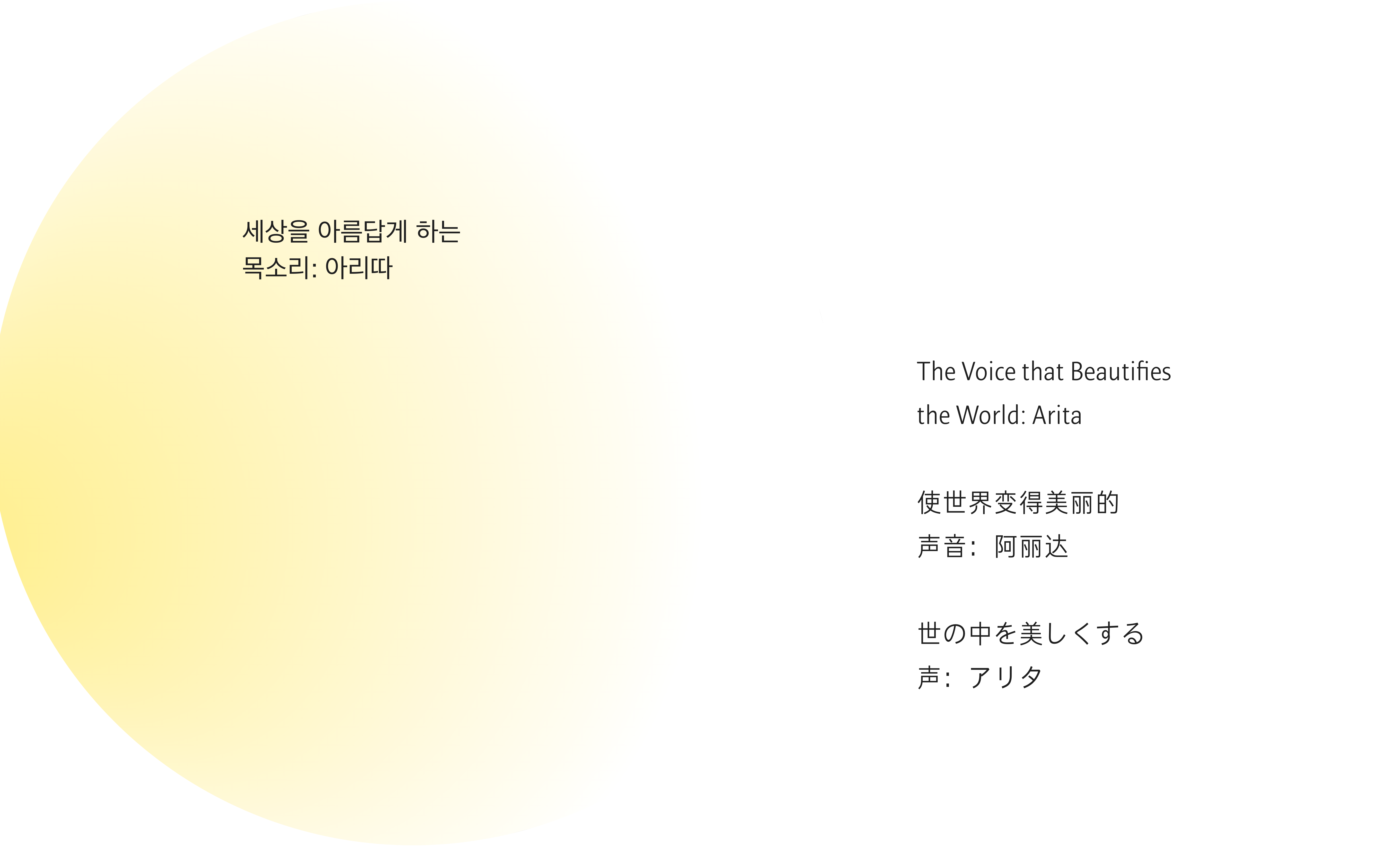
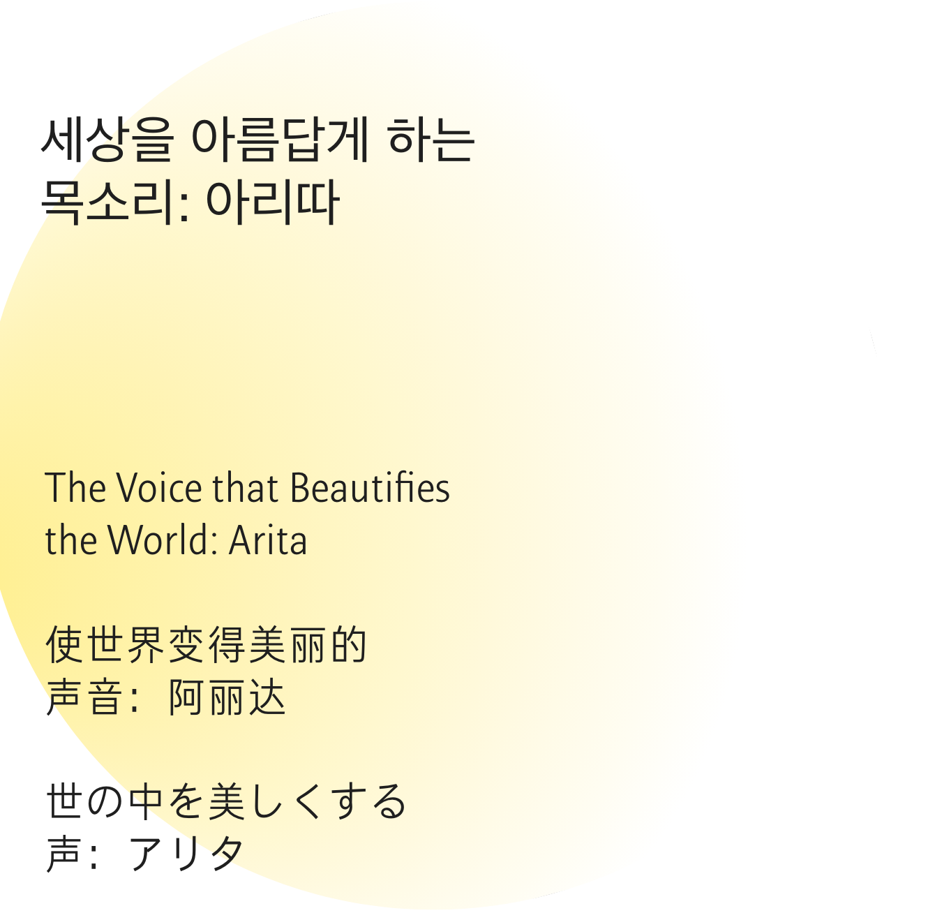
When Hangul was first created, it was named *Hunminjeongeum*, meaning
“the proper sounds for teaching the people.” The fact that characters were originally
defined as *sounds* provided key inspiration for this exhibition, and we selected
the title in homage to that idea. By incorporating Amorepacific’s mission —
“to make people beautiful and the world more beautiful” — the exhibition’s title and concept were completed.
Visually, the exhibition expressed the idea of a voice softly spreading into the world,
adopted as the main visual motif. The sub-colors, green and blue, were derived from the
“tree” that symbolizes Arita and the “sea” that represents our company.
adopted as the main visual motif. The sub-colors, green and blue, were derived from the
“tree” that symbolizes Arita and the “sea” that represents our company.


Given the high number of expected international visitors, all texts — including posters
— were produced in Korean and English, and where possible, also in Chinese and Japanese.
This was feasible because the Arita font family includes Chinese and Japanese typefaces.
— were produced in Korean and English, and where possible, also in Chinese and Japanese.
This was feasible because the Arita font family includes Chinese and Japanese typefaces.
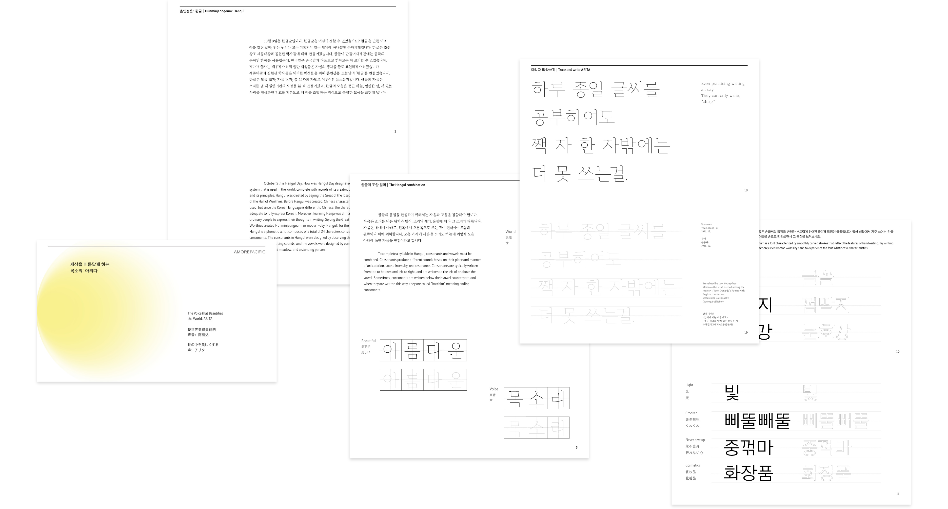


The exhibition brochure was designed and produced entirely in-house.
It was created as a versatile booklet that could be used not only for this exhibition but also in a variety of other contexts —
a compact yet content-rich publication.
The booklet begins with an introduction to the Korean alphabet, followed by an overview of the Arita typeface.
Tracing pages were also included to encourage interactive engagement.
While the booklet primarily focuses on Arita’s subfamilies, Arita and Buri,
we also aimed to present the diverse Arita fonts in an aesthetically pleasing way, showcasing how they appear when combined.
To achieve this, we designed compositions that mix different font sizes and weights.
Additionally, to ensure the content was accessible and linguistically accurate,
we consulted with the Korean Language Institute at Yonsei University for the Korean language introduction section.


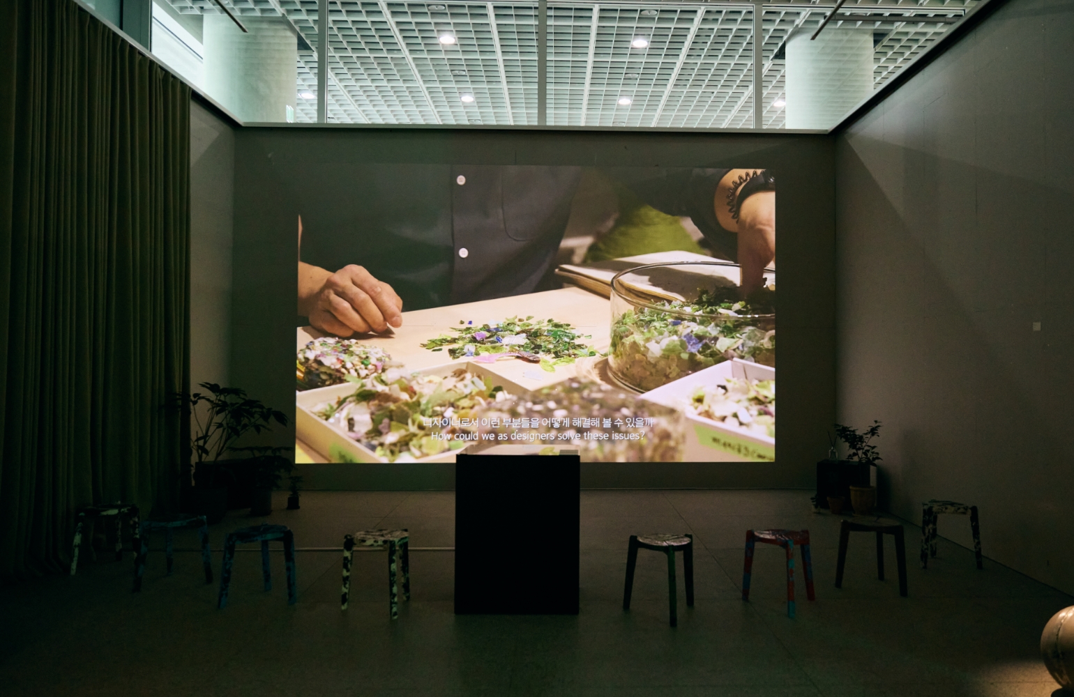
Because the video needed to explain the specialized subject of Korean typography in a way
that even first-time viewers could easily understand, producing a video was essential.
Through interviews with the designers and teachers who know Arita best — those who
directly participated in the development of the Arita Korean font family — we set
out to explore Arita’s past, present, and future. The video features insights from
four experts, who detailed everything from the initial inspiration behind the creation
of Arita to the actual font development process, including design
considerations and the envisioned direction for Arita’s future. Each interview session
lasted about two hours, and the footage was edited into a 12-minute film.
Additionally, we developed a concept for a video that would highlight the typographic beauty of
various *Arita* fonts by presenting their letterforms in large scale. We decided to produce
this as a looping video that would play continuously throughout the exhibition.
The words featured in the video were selected from familiar, everyday terms such
as “font” and “cosmetics.” To make the content more approachable and engaging for
younger audiences, we also included contemporary neologisms like “jungkkeotma” and “utppuda,”
as well as rhythmically shaped words such as “pittulppattul.” To help viewers better
understand the words and sustain their attention, we needed corresponding visuals.
Because it was challenging to find suitable existing images that perfectly matched
the words, we turned to the generative AI tool Midjourney to create unique, eye-catching imagery.
Since *Arita* revolves around the theme of “voice,” we incorporated a wide range of
recorded voices — from children, adults, and international participants.
We recorded the voices of family members and colleagues from the Arita exhibition
team and layered them into the final video, completing the multisensory experience.


We also designed a space where visitors could see, hear, and touch Arita.
Our goal was to bring the font — which typically exists only as digital data — to life by creating exhibition content that could be experienced through various media and physical materials.
Despite the short preparation period, we strived to enhance the overall quality through multiple rounds of sampling and testing.
The exhibition space was a long, narrow corridor lined with glass windows, with a single shared entrance and exit.
To make the most efficient use of the space, we divided the layout into distinct zones.
The exhibition was structured into two main sections: upon entering, visitors could explore detailed information about the *Arita* font;
then, as they moved up a low set of steps into the next area, they could appreciate artworks created with the *Arita* typeface,
browse typography-related books, or try font tracing in an interactive experience zone.
At the final exit, visitors received a *font envelope* as a small gift and were invited to view behind-the-scenes stories of the font’s development —
allowing them to carry the afterglow of the exhibition with them even after leaving the space.

The first exhibition, prepared in this way, opened on October 10, 2023, on the second floor of Amore Seongsu.
Including the subsequent unmanned extension that followed, the exhibition ran for approximately two months.


Due to the positive response to the exhibition, it was also held in Busan.
It took place on the fourth floor of Amore Busan and was presented as an unmanned exhibition.
The layout was adjusted to suit the characteristics of the space.


After the exhibition in Busan, the final showcase was held at Amorepacific Headquarters.
The second-floor space of Amore Seongsu, where the first exhibition took place, was a distinctive venue featuring long, narrow glass windows arranged in a regular pattern.
These transparent windows perfectly complemented Arita’s concept of “transparent typography,” and were therefore actively utilized — artworks were mounted directly on the glass, and the window sills were used as seating and display areas in creative ways.
The headquarters also featured extensive use of glass; however, instead of windows, the glass formed the walls themselves.
With open sides, six-meter-high ceilings, and walls resembling a vast glass box, the space presented both challenges and unique visual possibilities.
Accordingly, we brought in the existing exhibition content but sought to “translate” it to align with the spatial language of this new environment.
Drawing inspiration from the 17th-century European *Cabinet of Curiosities* — spaces where rare and precious objects were collected — we introduced the concept of *The Room of Type* to refine the exhibition’s direction.
We defined our ongoing projects related to Arita and Korean typography as “curiosities,” further categorizing them into “visual curiosity,” “auditory curiosity,” and “sensory curiosity.”
This structure allowed the exhibition to become a rich, immersive experience that visitors could enjoy through multiple senses.
To emphasize the spatial depth, we incorporated hanging installations throughout the venue and highlighted transparency using text wraps that enveloped the front surfaces of the cubes.
We also rearranged and expanded the layout to ensure that each artist’s work could be appreciated with ample space and clarity.


The exhibition was held at the AP Cube space on the first floor
of Amorepacific Headquarters from February 23 to March 22, running for one month.
of Amorepacific Headquarters from February 23 to March 22, running for one month.


From left to right: works by Ryu Yang-hee, Ahn Sang-soo, Han Jae-jun, Koo Mo-a, Yang Hyo-jung & Park Yoo-seon, and Roh Eun-yu.
All of these artists directly participated in the development of the Arita font.
Even after many years, they remember it as a meaningful and rewarding project.
Thanks to their dedication and passion, the final works were truly exceptional — serving as the centerpiece of the exhibition and grounding its overall narrative.


The most common question we received during the exhibition was, “Why does a cosmetics company create fonts?”
*Arita* is Amorepacific’s cultural initiative.
By developing high-quality typefaces and distributing them freely, Amorepacific aims to make excellent fonts accessible to everyone while contributing to the preservation of Hangul — Korea’s precious cultural heritage.
Moreover, Amorepacific’s various brands are the largest users of the Arita font, incorporating it across numerous products.
This not only reduces licensing costs but also establishes a cohesive typographic identity throughout our brand portfolio.
For these reasons, *Arita* — sustained and refined over many years — has become a vital part of Amorepacific’s heritage.
The exhibition venues in Seongsu-dong, Haeundae, and Yongsan attracted a diverse audience of adults, children, and international visitors. Our goal was to make the specialized world of typography accessible and enjoyable for everyone. To achieve this, we incorporated various audiovisual materials and hands-on experiences that allowed visitors to engage with fonts in a multisensory way. Through these activities, we aimed to reveal the human stories and dedication behind the typefaces that people often download and use so effortlessly.
We extend our sincere gratitude to all visitors and participants who shared in the exhibition.
- <The Voice that Beautifies the World: ARITA>
- Amore Seongsu Exhibition Period
- October 10 – October 29, 2023
- Amore Busan Exhibition Period
- November 22 – December 17, 2023
- Amorepacific Headquarters Exhibition Period
- February 23 – March 22, 2024
- Exhibition Directors
- Heo Jungwon, Lee OhKyung
- Participating Artists
- Ahn Sangsoo, Han Jaejun, Ryu Yanghee
- Noh Eunyu, Gu Moa, Yang Hyojung + Park Yooseon
- Exhibition Planning & Design
- Kang Yoosun, Jo Ara, Lee Gyeongju
- Baek Jiyoung, Jin Hyunjo, Yang Eunji
- Heo Yuseok, Yeo Youmi
- Video Planning & Design
- Park Yeongjoo, Gao Yang, SeoTR
- Cherubim Media (CEO: Kim Hongjun)
- Public Relations & Operations
- Jo Eunmin, Yeo Jeeyeh, Jeon Chaerin
- Hwang Sujin
- Photography
- Shin Sangwoo, Lee Yunjin, Noh Kyung(Rohspace)
- Production & Installation
- tuuk, Hermes Design
- Special Thanks
- Lee Yongje
- APMA
- Yonsei University Korean Language Institute – Jung Yeohun, Kim Seongsook
- Lee Younghee
- Yeo Seungyoon
- Park Jaewoo


![The exhibition [HEALING TIMES]'s work list thumbnail](https://cdn-design.amorepacific.com/contents/2024/01/22132941/24_00_list_thumb.jpg)


![Exhibition [The House of Beauty Scientists] 's work list thumbnail](https://cdn-design.amorepacific.com/contents/2024/08/02172154/24_88_list_thumb.jpg)


![[EXHIBITION] The House of Beauty Scientists _Busan's work list thumbnail](https://cdn-design.amorepacific.com/contents/2025/06/26102143/25_25_list_thumb.jpg)