IOPE presents a newly redesigned men's line
| Product Design
Summary
IOPE, the high-efficacy skincare brand known for delivering visible changes to the skin, has upgraded and launched its all-in-one series, designed to address the complex skin concerns of men with convenience.
Introducing the transformed Men All-in-One line design, encapsulating IOPE’s high efficacy and expertise.
Concept
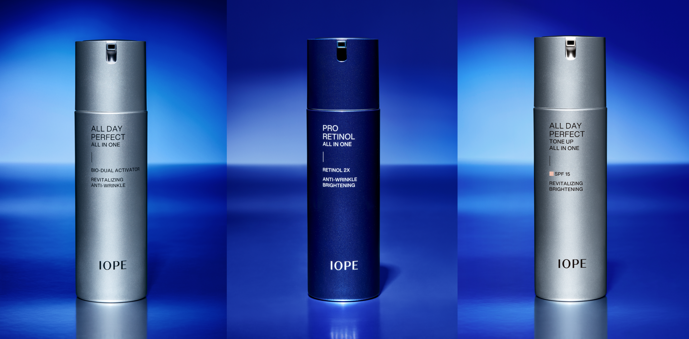
The newly launched Men All-in-One line was designed to more boldly express its powerful functionality and convenience.
The metallic color applied throughout the design underscores masculine performance, while the glossy finish accentuates the metallic texture, conveying a sense of strength and confidence.


The graphic layout follows the same logic as the women’s line but aligns the text to the left, giving a more rational and structured impression.
To ensure high visibility in online environments, key information is presented in larger type sizes for quick and efficient recognition. A vertical line connecting the product name and technology name symbolizes IOPE’s advanced technology concentrated within the product.

To emphasize masculinity and performance, the design adopts neutral silver as the main color.
For products containing Pro-Retinol, known for its unique efficacy, IOPE’s signature blue was applied with a metallic sheen, blending advanced functionality with the brand’s distinctive identity and premium tone.


- Amorepacific Creatives
- Product Design
- Hong Damee
- Photography
- Lee Yunjin
- BM
- Shin Hojeong
- Development
- Kim Seonglyoung