2024 MEDIAN Dr.median Toothpaste Product Design
Summary
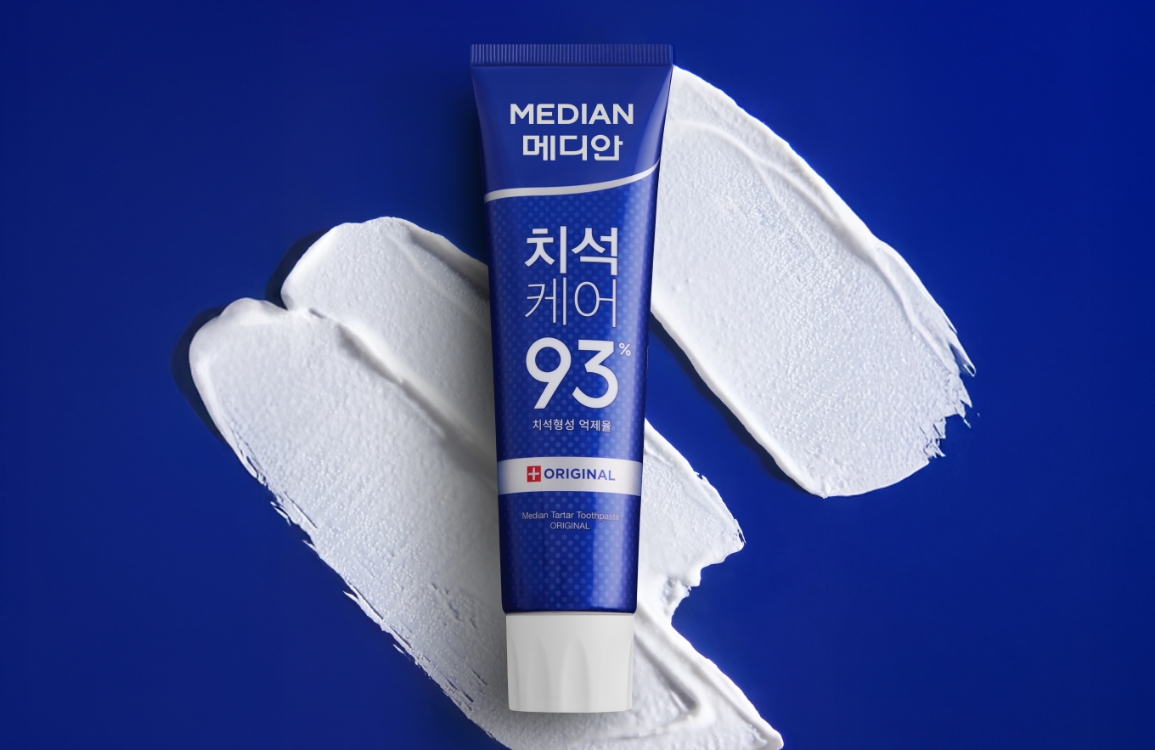
Dr. Median is a new toothpaste launched by Median to address the ultra-low-price offline market.
It is a multi-care product that comprehensively manages plaque, bad breath, and cavities.
The design inherits the traditional blue color code used in the toothpaste multi-care category to make it familiar to consumers, while incorporating images and icons of teeth to create a friendly and proactive design.
Introducing Dr. Median, your trusted partner for the total oral health of the entire family.

Design Concept
Since the main sales channel is offline stores, we designed the product to maximize visibility and prioritize friendly and descriptive methods so that customers can easily recognize the product even in complex store environments.
Design using only Korean
Considering the main age group of the distributors, the product name ‘Dr’ and the ‘AMORE PACIFIC’ logo were also displayed in Korean to ensure easy and intuitive recognition.
High visibility
Products with dark colors as the main color may have reduced visibility when placed on shelves due to shadows.
To address this physical limitation, we used a strong contrast between white and navy blue to enhance visibility in stores.
Additionally, since the product is sold in a 3-pack, the strong contrast between colors is further emphasized when grouped together, making it a significant advantage in terms of visibility.
Friendly Explanations
We created icons that help users easily understand the combined effects of cavity prevention, bad breath removal, and plaque removal, and added actual tooth images to create a realistic depiction of how these effects are applied.


- Amorepacific Creatives
- Product Design & Visual Directing
- Koo Hyewon
- Photography
- Shin Sangwoo
- BM
- Jung Youjung


