Amorepacific’s 80th Anniversary Emblem
Summary
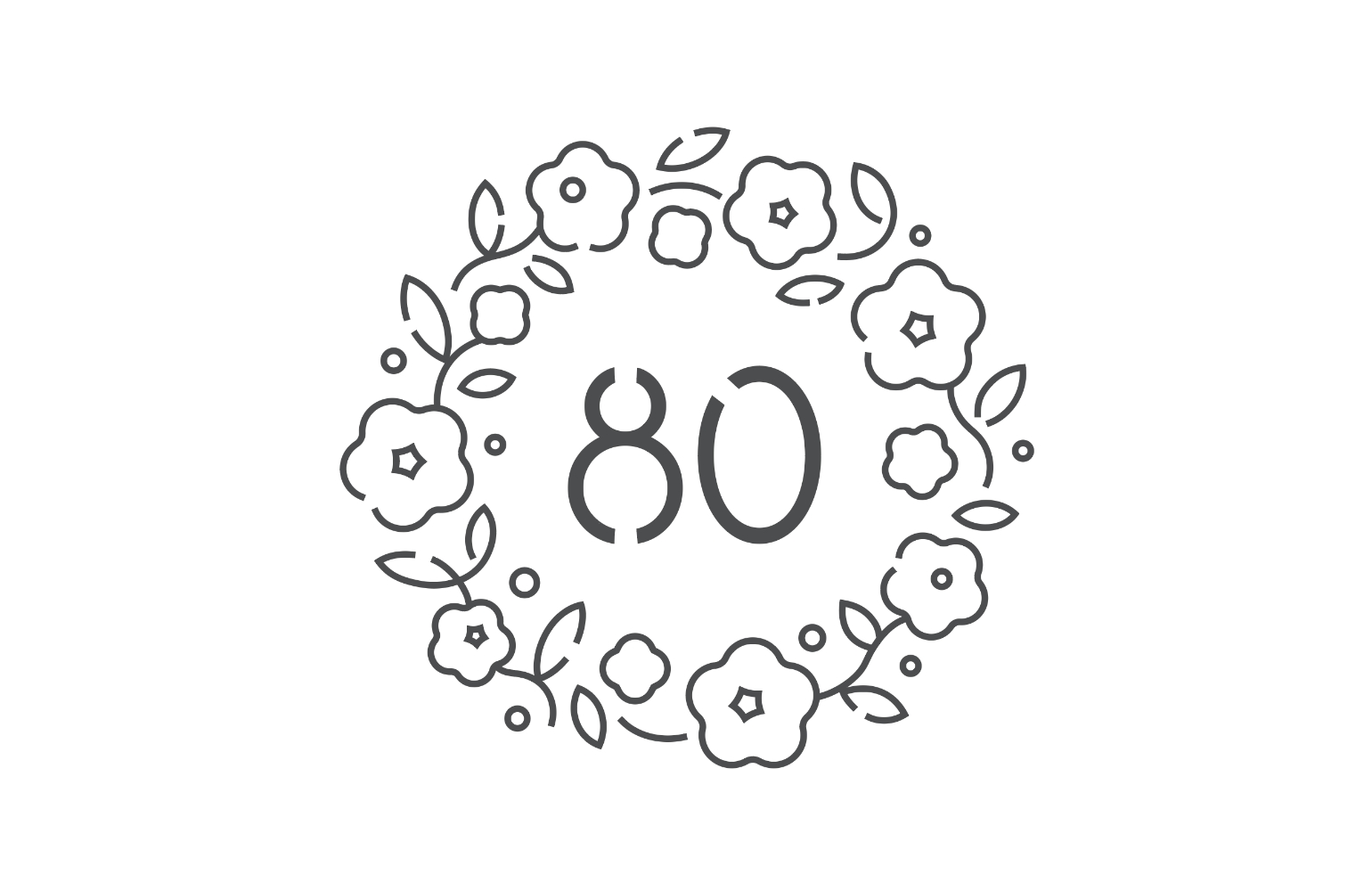
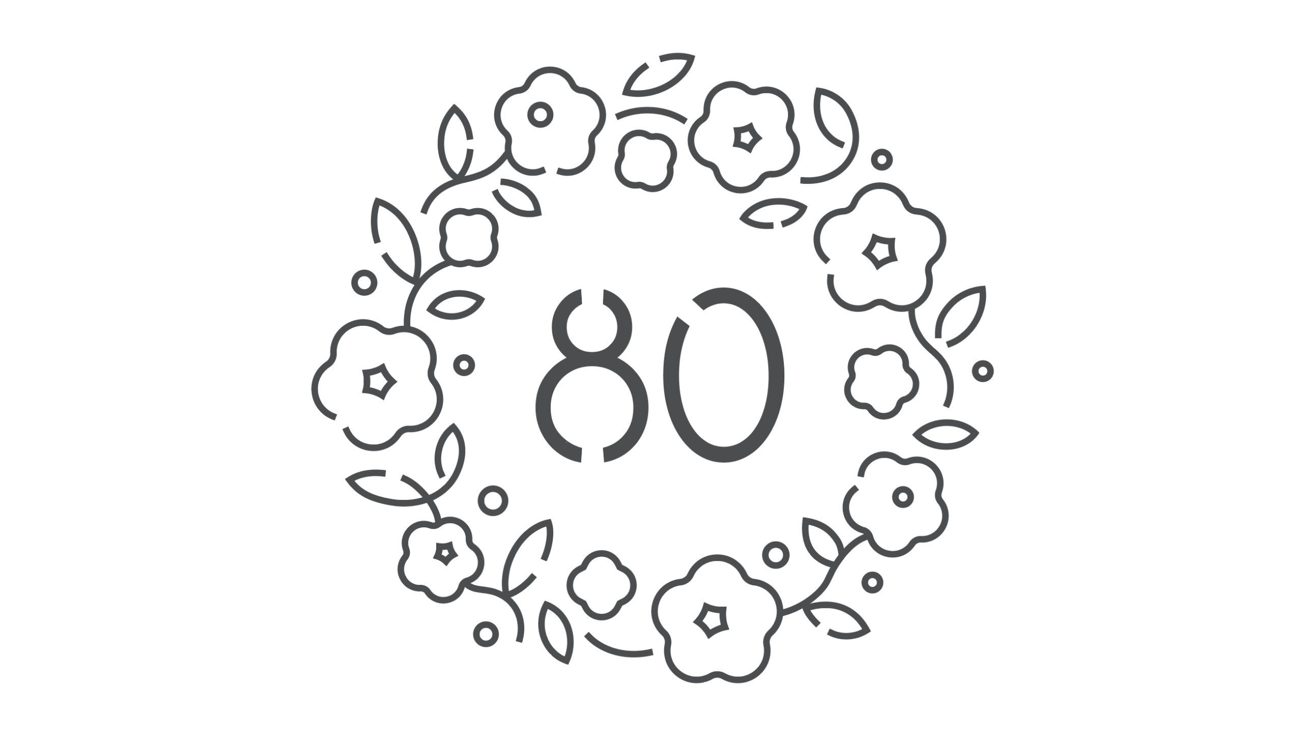
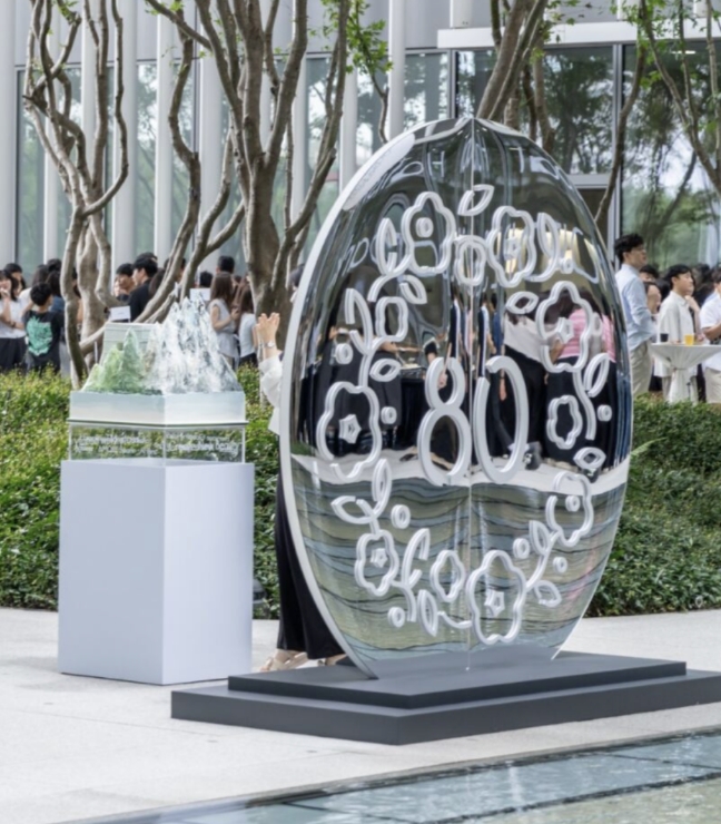
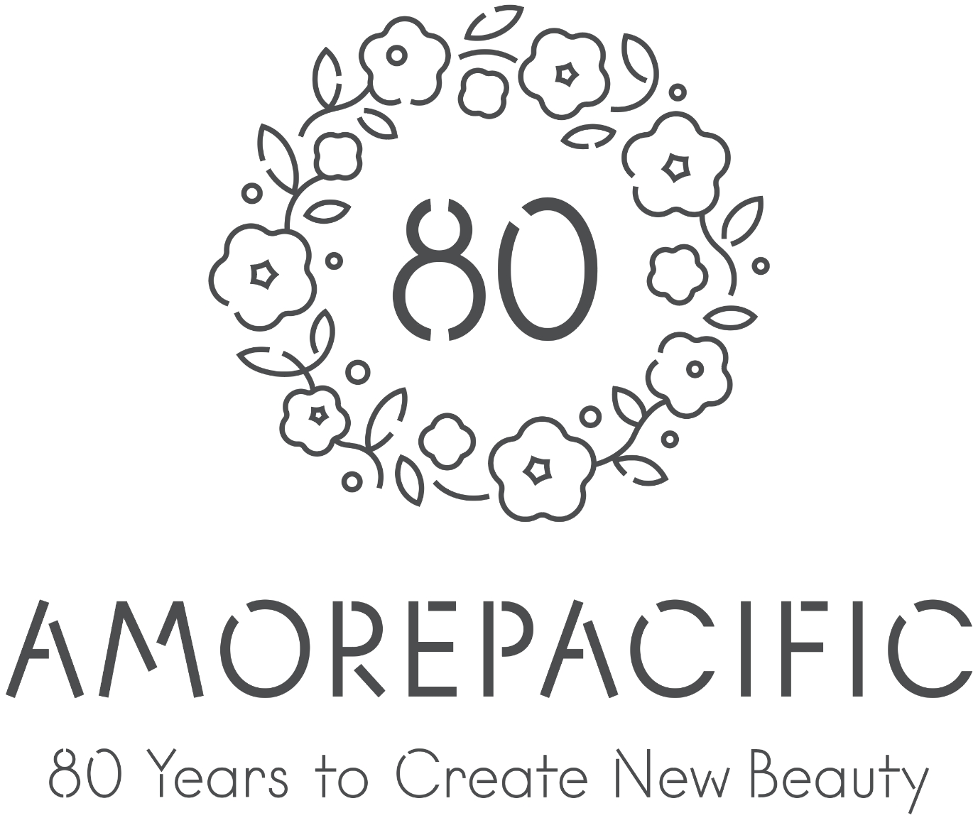
To mark the company’s 80th anniversary in 2025, a commemorative emblem was created, inheriting the camellia and welcoming wreath from the 70th-anniversary design.
While preserving these enduring symbols, the emblem was reinterpreted to harmonize with the widely used APHQ typeface in a more contemporary expression.
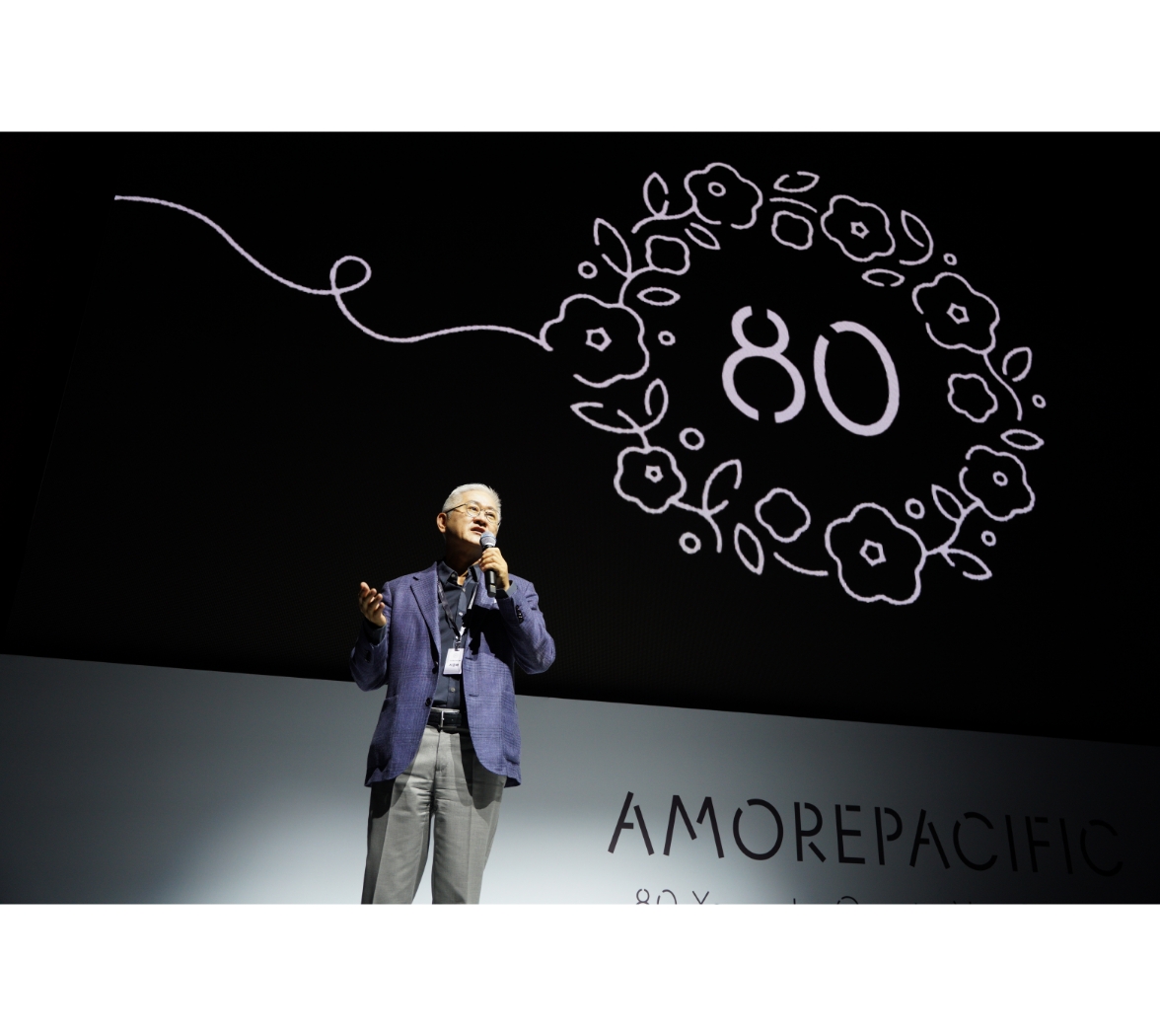
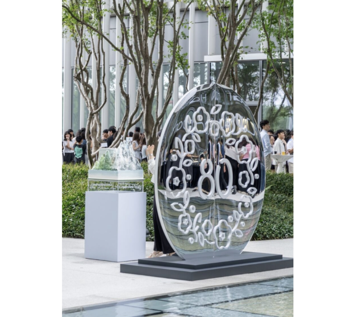
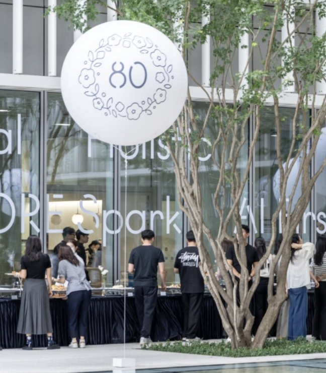
The year 2025 marks the significant milestone of our company’s 80th anniversary.
To commemorate this occasion, we have created an 80th-anniversary emblem for use across a variety of celebratory events.
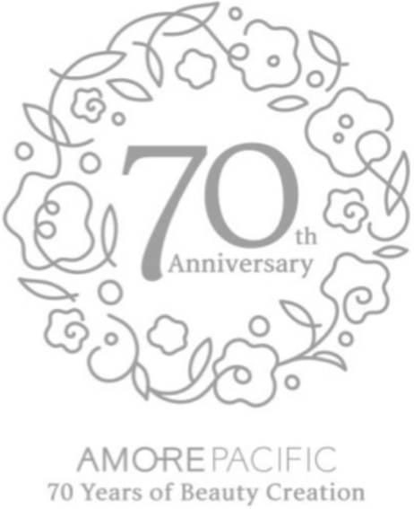
This initiative builds upon the legacy of our 70th anniversary, for which we designed an emblem combining the English ‘Arita Buri’ typeface with a camellia wreath symbolizing a warm welcome.
The design of the new 80th-anniversary emblem began with the intent to inherit this design heritage.
We retained the camellia and the wreath—symbols that remain deeply meaningful to this day—as the foundational framework.
Building on this structure, we developed a new variation that harmonizes with the ‘APHQ’ typeface, currently the most widely used corporate font.
Created in 2015: The 70th Anniversary Emblem
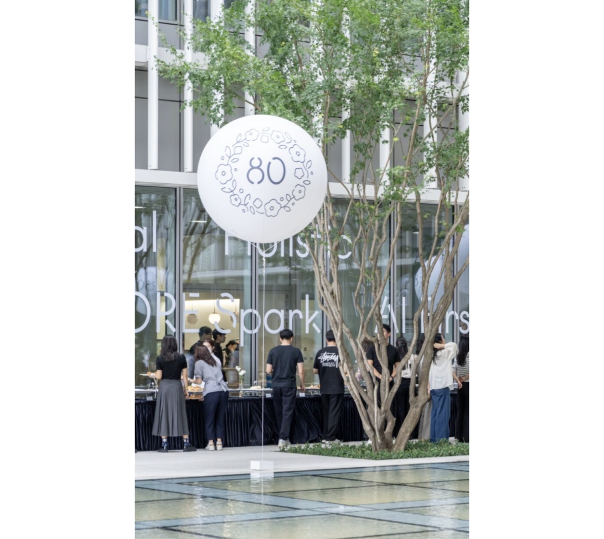
This emblem was utilized across a wide range of applications.
Our core values and assets remain unchanging.
It is our sincere hope that the emblems for our upcoming 90th and 100th anniversaries will also be beautifully realized through diverse creative variations, continuing this meaningful legacy.
- Amorepacific Creatives
- Directing
- Lee OhKyung
- Planning
- Kang Yoosun
- Graphic Design
- Jeong Jiyun