Beauty point rebranding project
Summary
Beauty Point is Amorepacific’s integrated membership program, which aims to convey benefits to customers with
the slogan “The more you accumulate, the more beautiful you become.
We decided to reorganize the membership to convey the benefits of the long-standing membership from simply accumulating points to a good experience, and in the process, we conducted a rebranding project to better communicate the change in communication message to customers.
We decided to reorganize the membership to convey the benefits of the long-standing membership from simply accumulating points to a good experience, and in the process, we conducted a rebranding project to better communicate the change in communication message to customers.
Change in Communication Message

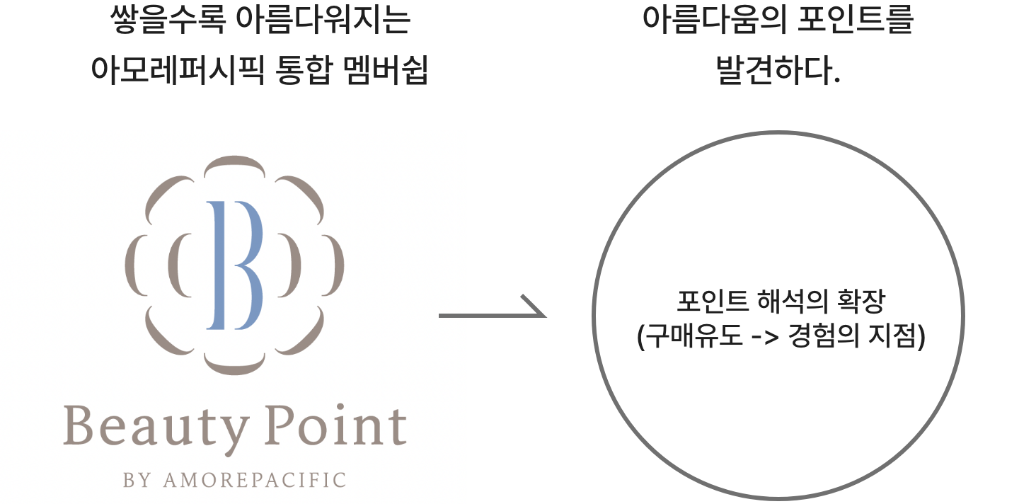
An identity design that expresses
the shift in messaging
a
reinterpretation of the meaning of ‘point.’
the shift in messaging
a
reinterpretation of the meaning of ‘point.’
Rather than focusing on simply accumulating points, we aimed to reinterpret and expand the meaning of
“points” by restructuring the membership system so that customers can enjoy new beauty experiences through
Beauty Points. The goal was not just to drive purchases, but to offer a richer, more meaningful engagement.
From a branding perspective, we sought to explore and express this shift through diverse design proposals.


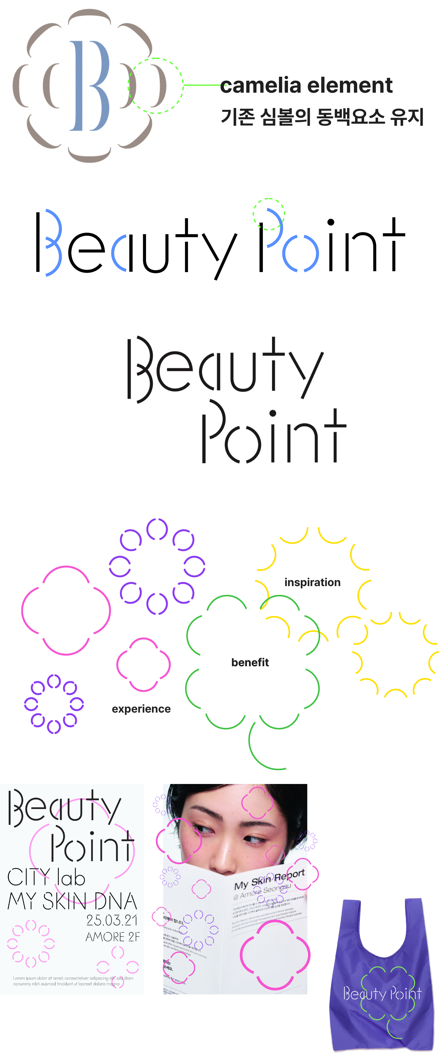
Design reflecting corporate identity for
the integrated company-wide membership.
the integrated company-wide membership.
Beauty Points, as an integrated membership system across the entire company, were designed to reflect
Amorepacific’s brand identity. This allows customers to experience a consistent and unified brand experience at
every touchpoint where they engage with Amorepacific.
concept 01
A beauty ‘point’ that creates diverse
benefits, experiences, and inspiration.
benefits, experiences, and inspiration.
While retaining the original camellia symbol, we explored various combinations and arrangements
of its form to express the ideas of benefits, experiences, and inspiration.

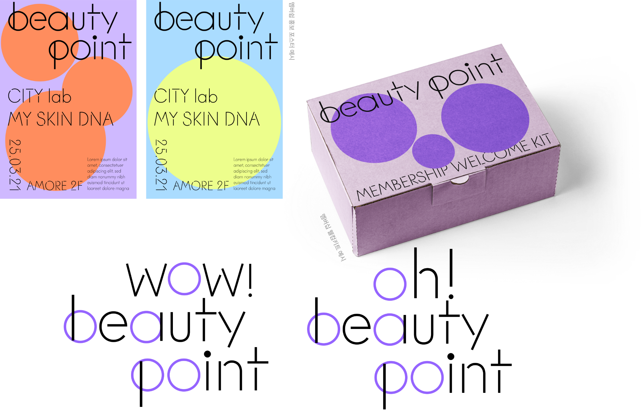
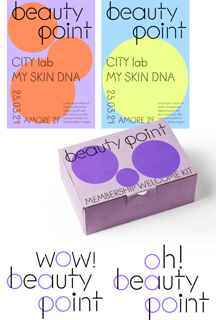
concept 02
Beautiful ‘points’ emerging
everywhere,
the starting
point of beauty.
everywhere,
the starting
point of beauty.
To visualize the concept of beautiful moments and experiences appearing in various places, we focused on the circular shape
of the “o” in Beauty Points. This form was used as a flexible graphic element to represent diverse and scattered points of beauty.
To visualize the concept of beautiful moments and experiences appearing in various places, we focused on the circular shape
of the “o” in Beauty Points. This form was used as a flexible graphic element to represent diverse and scattered points of beauty.
concept 03
The Starting Point of Beauty


Example of SNS Symbol Application

Example of Membership Promotion Poster
A proposed design that reflects the concept of a point marking the beginning of a beautiful experience through “Beauty Point.” The design features a map with
regions marked and a pin placed on top, symbolizing the point of experience. To improve readability in mobile environments, the name can be shortened to “Viewpo,”
serving as a friendly nickname.
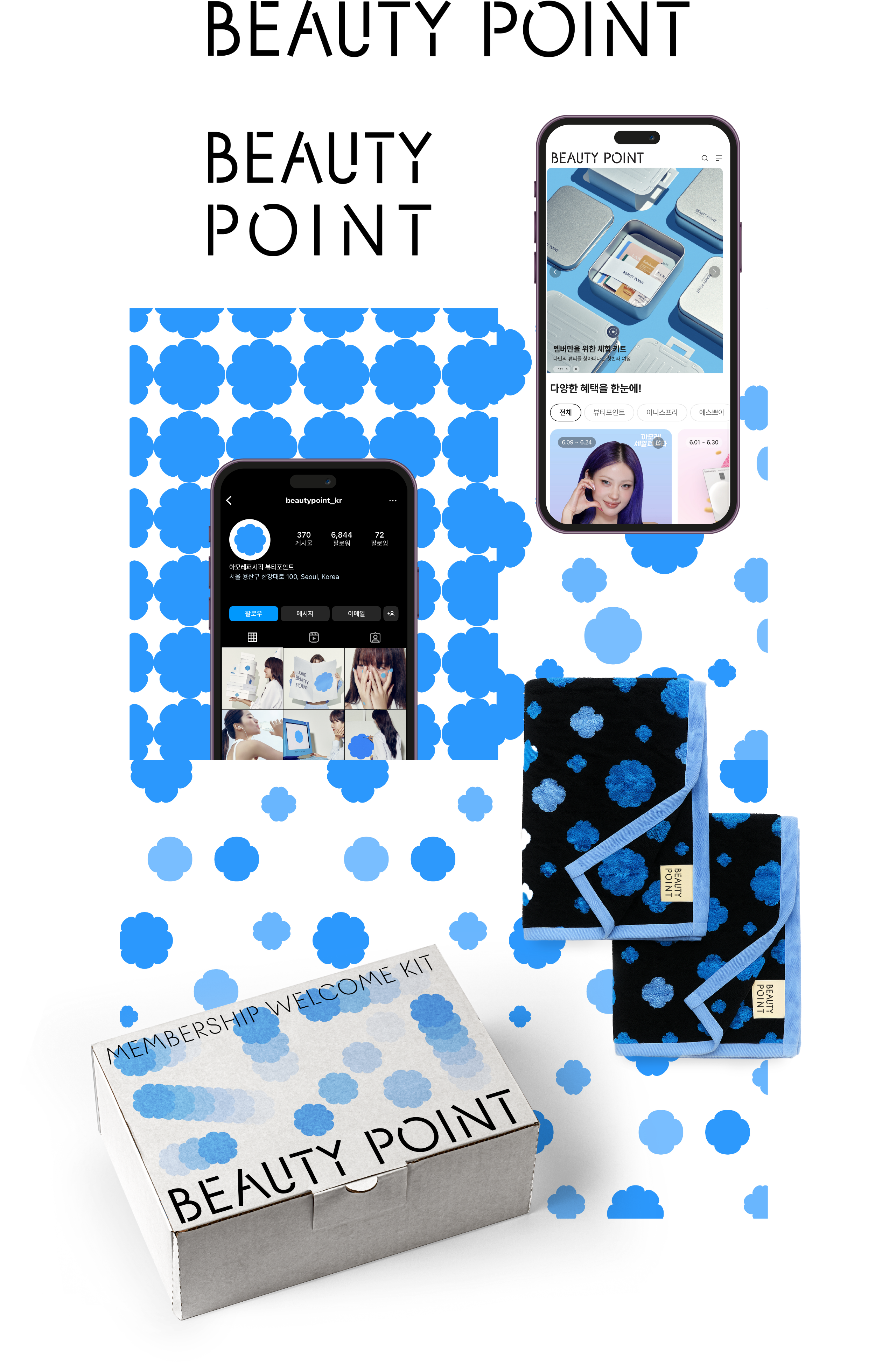

The final design was confirmed in a form that is simple and clear, optimized for readability in digital environments. The logo design retains
the existing camellia symbol and is developed into a pattern format that can express various points of experience.
This project offered a valuable opportunity to study how logos are used in small-scale environments such as KakaoTalk message senders and on the web.
This project offered a valuable opportunity to study how logos are used in small-scale environments such as KakaoTalk message senders and on the web.
- Amorepacific Creatives
- Identity Design
- Cheon Nari