Experience in Space, Connection through Content
Aditor Jeju Cafe N Spatial Content Proposal Inspired by Local Sensibility ② Spatial Content Chapter
Summary
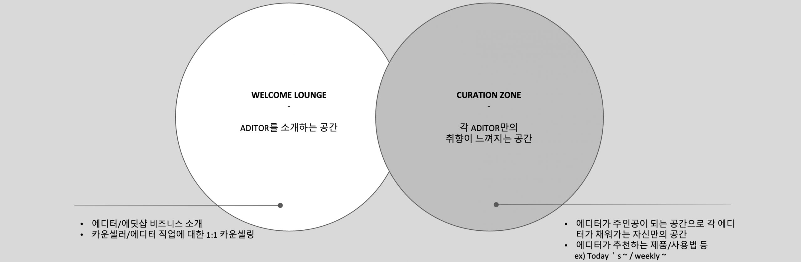
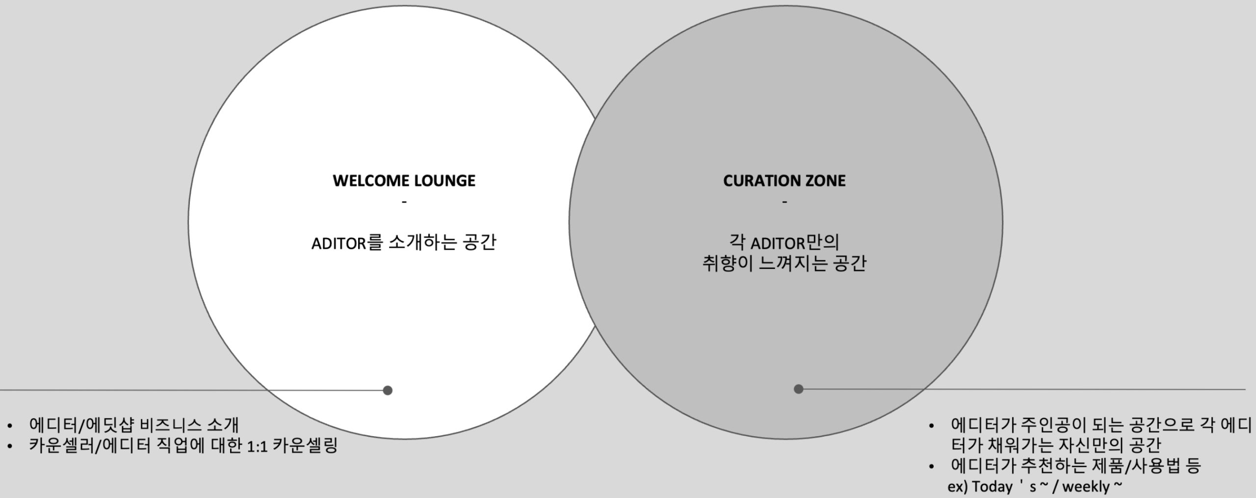
We proposed spatial content ideas that invite Aditors and visitors to experience the Adit Shop and naturally transition into registration.
While the previous project focused on Aditor’s graphic identity, this proposal expands the brand into spatial experiences.
① Graphic Content Development for Aditor :
https://design.amorepacific.com/work/2024/amorepacific/graphic-content-development-for-new-commerce-channel-a-dit-shop-edit-shop-bi-edition/


The journey leading visitors to register as editors was designed to feel natural, while ensuring
that the value and benefits of being an editor are seamlessly embedded within the space.
We developed a self-guided tour path and service content, incorporating local materials and
colors as sculptural elements that allow visitors to experience the essence of Jeju.
that the value and benefits of being an editor are seamlessly embedded within the space.
We developed a self-guided tour path and service content, incorporating local materials and
colors as sculptural elements that allow visitors to experience the essence of Jeju.
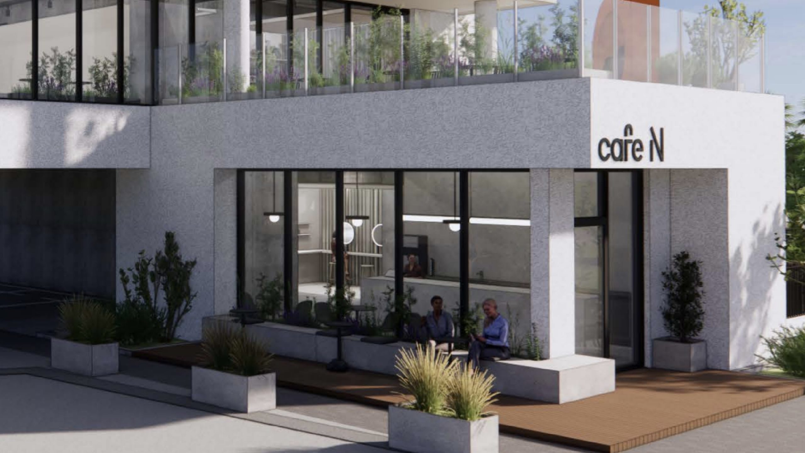
This project began by exploring the potential use of the Jeju Café N editor space,
based on early discussions with the CX Team. Spanning approximately 660 square meters (200 pyeong),
the complex accommodates multiple functions—including brand experiences, classes, broadcasting, and consultations.
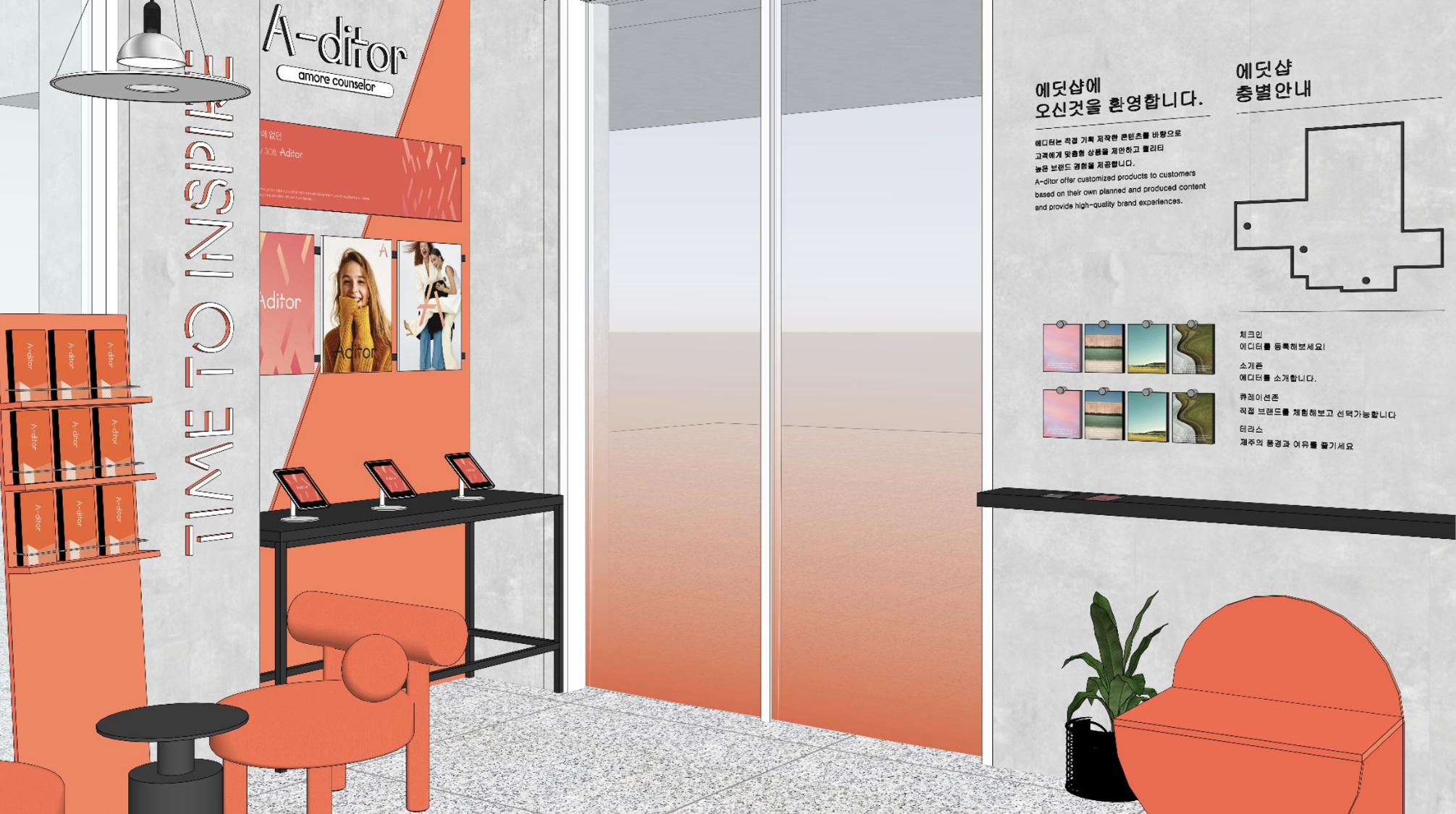
Our proposal introduced new content concepts for both the Introduction Zone and the Curation Zone.
based on early discussions with the CX Team. Spanning approximately 660 square meters (200 pyeong),
the complex accommodates multiple functions—including brand experiences, classes, broadcasting, and consultations.
Our proposal introduced new content concepts for both the Introduction Zone and the Curation Zone.
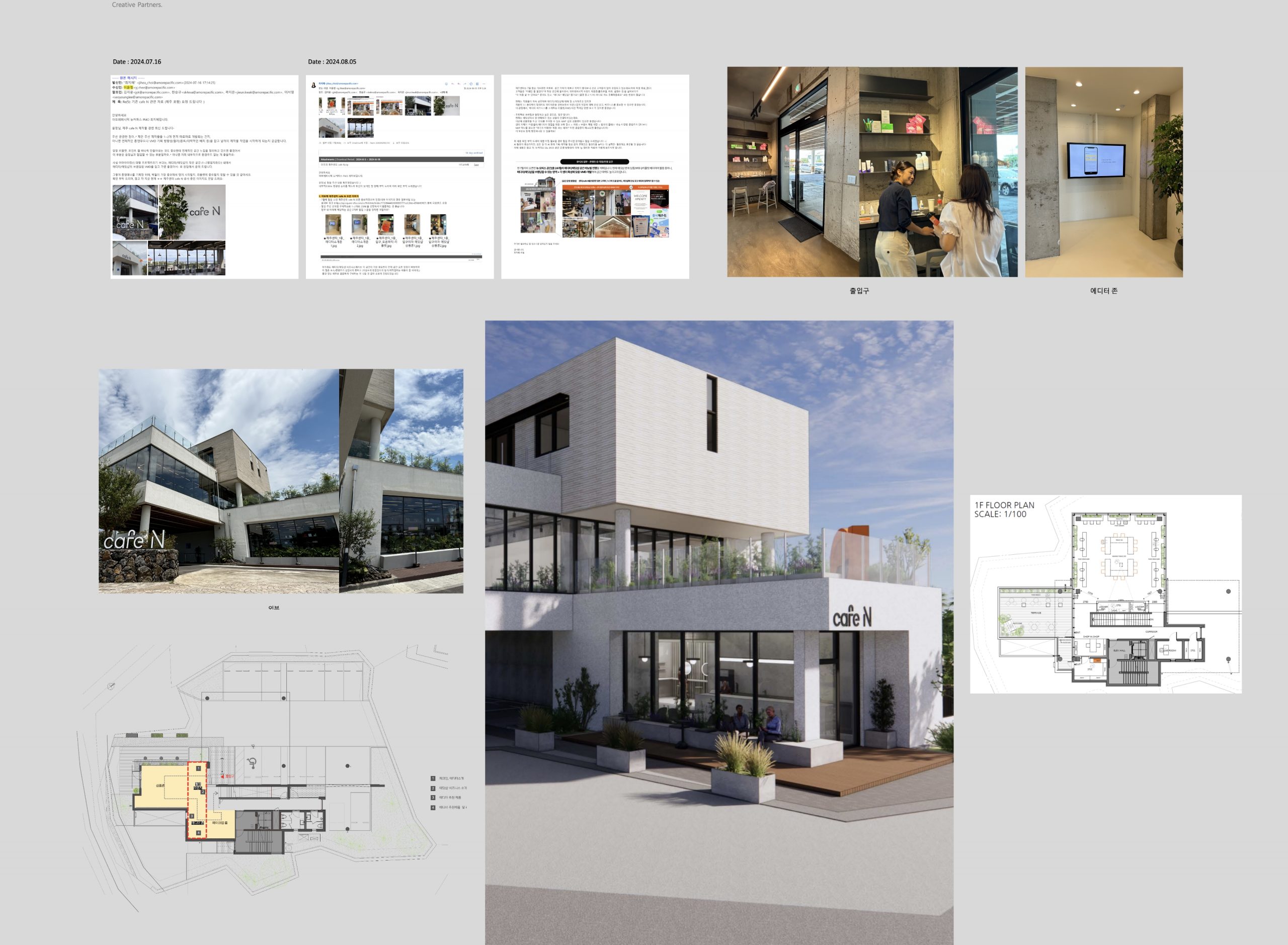
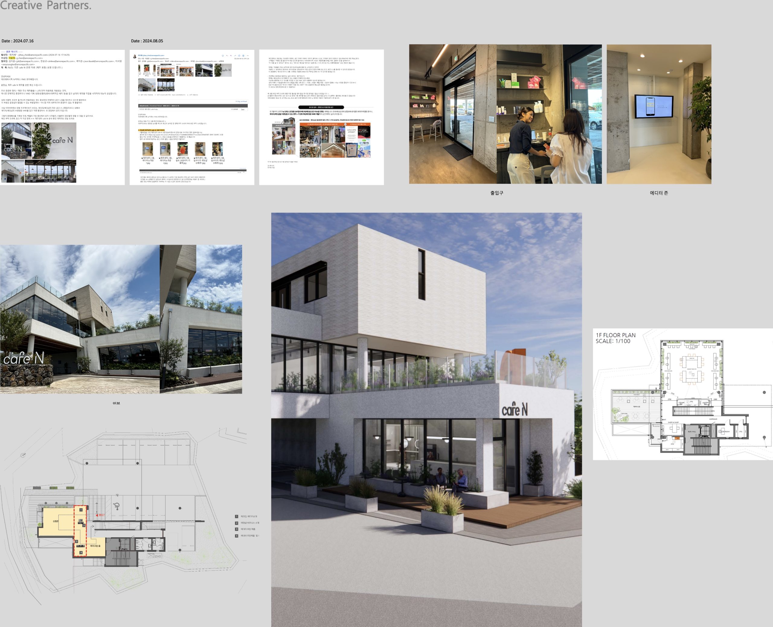
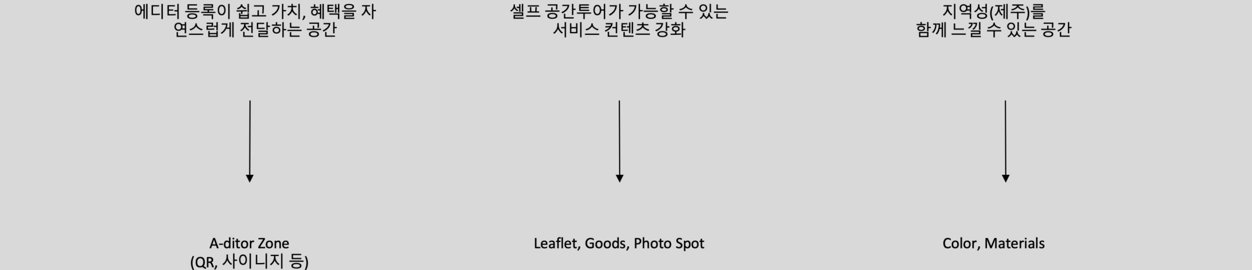
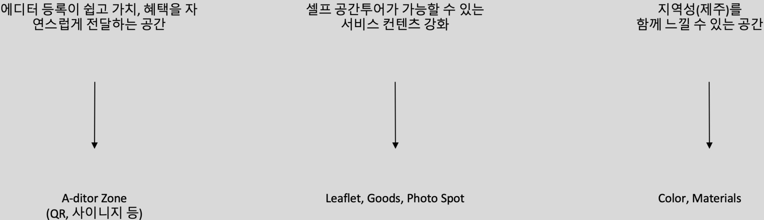
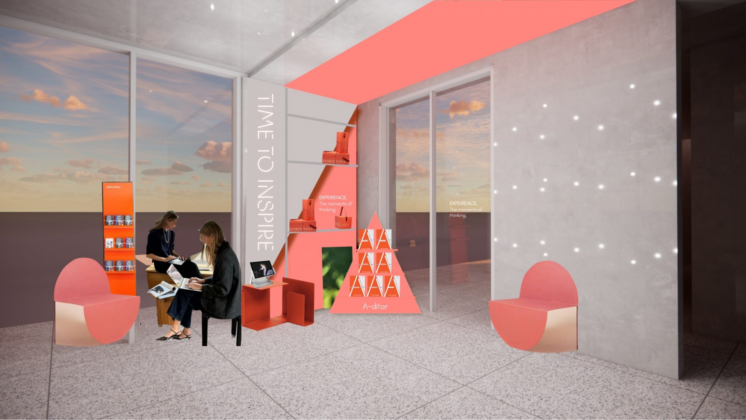
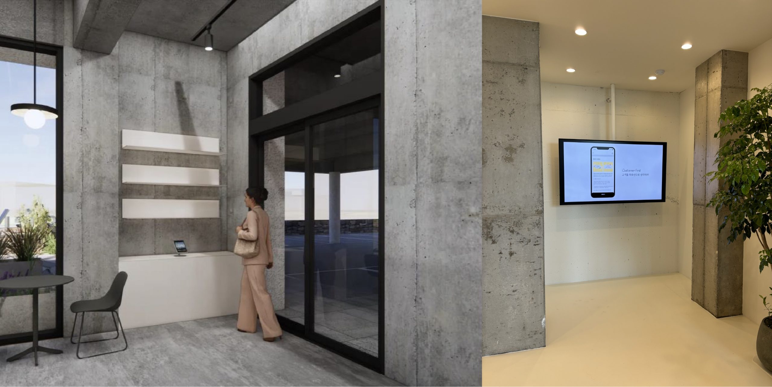
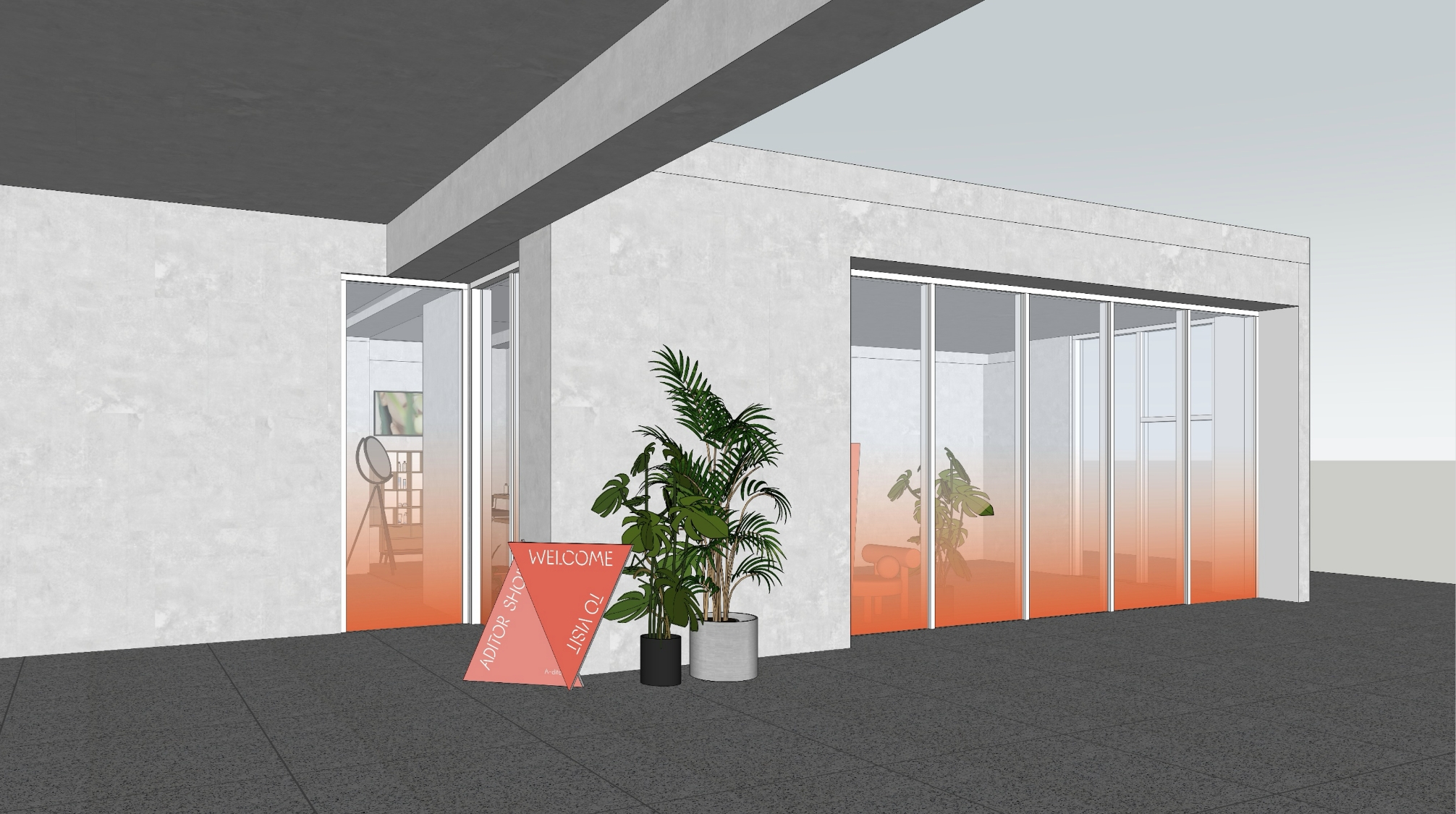
At the entrance, we proposed an illuminated sign reading “Time to Inspire” to draw visitors’ attention.
By pairing a QR code with an iPad stand, we designed a setup that intuitively encourages editor registration.
Balancing branding impact with practical usability, the narrow entry area was reimagined
as an unmanned registration zone, visually conveying its potential through a compact yet engaging design.
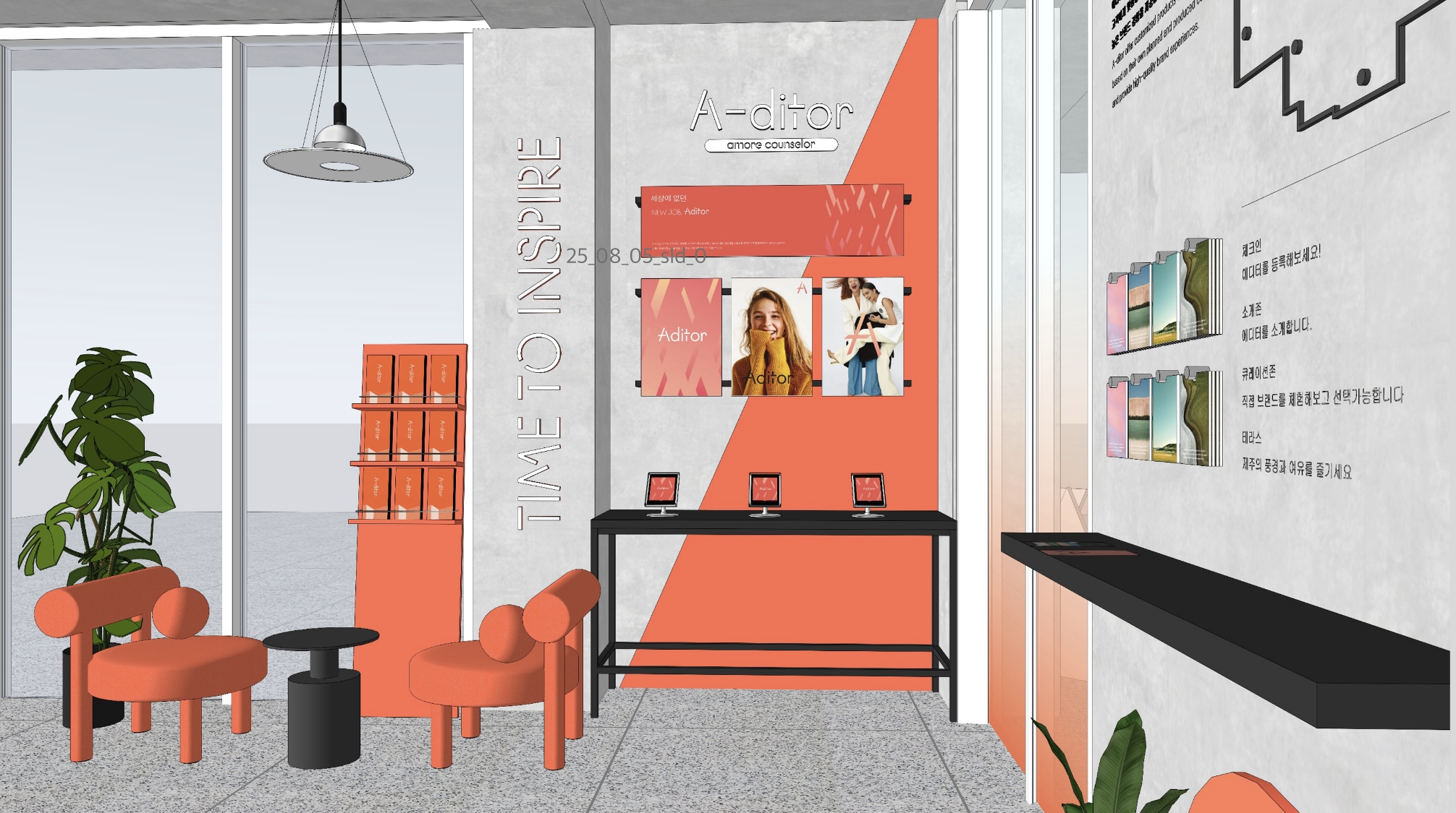
On the right wall near the entrance, we installed panels showcasing editors’ beauty tips and
trend insights, effectively communicating the brand image. The panels were designed with an
easy-to-detach structure, allowing flexible updates in response to changing promotions.
At the front area, we introduced a compact experience zone, naturally leading visitors
to scan the QR code and complete their editor registration after engaging with the content.
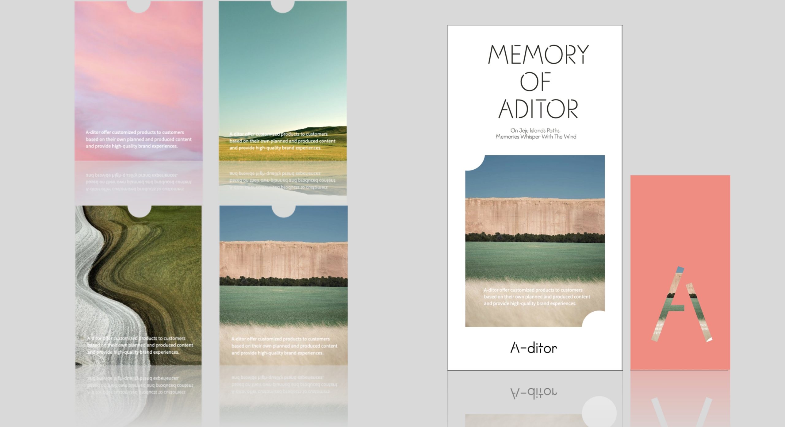
For merchandise, we proposed thick transparent photo cards or bookmarks inspired by Jeju’s sky and sea.
Capturing the unique sense of place of Jeju Café N, these items were designed as simple yet effective
forms that could be inserted into leaflets or used as small decorative objects within the space.
Capturing the unique sense of place of Jeju Café N, these items were designed as simple yet effective
forms that could be inserted into leaflets or used as small decorative objects within the space.
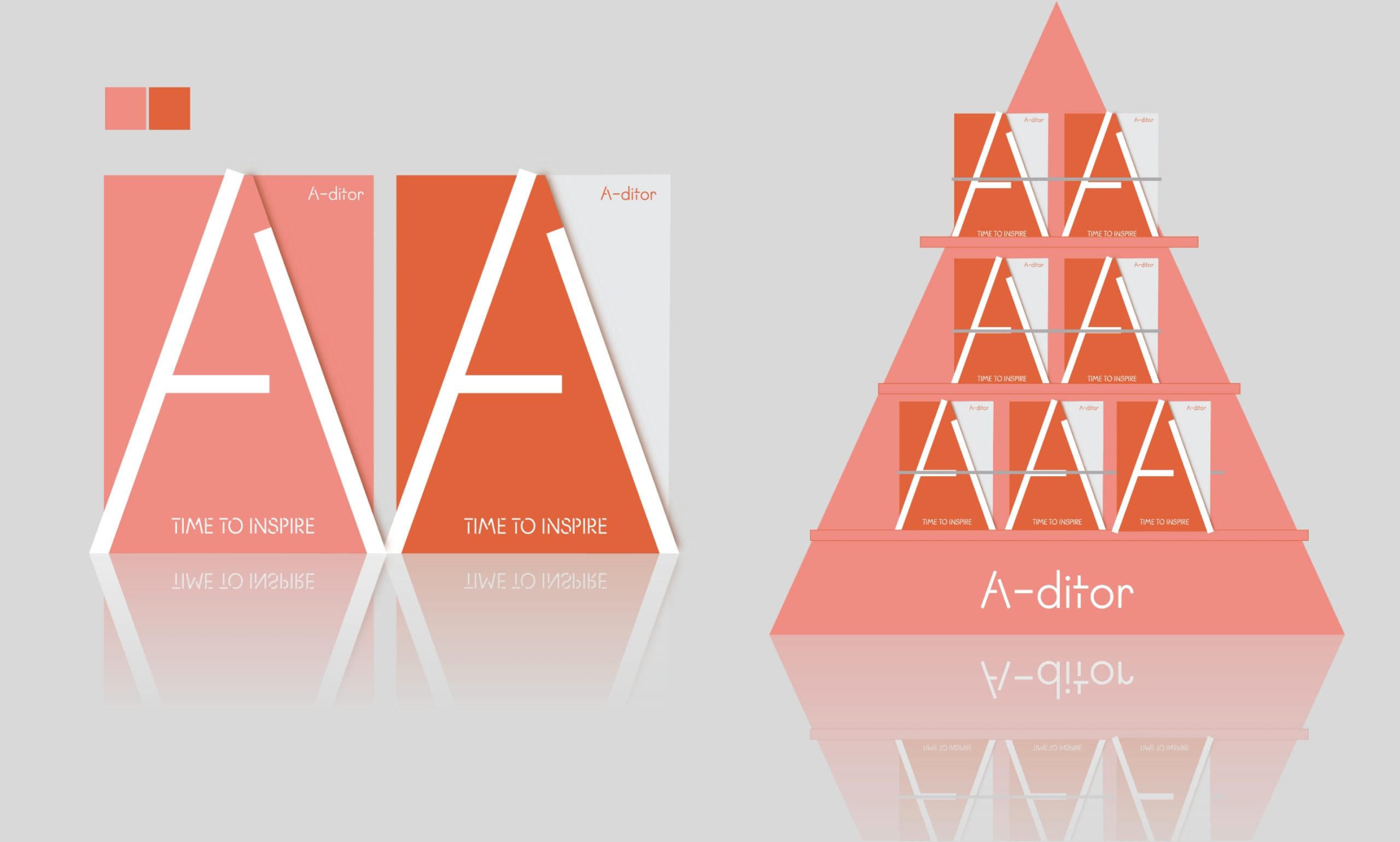
The standing sign can be produced through various material combinations—such as metal and vinyl,
foam board, or wood—offering versatility in finish and tone. We proposed incorporating a graphic motif
derived from the letter ‘A’ in “Aditor”, establishing it as a core branding element woven throughout the space.
foam board, or wood—offering versatility in finish and tone. We proposed incorporating a graphic motif
derived from the letter ‘A’ in “Aditor”, establishing it as a core branding element woven throughout the space.
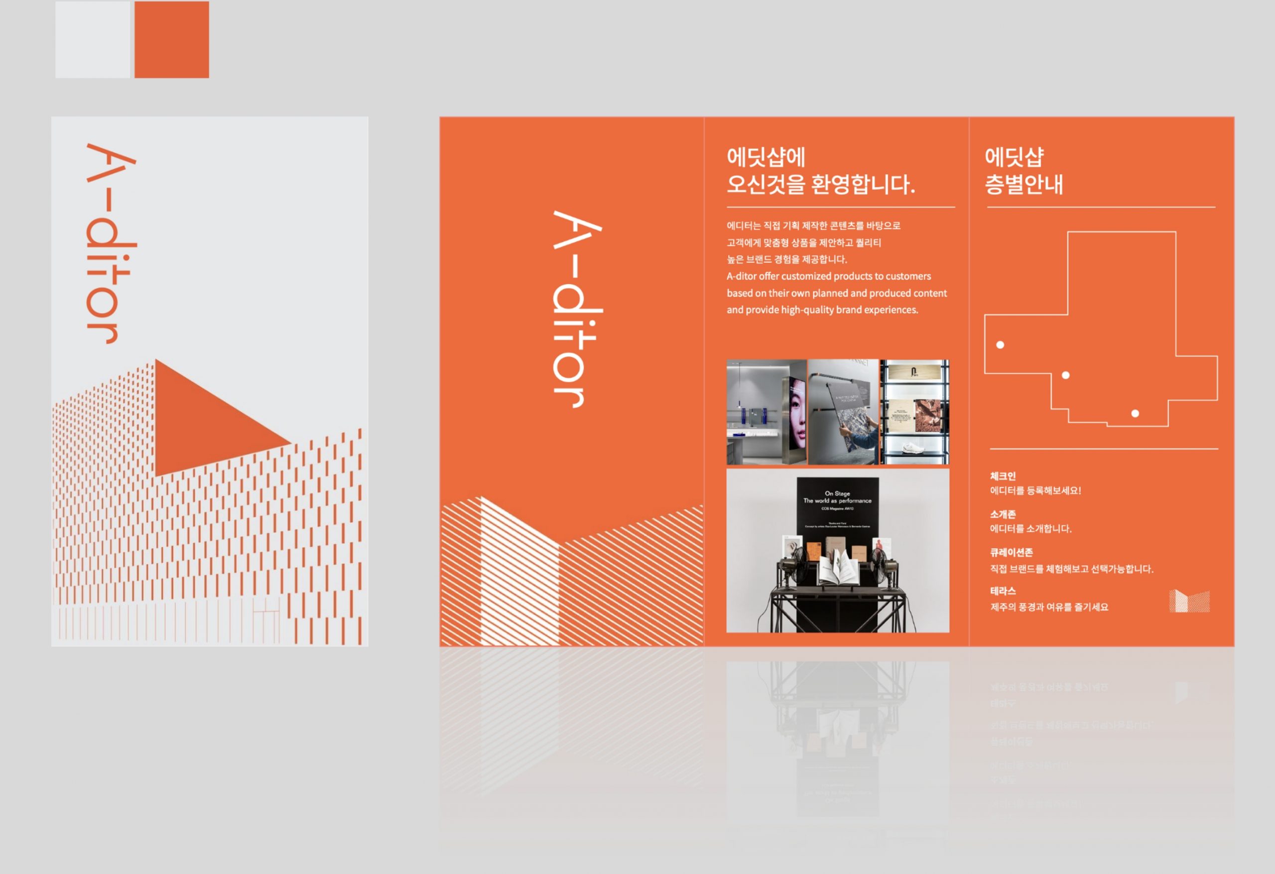
The Jeju branch–exclusive leaflet features a bright gray and orange color palette, with the building’s
façade expressed through clean line graphics to evoke a modern, museum-like impression.
The graphic style harmonizes seamlessly with the Editor HQ typeface, maintaining brand consistency.
While the leaflet primarily introduces the store overview and floor guide, it is designed with an
expandable layout structure, allowing for flexible updates and future content extensions.
- Amorepacific Creatives
- Visual & Space design
- Rhee Yunjung, Jin Hyunjo


