JEJU GREEN AWARD BRAND IDENTITY DESIGN
| BI DESIGN
Summary
The Jeju Green Awards, organized by the Innisfree Foundation, is an environmental awards program established
to honor individuals and organizations dedicated to the preservation and advancement of Jeju’s natural
environment. Following its inaugural ceremony in 2023, the second awards ceremony is scheduled to take
place in November this year. In order to solidify the Jeju Green Awards as the foremost environmental
awards event representing Jeju, we have undertaken a comprehensive rebranding initiative.
BACKGROUND
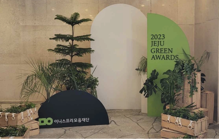
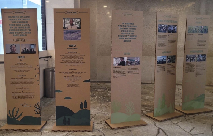
The 1st GREEN AWARD
Poster
VMD
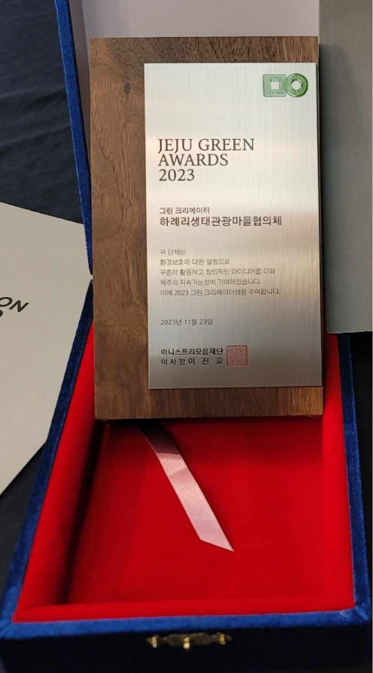
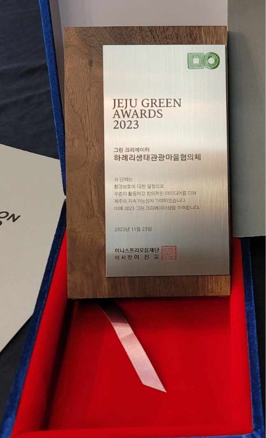
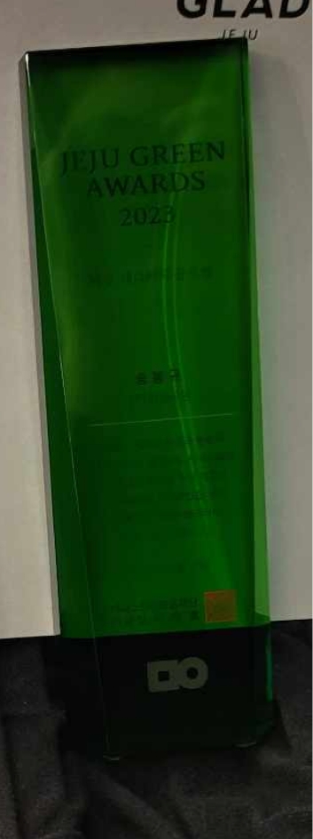
Trophy_Green Creator
Trophy_Jeju Heritage
Poster
VMD
Trophy_Green Creator
Trophy_Jeju Heritage
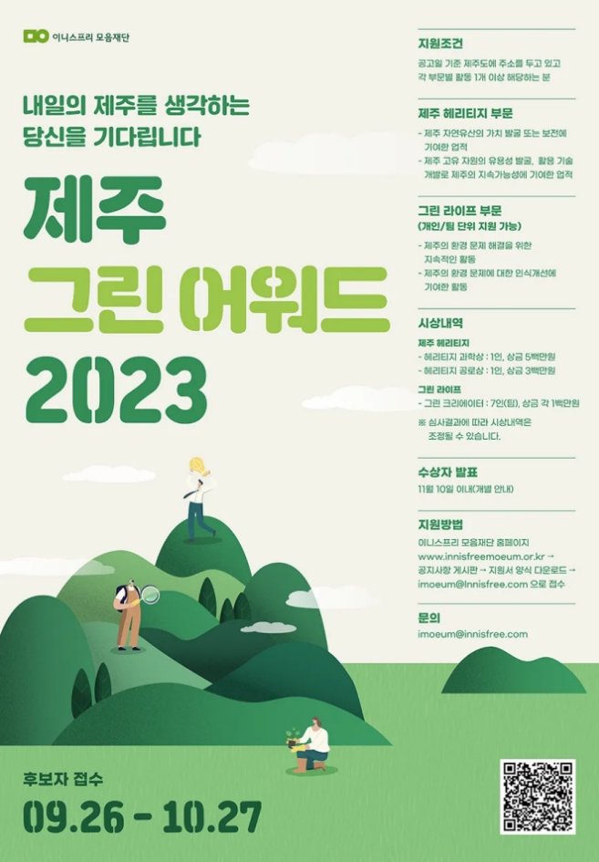
The concept for the first Jeju Green Awards, hosted by the Moaeum Foundation, was centered around the slogan “We await those who love tomorrow’s Jeju” and featured a graphic style based on shades of green.
While the design reflected the foundation’s symbolic color, it did not align with the tone and manner of the newly rebranded Innisfree, and the distinct identity of the Jeju Green Awards was not clearly conveyed.
Although there were commendable efforts to incorporate eco-friendly materials into the event fixtures, the award plaques—symbolic elements of the ceremony—relied on standard, off-the-shelf designs, making it difficult to fully express the uniqueness of the Green Awards.
The concept for the 1st Jeju Green Awards, organized by the Moaeum Foundation, was built around the slogan “We await those who love tomorrow’s Jeju” and featured a graphic style centered on the color green.
While the design incorporated the foundation’s symbolic color, it did not align with the tone and manner of the newly rebranded Innisfree, nor did it successfully convey a unique identity specific to the Jeju Green Awards.
Although there was a clear effort to use eco-friendly materials in the event fixtures, the award plaques—a key symbol of the ceremony—were unfortunately limited to off-the-shelf products, making it difficult to express the distinct character and value of the Green Awards.
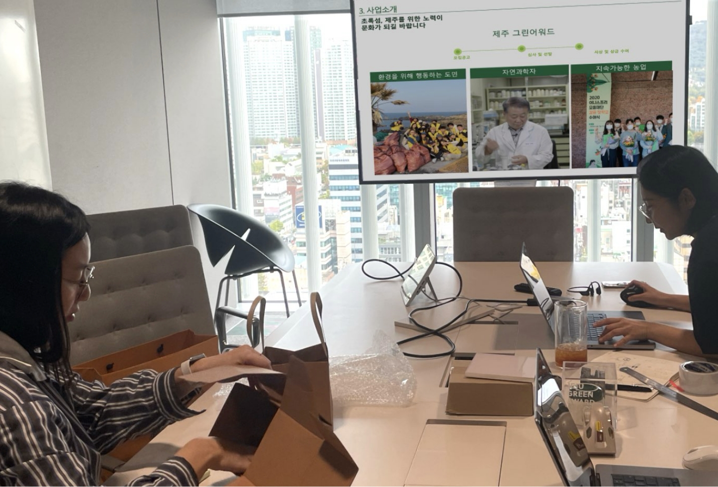
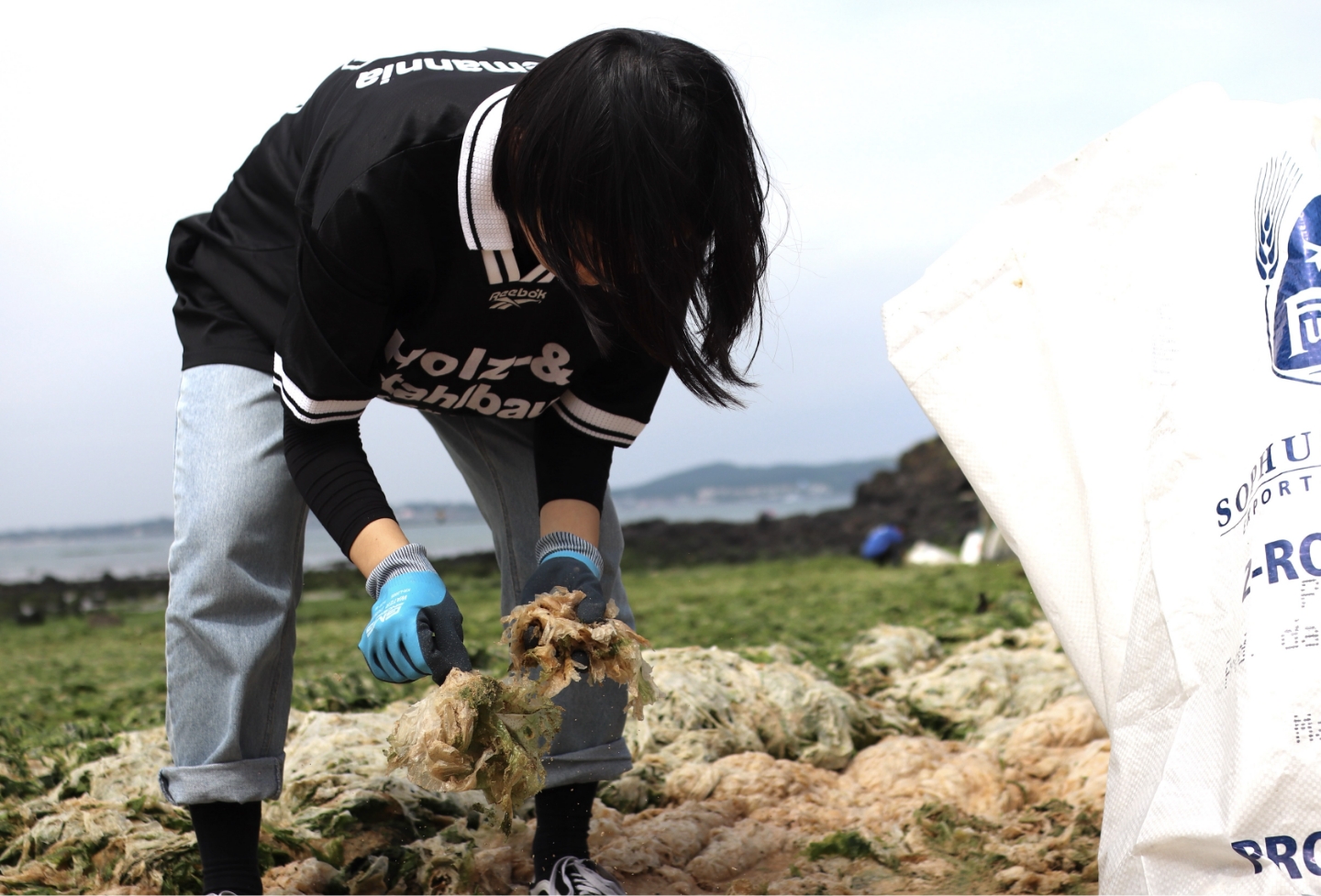
Before beginning the Green Award branding, we first sought to gain a deeper understanding of the foundation’s operational environment in order to develop a practically applicable solution.
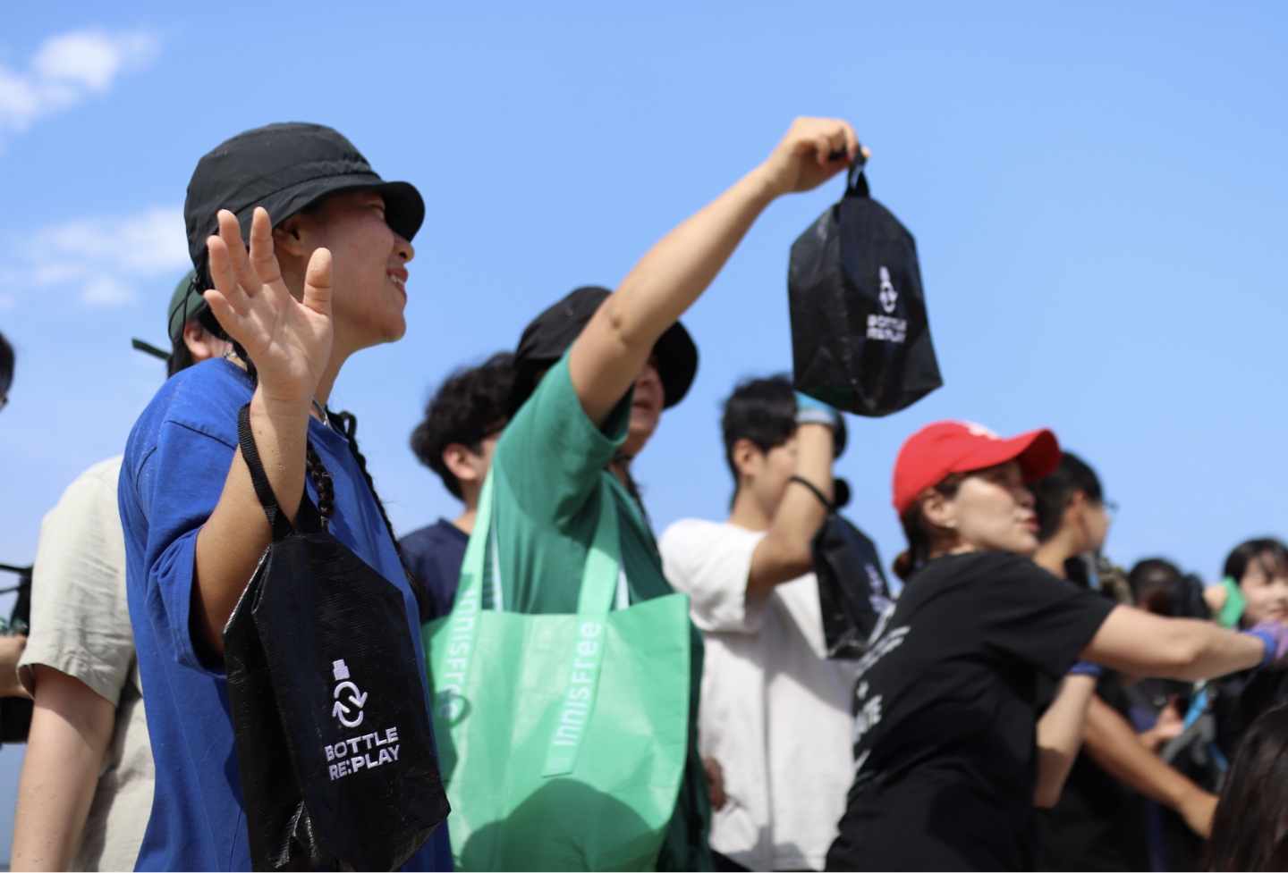
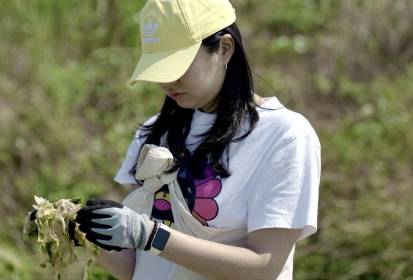
To do so, we maintained ongoing communication with the Mo-eum Foundation and actively participated in its eco-friendly events and volunteer activities.
Through this, we were able to empathize with the foundation’s real-world challenges and better understand its working context.
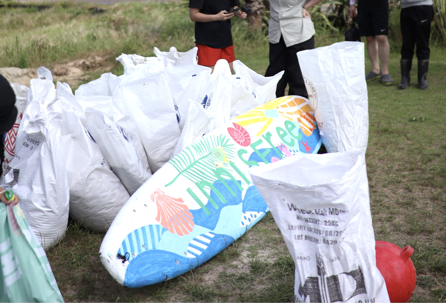
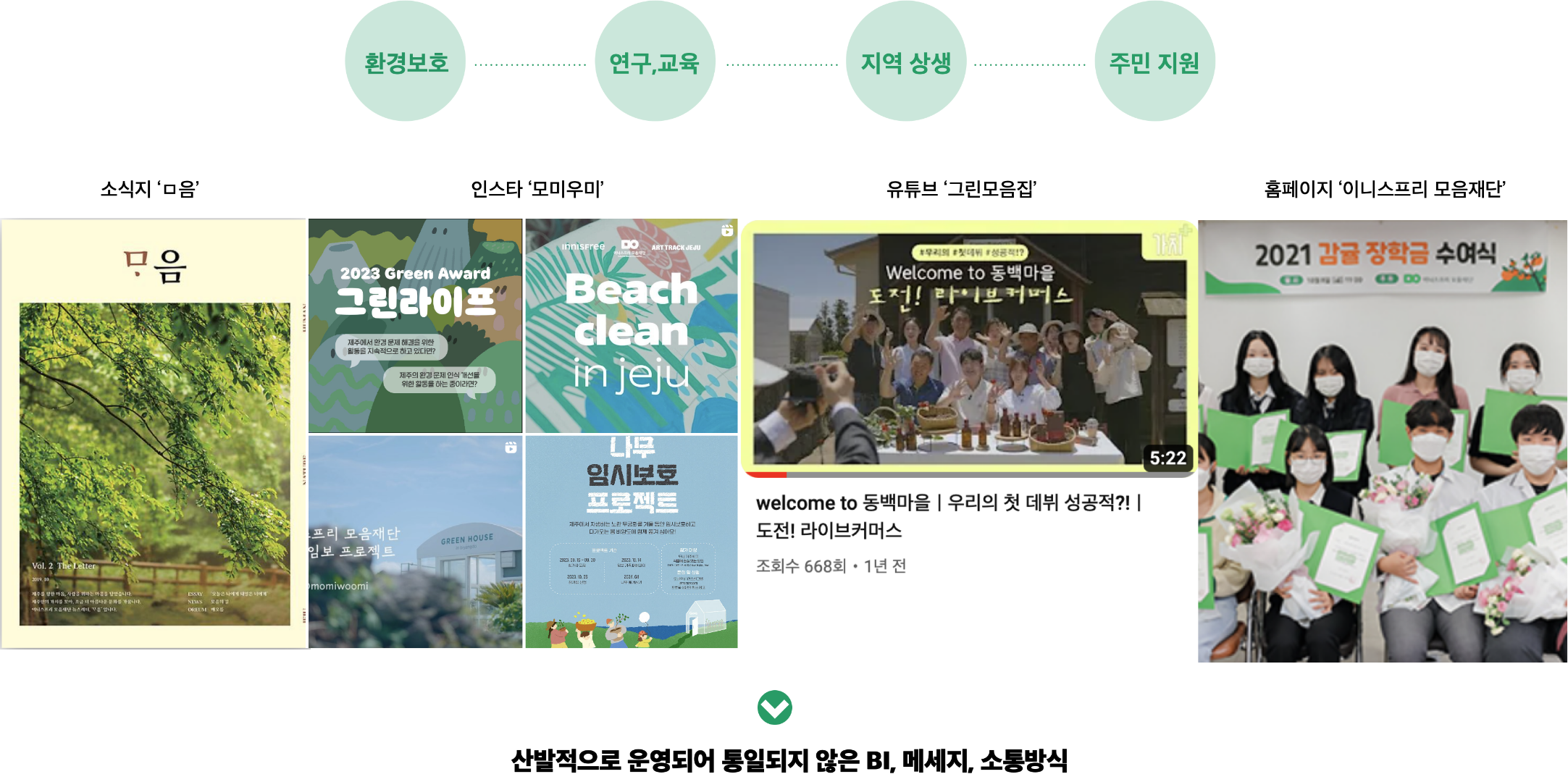
The Mo-eum Foundation was running a wide range of environmental and Jeju-focused initiatives.
However, with multiple projects in progress, different PR agencies were engaged for each event, and new communication channels were established separately for every project.
This fragmented structure made it difficult to deliver a consistent and efficient message.
Moreover, the varying and complex design formats produced by different agencies created a vicious cycle that increased the internal workload.
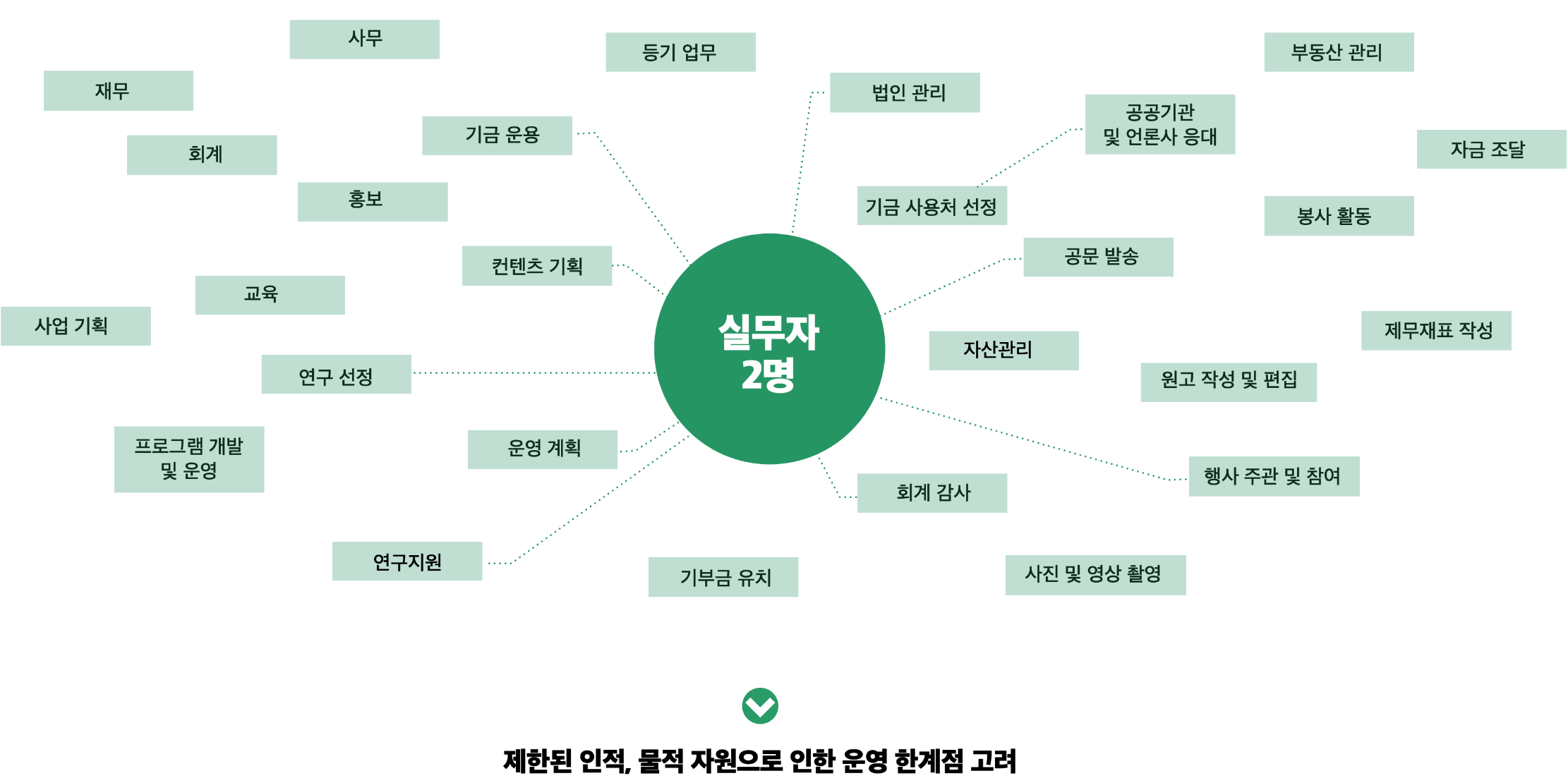
The root of the issue lay in the foundation’s operational limitations: as a non-profit organization, it was difficult to secure sufficient staffing, leaving only two team members to handle a broad range of responsibilities — from administration and PR to finance, planning, and operations.
Recognizing these constraints, the foundation sought to streamline scattered and inefficient projects and focus more strategically on the Jeju Green Awards as its flagship initiative.
Recognizing these constraints, the foundation sought to streamline scattered and inefficient projects and focus more strategically on the Jeju Green Awards as its flagship initiative.

As we came to understand the internal situation, two key challenges emerged:
first, how to elevate the authority and recognition of the Jeju Green Awards to position it as Jeju’s leading environmental award ceremony;
and second, how the two non-design staff members could manage and sustain the award efficiently over time.
After in-depth discussions, we concluded that the most effective approach would be to strengthen the identity of the Mo-eum Foundation itself — the very foundation and driving force behind the awards
— and connect its long-standing values, built through years of commitment to Jeju and its people, directly to the Green Award.
This would ensure the project goes beyond a one-time, visually appealing design and instead builds credibility and authenticity rooted in the foundation’s mission.
Taking into account the foundation’s limited staffing, we also aimed to provide realistic, scalable, and easy-to-operate guidelines to support long-term management and consistent execution of the awards.
CONCEPT
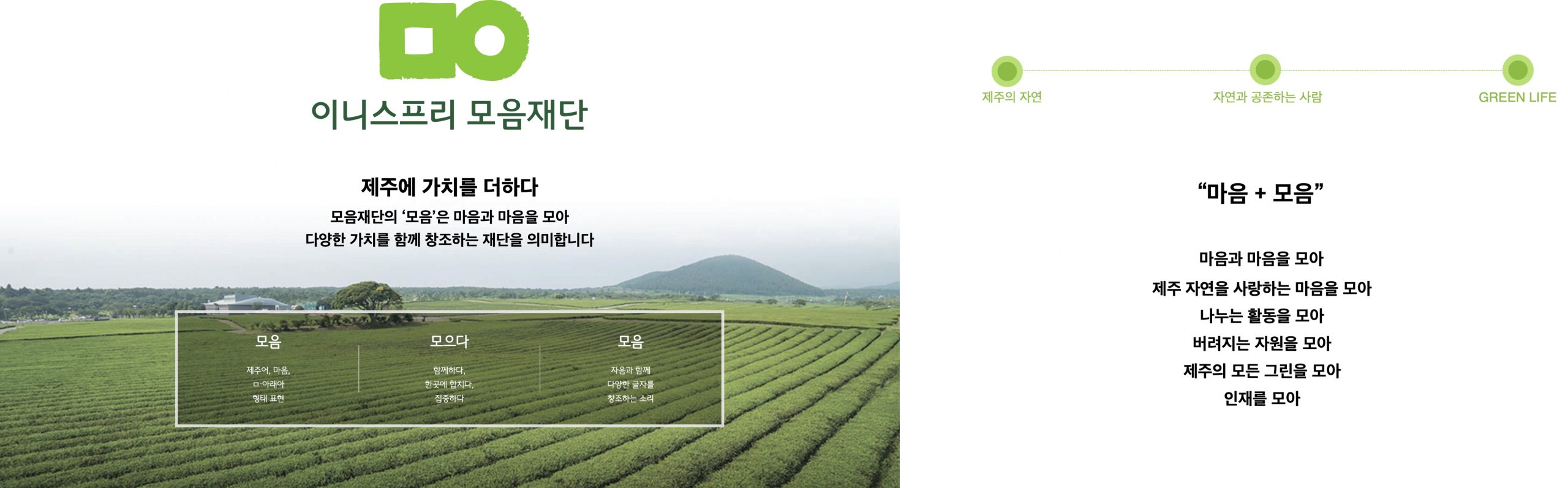
We returned to the beginning — starting once again from the Mo-eum Foundation, the organizer of the awards.
In the Jeju dialect, “Mo-eum” means heart, symbolizing the act of gathering hearts together to create shared values. Rather than introducing a completely new concept, we sought to reflect the beautiful philosophy and spirit already embodied in the Mo-eum Foundation. By expanding on the slogan “gathering hearts and minds,” we aimed to connect the identities of Jeju Island, the Mo-eum Foundation, and the Green Awards — gathering hearts that love Jeju’s nature, gathering actions that share, and gathering resources that might otherwise be discarded.
In the Jeju dialect, “Mo-eum” means heart, symbolizing the act of gathering hearts together to create shared values. Rather than introducing a completely new concept, we sought to reflect the beautiful philosophy and spirit already embodied in the Mo-eum Foundation. By expanding on the slogan “gathering hearts and minds,” we aimed to connect the identities of Jeju Island, the Mo-eum Foundation, and the Green Awards — gathering hearts that love Jeju’s nature, gathering actions that share, and gathering resources that might otherwise be discarded.

To achieve this, we organized previously scattered communication elements into a practical guideline that staff could easily implement.
We also infused the Green Award’s brand identity (BI) with the Mo-eum Foundation’s essence, ensuring that the foundation’s values could be expressed consistently and coherently across all touchpoints.
COMMUNICATION GUIDE
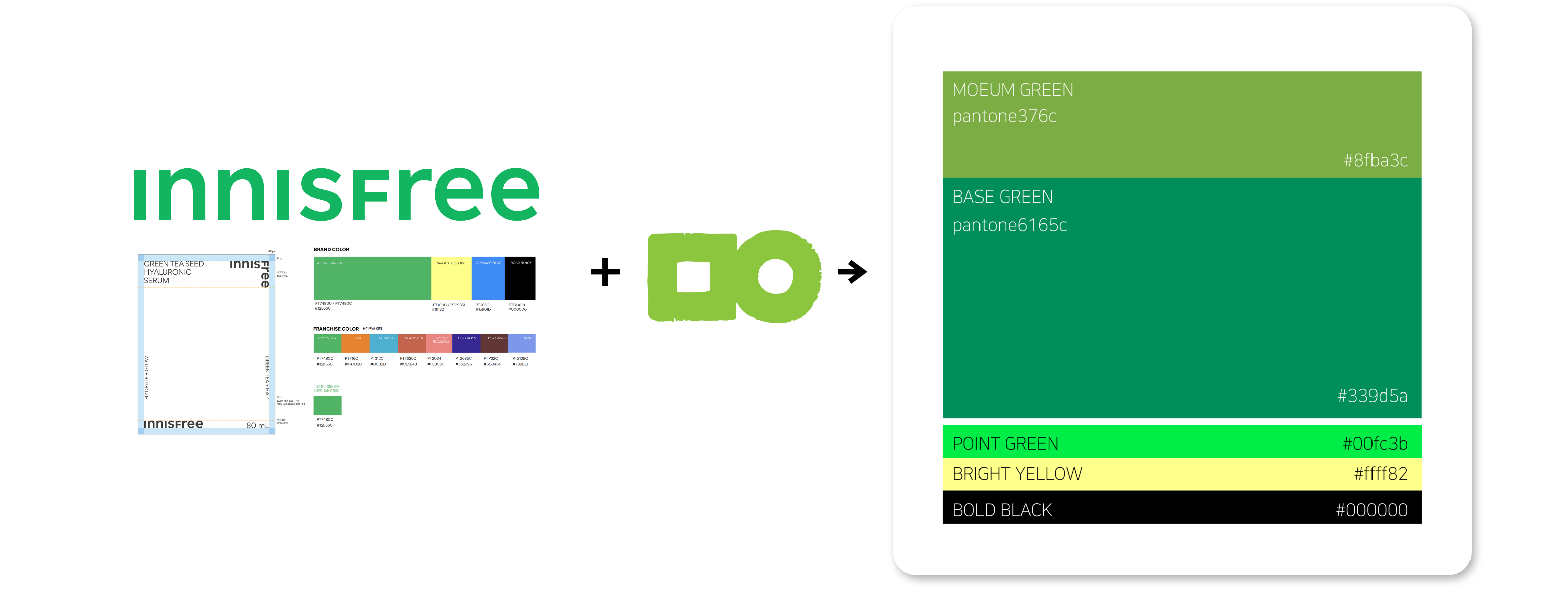
For the Brand Identity (BI), we focused on creating visual cohesion between Innisfree and the Mo-eum Foundation, while refining a distinct visual style unique to the Green Awards.
By combining the signature colors used by both organizations, we redefined a four-color palette suitable for diverse content applications across online and offline platforms.
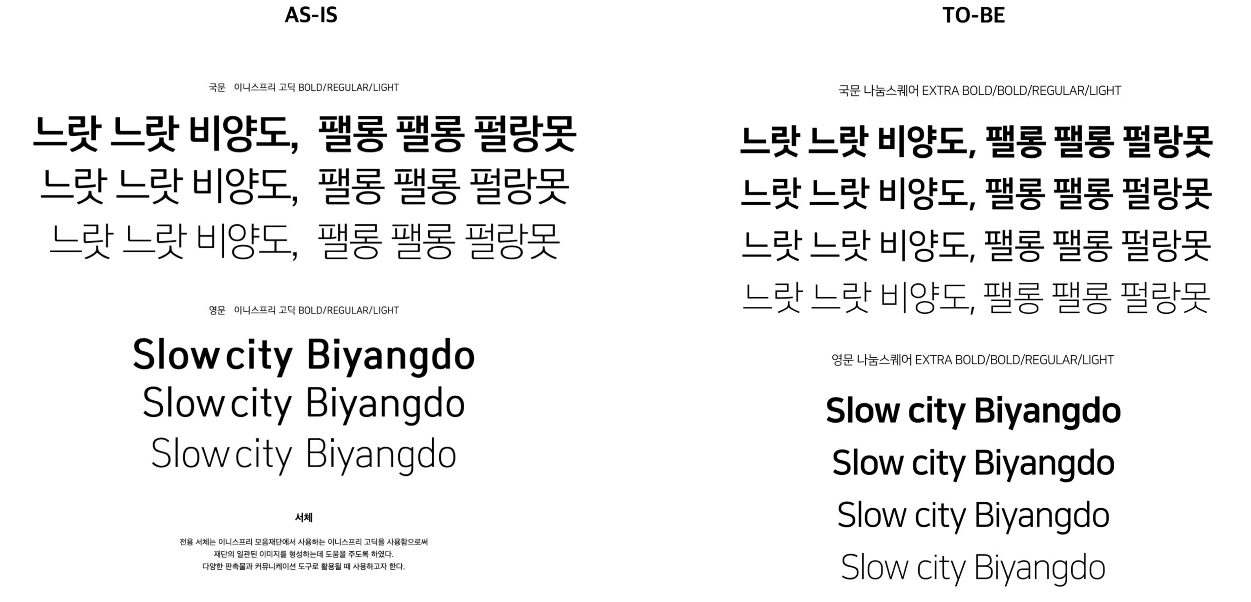
In response to internal VOC noting the low readability of the existing typeface, we proposed freely accessible fonts that can be easily used across multiple agencies and standard Microsoft work environments.
Communication Operations Guide
SNS Thumbnail Guide

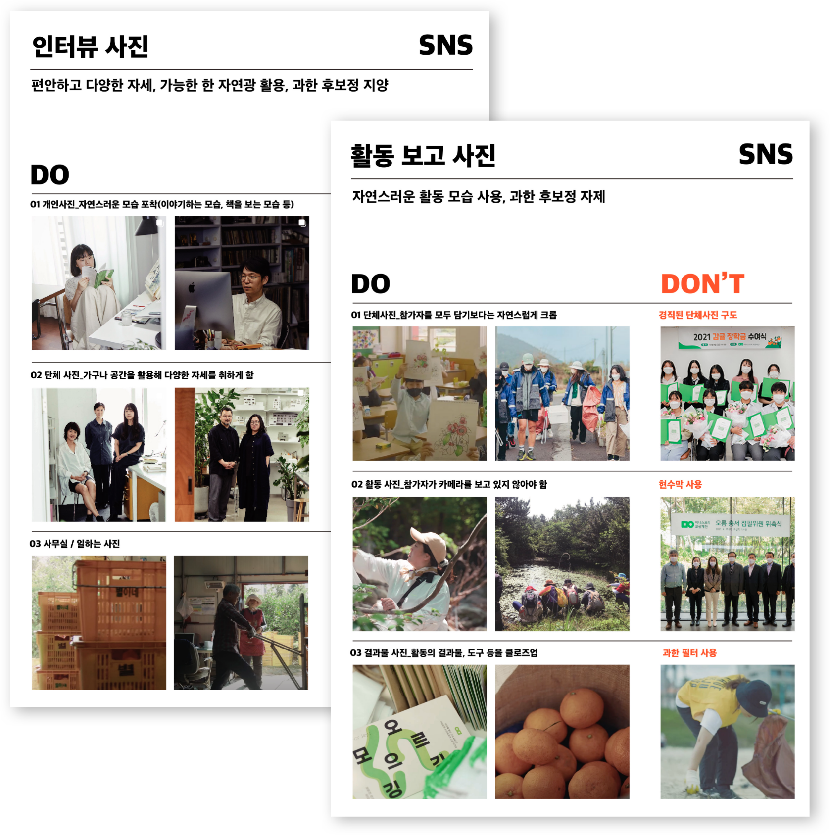
The Communication Operations Guide was developed as an internal reference to strengthen the Mo-eum Foundation’s brand value and credibility through unified messaging and cohesive visual elements, while improving operational efficiency.
It emphasizes visuals with a warm sensibility, communication that is clear, concise, and trustworthy, and formats that are simple, accessible, and easy to apply.
Content Production Guide

Instagram Guideline Application Examples
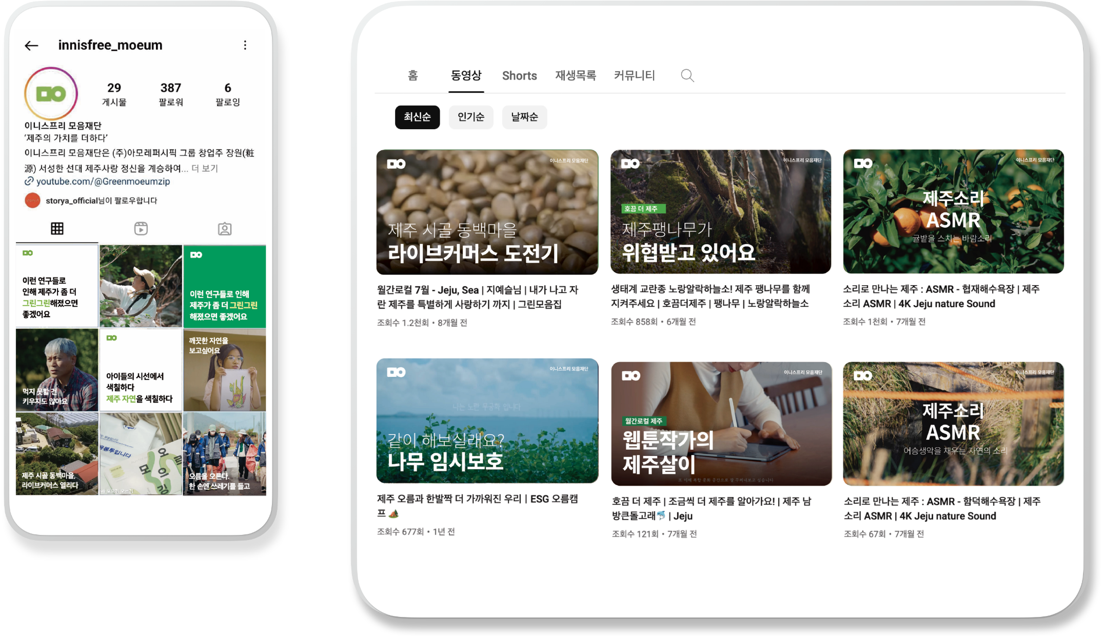
We applied Innisfree’s square frame logic to the thumbnail template, creating consistency in logo placement and typography.
To enable faster, easier content production across multiple channels, we also proposed voice tone and interview guidelines.
This approach ensures that all channels communicate with a unified voice, allowing the story of the Green Awards to spread naturally and cohesively.
BRAND DESIGN

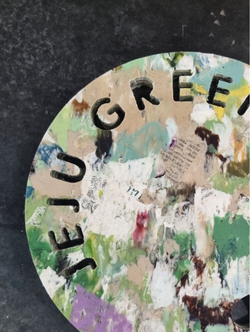
By defining “heart” as the consonant ㅁ (mieum) and “to gather” as ㅇ (ieung), the emblem symbolizes the sustainable values of the Green Awards—a love for nature and the gathering of hearts—through a form that combines these two consonants.
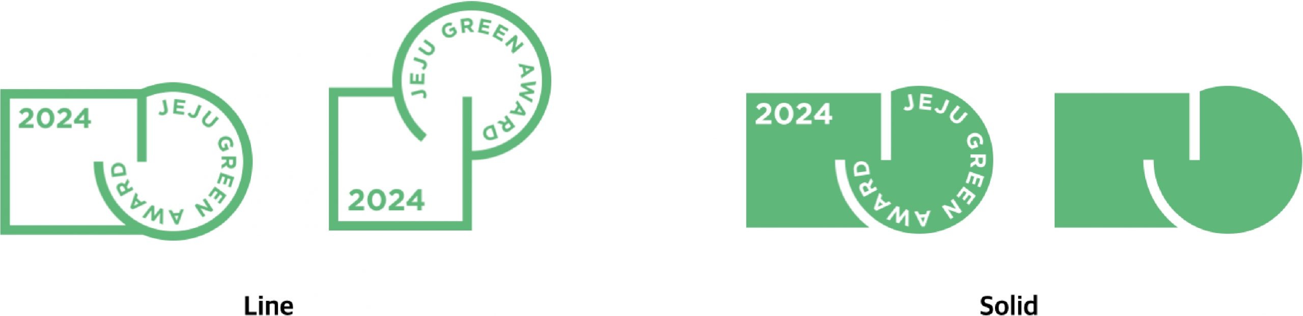
To give the emblem a distinct symbolism unique to the Green Awards, we adopted the ㅁㅇ consonant motif from the Mo-eum Foundation’s BI, embodying the value of “gathering hearts and minds.”
The design was refined into a more modern and dynamic expression, developed in horizontal and vertical formats as well as line and solid versions to ensure versatility across diverse media.
Additionally, we introduced the practice of including the award year within the emblem each cycle, visually reinforcing the continuity and tradition of the Green Awards.
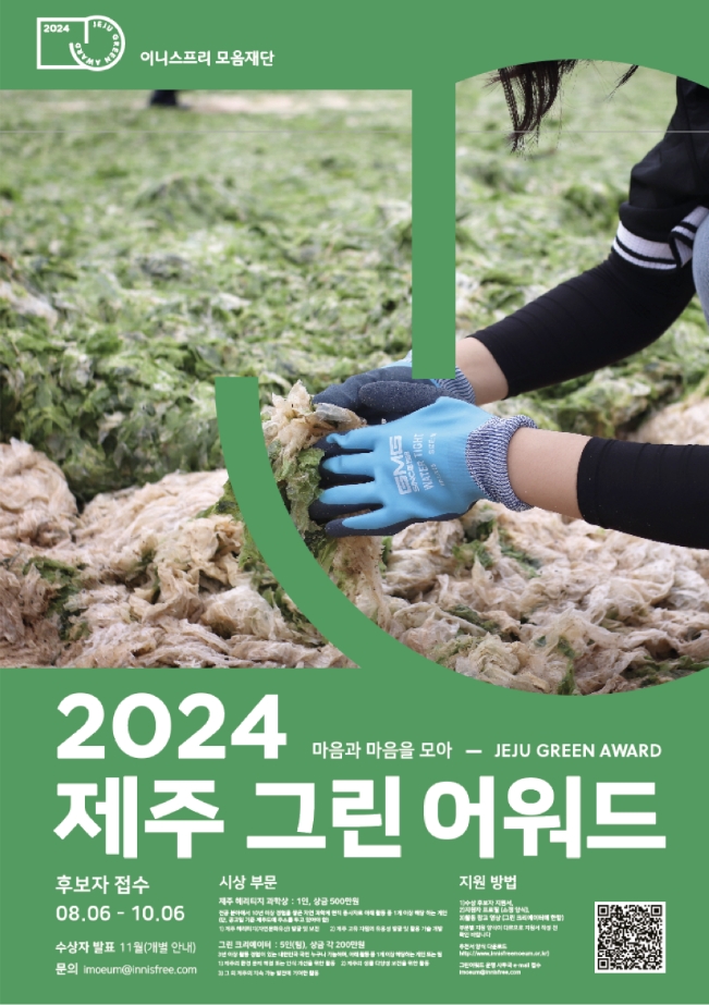
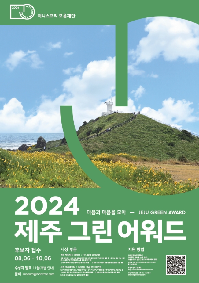
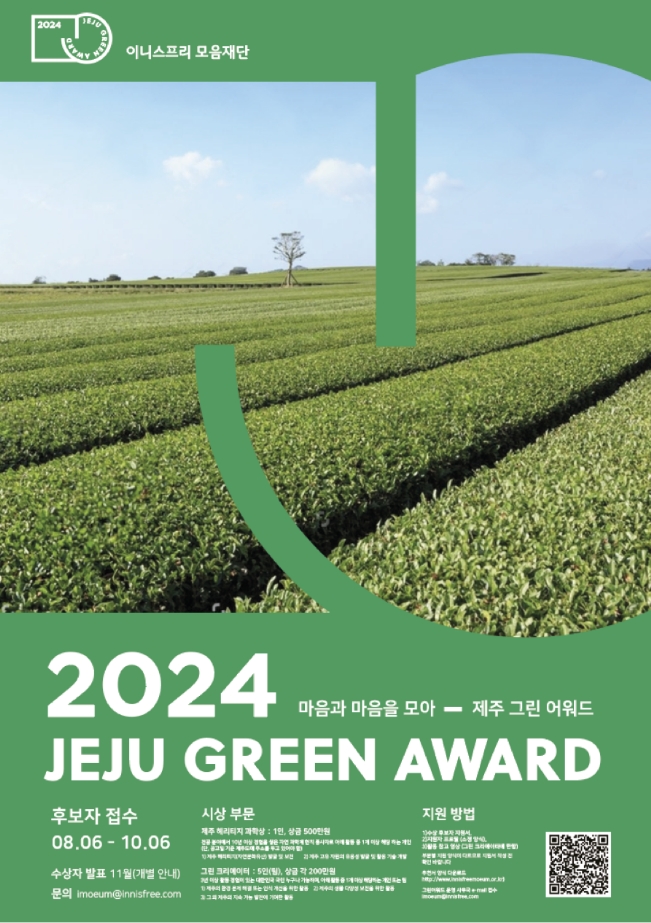
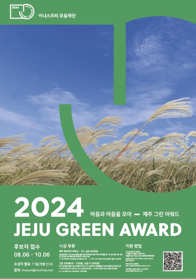
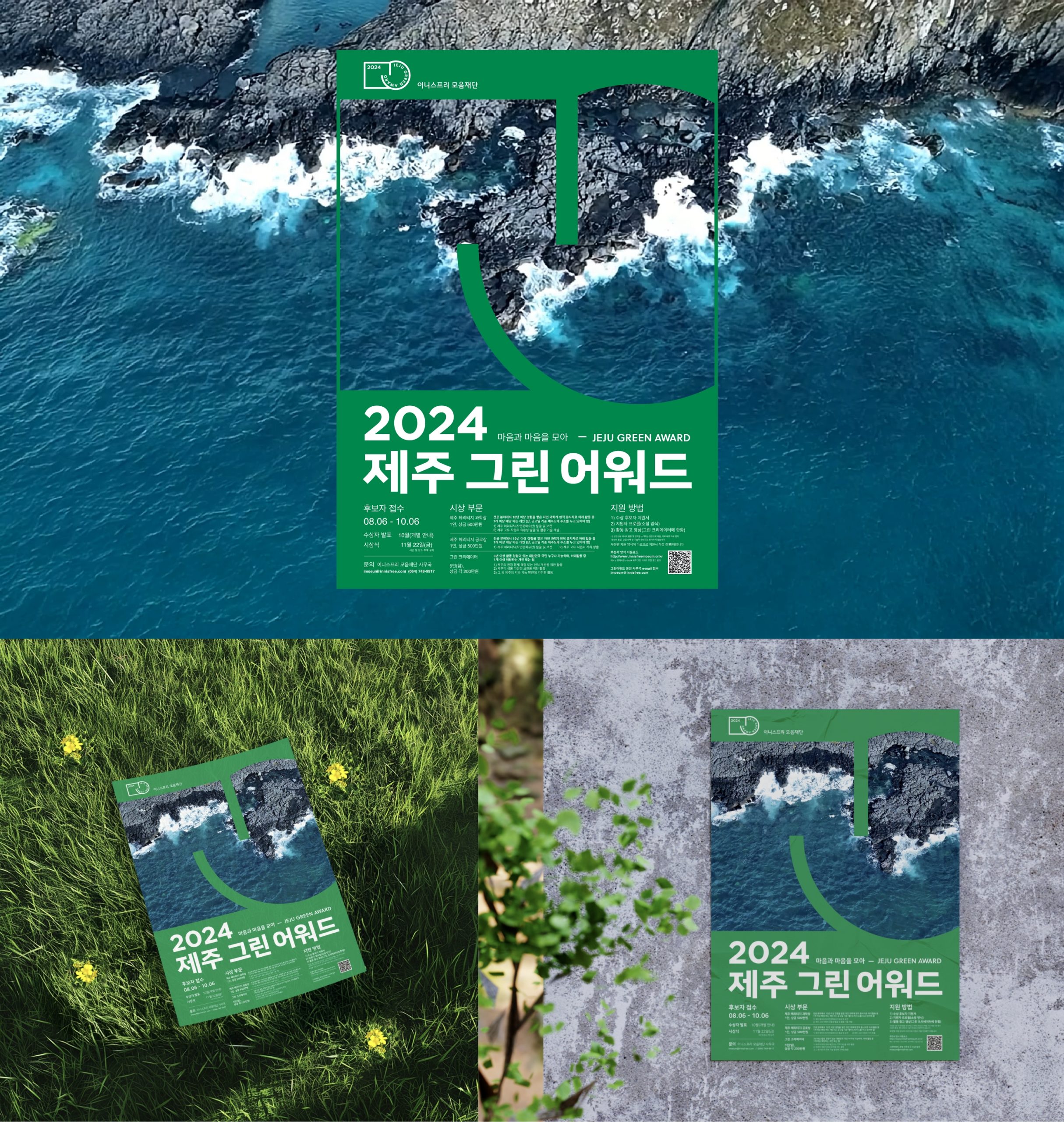
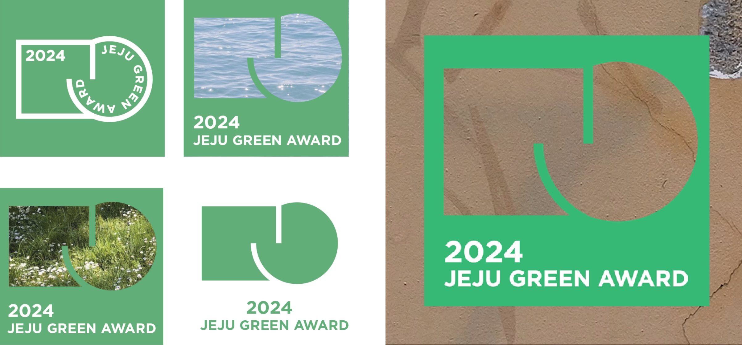
For the poster design, the emblem’s shape was used as a framing device, creating the impression of looking through it into Jeju’s vibrant and colorful landscapes.
Following an internal vote within the Mo-eum Foundation, a dynamic natural scene featuring Jeju’s symbolic blue sea and basalt formations was selected as the key visual for the 2024 Green Awards.
Moaeum Foundation Website

Contest Platform

To differentiate the poster from the many contest designs that typically rely on illustrations, we used an image of the blue ocean—a color
contrasting with green—to both convey the spirit of the Green Awards and evoke curiosity.
The title was intentionally simplified to maximize visibility and recognition in crowded digital environments such as contest promotion platforms.
Visual Production for the Awards Ceremony
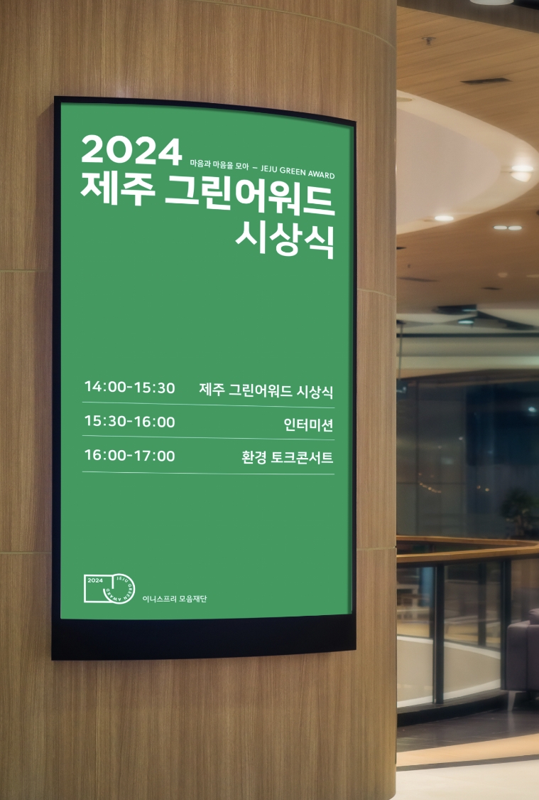
For promotional and informational visuals related to the awards, we prioritized using existing digital displays within the space rather than printed materials whenever possible.
The back-wall template was designed with the presenter’s movement in mind, positioning the award title and emblem prominently at the top to ensure constant visibility when recipients stood in front.
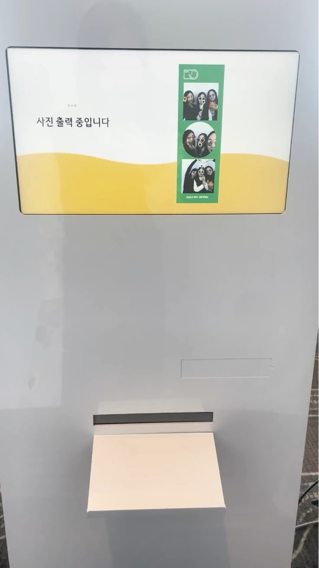
Additionally, we created an interactive photo booth frame featuring the emblem, allowing visitors to commemorate the awards and spontaneously generate shareable content.


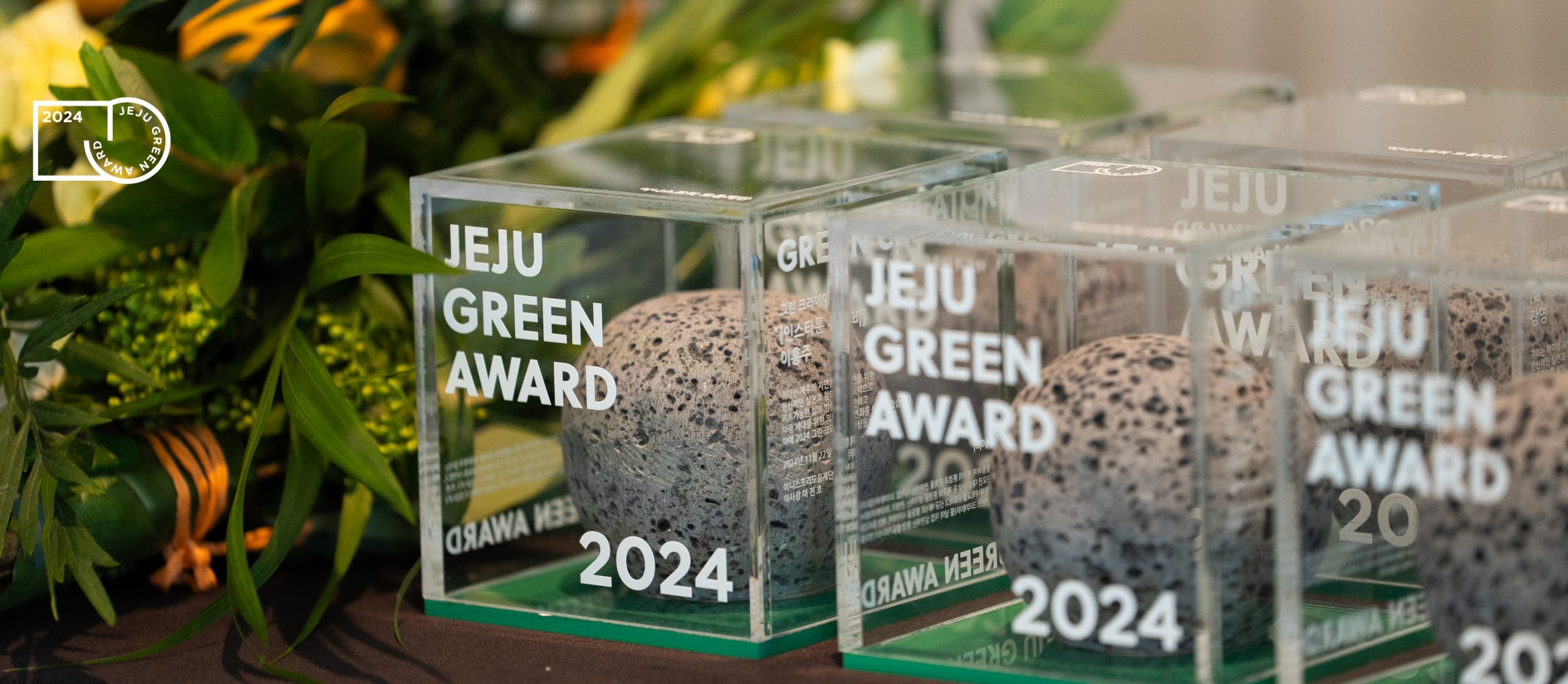
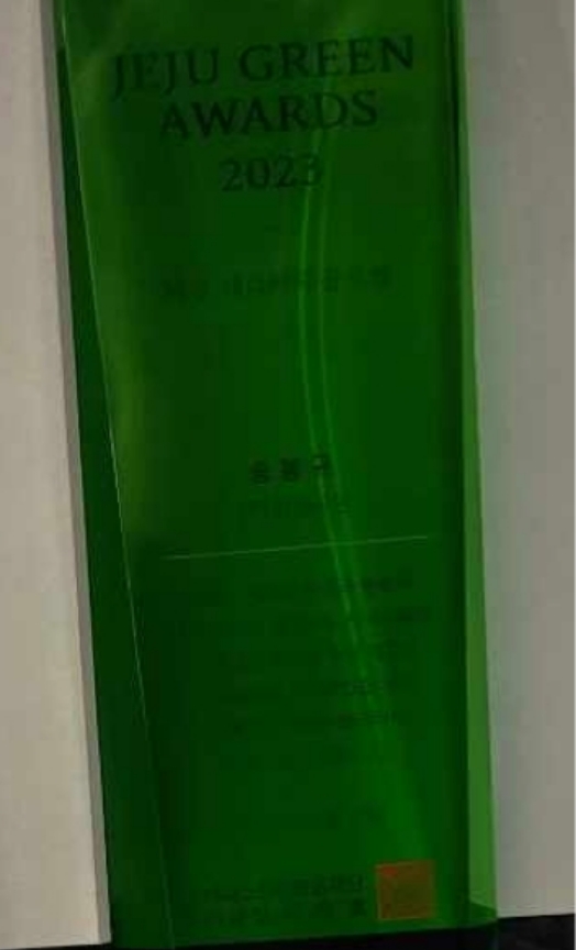
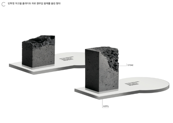
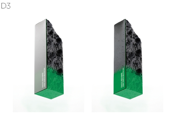
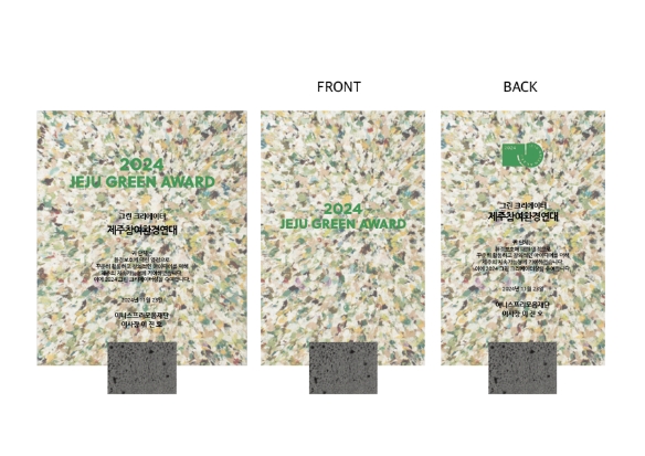
At the heart of the Green Awards lies the award plaque design, which embodies the event’s identity through Jeju-inspired forms, upcycled materials, and the emblem.
To differentiate it from mass-produced plaques and give deeper meaning to the material itself, we collaborated with a local Jeju company,
“Jeju Stone,” to repurpose discarded basalt offcuts—waste fragments from construction sites—into the final design.
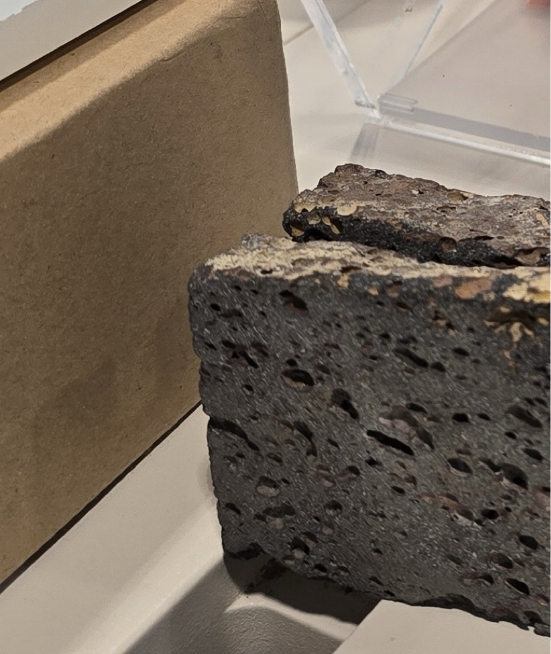


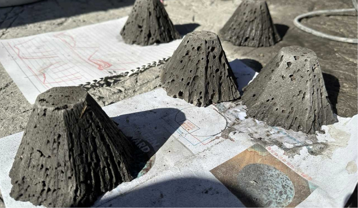
We explored a variety of design concepts inspired by the consonants ‘ㅁ’ (mieum) and ‘ㅇ’ (ieung), as well as motifs from Jeju Island.
basalt is difficult to combine with other materials or sculpt with fine precision, the process involved considerable trial and error.
Through real-time testing at Jeju’s quarries and fabrication sites, we gradually refined and finalized the design.
As this was a limited prototype production, we could not commission external manufacturers.
Instead, for the first award ceremony, every plaque was 100% handcrafted by the designers of this project themselves—an act that imbued the awards with even greater authenticity and significance.
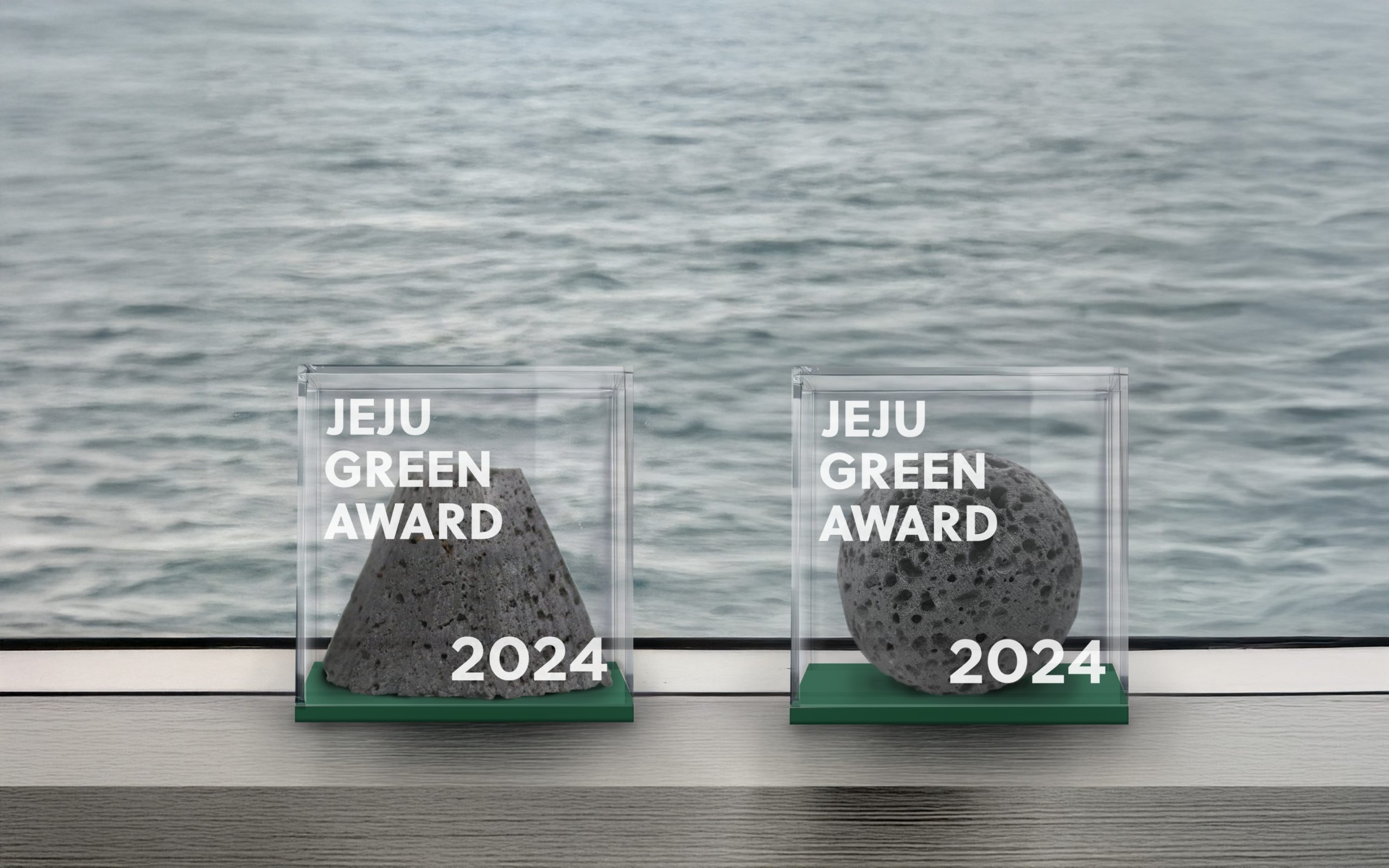
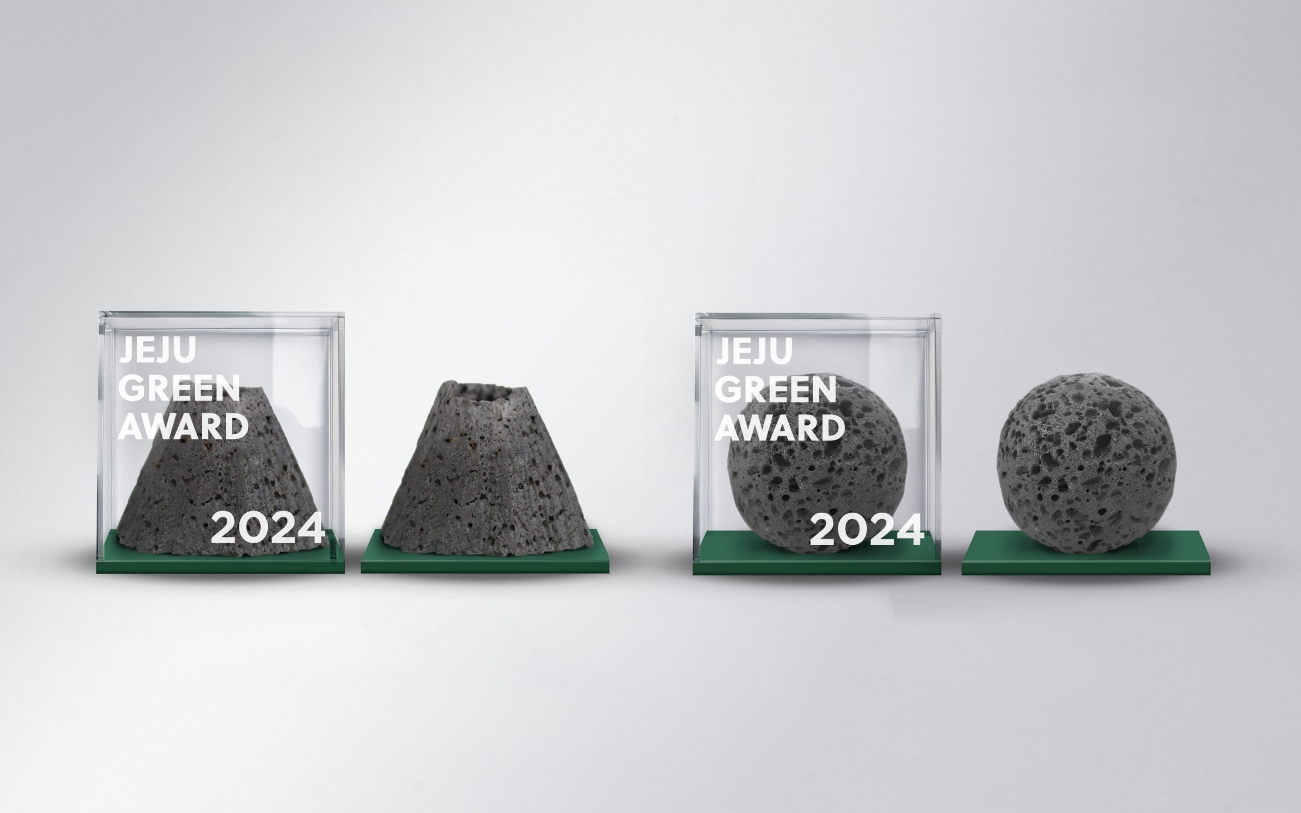
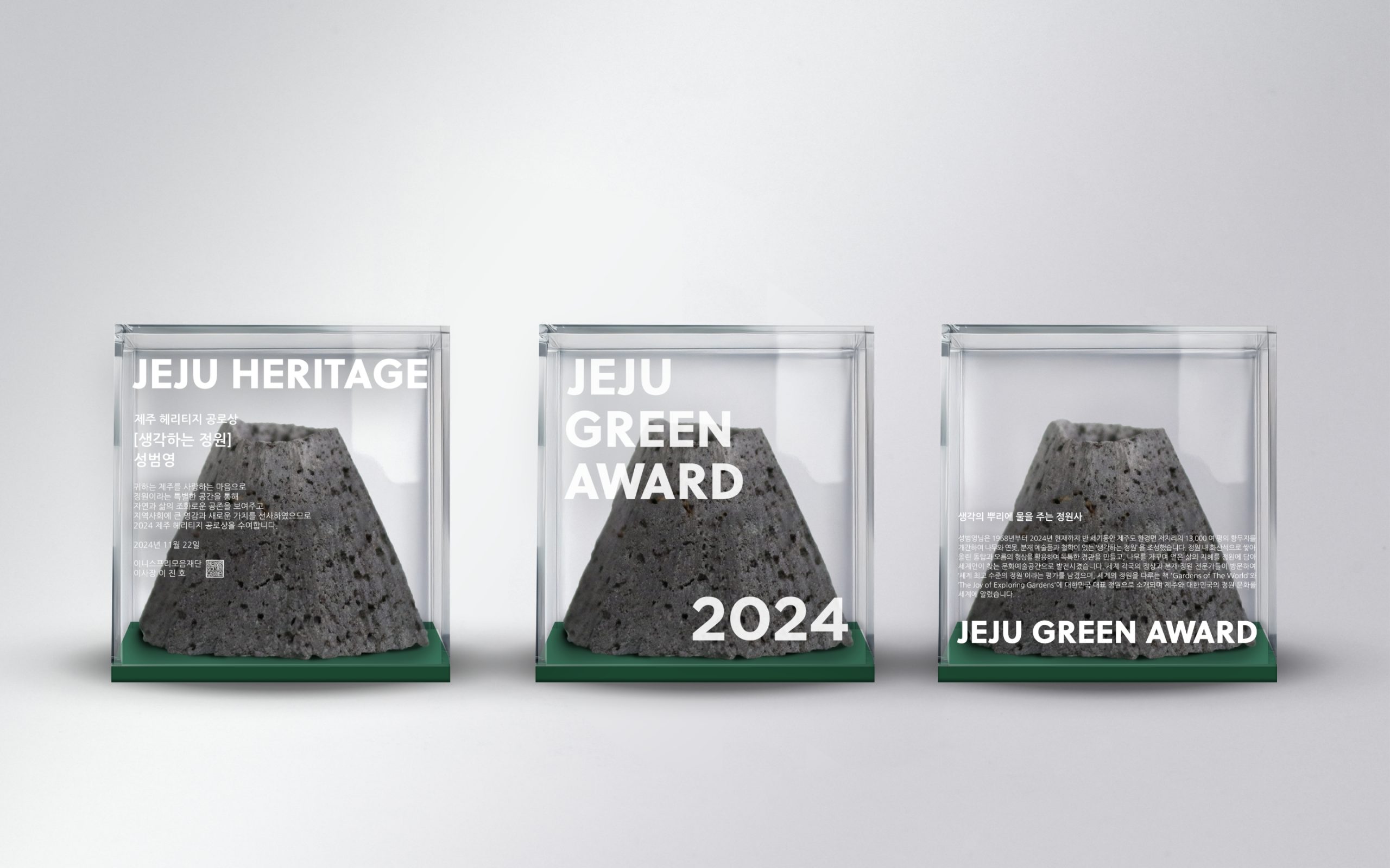
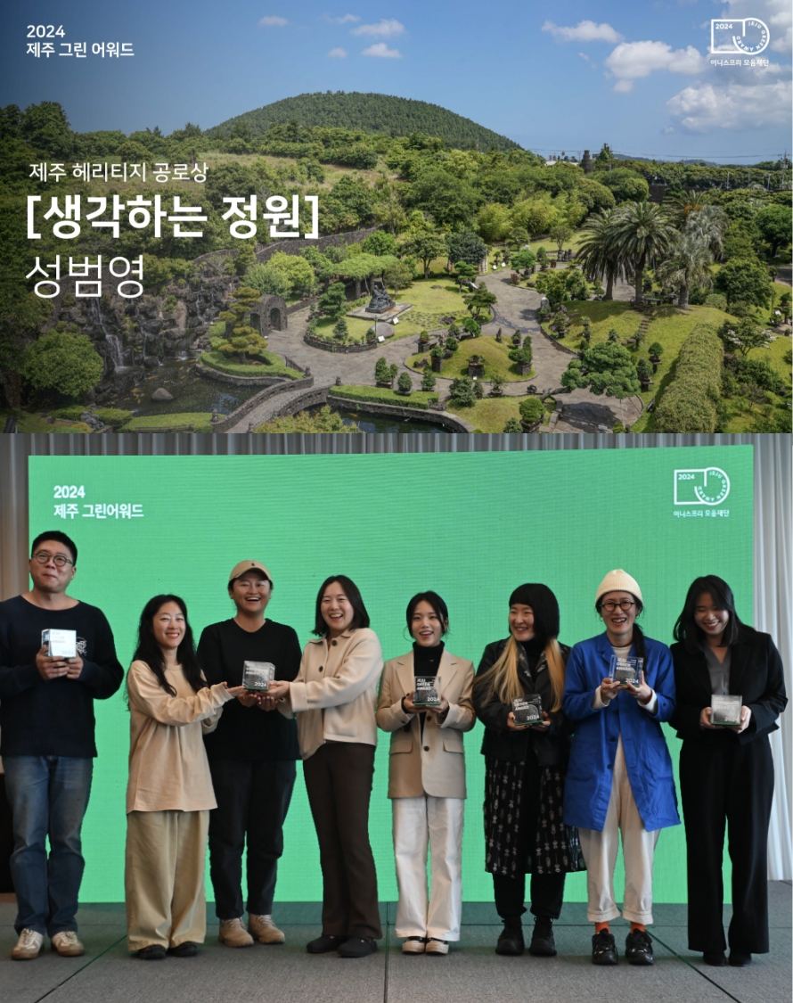
After much deliberation, the completed Jeju Green Award plaques were designed to honor those who love Jeju and dedicate themselves to protecting its nature.
Set on a green base, symbolizing the Green Awards, each piece features a basalt object enclosed within a transparent case, evoking the feeling of preserving an artwork.
The Heritage Award incorporates a Hallasan Mountain silhouette, while the other awards use round basalt forms inspired by the consonants ‘ㅁ’ and ‘ㅇ’, representing unity and gathering.
Unlike conventional plaques that only list the award category and recipient’s name, these also include the story behind each project, reflecting genuine respect for the honorees.
This thoughtful approach resonated deeply with both the Mo-eum Foundation and the award recipients, creating a more meaningful and memorable award experience.
We created a short video to commemorate our rewarding collaboration with the Moaeum Foundation.
- Amorepacific Creatives
- Brand Design
- Kim Bitnuri, We Ahin, Jung Suhyun
- Kim Bitnuri, We Ahin,
- Jung Suhyun
- Client
- Innisfree Moeum Foundation
- Kim Ahin, Park Seoyeon