HOLITUAL BLUE PDRN DOUBLE AMPOULE
Summary
The Blue PDRN Double Ampoule is a high-performance repair care solution proposed by HOLITUAL, designed as a night ritual that soothes both skin and mind at the end of the day.
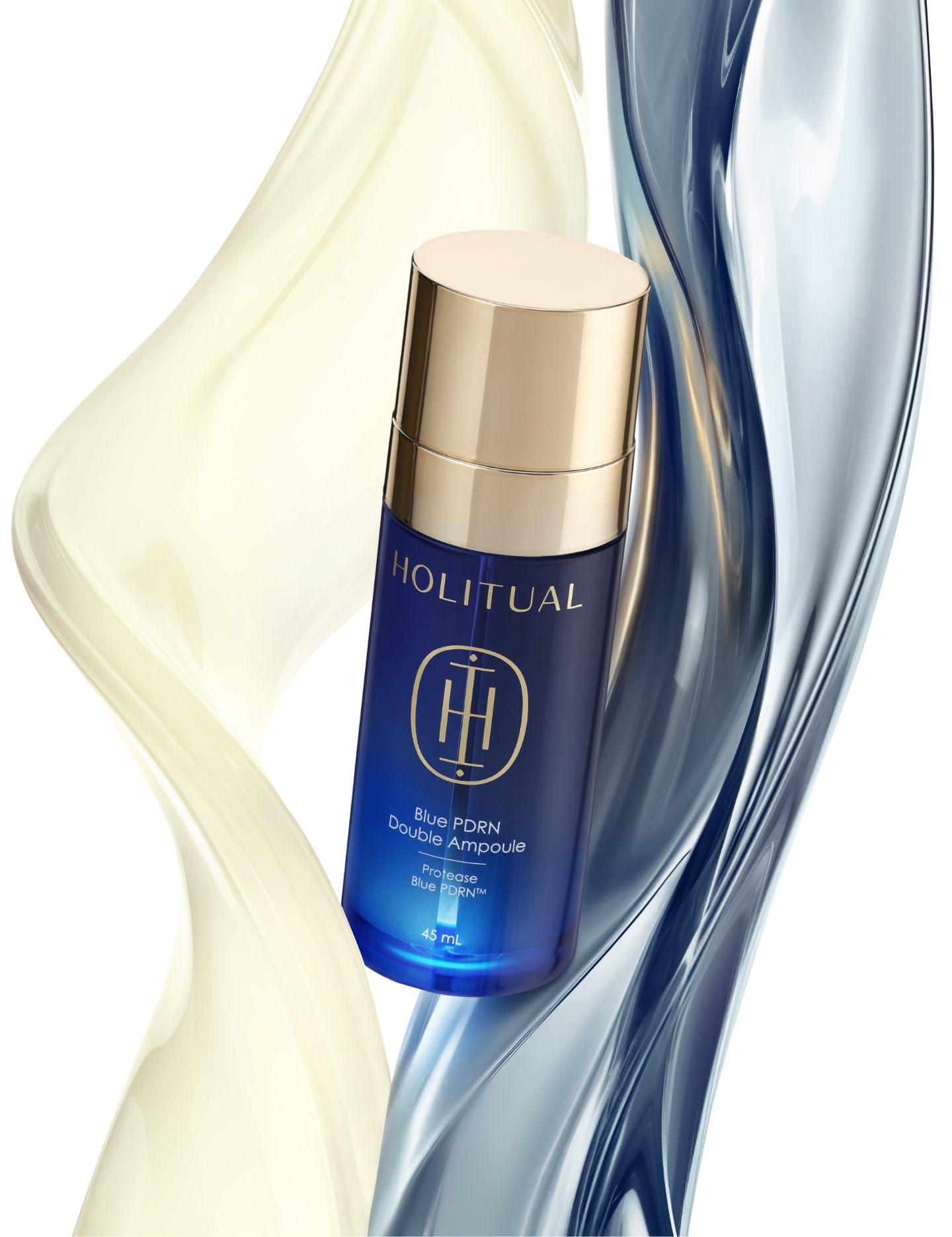
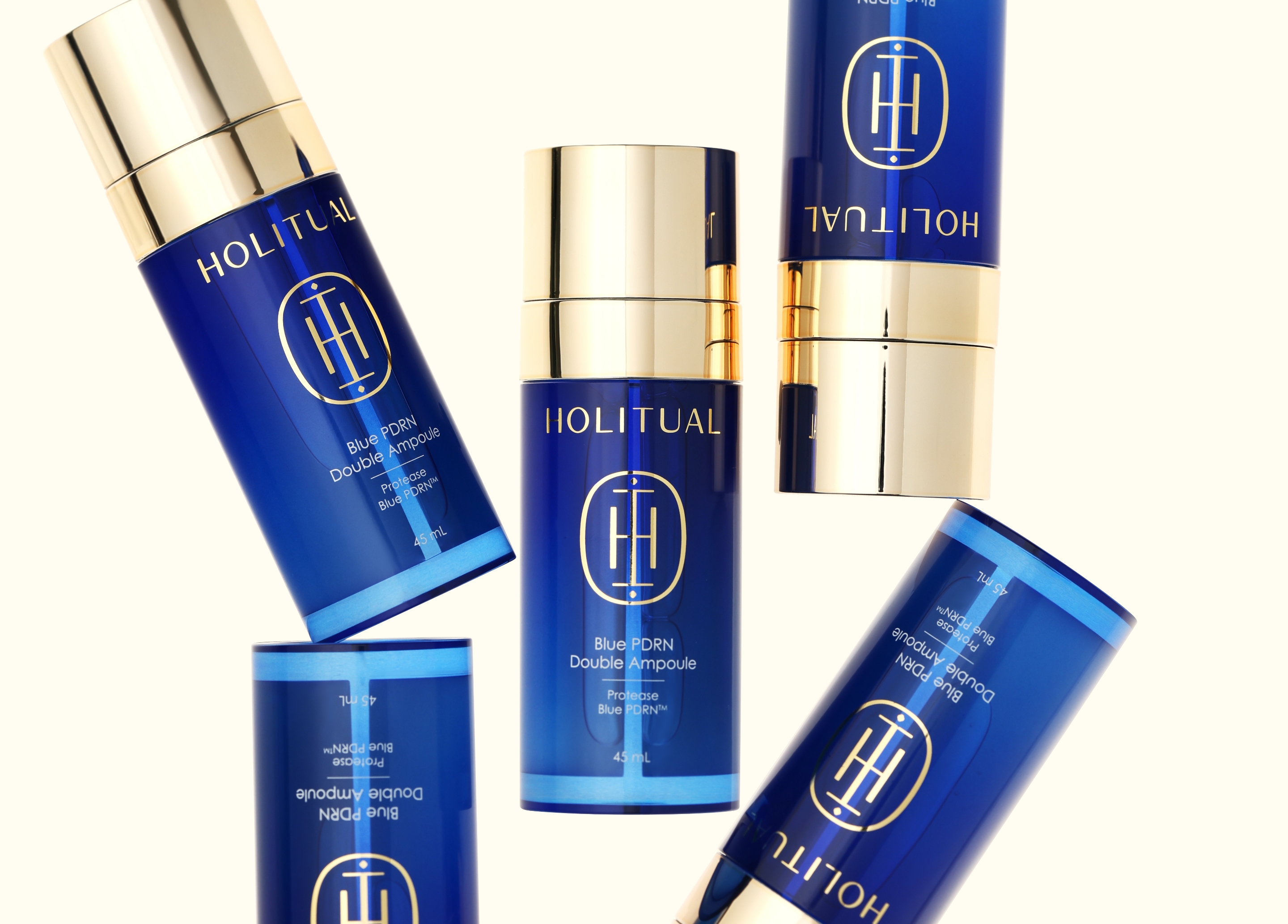
The package design began with the intention of maximizing the appeal of the ampoule’s clear and vivid blue color, and combining it with gold—an asset symbolizing the brand’s luxurious mood—to create a cohesive impression across the entire line.
Material & color
The key design challenge of this project was to maximize the visual appeal of the contents within the structural constraint of a transparent dual-container.
To achieve this, a refined gradient technique was applied across the entire body of the container.
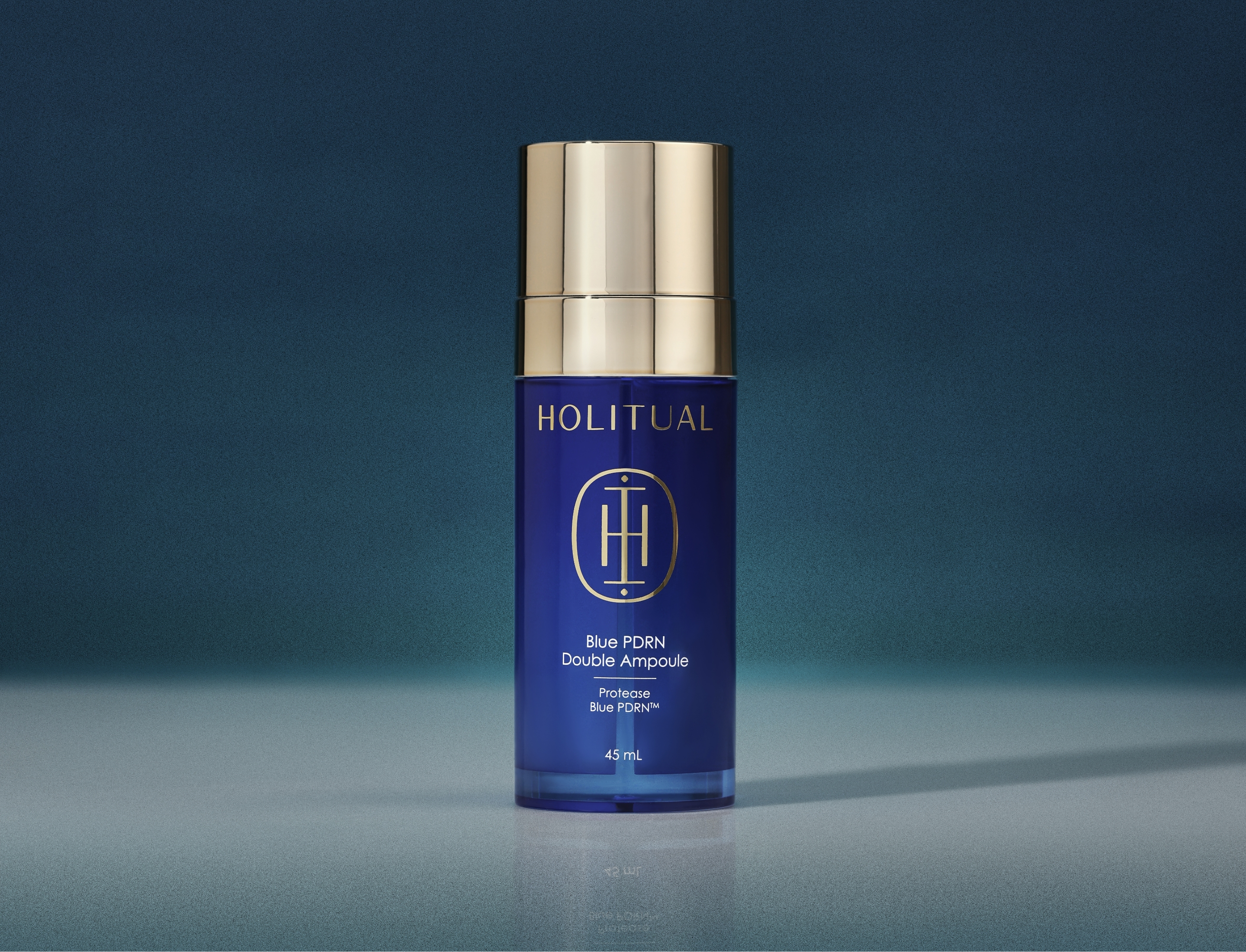
The gradient—transitioning from a deep blue at the top to increasing transparency toward the bottom—gracefully evokes the temporal flow of the “night ritual,” from the stillness of deep night to the clarity of dawn.
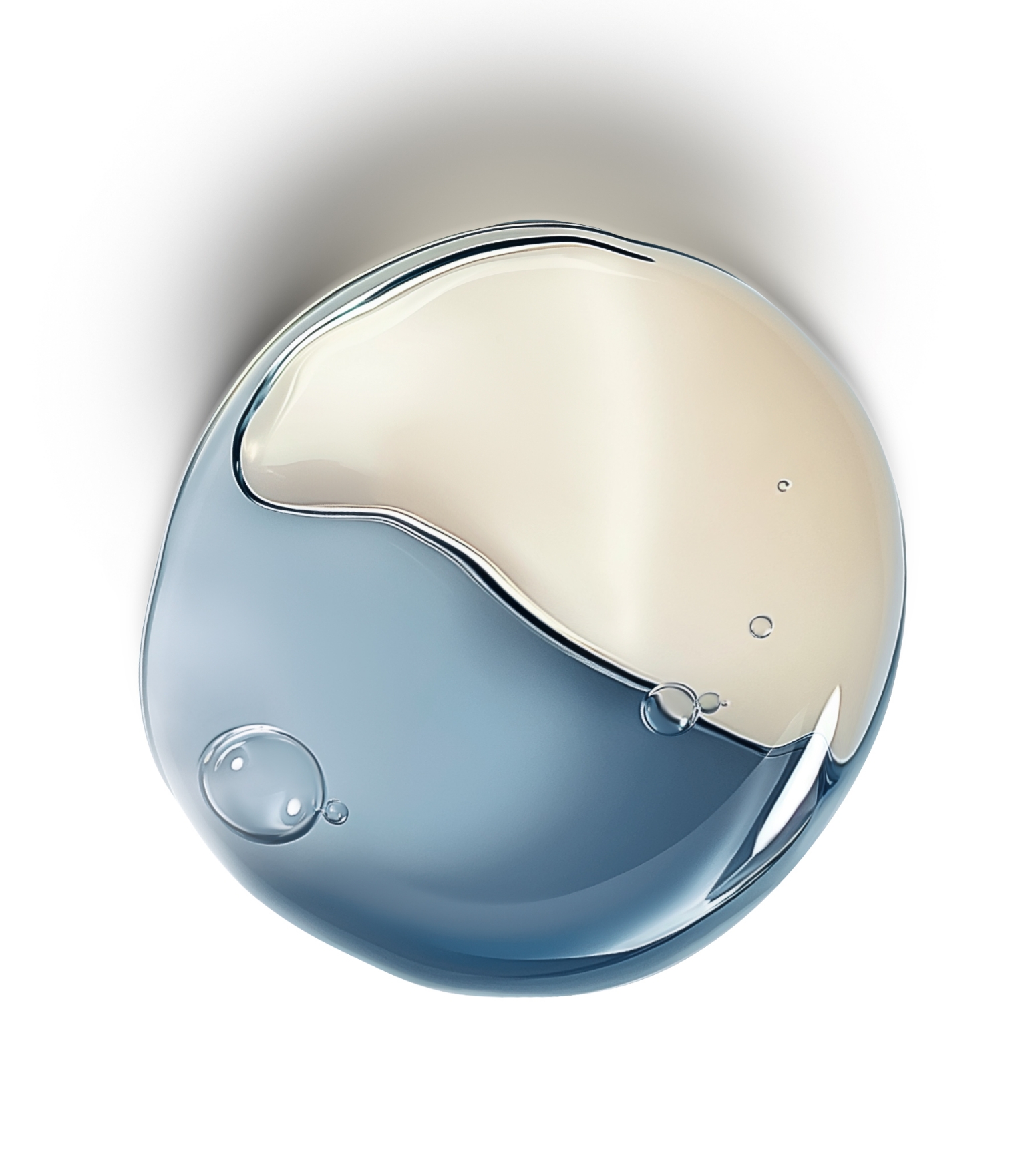
At the same time, the transparent lower section of the container was designed to naturally reveal the two different formulations inside, allowing users to intuitively recognize their characteristics and color, while enhancing anticipation of the product’s efficacy.
In addition, by directly reflecting the ampoule’s inherently clear and deep blue color onto the container body, the product’s narrative is visually reinforced with clarity and cohesion.
The blue adopted here goes beyond mere aesthetic appeal, symbolizing the stillness of deep night and a time of restoration when both skin and mind can fully rest.
This aligns seamlessly with HOLITUAL’s core philosophy—the “night ritual” mood—conveying the brand’s authenticity with depth and sincerity.
Furthermore, gold serves as the most essential design language in expressing HOLITUAL’s distinctive sense of luxury.
While gold was extensively applied across the existing skincare line to convey its premium positioning, this ampoule adopts a more focused approach by concentrating the use of gold on the upper cap and key graphic elements.
The bold gold cap, with its weighty presence and subtle luster, creates a striking yet elegant contrast with the blue gradient container that softly absorbs light.
Through this restrained application of detail, the product’s high-end positioning and luxurious identity are expressed naturally and with clarity, even within a minimal and refined design.
Visual
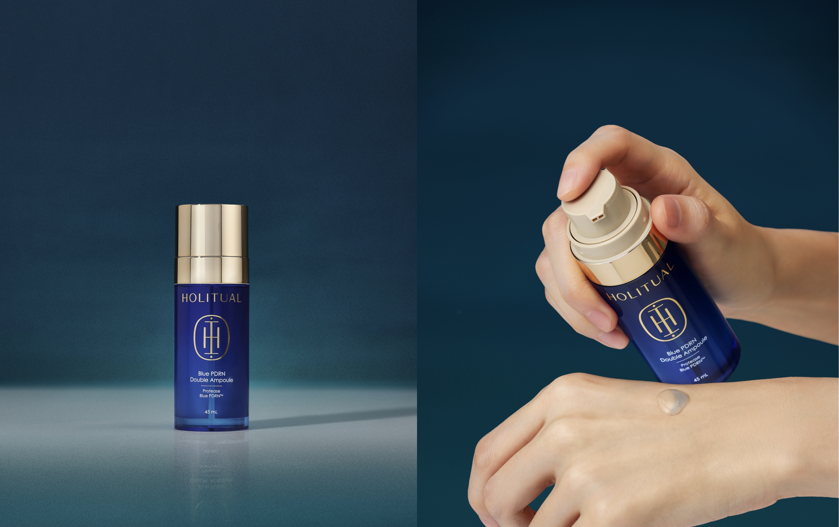
The overall visual mood is centered on the idea of “a noble transformation that unfolds while you sleep.”
Through a strong contrast of light and shadow, we sought to visualize this quiet moment.
Lighting that gently settles only around the container, as if seeping through the darkness, reveals the ampoule’s clear and deep blue hue with an elegance reminiscent of the depths of the sea.
Paired with a matte, subdued background texture, this creates a sense of visual stability, connecting the skincare experience to a moment of complete rest and ritual.
Generated by AI
Generated by AI
Generated by AI
- Amorepacific Creatives
- Design Directing
- Lee Hyejin
- Product Design
- Sun Hwajung
- BM
- Yoon Hana
- Development
- Son Bobae, Lee Inyoung
- Photography
- Studio 13