REFRAMING IOPE in MBS
Summary
In a beauty retail environment increasingly centered around MBS (Multi Brand Shop), IOPE carried out a set design renewal to rebuild the brand’s visibility and presence. In the previous brand-store-centered environment, the functionality and individual message of each product played an important role. However, in MBS environments such as Olive Young, it has become more important for the brand to be recognized quickly and read as a unified group.
Based on the newly elevated brand concept of “IOPE CLINICAL GRADE,” this project aimed to establish a new set design system centered on the brand logo and Clinical Visual Language.
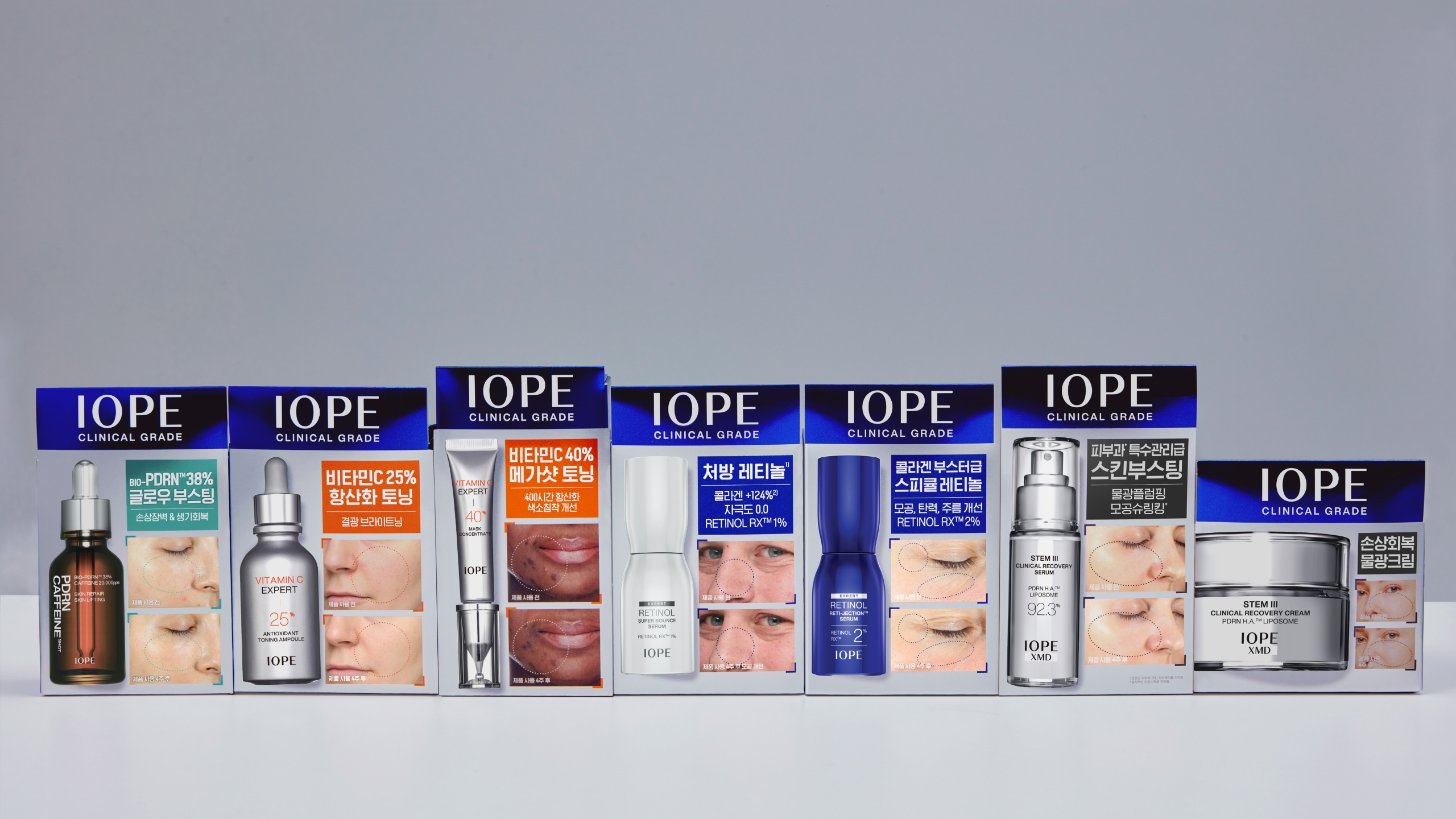
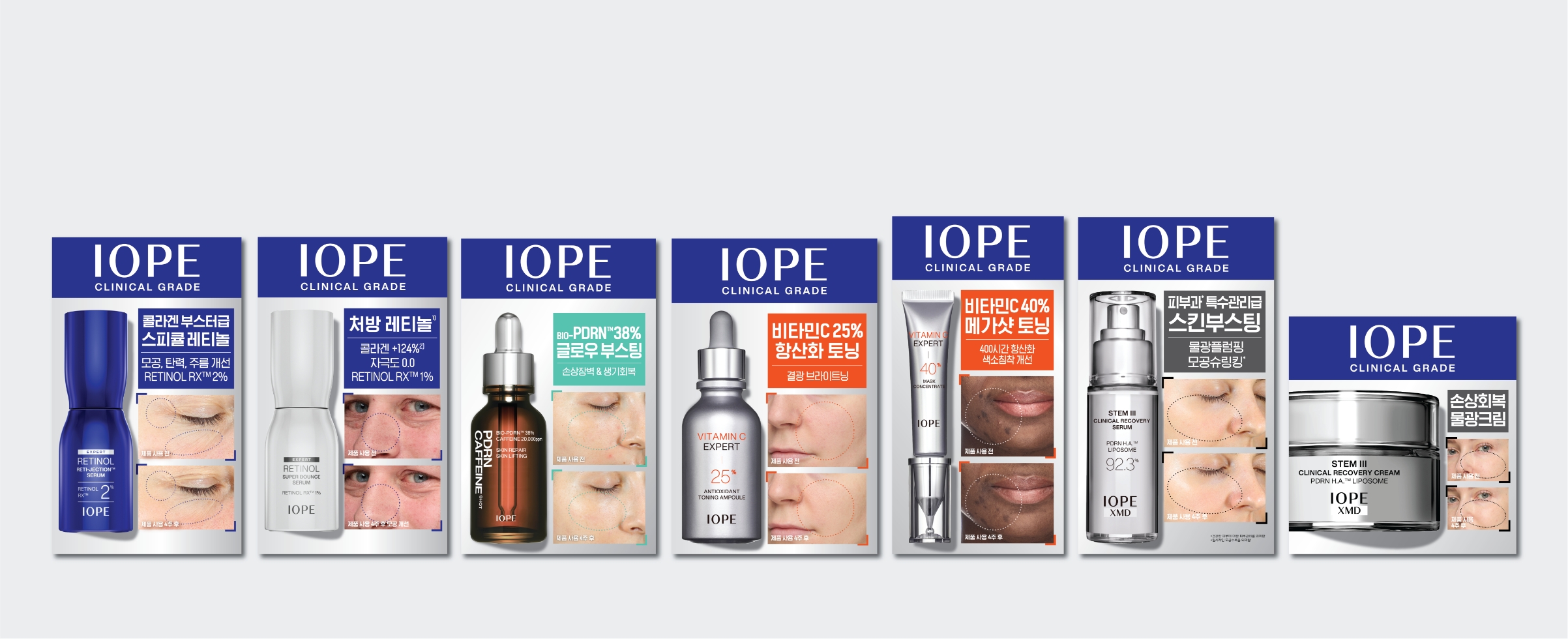
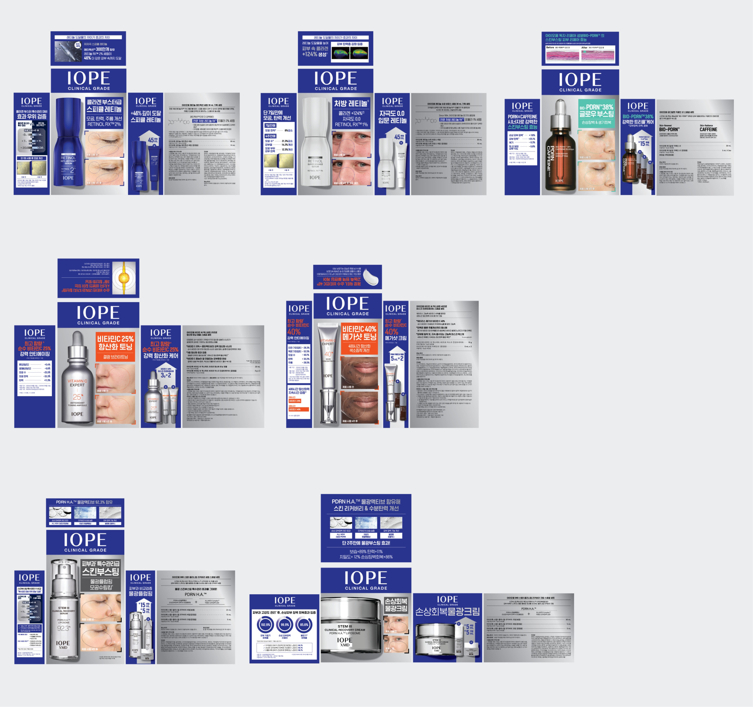
In particular, B&A (Before & After) images were actively used as a key visual asset to communicate the efficacy experience of dermatologist-level treatments more intuitively.
This renewal is not simply a change in set design, but a retail design strategy project intended to make the IOPE brand visible again within the changing MBS environment.
Based on the newly elevated brand concept of “IOPE CLINICAL GRADE,” this project aimed to establish a new set design system centered on the brand logo and Clinical Visual Language.
In particular, B&A (Before & After) images were actively used as a key visual asset to communicate the efficacy experience of dermatologist-level treatments more intuitively.
This renewal is not simply a change in set design, but a retail design strategy project intended to make the IOPE brand visible again within the changing MBS environment.
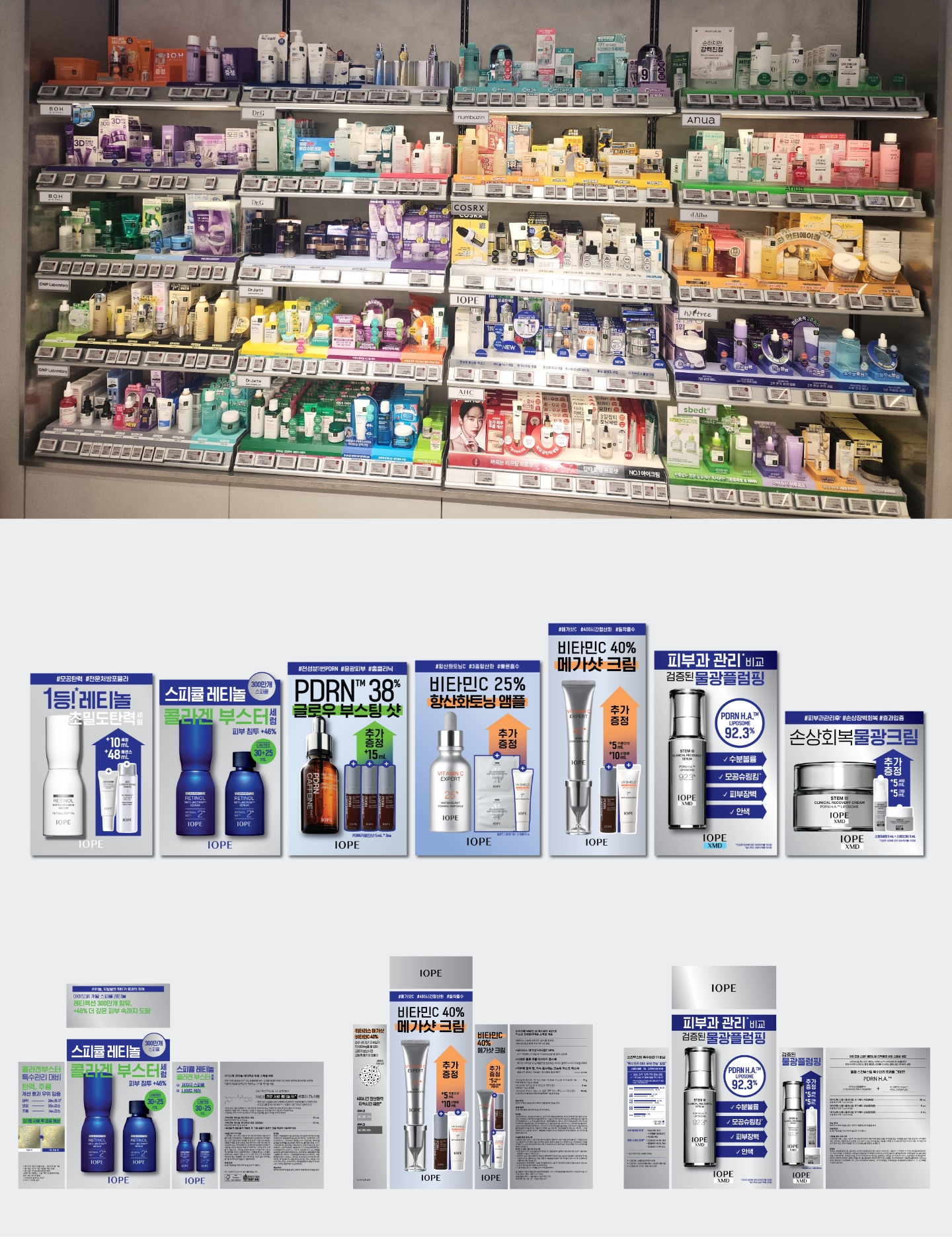
A Shelf Where the Brand Was Not Visible
The previous IOPE set design was based on a design language built for a brand-store-centered environment. At the time, placing the brand logo at the bottom of the package, or emphasizing each product’s individual character and functional message over the brand itself, was also used as a kind of trend. In retail environments centered around Aritaum and marts, consumers could naturally recognize the brand through brand signage and explanations from BAs (Beauty Advisors), so there was relatively less need for the package itself to strongly reveal the brand.
However, the situation changed completely in MBS environments such as Olive Young. In a structure where numerous brands compete within a single shelf, consumers had to explore products on their own without dedicated brand staff. In actual stores, the lower area of the package was often covered by price tags and VMD elements.
As a result, the IOPE brand logo positioned at the bottom was not sufficiently visible on the shelf, creating a situation in which it was difficult to quickly recognize the brand itself in-store. In addition, one-point copy with different sizes and structures for each product, along with gift information concentrated on the front, weakened the sense of brand consistency and created limitations in being perceived as a unified brand block within the shelf.
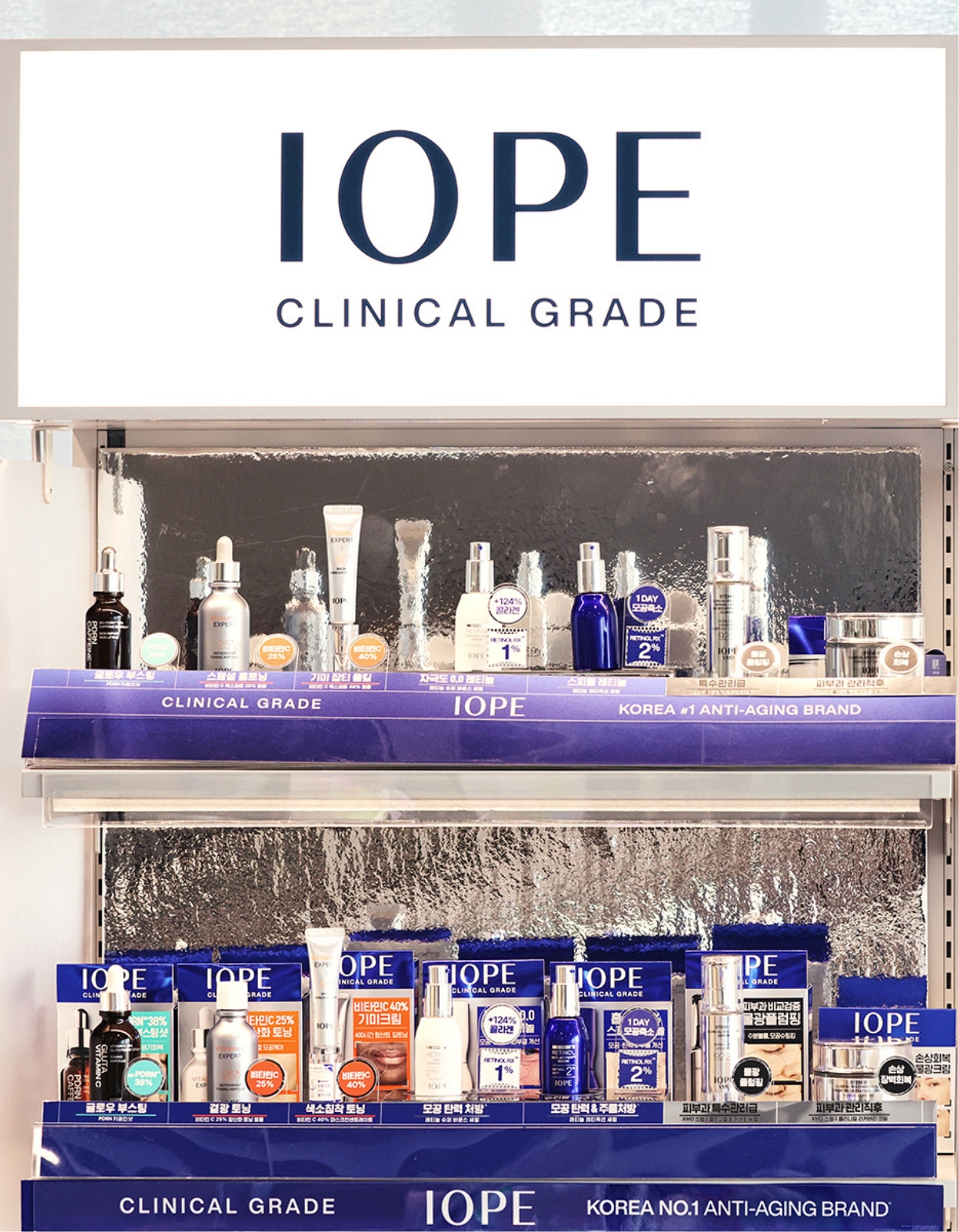
IOPE CLINICAL GRADE
Amid these changes, IOPE came to redefine the brand concept itself with greater clarity.
Moving beyond its existing position as a functional skincare brand, IOPE elevated its positioning as a Clinical Beauty brand that delivers an efficacy experience comparable to dermatological treatments. As a result, the newly defined brand slogan became “IOPE CLINICAL GRADE.”
Olive Young, in particular, also expected IOPE to play the role of a representative brand in the high-function, high-efficacy skincare category. This direction became an important starting point for the brand design renewal.
The most important goal of the new set design was singular:
“To make the IOPE brand the first thing visible in-store.”
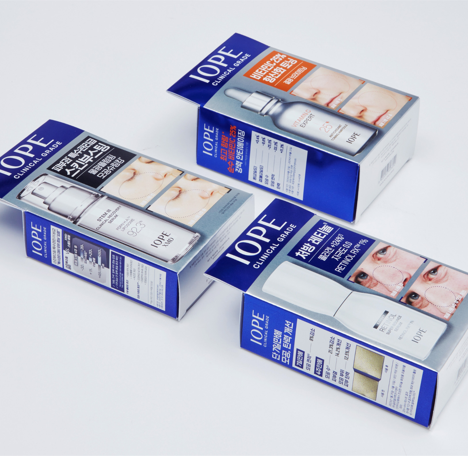
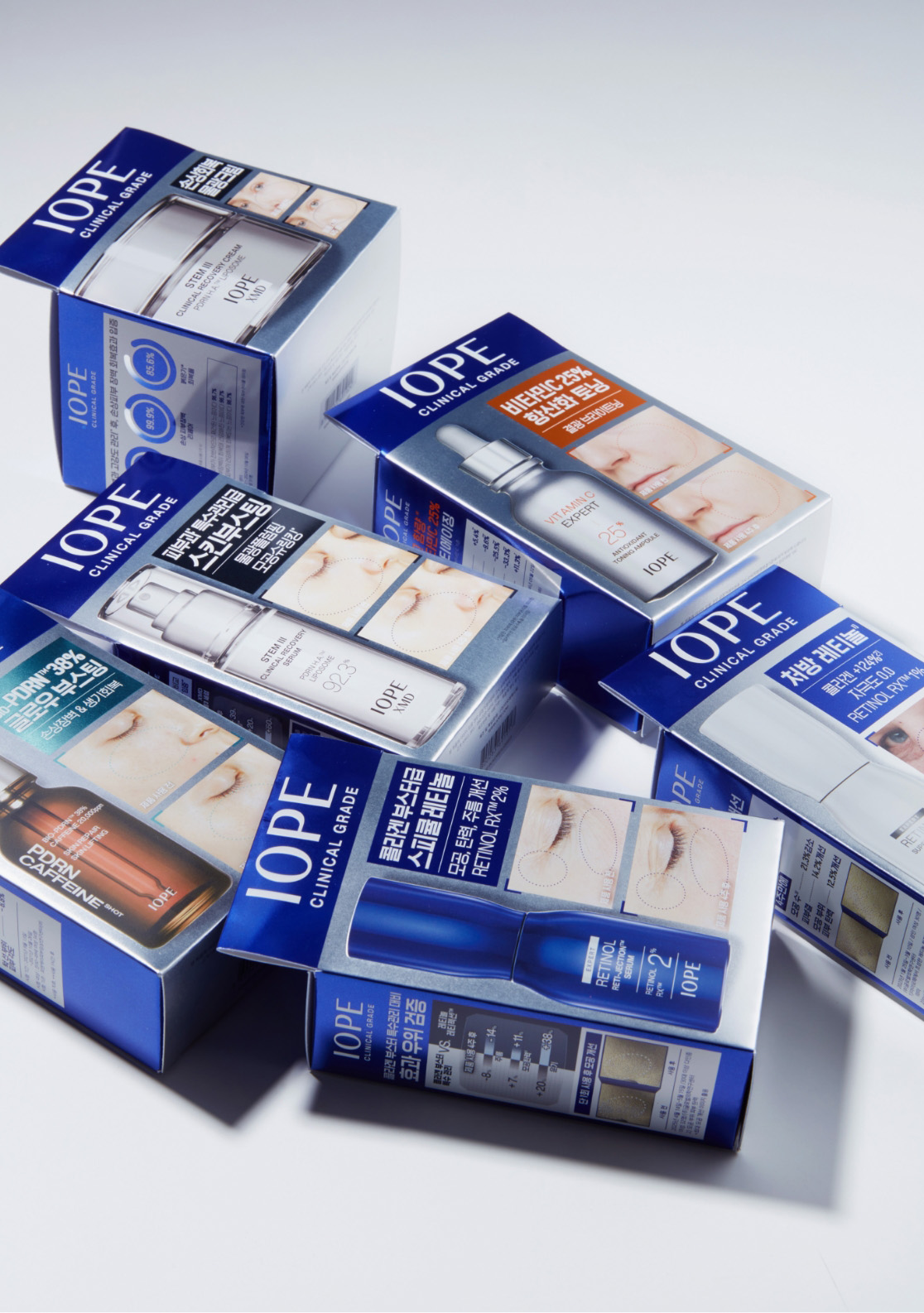
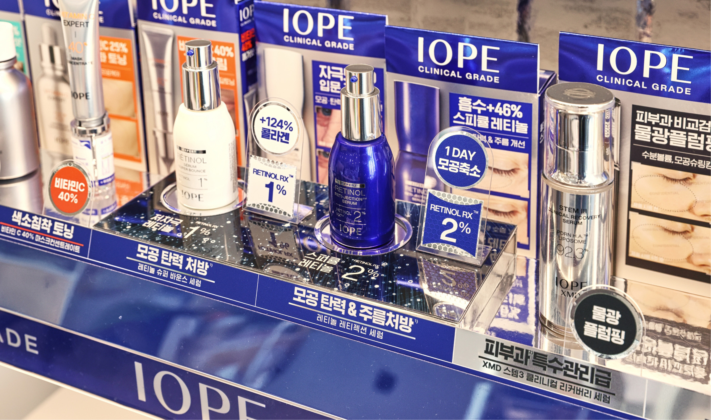
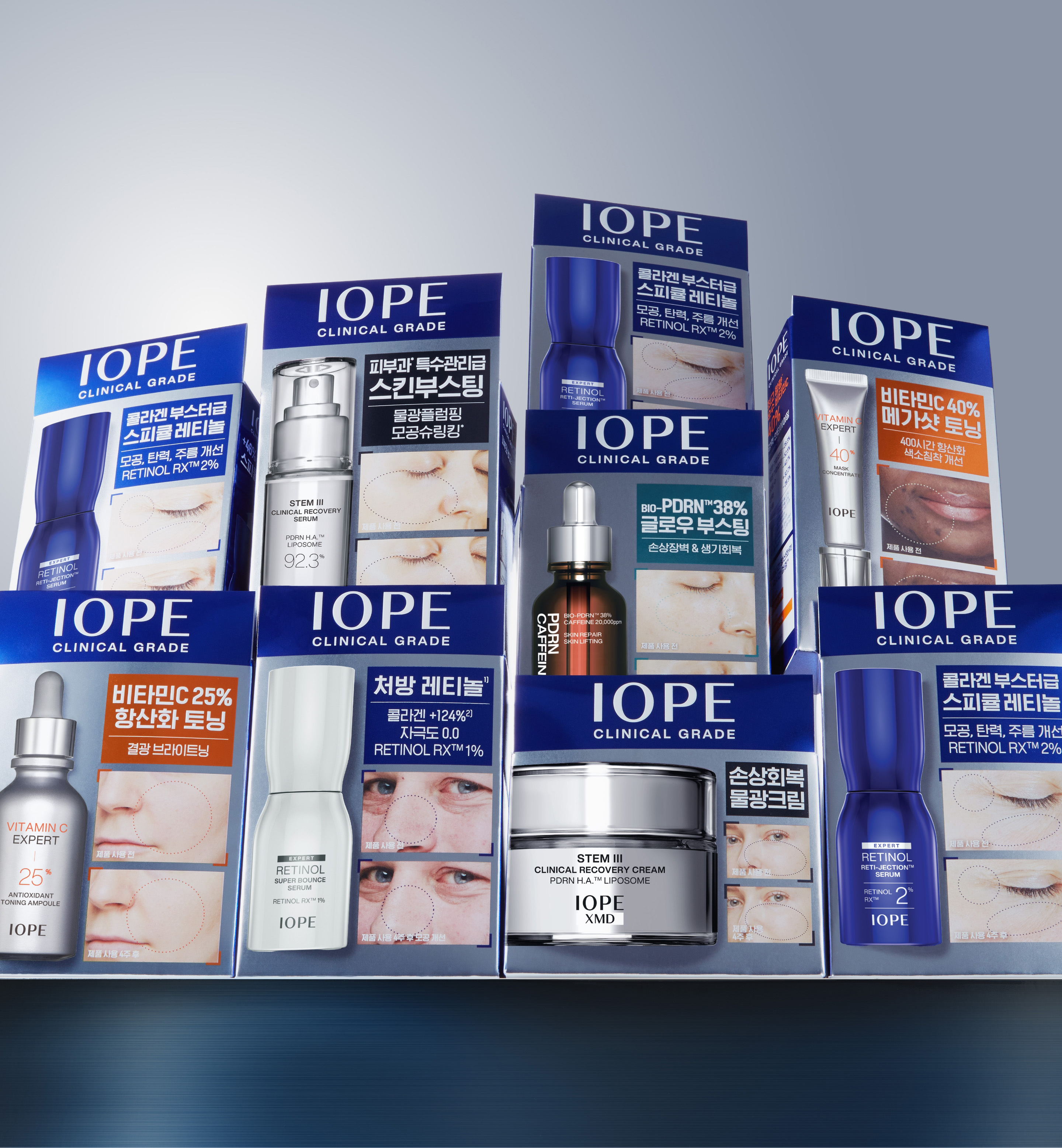
To achieve this, IOPE BLUE, the brand color, was applied across the entire upper area of the package, while the IOPE logo and “CLINICAL GRADE” slogan were placed prominently to maximize the brand’s presence.
Whereas previous set designs prioritized the exposure of promotional information or product function messages, this renewal was designed so that the brand itself would function as a strong visual sign.
Moving beyond its existing position as a functional skincare brand, IOPE elevated its positioning as a Clinical Beauty brand that delivers an efficacy experience comparable to dermatological treatments. As a result, the newly defined brand slogan became “IOPE CLINICAL GRADE.”
Olive Young, in particular, also expected IOPE to play the role of a representative brand in the high-function, high-efficacy skincare category. This direction became an important starting point for the brand design renewal.
The most important goal of the new set design was singular:
“To make the IOPE brand the first thing visible in-store.”
To achieve this, IOPE BLUE, the brand color, was applied across the entire upper area of the package, while the IOPE logo and “CLINICAL GRADE” slogan were placed prominently to maximize the brand’s presence.
Whereas previous set designs prioritized the exposure of promotional information or product function messages, this renewal was designed so that the brand itself would function as a strong visual sign.
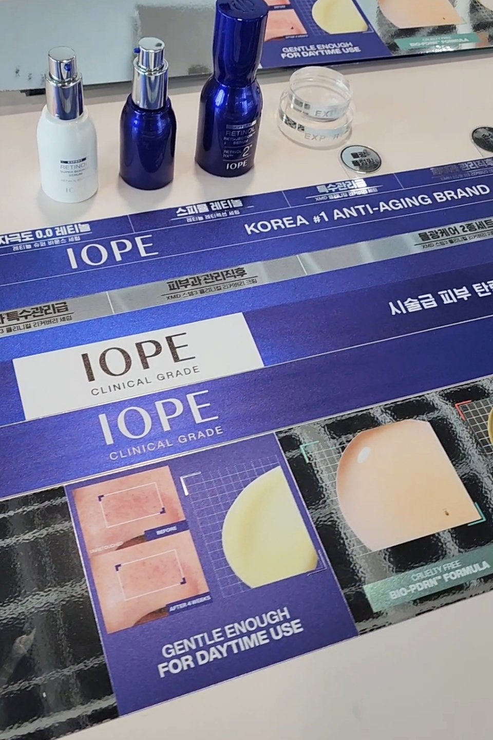
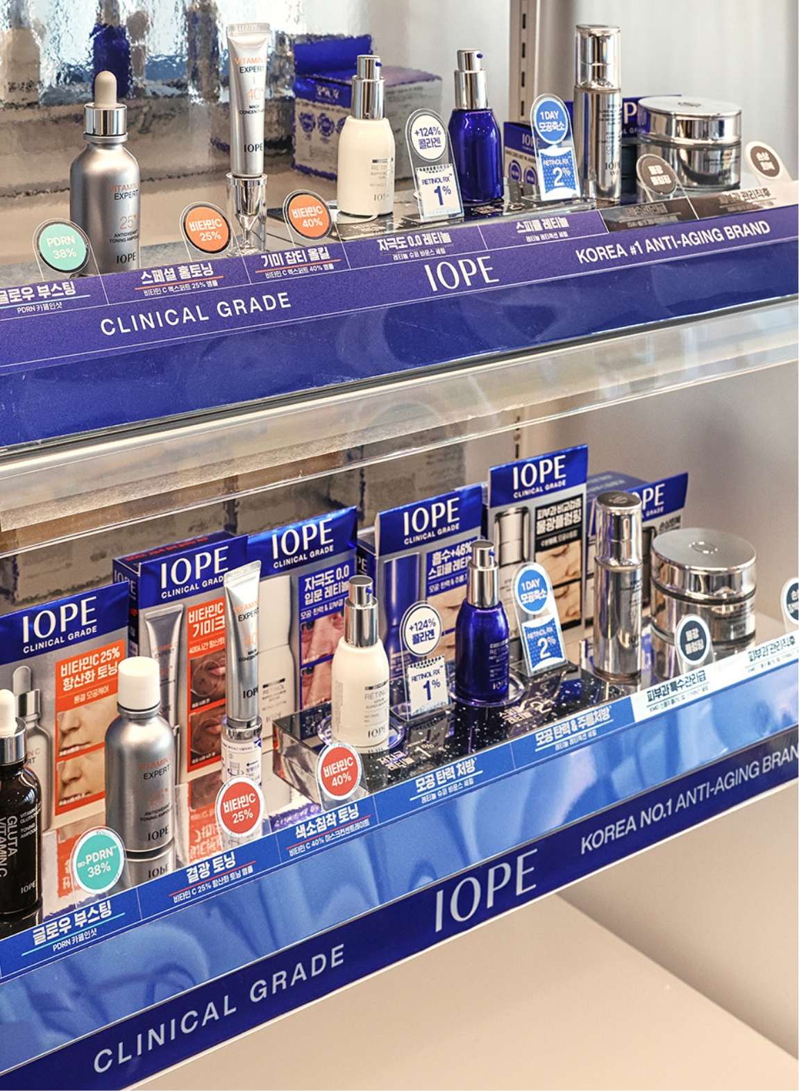
Clinical Visual Language
Another key change in this renewal was the active use of B&A (Before & After) images.
Although IOPE already had various clinical-based images and efficacy data within the brand, they had only been used in a limited way on actual packaging. In contrast, in global beauty retail environments, particularly at Sephora, B&A images were being actively used as a key visual language for communicating brand efficacy. Their use was expanding rapidly, to the point where entire retail spaces were being structured around efficacy-centered communication.
At the time, however, there were still not many cases in the domestic MBS environment where B&A images were actively used on the front of packaging. In most cases, they remained limited or supplementary. Within this market context, IOPE sought to proactively introduce a B&A visual language as the most intuitive way to communicate the brand concept of Clinical Grade.
As a high-function skincare brand aiming to deliver an efficacy experience comparable to dermatological treatments, directly showing skin changes before and after product use was considered the clearest way to communicate the brand’s technology and efficacy credibility. At the same time, this was also a strategic attempt to build a more distinct brand position for IOPE within the high-function, high-efficacy skincare category.
On the front of the product, skin-change images were boldly placed alongside product cuts so that consumers could recognize the product and its efficacy at the same time. The one-point copy for each product was also organized within a consistent structure and typography system, while copy length was limited to strengthen the grouping effect and brand consistency on the shelf. A product-specific color system was applied to ensure clear SKU differentiation, while the overall design was intended to be perceived as a unified Clinical Grade brand block.
A Design System Considering the MBS Environment
In this renewal, the actual display environment of Olive Young stores was also an important consideration.
Because products are often displayed sideways or laid flat within narrow shelf structures, IOPE BLUE and the brand logo system were applied consistently to the side design as well, allowing the brand to be recognized from any direction. In addition, efficacy information and clinical data that could not all be included on the front were placed on the left side and upper areas, enabling consumers to naturally check additional product information.
The information hierarchy was reorganized so that the front intuitively communicates the brand and efficacy, while the side serves to supplement credibility information as a Clinical Grade brand.
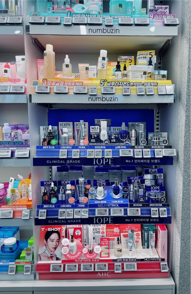

VMD Renewal for Retail Visibility
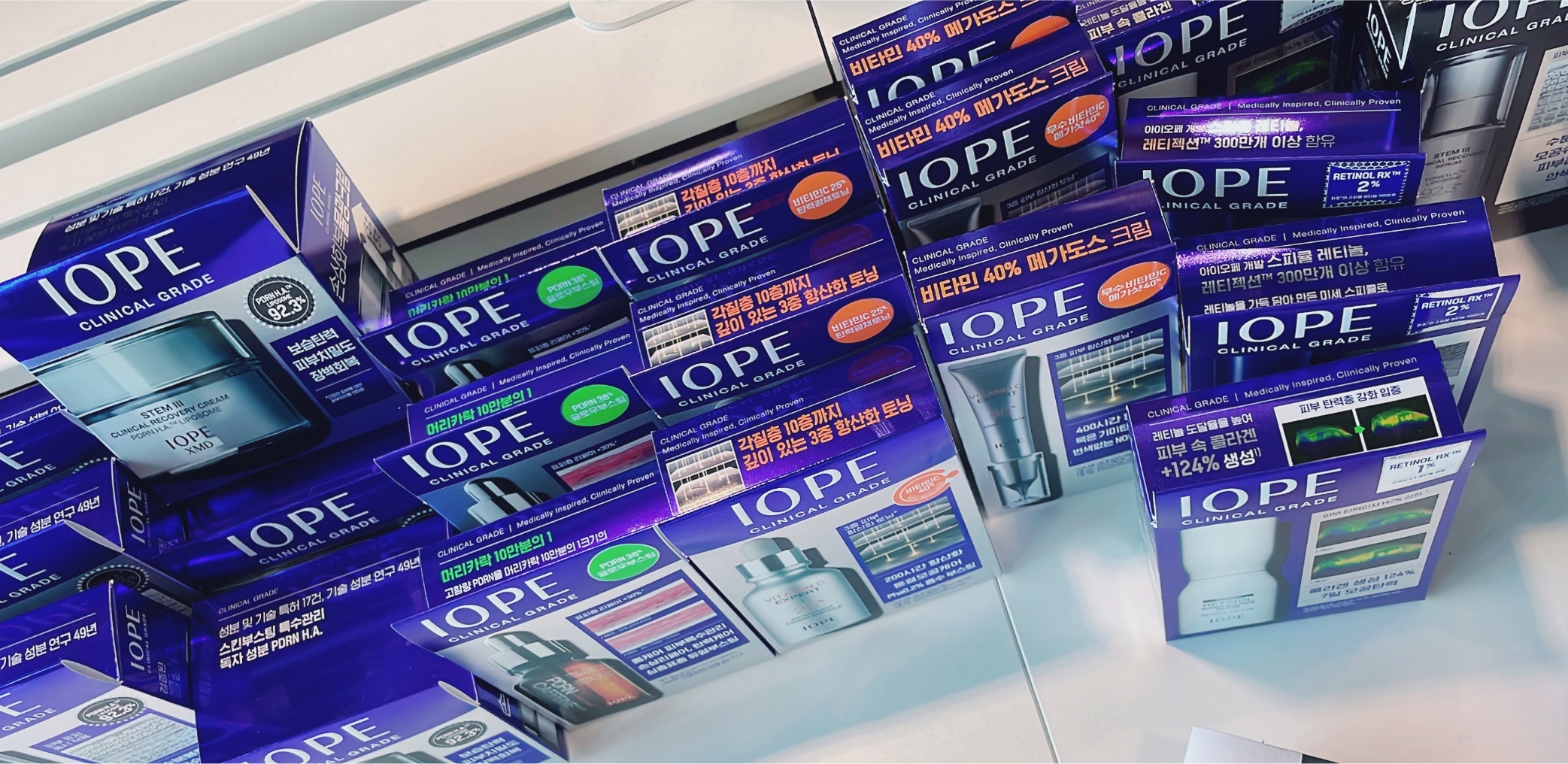
In this renewal, the VMD within Olive Young stores was also reorganized together with the set design.
In an MBS environment, where customers need to recognize the brand and products within a short period of time, we focused on reviewing a VMD structure that could more intuitively communicate IOPE’s “Clinical Grade” direction. To do this, we conducted competitor and retail environment analyses, along with various sampling tests for color, materials, and graphic elements.
The previous silver-centered VMD had the advantage of conveying a clinical and premium mood, but in the actual Olive Young environment, it had limitations in terms of visibility. As a result, IOPE BLUE, the same key color used in the set design, was ultimately applied as the main color to strengthen brand recognition and the color-blocking effect within the store.
Considering that the set design already contained various efficacy information and Clinical Visual Language, the VMD was designed to focus more on helping consumers explore products intuitively. One-point copy and navigating elements were organized concisely so that hero products, key ingredients, and efficacy points could be recognized quickly. Through this, the renewal aimed to further strengthen IOPE’s professional and premium image as a Clinical Beauty brand.
Making the Brand Visible Again
The renewed set and VMD designs also received positive responses during actual in-store testing.
Consumers were able to recognize the IOPE brand more easily in-store and approach it directly. Even when multiple SKUs were displayed together, the design created a strong grouping effect and effectively revealed the brand’s presence.
This renewal was not simply a design change, but a process of rebuilding the design language of the brand-store era into a Clinical Beauty Retail System suited to the MBS environment.
Going forward, IOPE aims to continue expanding its design strategy to deliver a clearer and more intuitive brand experience within the changing global retail environment.
- Amorepacific Creatives
- Design Directing
- Lee OhKyung
- Product Design
- Park Kyungmi, Kim Seongeun
- VMD Design
- Lee Jihye
- BM
- Park Soojin, Shin Bomi, Park Jihyun
- Development
- Kim Kinam
- Photography
- Kim Kwangrae