
IOPE Derma Trouble Line
아이오페 더마트러블라인
Summary
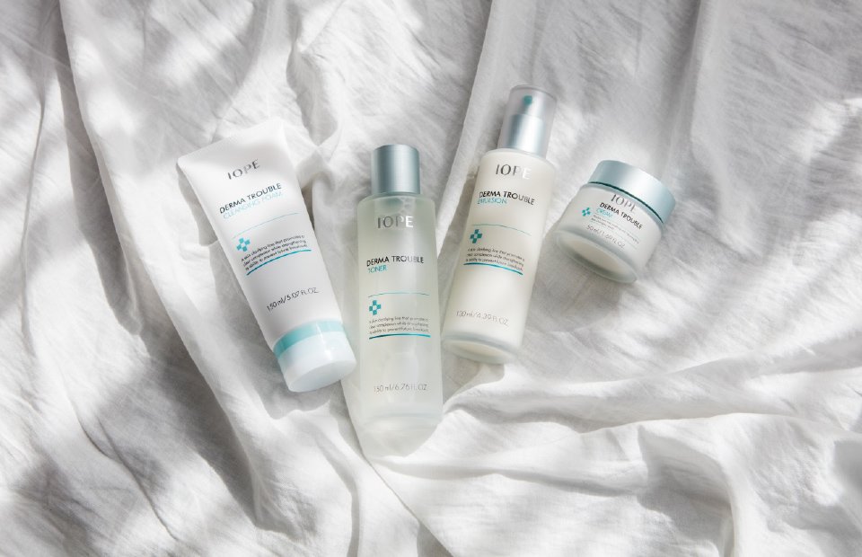
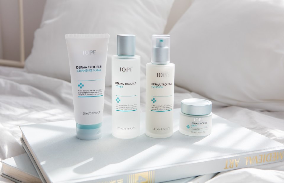
마니아층이 확실했던 기존 트러블 클리닉 라인 사용 고객과 민감성 피부를 가진 신규 고객 모두를 만족시킬 신규 Derma Trouble 라인의 요소가 무엇일지 고민했습니다. 기존 아이오페의 트러블 클리닉 라인 용기는 기존 그래픽 로직과는 조금 다르게 십자가와 문안이 배치되어 있었습니다. 이번 Derma 라인은 글씨가 많아 다소 복잡했던 그래픽을 깔끔하게 정리하였고, 반투명한 무광의 용기와 민트 컬러의 금속캡을 이용하여 기존 아이오페 클리닉 라인의 컬러를 보다 세분화하였습니다. 또한 내용물의 색상이 그대로 보일 수 있도록 하여 기능적인 느낌을 줍니다.
We at AmorePacific thought hard about what would be the better, newer elements of the Derma Trouble line to satisfy both existing customers who loved the Trouble Clinic line and new customers with sensitive skin. The container used for the existing IOPE’s Trouble Clinic had a cross and words that were slightly different from most containers. We cleaned up rather complicated-looking graphic elements of the new Derma line, and using semi-transparent matte containers and metal caps in mint green, the existing colors of the IOPE Clinic line were segmented. The cosmetic content made visible to users makes the product appear more functional.
- Amorepacific Creatives


