
IOPE ideal cleansing line
아이오페 아이디얼 클렌징 라인
Summary
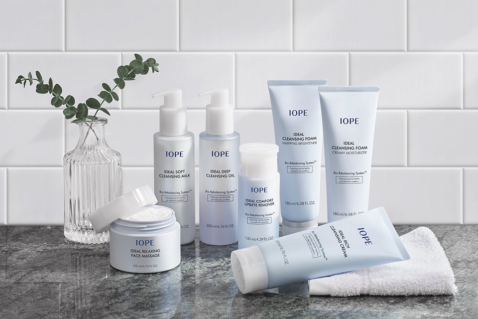
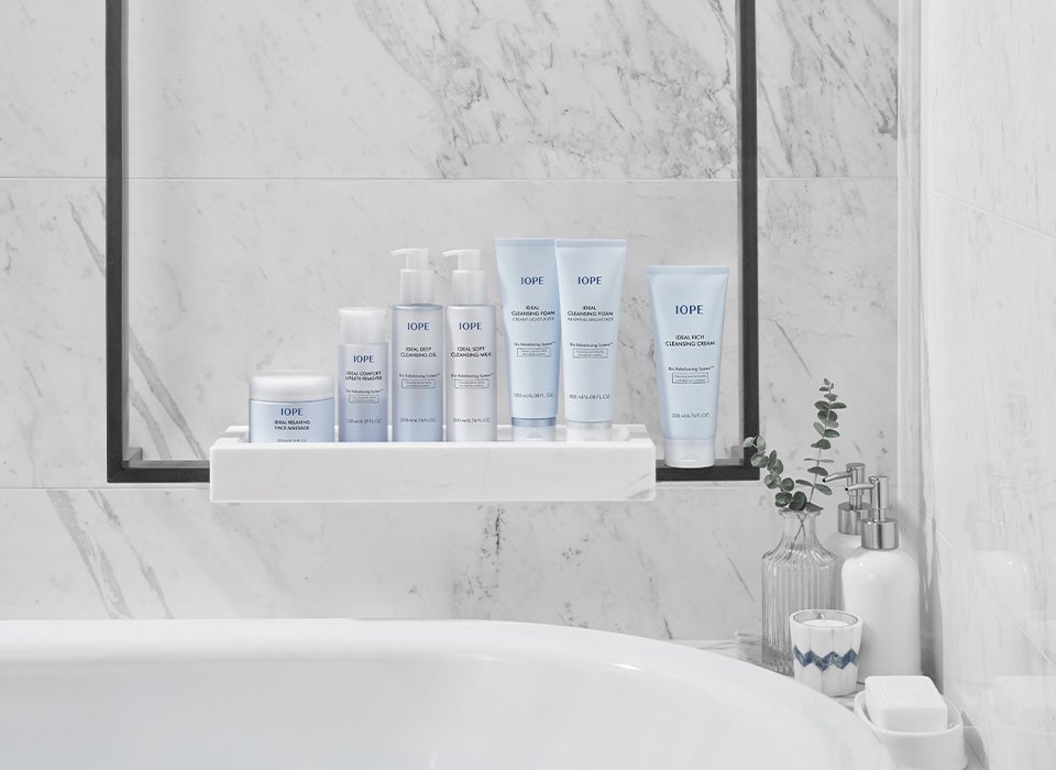
기존 아이오페의 클렌징 라인은 용기의 형상과 컬러 모두 전체적으로 통일감이 부족하였습니다. 그리하여 아이오페의 클렌징 라인을 전체적으로 AD 하면서 라인을 아우를 수 있는 키 컬러를 재정립하였습니다.
Overall, the existing IOPE cleansing line lacked a sense of unity in the shape of containers and theme colors. Thus, we AD IOPE’s cleansing line while reestablishing the main colors that not only help advance the image of the brand’s cleansing line but also harmonize the entire line.
Concept
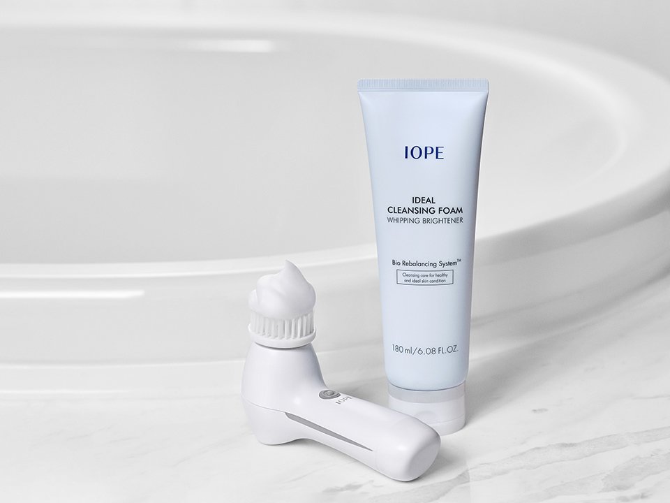
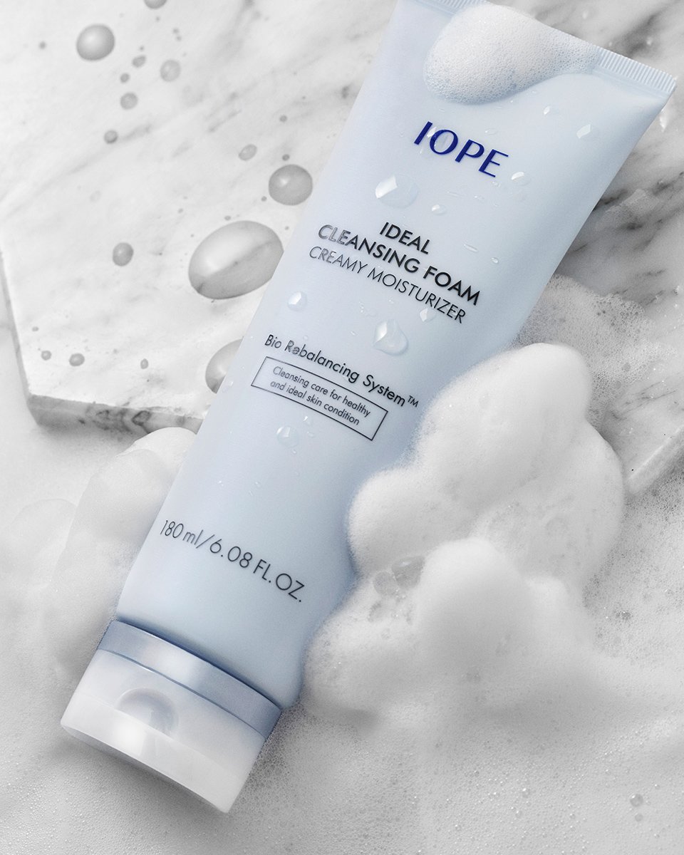
기존 아이오페 클렌징 라인에서 사용된 화이트 용기의 이미지를 새롭게 환기할 신규 컬러와 재질을 채택함으로써, 피부 본연의 힘을 기르고 수분 증발을 억제하는 고기능성 클렌징 콘셉트를 부각시켰습니다. 수분감과 기능성이 강화된 제품력을 표현할 수 있는 컬러로 파스텔블루가 가장 적합하다고 생각하여 Light Blue 컬러를 클렌징 라인의 대표 컬러로 지정하였으며, 깨끗하고 상쾌한 사용감을 나타내는 반투명 화이트 컬러의 캡과 조화를 이룰 수 있도록 하였습니다.
We chose new colors and textures that can refresh the image of white containers used for the existing IOPE cleansing line in order to highlight the highly functional concept of cleansing, which helps strengthen skin’s innate power and control the evaporation of moisture. We believe pastel blue as the main color is appropriate to express the power of products fortified with moisturizing effects and functions, so we designated light blue as the representative color of the cleansing line. In addition, we tried to create beautiful harmony with the semi-transparent white cap designed to reflect the clean and refreshing feelings that customers get when applying the cleanser.
- Amorepacific Creatives


