Sulwhasoo Perfecting Cushion AD
설화수 퍼펙팅 쿠션 AD
Summary
설화수 퍼펙팅 쿠션의 사용감 및 효능 업그레이드로 '커버 보습' 포지셔닝 재구축이 진행되었습니다. 기존 고객 로열티 강화 및 대표 엔트리 상품 군으로
신규 고객 유입을 확대하였으며, 글로벌 경쟁력 확보를 위한 원료, 기술 보완 및 컬러 쉐이드 또한 확대하였습니다. 특히 디자인 매력도를 제고하여 최적 어플리케이터 도입 등 디테일 요소를 강화하였습니다.
“Cover moisture” is repositioned with the upgrade of the application feel and effects of Sulwhasoo
Perfecting Cushion. It has led to strengthening existing customers’ loyalty and drawing new customers
to the groups of representative entry products. To secure global competitiveness, ingredients, technologies,
and color shades are expanded as well. In particular, detailed elements such as introduction of optimal applicators
are improved in order to improve the attractiveness of designs.
Concept
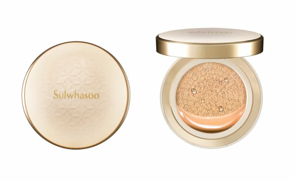
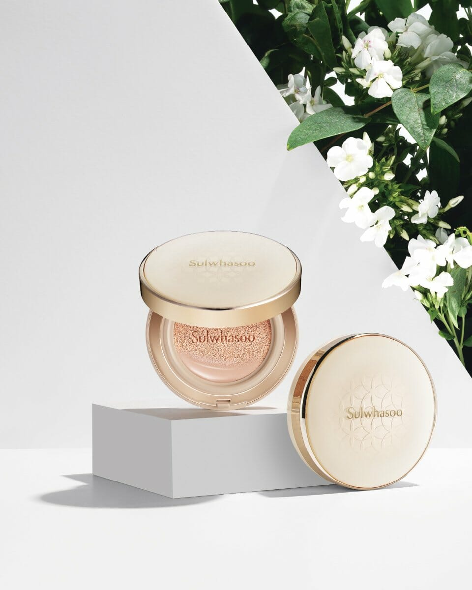
퍼펙팅 쿠션 AD에서는 먼저 기존 쿠션의 둥근 실루엣을 유지한 형태 업그레이드를 통해 감성적인 브랜드 이미지를 전달합니다. 밝은 스킨톤 컬러를
사용해 높은 커버력으로 도자기같은 피부결을 구현하는 제품력을 표현하는 동시에 여성스럽고 부드러운 느낌을 표현하였습니다. 또한 명판 내측 꽃살패턴 성형으로 설화수만의 쿠션의 아이덴티티 확보와
부자재 디테일에서 브랜드 아이덴티티를표현(리필용기, 씰링지, 스펀지)합니다.
In the aspect of Perfecting Cushion AD, a sensible brand image is delivered by upgrading the shape while maintaining the round
silhouette of the existing cushion. A bright skin tone color is used to provide high coverage while expressing porcelain-smooth
skin and feminine, soft feel. The flower and plant pattern inside the name plate is used to express the identity of
Sulwhasoo cushion, and the details of subsidiary materials express the identity of the brand (refill container, sealing
sheet, and sponge).
- Amorepacific Creatives