Beauty Point Week Identity Design
뷰티포인트 위크 아이덴티티
Summary
뷰티포인트 10주년을 기념하여 진행된 뷰티포인트 위크의 아이덴티티 작업을 진행하였습니다.
To celebrate the 10th anniversary of beauty point, the identity of beauty point week is implemented.


Concept
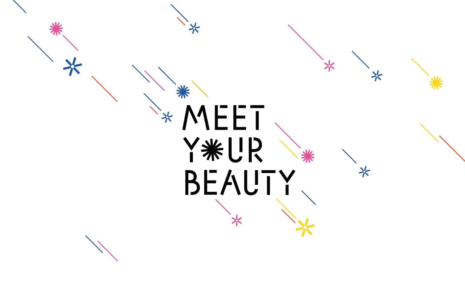
뷰티포인트 기간동안 포인트가 적립되어 쌓이고 늘어나며 다양하게 소비되는 것을 모티브로 표현했습니다.
‘POINT’라는 단어에서 ‘O’를 점점 쌓여가는 포인트로 표현하여 변화하는 워드마크를 만들었습니다. 또한 워드마크에서 보여지는 ‘O’의 변화가 통통튀는 컬러와 패턴으로 이어지며 뷰티포인트 위크동안의 누릴 수 있는 다양한 혜택들을 즐거운 무드로 표현하였습니다.
‘POINT’라는 단어에서 ‘O’를 점점 쌓여가는 포인트로 표현하여 변화하는 워드마크를 만들었습니다. 또한 워드마크에서 보여지는 ‘O’의 변화가 통통튀는 컬러와 패턴으로 이어지며 뷰티포인트 위크동안의 누릴 수 있는 다양한 혜택들을 즐거운 무드로 표현하였습니다.
The accumulation of points during the beauty point period and various forms of consumption are expressed as motifs.
From the word “POINT,” the letter “O” was used to express points that accumulate gradually and is made into a word mark that changes. In addition, the change of “O” that is visible from the word mark is connected to noticeable colors and patterns, and various benefits that can be enjoyed during the beauty point week are expressed in an enjoyable mood.
From the word “POINT,” the letter “O” was used to express points that accumulate gradually and is made into a word mark that changes. In addition, the change of “O” that is visible from the word mark is connected to noticeable colors and patterns, and various benefits that can be enjoyed during the beauty point week are expressed in an enjoyable mood.
- Amorepacific Creatives