
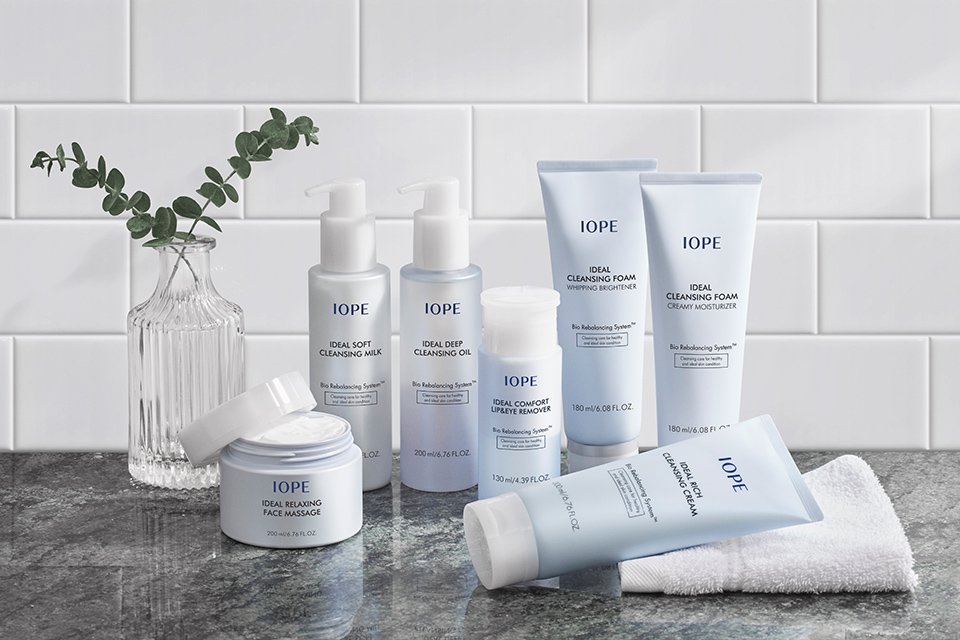
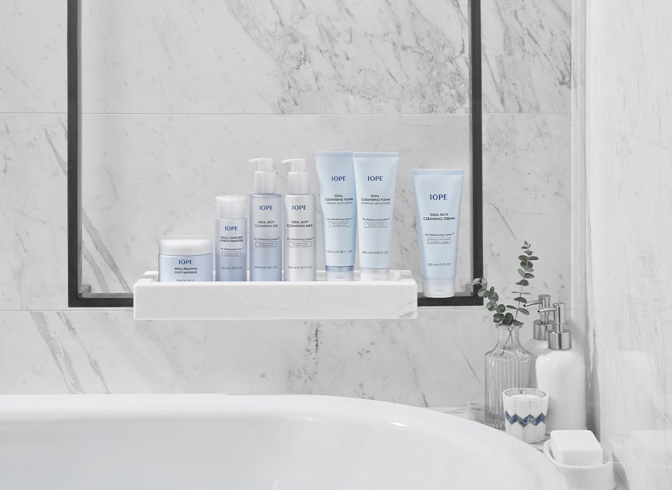
IOPE ideal cleansing line
Summary
Overall, the existing IOPE cleansing line lacked a sense of unity in container shape and theme colors. Thus, we redesigned IOPE’s cleansing line by reestablishing the main colors to not only elevate the brand image but also create harmony across the entire line.
Concept
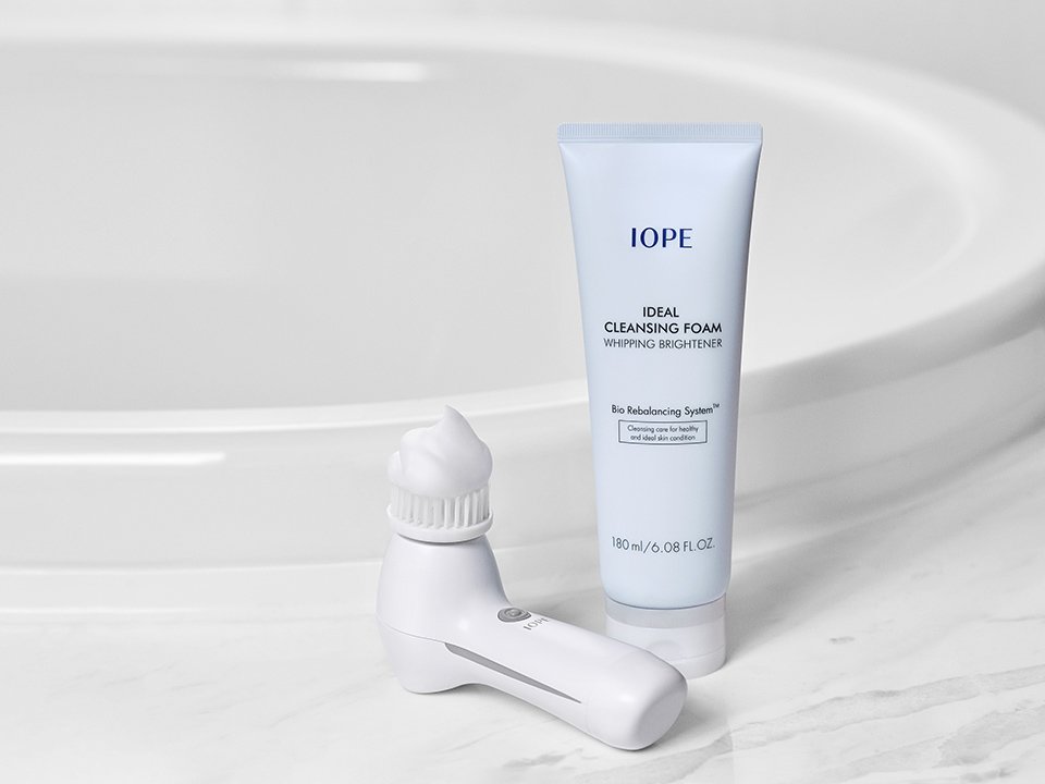
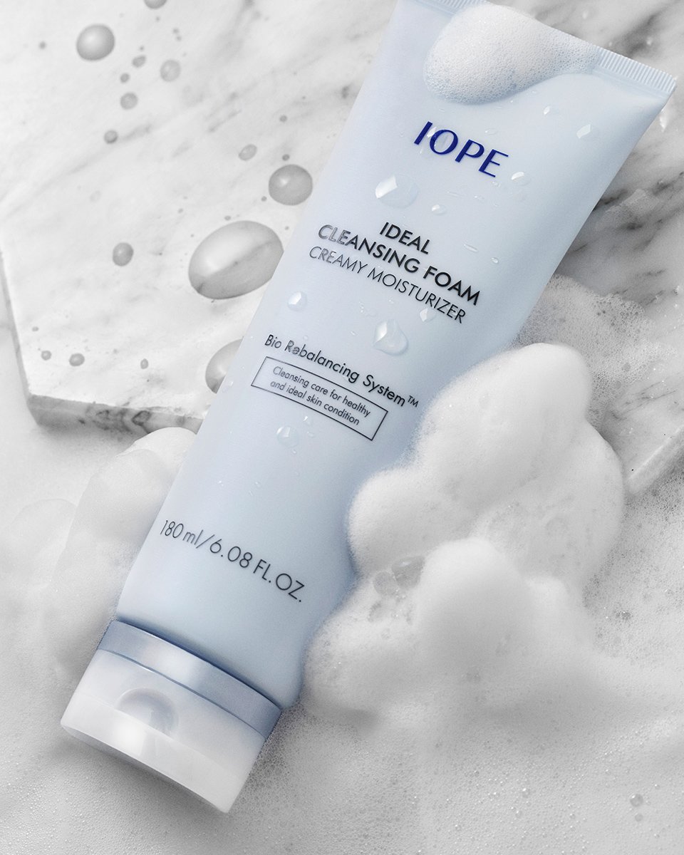
We selected new colors and textures to refresh the image of the previous white containers, aiming to emphasize the highly functional concept of cleansing—strengthening the skin’s natural power and preventing moisture loss. We believe pastel blue is the right choice to represent products enhanced with moisturizing properties, so we designated light blue as the signature color of the cleansing line. Additionally, the semi-transparent white cap was designed to reflect the clean and refreshing feeling users experience when applying the cleanser, creating a harmonious and polished look.
- Amorepacific Creatives


