
IOPE Retinol
Summary
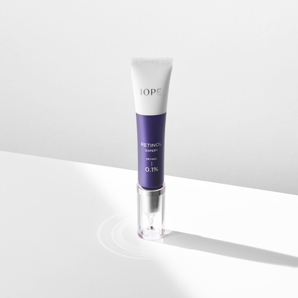
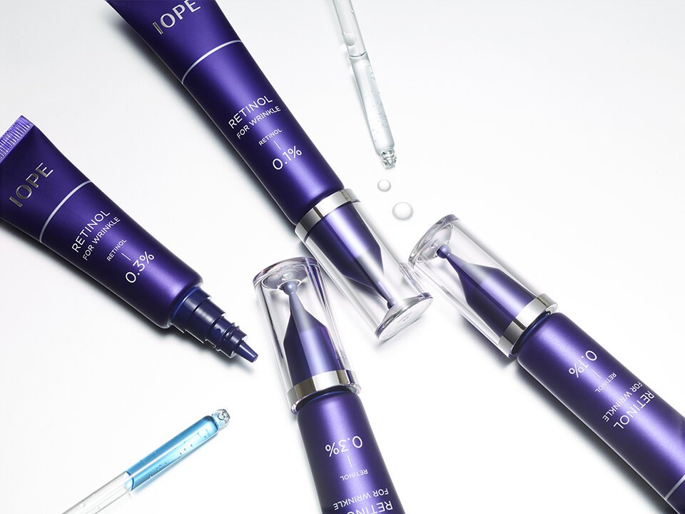
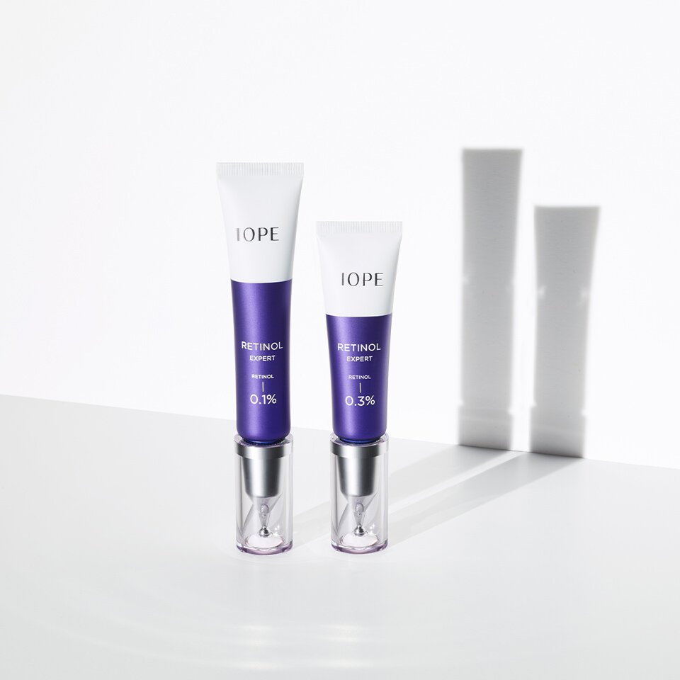
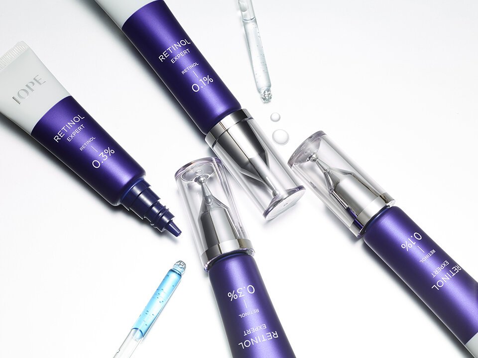
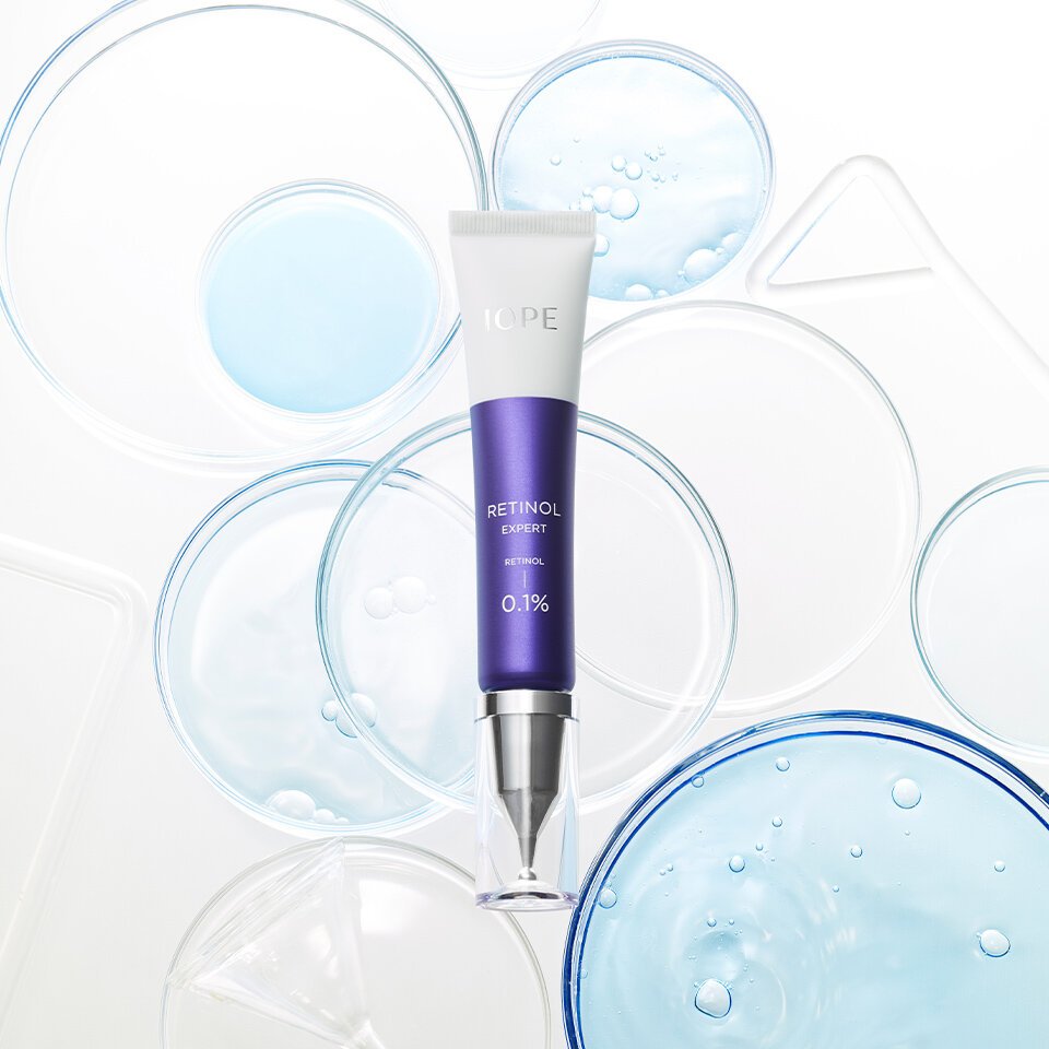
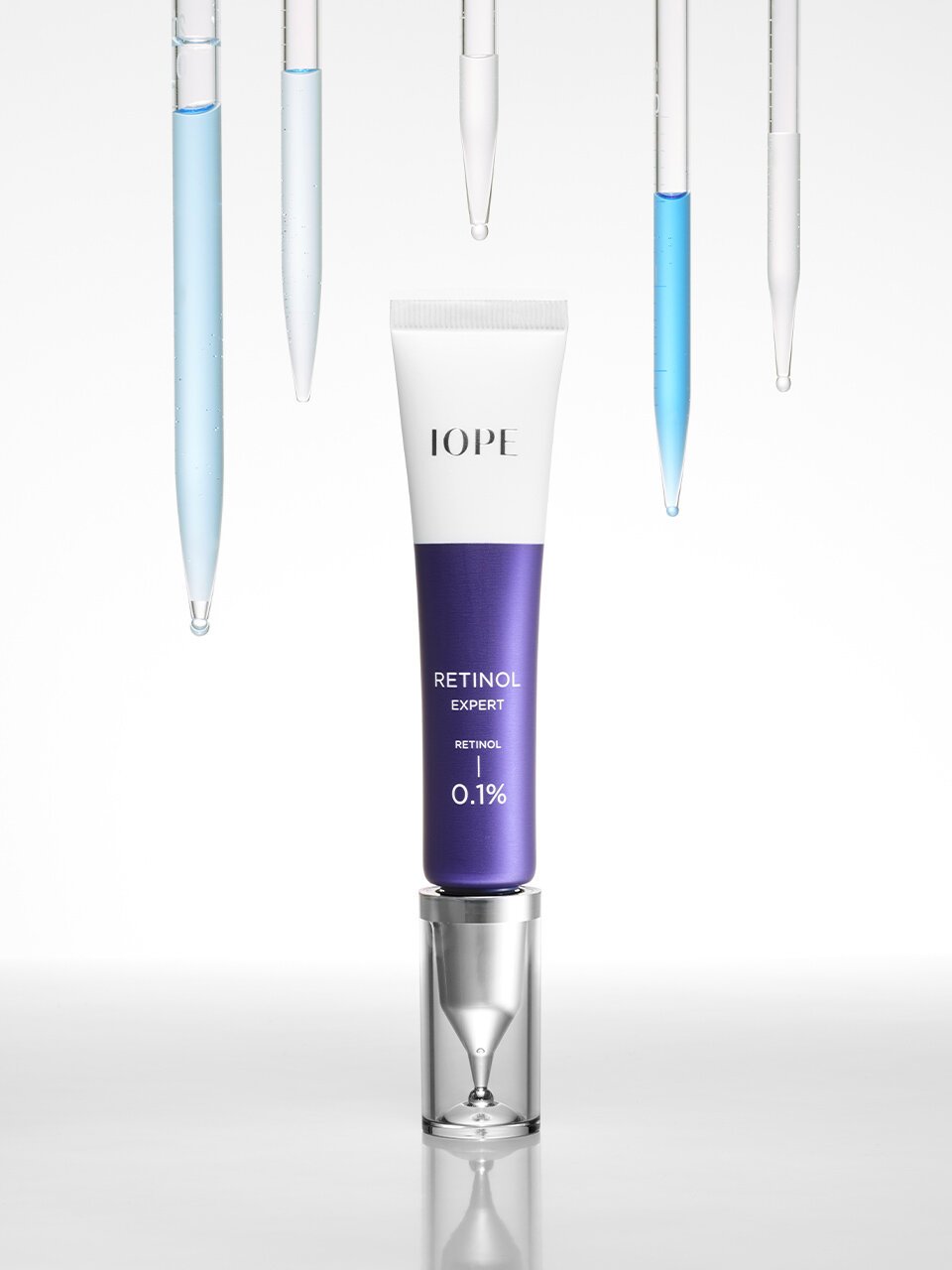
To celebrate the 20th anniversary of IOPE Retinol and the launch of its 10th-generation renewal, the two-tone white and IOPE blue color scheme symbolizes both the brand’s heritage and its cutting-edge technology. The design, with its stable upright cap proportions, reflects IOPE’s botanical science and features a form reminiscent of a syringe—an object commonly associated with laboratories.
Concept
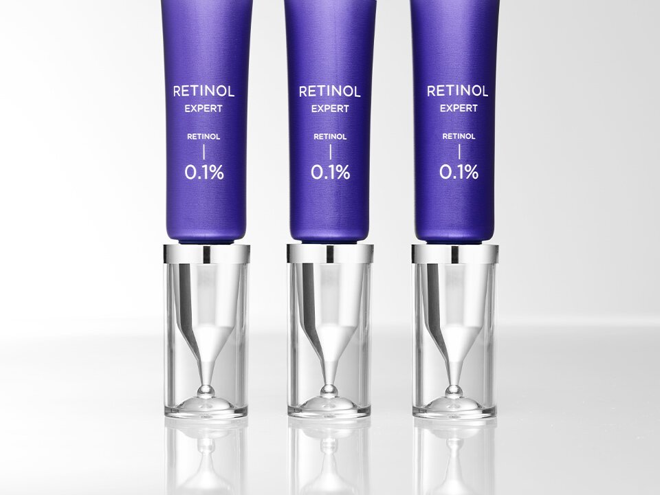
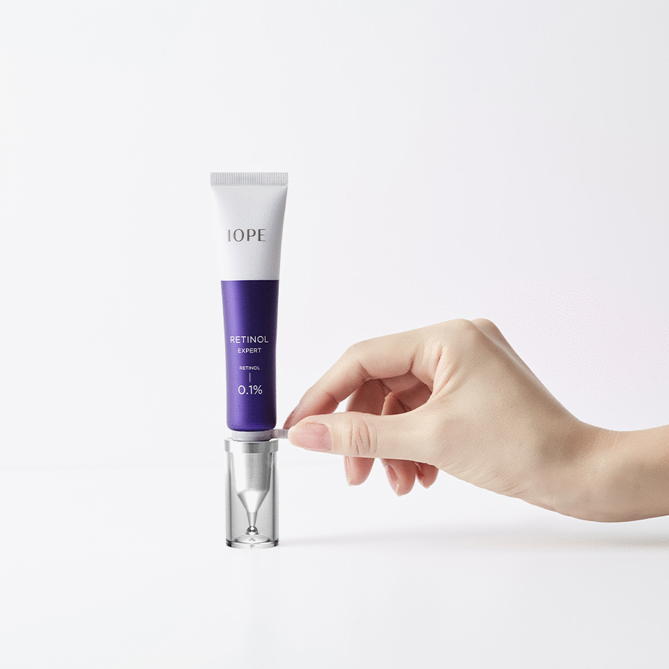
The design embodies the rational and functional elements that IOPE values. Most notably, maintaining the potency of retinol requires perfect airtightness. To achieve this, a new applicator with a metal insert structure was developed in collaboration with the packaging development team. A handle-shaped stopper was also added to give users a clear “first-time opening” experience. While the tube and cap specifications remain the same as previous versions, the cap has been redesigned with proportions that allow it to stand upright more stably. The inner cap was crafted to resemble a filter or wrap element, visually conveying the idea of the core ingredients being carefully filtered and delivered.
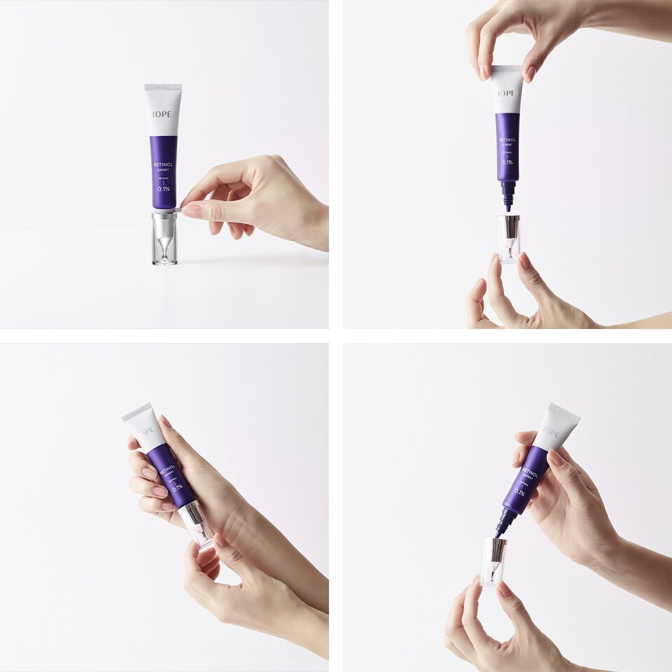
Usage Image: Remove the stopper, pierce the metal insert, and open the cap.
- Amorepacific Creatives


