Illiyoon Ceramide ato Body wash
Summary
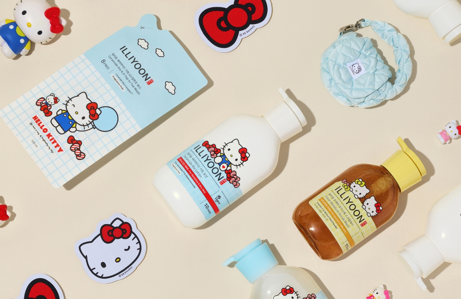
As ILLIYOON’s Ceramide Ato line continues to grow and diversify, a design overhaul was needed to help consumers intuitively distinguish between different product types.
We established a design logic for the full range—including body lotion, body wash, and bubble wash—and enhanced product detail through revised container finishes and color updates.
Concept
The primary objective was to minimize user inconvenience. Previously, the similar appearance of the lotion and body wash led to consumer feedback that they were hard to tell
apart without reading the label. To resolve this, the body wash now features a transparent container, allowing for immediate visual recognition. Secondly, we established a
cohesive design logic for the Ceramide Ato line, ensuring a clear “family look” so that the positioning of each product is easily understood without additional explanation.
Lastly, to improve visibility both online and offline, we redefined the color scheme—enhancing the light blue that symbolizes Ceramide Skin Complex and phytoceramide technology,
and the seal red that represents ILLIYOON’s responsibility and pride—to elevate the product’s overall appeal.


- Amorepacific Creatives
- Design
- Kim Yeonseo
- BM
- Kim Yeseul
- Development
- Choe Jaeyong


