MEDIAN FRESH TOOTHPASTE
Summary
MEDIAN Fresh Toothpaste is now available for the whole family, young and old.
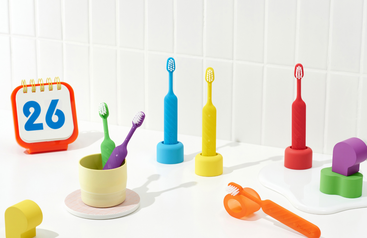
The toothpaste is designed with a clear color code theme of blue and green.
The product is positioned as the lowest-priced toothpaste among our toothpastes, and is designed to be easily and comfortably recognized and used by everyone.
We summarized our design intentions for the product by considering the characteristics of sales outlets that we frequently visit on a daily basis, such as local distributors and supermarkets.


Design Concept
1. Strengthening the MEDIAN Brand
A key feature of Fresh Toothpaste, compared to other Median products, is its large and prominent brand logo.
This confident placement is intended to reinforce Median’s positioning as a dental care specialist.
By using ‘Median’ as the product’s primary identifier, we encourage consumers to instantly associate the toothpaste with the trusted parent brand, thereby strengthening our overall presence in the dental market.
Furthermore, mindful of the diverse age range of shoppers at local distributors and supermarkets, the design was kept simple and intuitive, allowing the product’s purpose to be understood at a glance without complex explanations.

2. A Focus on the Fundamentals
The design was developed with the awareness that retail display environments can be inconsistent.
Because the product is sold in a wide variety of local stores and supermarkets nationwide, it needed a design that could command attention even in suboptimal conditions.
Furthermore, since the target audience is broad—encompassing all ages and genders—we intentionally focused on a simple, back-to-basics approach.
To encourage casual, everyday purchases in local neighborhoods, all text on the packaging is in Korean for maximum readability.
The product’s key benefit is also distilled into a single, concise point. This simplicity is designed to capture visual attention in the often-crowded toothpaste aisle.


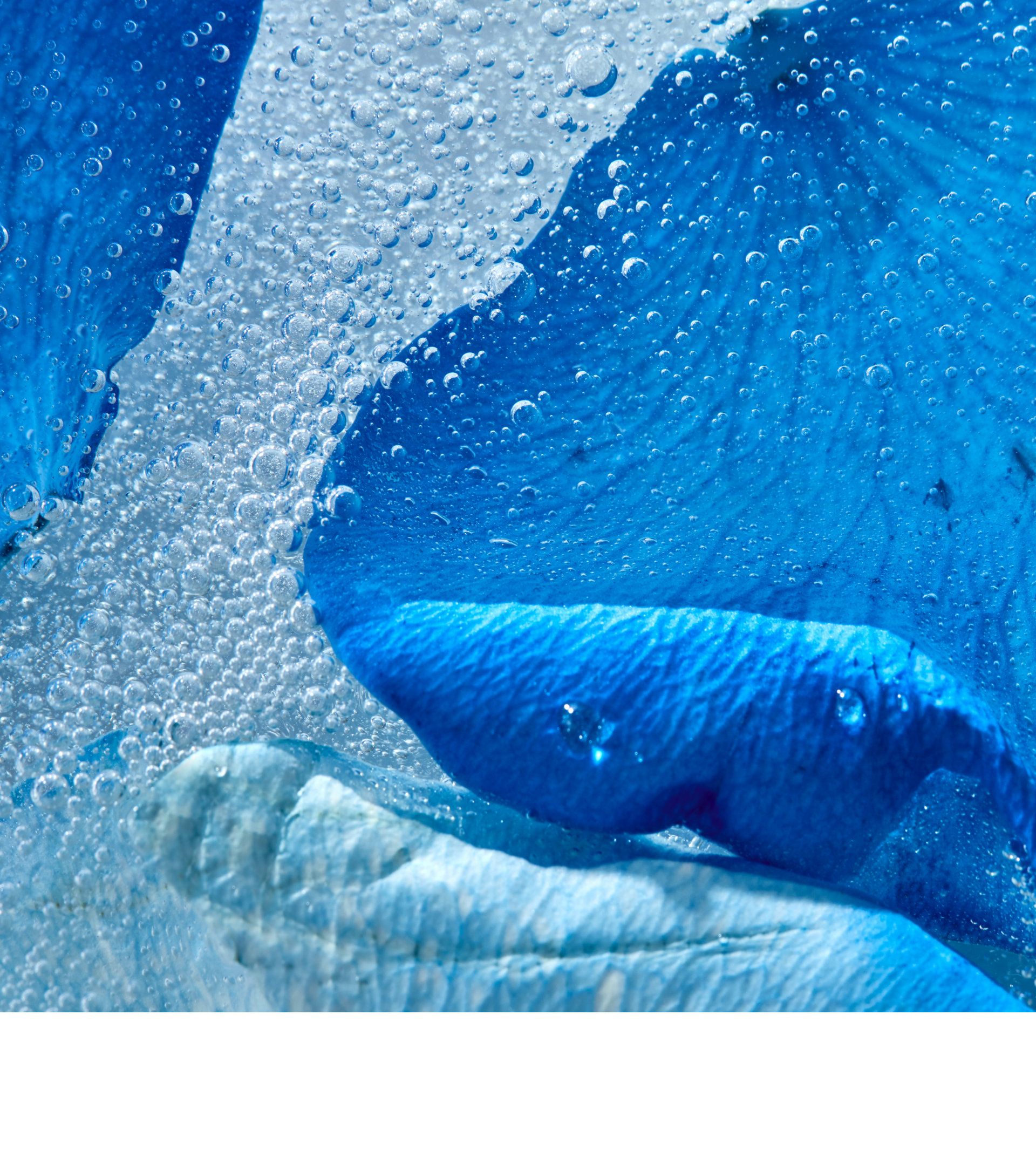
3. A Clear Color-Coding System
The colors blue and green naturally evoke the sea and mountains, respectively.
Our goal was to leverage this instant association, allowing consumers to grasp each product’s concept at a single glance.
For ‘Fresh Blue,’ the color itself is the primary design element, intended to evoke the refreshing scent of ocean waves.
We chose a vibrant marine blue as the main color, complemented by subtle wave patterns and water droplet graphics in the background to enhance the aquatic feel.
For ‘Fresh Green,’ we used a crisp green reminiscent of a lush forest to suggest a clean, refreshing scent.
This is paired with a soft hairline pattern designed to evoke the calm, deep breaths one takes while forest bathing.


The challenge for Fresh Toothpaste was to create a design that could cater to a broad consumer base across numerous retail channels.
To meet this challenge, we returned to the fundamentals. The design relies on primary colors and clean typography to achieve a universally appealing and straightforward aesthetic.
The result is an approachable look that feels familiar and makes the purchase decision effortless for the customer.
- Amorepacific Creatives
- Product Design / Visual Directing
- Kim Yeonseo
- Photography
- Lee Yunjin
- BM
- Jung Jihye