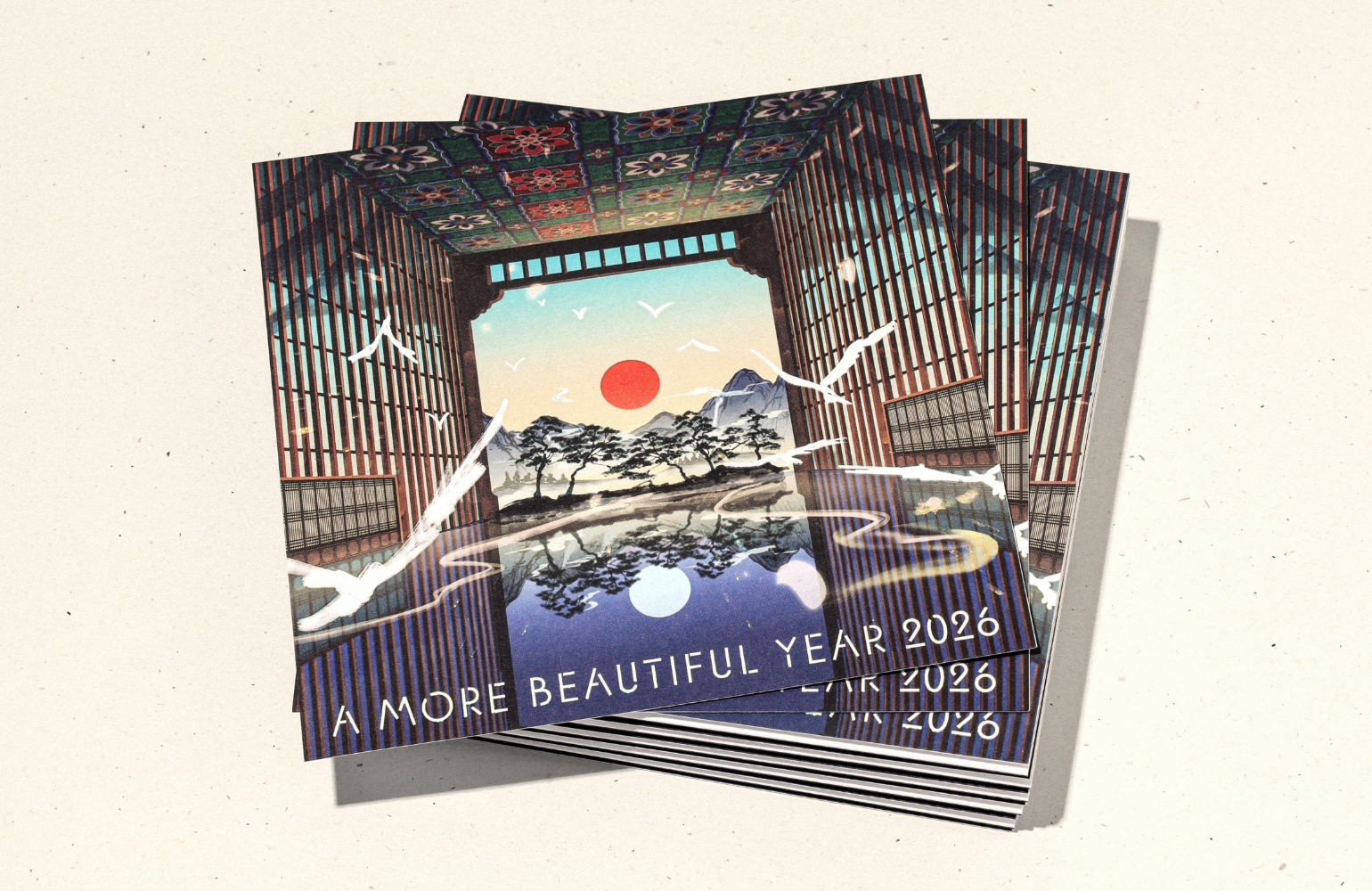
CSR Campaign Logo Renewal
Summary
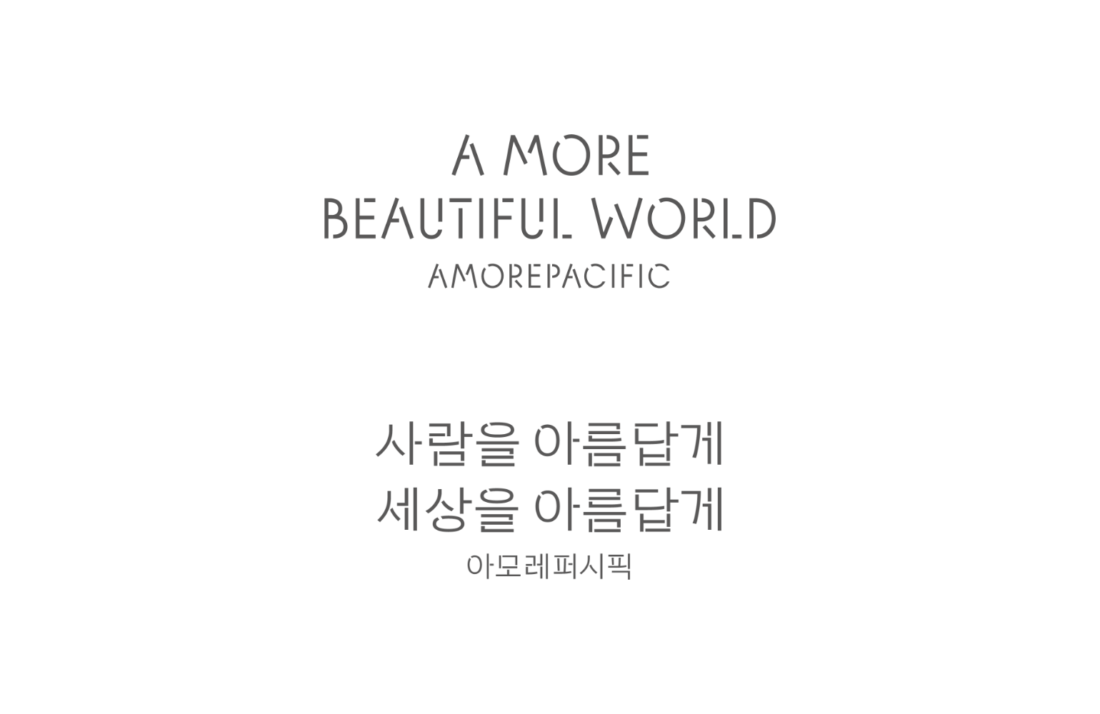
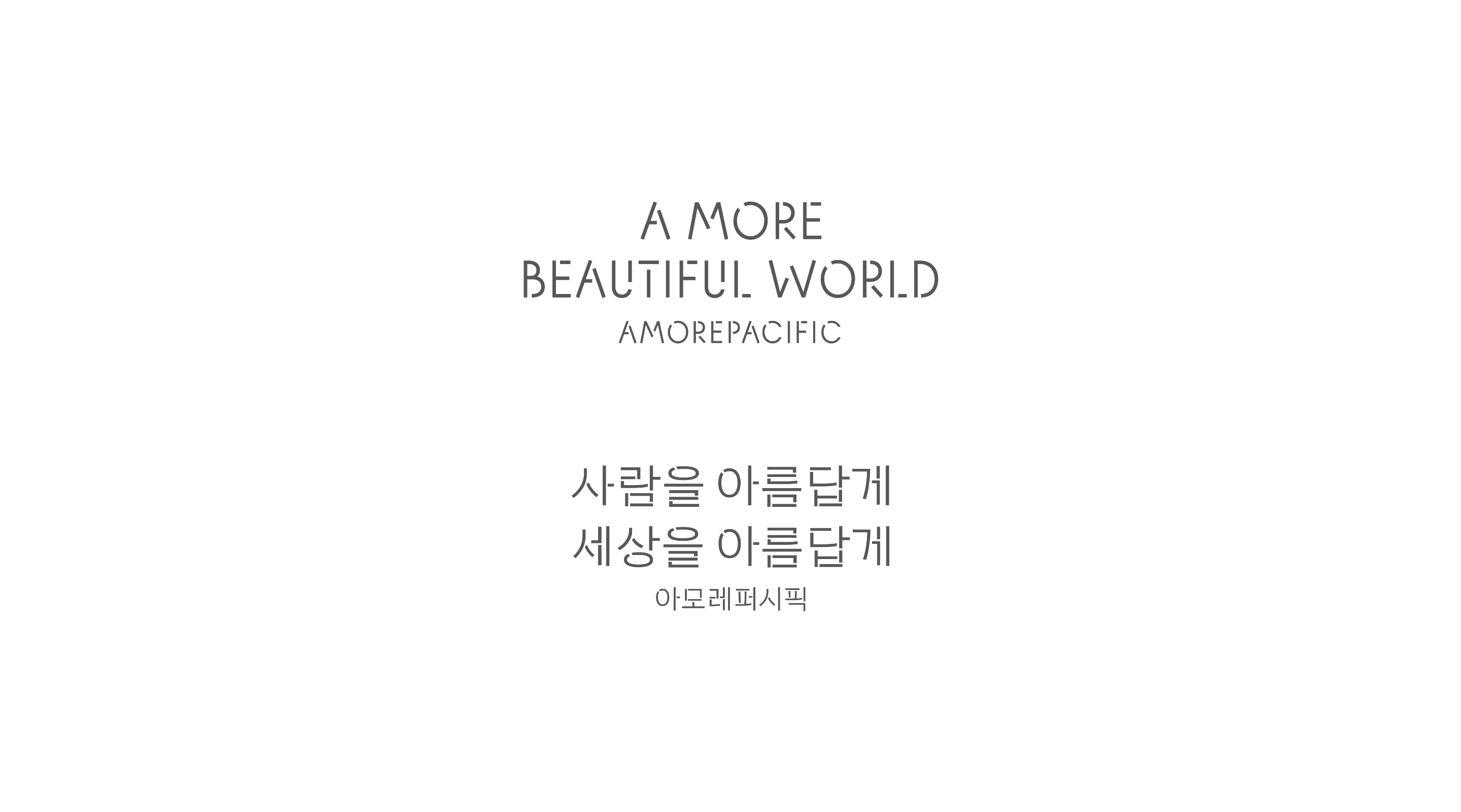
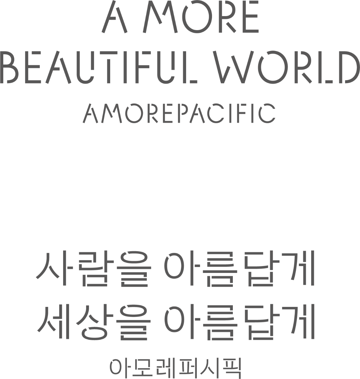
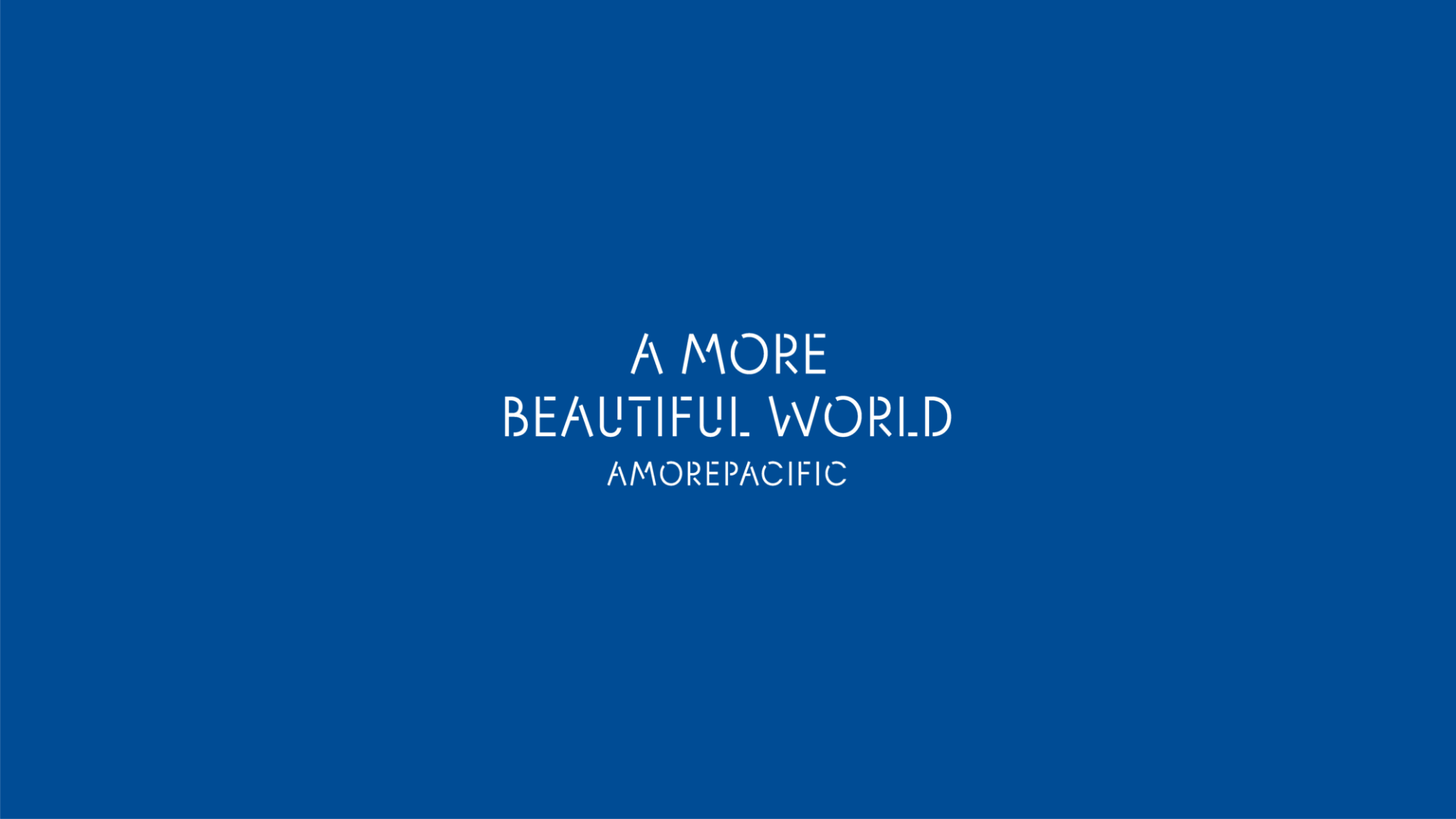
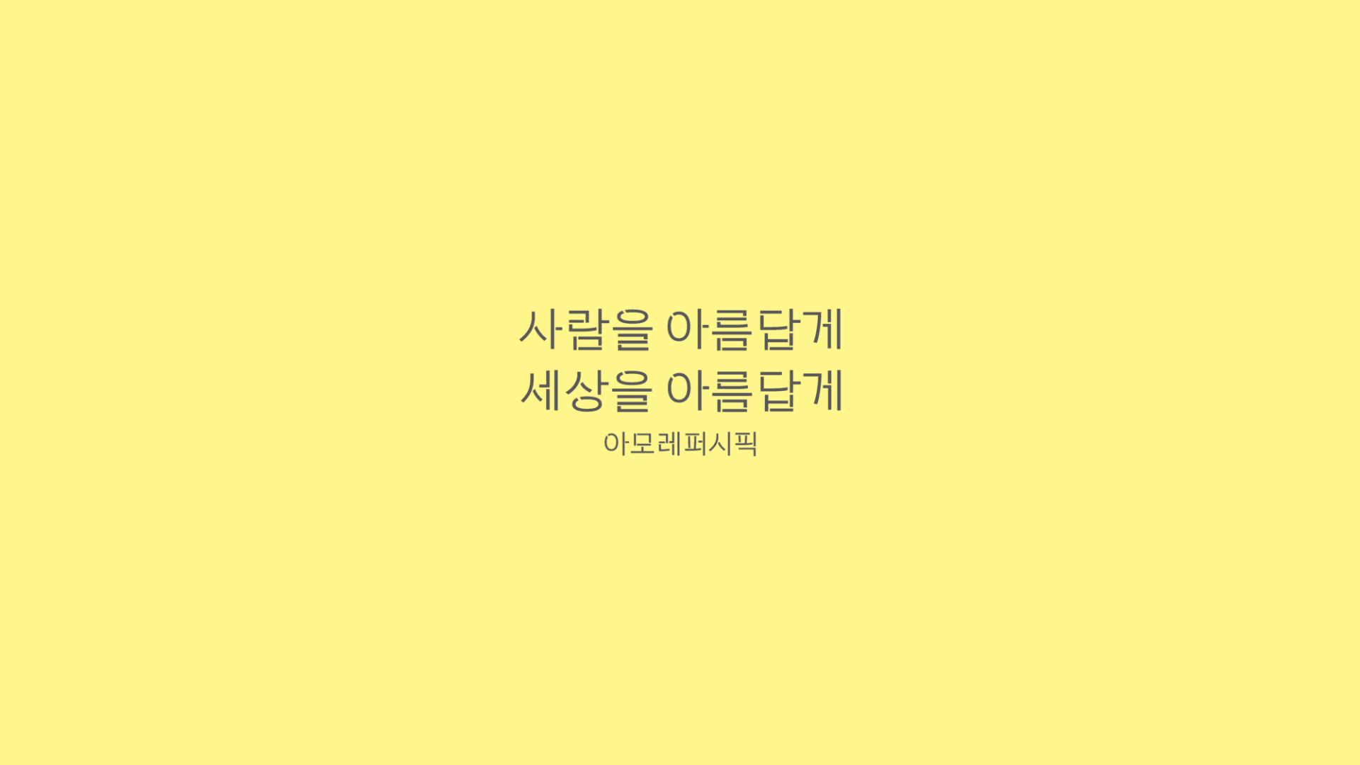
We renewed the previously developed CSR logo.
The updated CSR logo applies the APHQ typeface, which is widely used across Amorepacific, and embodies the company’s mission, “We Make A More Beautiful World.”
Through this renewal, consistency with the CI guidelines has been strengthened, and both Korean and English versions of the logo were designed together to help consumers recognize the logo more quickly and clearly.
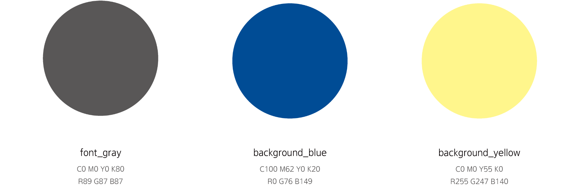
COLOR
To ensure flexible use across various communication environments, a color palette was proposed for use as needed.
Centered on blue and yellow tones that convey a fresh and hopeful impression, the palette was designed to express Amorepacific’s CSR activities aimed at creating a more beautiful world.
- Amorepacific Creatives
- Project Planning
- Kang Yoosun
- Graphic Design
- Jeong Jiyun