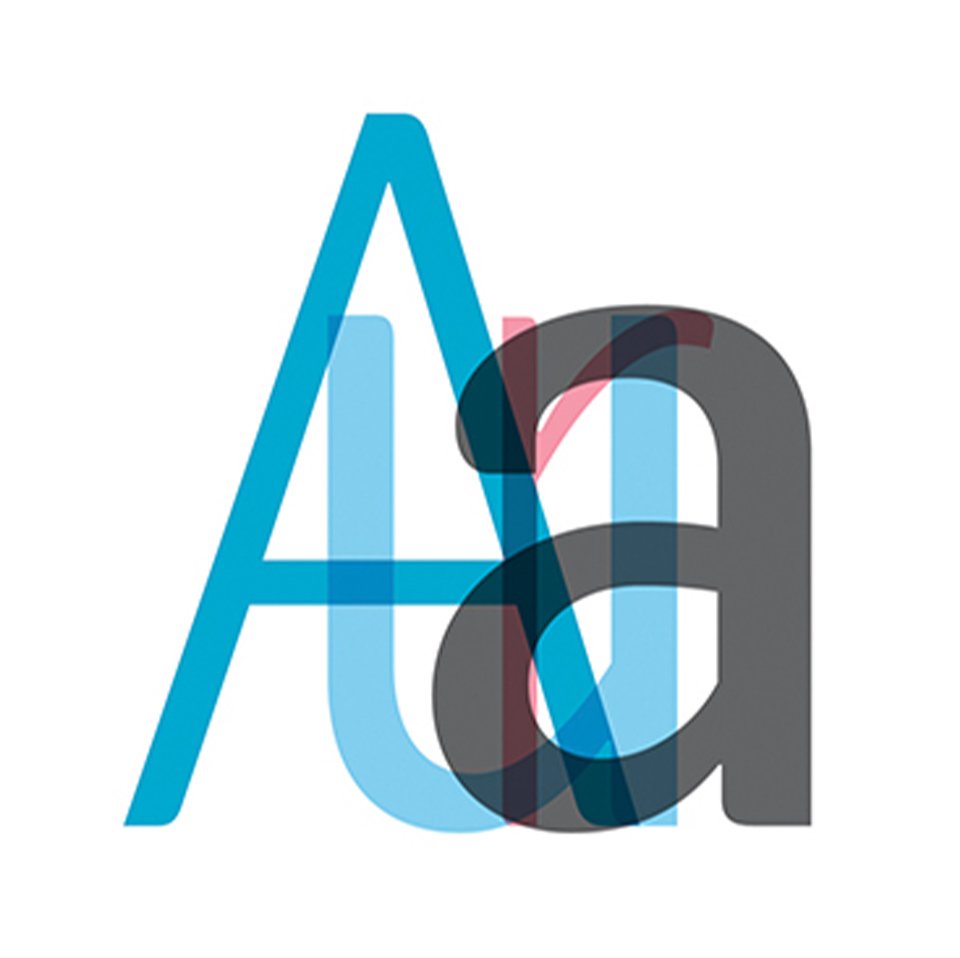
Typeface Arita
Introduce
Beauty that is elegant, intelligent, and healthy—this is the kind of beauty that AMOREPACIFIC aspires to create. “Arita,” a refined expression coined by AMOREPACIFIC, is like a small seed spreading beauty far and wide across the world.
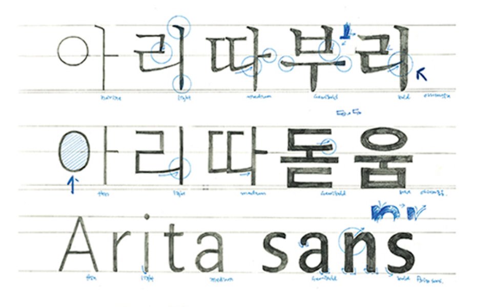
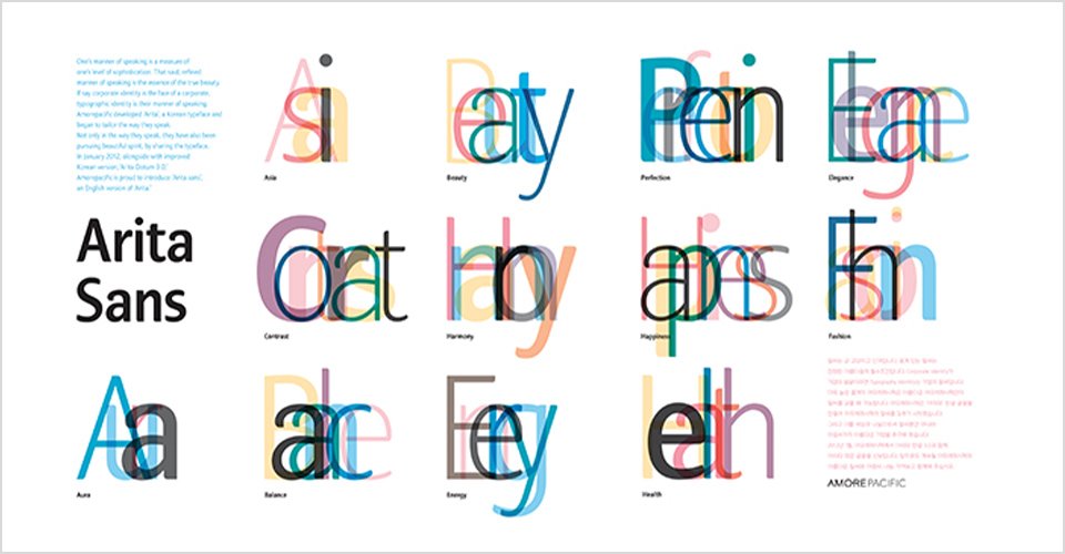
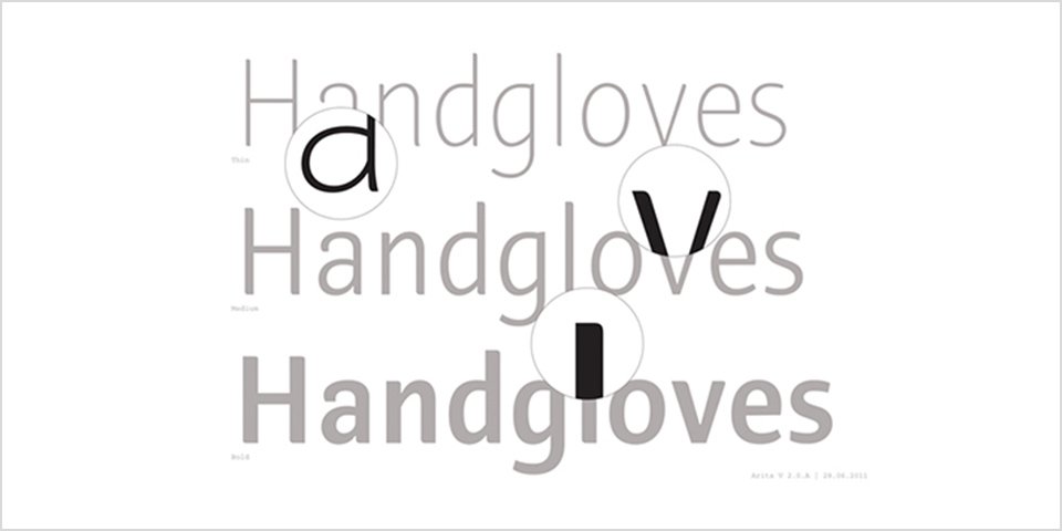
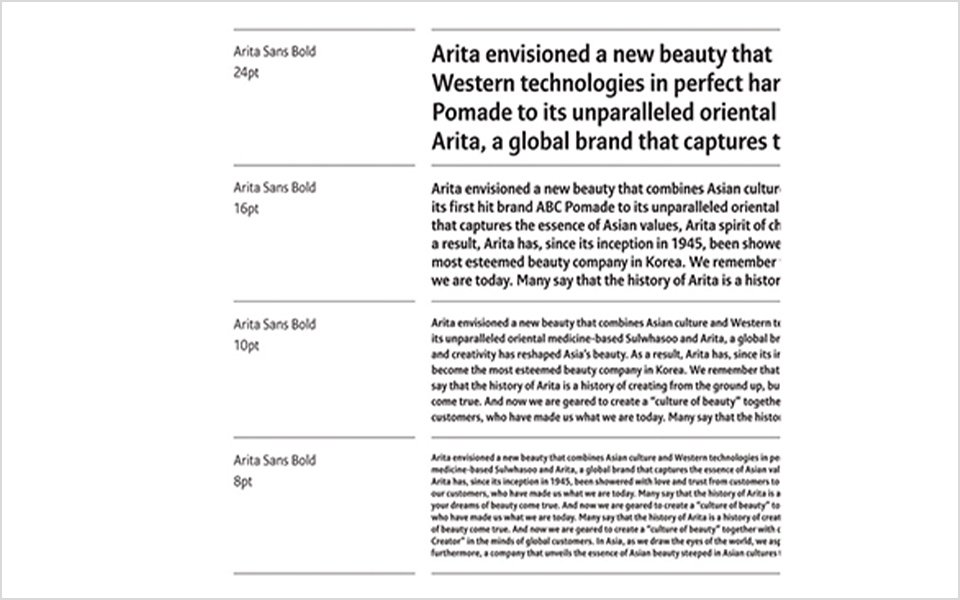
The “Arita” typeface consists of three fonts: the gothic-style Korean font Arita Dotum, the serif-style Korean font Arita Buri, and the English font Arita Sans. Starting with Arita Dotum in 2005, Arita Sans followed in 2012, and Arita Buri in 2014. The fonts were designed by Ahn Sang-soo in collaboration with various experts. The Arita typeface not only symbolizes AMOREPACIFIC’s corporate identity, but also embodies its commitment to the “value of sharing” by being made freely available to the public.
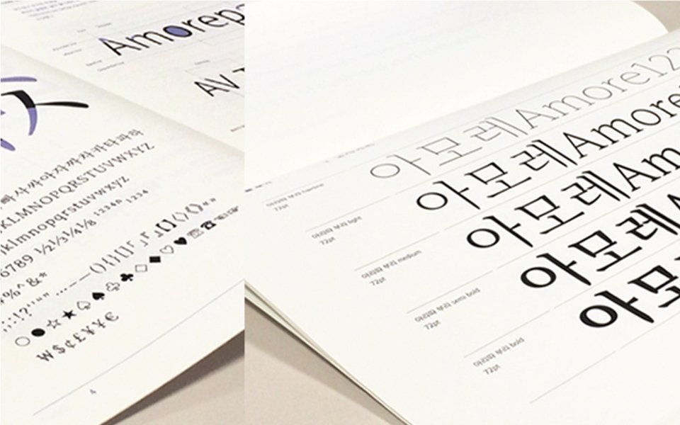
Completion of the Arita Buri Font in 2014
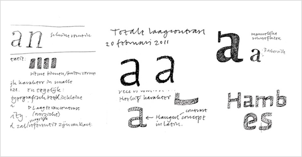
The Arita Buri font is a new member of the Arita Dotum family, designed as a high-quality body text font suitable for long passages. It adds a modern aesthetic to the traditional appearance of the Ming-style (Myeongjo) typeface. The name ‘Buri’ was added to mark the beginning of a new typeface for body text. Additionally, Korea’s first hairline weight was developed to expand the type family and broaden its range of applications.
The Arita Buri font is a new member of the Arita Dotum family, designed as a high-quality body text font suitable for long passages. It adds a modern aesthetic to the traditional appearance of the Ming-style (Myeongjo) typeface. The name ‘Buri’ was added to mark the beginning of a new typeface for body text. Additionally, Korea’s first hairline weight was developed to expand the type family and broaden its range of applications.
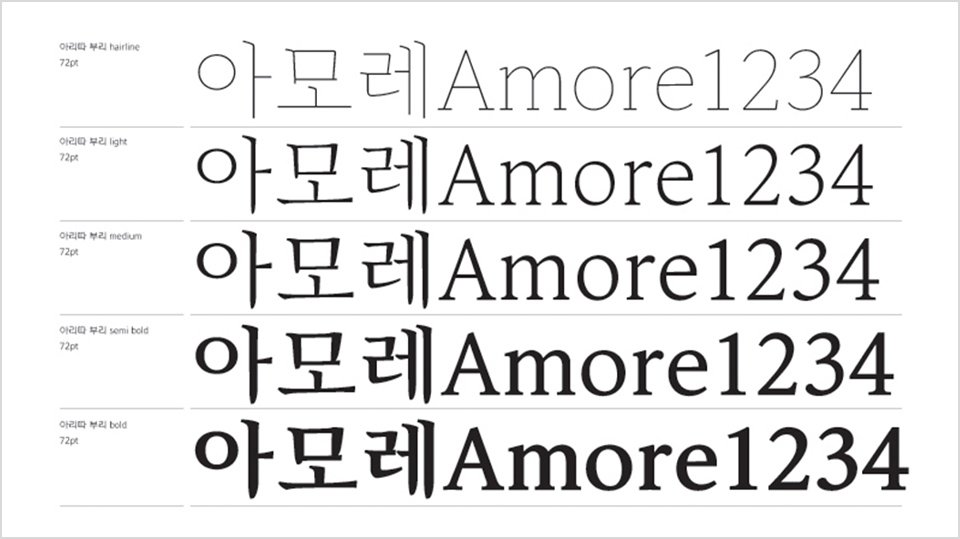
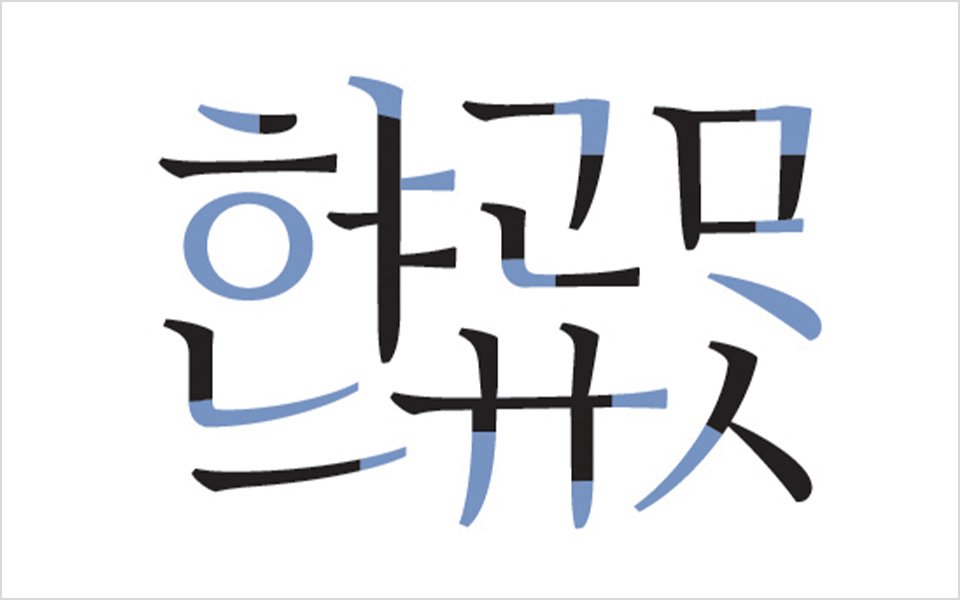
This font presents a modern look that departs from the classic yet somewhat old-fashioned appearance of traditional Myeongjo and Batang fonts. The name ‘Buri (Serif)’ was used instead of ‘Batang’ to reflect its distinctive expression among Hangul body text fonts. Designed for horizontal writing, the font family consists of five weights. Among them, the ‘Hairline’ weight—developed for the first time in Korea—expanded the scope and versatility of the type family. The contrast between horizontal and vertical strokes has been slightly increased, and curves and straight lines are harmoniously blended at the beginnings and ends of the strokes. Inspired by the shape of flower petals, the initial and final strokes of ‘ㅅ’ and ‘ㅈ’ complete Arita Buri’s unique character.
- Amorepacific Creatives