
Typeface Arita
타입페이스 아리따
Introduce
단아하고 지적이며, 건강한 아름다움. 바로 아모레퍼시픽이 추구하는 아름다움입니다. 아리따는 아모레퍼시픽의 아리따운 말씨로서, 아름다움을 세상에 전파하는 작은 홀씨가 되어 넓은 세상을 향해 멀리멀리 퍼져 나가고 있습니다.
Beauty that is elegant, intelligent and healthy—this is the kind of beauty that AMOREPACIFIC aspires to create. Arita, as the expression of beauty sought by AMOREPACIFIC, is a small spark that will help spread beauty around the world.
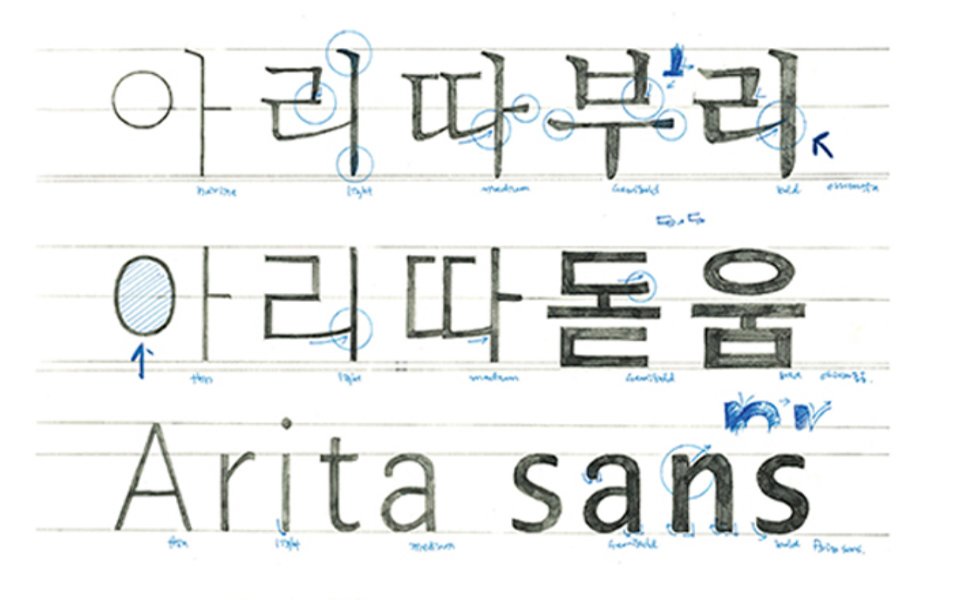
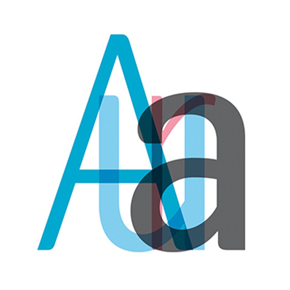
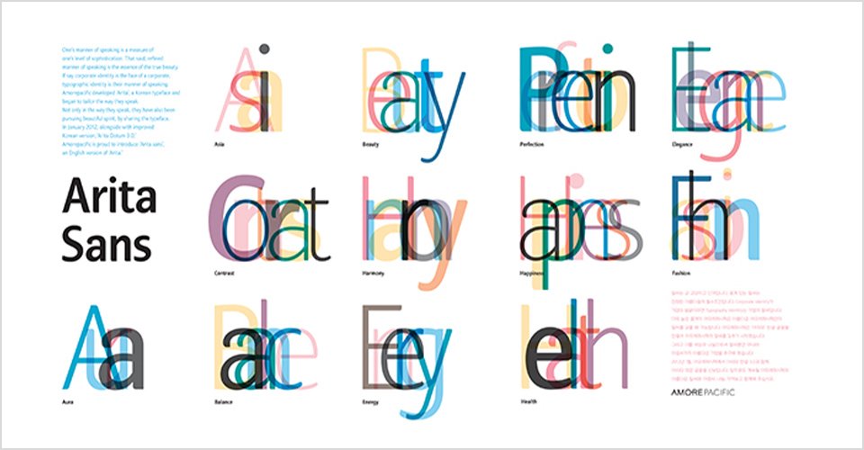
아리따 서체는 고딕계열의 한글서체 ‘아리따 돋움체’와 명조계열의 한글서체 ‘ 아리따 부리체’ 영문 글꼴인 ‘Arita Sans’ 가 있습니다. 2005년 아리따 돋움을 시작으로, 2012년 아리따 산스, 2014년 아리따 부리가 차례로 개발되었고 디자인은 디자이너 안상수님과 여러 전문가의 참여를 통해 완성되었습니다. 아리따 서체는 아모레퍼시픽의 기업 아이덴티티를 상징적으로 보여주는 서체일 뿐만 아니라 일반대중에게 널리 보급함으로써 ‘나눔의 가치’를 실현하고자 합니다.
The “Arita” typeface consists of three fonts: Arita Dotum & Arita Sans & Arita Buri. Starting from Arita Dodum in 2005, Arita Sans (2012) and Arita Buri (2014) were developed in that order. It was designed by Ahn Sang-Soo with various specialists.The font “Arita” presents AMOREPACIFIC’s determination to realize the “value of sharing” by letting the public use it free of charge while also showing the company’s typographic identity.
2014년 아리따 부리 글꼴 완성
아리따 부리 글꼴은 아리따 돋움의 새로운 글자가족으로 긴 호흡의 문장에 적합한 완성도 높은 본문용 글꼴입니다. 기존 명조체의 표정에 현대적인 미감을 더했으며, 이에 따라 글꼴 이름에 ‘부리’를 붙여 새로운 본문용 글꼴 탄생의 첫발을 내딛었습니다. 또한, 국내 최초로 헤어라인(Hairline)을 개발하여 글자 가족의 범위를 확장시키고 쓰임의 폭을 넓혔습니다.
아리따 부리 글꼴은 아리따 돋움의 새로운 글자가족으로 긴 호흡의 문장에 적합한 완성도 높은 본문용 글꼴입니다. 기존 명조체의 표정에 현대적인 미감을 더했으며, 이에 따라 글꼴 이름에 ‘부리’를 붙여 새로운 본문용 글꼴 탄생의 첫발을 내딛었습니다. 또한, 국내 최초로 헤어라인(Hairline)을 개발하여 글자 가족의 범위를 확장시키고 쓰임의 폭을 넓혔습니다.
Completes Arita Buri Font in 2014
Arita Buri font is a new font that belongs to the family Arita Dodum, the body font appropriate for long sentences. Modern esthetic sense is added to the look of the existing Meungzo font, so we added ‘Buri’ to the name of the new font to connote the beak-like shape of the font. In addition, we developed a hairline symbol for the first time in Korea to extend the scope and usage of the type family.
Arita Buri font is a new font that belongs to the family Arita Dodum, the body font appropriate for long sentences. Modern esthetic sense is added to the look of the existing Meungzo font, so we added ‘Buri’ to the name of the new font to connote the beak-like shape of the font. In addition, we developed a hairline symbol for the first time in Korea to extend the scope and usage of the type family.
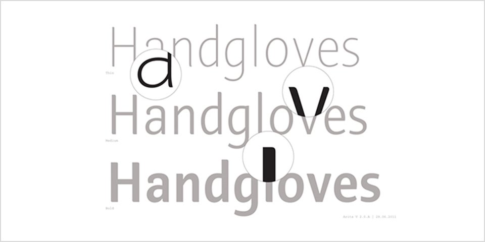
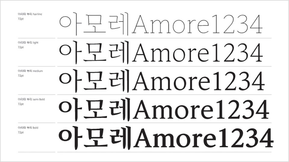
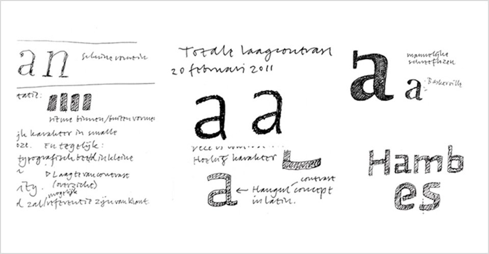
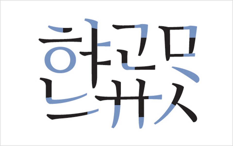
기존 명조체 및 바탕체의 클래식하지만 다소 예스러운 표정에서 벗어나 모던한 표정을 띠고 있는 글꼴입니다. 한글 본문용 글꼴 중에서 새로운 표정을 갖추었다는 의미에서 ‘바탕’이 아닌 ‘부리(Serif)’라는 이름을 붙였습니다. 가로쓰기용으로 개발되었으며, 총 5종의 굵기가족으로 이루어져 있습니다. 이 중 ‘헤어라인(Hairline)’은 국내 최초로 개발된 것으로, 글자 가족의 범위를 확장시키고 쓰임의 폭을 넓혔습니다. 가로세로 획의 대비가 조금 더 강해졌으며, 글자 줄기의 시작과 맺음에서 곡선과 직선이 적절히 어우러져 있습니다. ‘ㅅ, ㅈ’의 첫 번째 줄기와 ‘ㅅ, ㅈ’의 맺음을 부드러운 꽃잎 모양에서 본따 아리따 부리만의 독특한 표정을 완성했습니다.
This font is a slightly modern version of the classic Meungzo and Batang fonts. We added ‘Buri (Serif)’ to the name, not ‘Batang,’ because the font has a new look among fonts for the Hangul body. It was developed for horizontal writing and has five degrees of thickness. Among them, ‘Hairline’ was the first developed in Korea that extends the scope of the type family and usage. The contrast between vertical and horizontal strokes gets a bit stronger, and the curved and straight lines are mixed well at the start and end of the type stem. Copying a soft petal for the first stem and the end of ‘ㅅ andㅈ,’ we completed the unique look of Arita Buri.
- Amorepacific Creatives