New Space Identity of Aritaum
Summary
ARITAUM is a retail brand with 1,300 stores nationwide, operating 13 different beauty brands. From the perspective of a retail channel, several elements are considered: displaying effective and reasonably priced products, designing adaptable spaces to suit diverse locations, and expressing brand identity (BI) to highlight the unique image of each brand. The goal is to elevate ARITAUM into a more attractive and inspiring brand. The newly developed ARITAUM New SI introduces its own design language through a modular system, ARITAUM’s signature design, and brand communication, establishing a unique and cohesive design system.
Concept
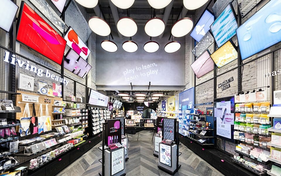
‘MY BEAUTY ATELIER’ was selected as the key concept for the ARITAUM brand, creating a lively and playful space where customers can explore various textures and colors. While the previous ARITAUM SI focused on selling products, the new SI transforms the store into an experience-driven space that provides inspiration and guidance on beauty. It goes beyond a simple retail environment to offer customers the opportunity to experience, enjoy, and share beauty, ultimately creating a unique “Only ARITAUM” experience. Through interactive engagement between people, and between people and products, ARITAUM aims to deliver memorable and differentiated experiences.
Concept
FACADE:
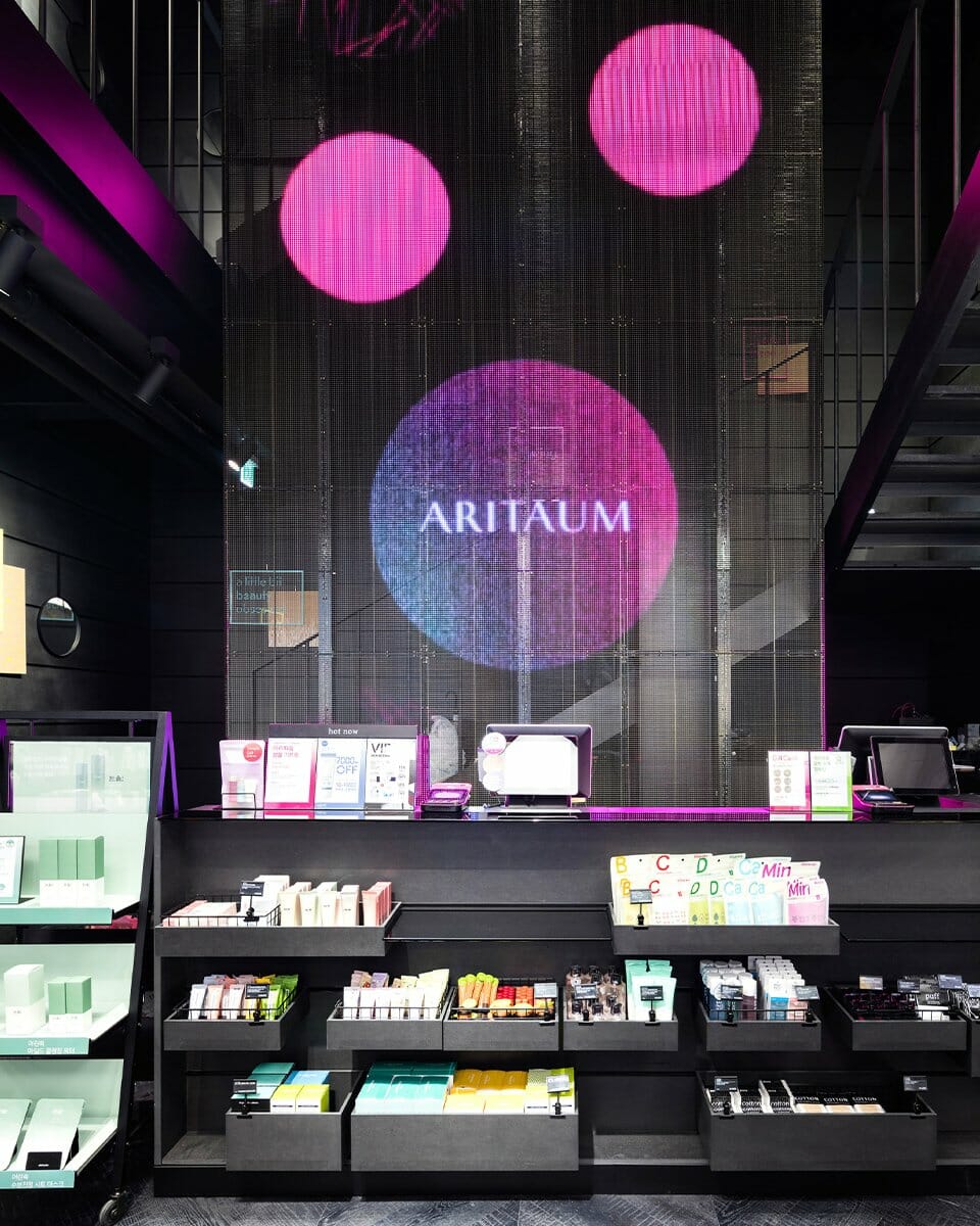
The facade is constructed using black bricks stacked with a void-stacking method, creating contrast with mirrors that reflect natural light. This contrast between the strong texture of black bricks and the sparkling mirrors communicates the “atelier” design concept while expressing the stylish aesthetic of a modern beauty store. Instead of a traditional pink entrance gate, ARITAUM’s signature pink is reimagined as a watercolor splash across a 100m² canvas-like facade. The fusion of black bricks, reflective mirrors, and expressive pink creates a new yet familiar brand image.
COMMUNICATION (Pattern, Visual, Package): Customer communication within the space follows a design logic unique to ARITAUM, forming a comprehensive VMD (Visual Merchandising Design) system.
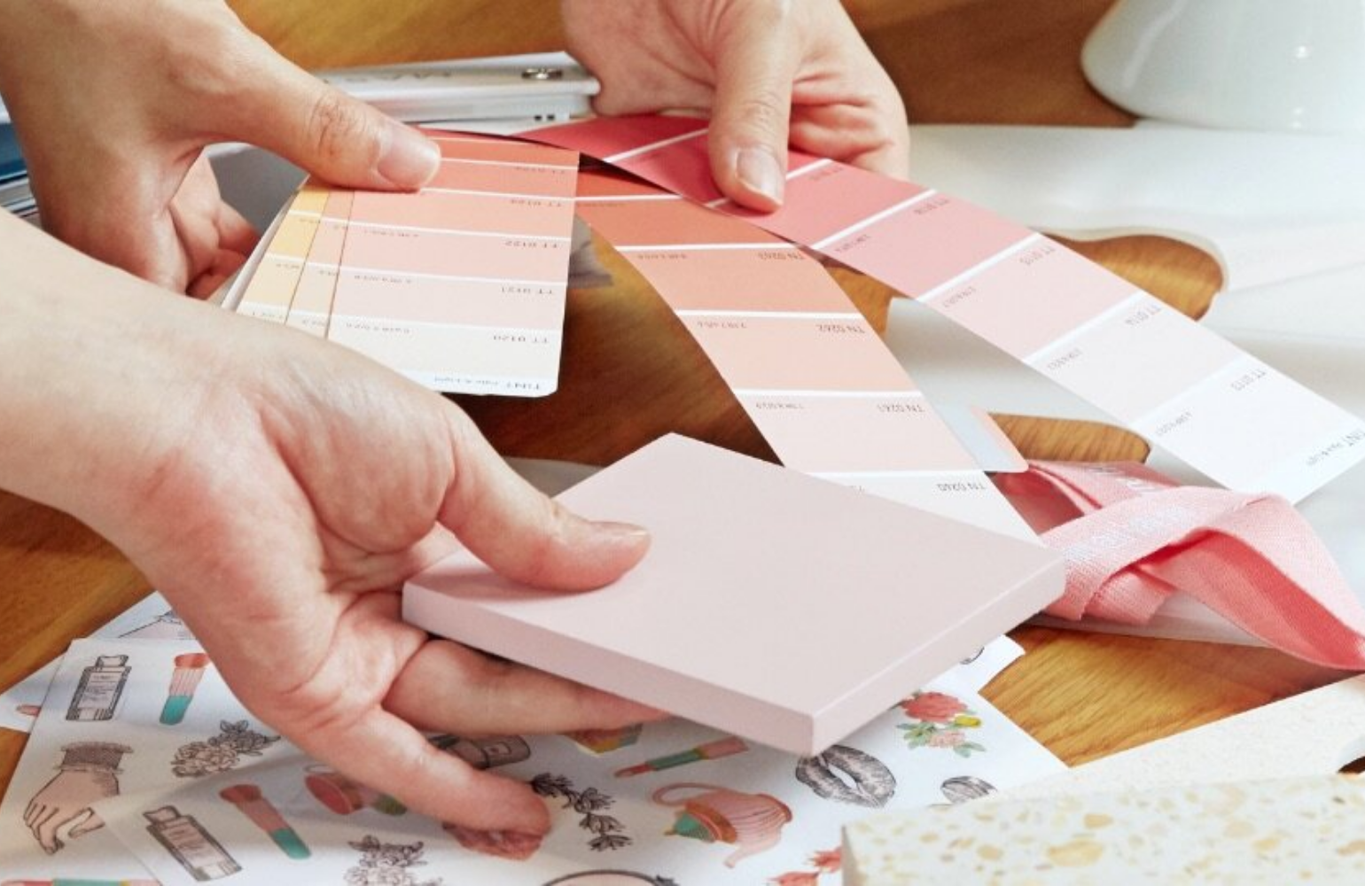
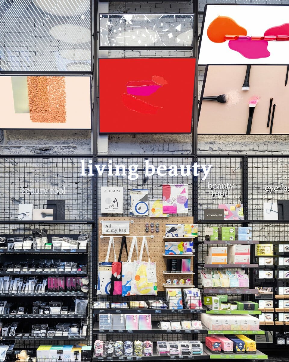
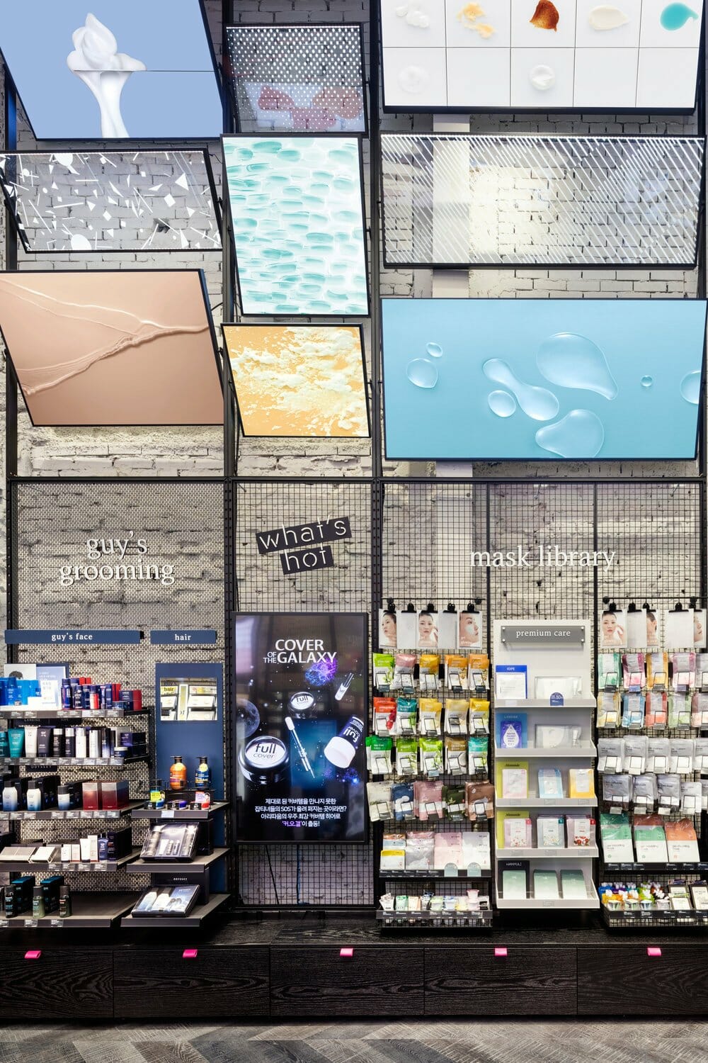
*Pattern: The physical characteristics of ARITAUM’s beauty products are transformed into simple and consistent graphic patterns. The textures of skin, hair, and nail glitters are abstracted into shapes, colors, and compositions, then applied across various visual formats.
*Visual: Product textures are showcased visually to express the atelier concept. Makeup and nail products are blended into artistic compositions, while skincare textures are applied directly to canvases to convey their qualities. Model makeup also emphasizes each product’s characteristics with bold, intuitive visuals that maintain balance with texture cuts, encouraging customers to engage more actively with the brand.
*Package: ARITAUM’s new pattern designs are combined with its tone of voice (TOV) to create more user-friendly packaging. The upgraded foldable box, reimagined shopping bags, and paper bands tailored to different time-place-occasion (TPO) uses enhance convenience and branding. The integration of patterns, color gradients, and stickers on clear plastic bags increases the usability and visual appeal of the packaging, symbolizing ARITAUM’s diverse product offerings.
EXPERIENCE: At the center of the store, an atelier-style table encourages customers to naturally explore and test products. Product testing feels like play, supported by beauty tutorial videos and product samples housed in a painting tool box. ARITAUM’s signature mirror is reimagined with a symbolic design, while interactive hair-testing stations evoke a powder room, emphasizing a hands-on beauty experience.
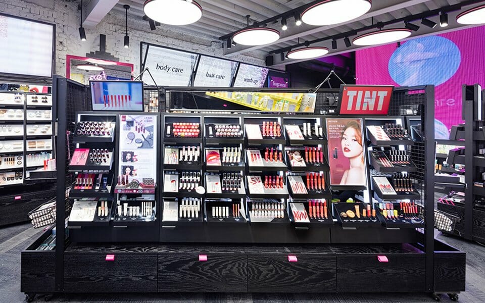
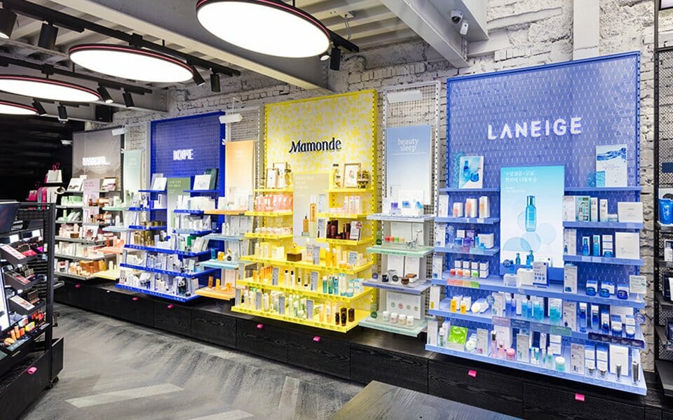
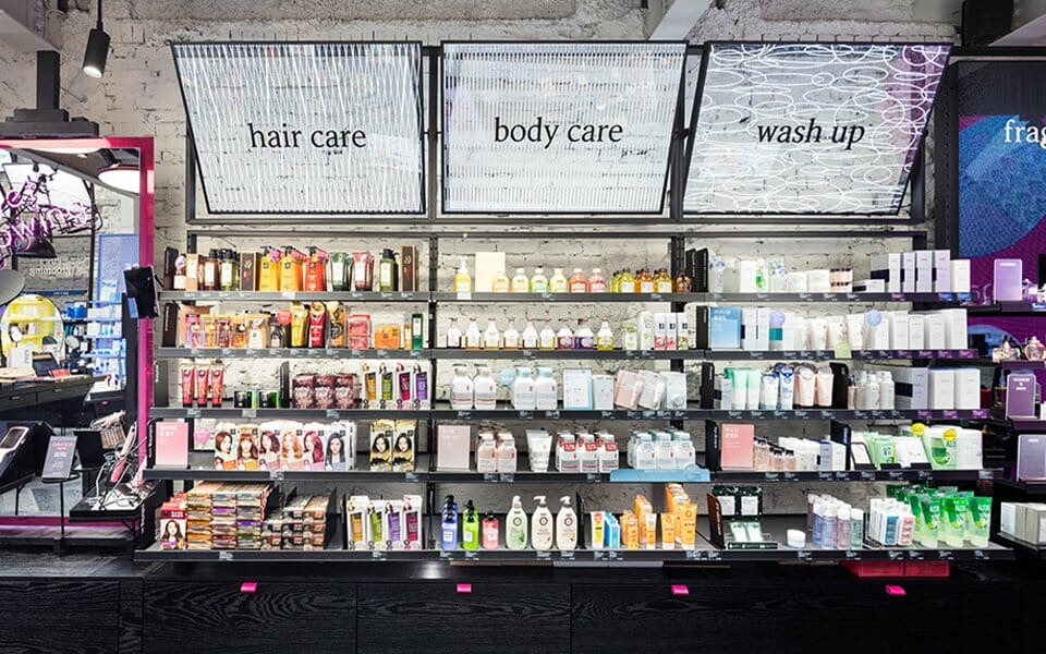
FURNITURE: The modular furniture system is based on a simple and intuitive logic combining support structures and brackets, allowing for flexible installation at different locations. These structures incorporate essential functionality like electric distribution and load capacity while accommodating shelves and mesh baskets to support a wide range of products.
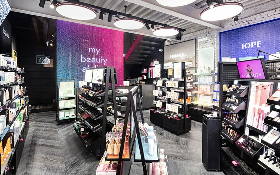
LIGHTING: ARITAUM’s unique lighting design features round, geometric forms accented with the brand’s signature pink. Previously overlooked, the ceiling is now incorporated to create a visually expanded space. The lighting is designed to minimize glare and accurately render product colors, with optimized brightness and temperature suited to the beauty environment. This blend of functionality and form adds to the store’s distinctive atmosphere.
COMMUNICATION (Pattern, Visual, Package): Customer communication within the space follows a design logic unique to ARITAUM, forming a comprehensive VMD (Visual Merchandising Design) system.
*Pattern: The physical characteristics of ARITAUM’s beauty products are transformed into simple and consistent graphic patterns. The textures of skin, hair, and nail glitters are abstracted into shapes, colors, and compositions, then applied across various visual formats.
*Visual: Product textures are showcased visually to express the atelier concept. Makeup and nail products are blended into artistic compositions, while skincare textures are applied directly to canvases to convey their qualities. Model makeup also emphasizes each product’s characteristics with bold, intuitive visuals that maintain balance with texture cuts, encouraging customers to engage more actively with the brand.
*Package: ARITAUM’s new pattern designs are combined with its tone of voice (TOV) to create more user-friendly packaging. The upgraded foldable box, reimagined shopping bags, and paper bands tailored to different time-place-occasion (TPO) uses enhance convenience and branding. The integration of patterns, color gradients, and stickers on clear plastic bags increases the usability and visual appeal of the packaging, symbolizing ARITAUM’s diverse product offerings.
EXPERIENCE: At the center of the store, an atelier-style table encourages customers to naturally explore and test products. Product testing feels like play, supported by beauty tutorial videos and product samples housed in a painting tool box. ARITAUM’s signature mirror is reimagined with a symbolic design, while interactive hair-testing stations evoke a powder room, emphasizing a hands-on beauty experience.
FURNITURE: The modular furniture system is based on a simple and intuitive logic combining support structures and brackets, allowing for flexible installation at different locations. These structures incorporate essential functionality like electric distribution and load capacity while accommodating shelves and mesh baskets to support a wide range of products.
LIGHTING: ARITAUM’s unique lighting design features round, geometric forms accented with the brand’s signature pink. Previously overlooked, the ceiling is now incorporated to create a visually expanded space. The lighting is designed to minimize glare and accurately render product colors, with optimized brightness and temperature suited to the beauty environment. This blend of functionality and form adds to the store’s distinctive atmosphere.
The initial design direction for ARITAUM’s new space focused on showcasing raw, textural materials. During demolition, the team discovered that the exposed brick structure offered a strong visual identity aligned with the design concept. Instead of applying new finishes, they preserved and restored the original brickwork using chisels—transforming the existing architecture into a design feature.
In celebration of ARITAUM’s reopening, a collaboration with Artist Proof—a print label led by artist Choi Gyeongju—resulted in the creation of lifestyle beauty items. These items, designed using methods such as silkscreen, etching, and painting, serve as media for delivering the atelier’s sensibility to customers more directly.
In celebration of ARITAUM’s reopening, a collaboration with Artist Proof—a print label led by artist Choi Gyeongju—resulted in the creation of lifestyle beauty items. These items, designed using methods such as silkscreen, etching, and painting, serve as media for delivering the atelier’s sensibility to customers more directly.
- Amorepacific Creatives