New Space Identity of Aritaum
아리따움 새로운 Space Identity 개발
Summary
아리따움은 유통브랜드로서, 전국 1300여 개의 매장이 있으며 13개의 브랜드를 담고 있습니다. 유통이라는 채널관점에서 합리적이고 효율적인 제품진열에 대한 생각, 다양한 사이트에 적절히 대응할 수 있는 공간 디자인에 대한 고민, 다양한 브랜드들이 적절히 본연의 이미지를 드러낼 수 있도록 BI의 표현수위에 대한 고민들이 있었습니다. 그리하여 아리따움이라는 브랜드관점에서 더 매력있는 브랜드로 업그레이드 하고자 하였습니다. 새로 개발된 아리따움 신SI는 모듈러 시스템, 아리따움 시그니처 디자인, 아리따움 커뮤니케이션 등 아리따움만의 디자인언어를 구축하였고, 아리따움만의 디자인 시스템을 설계하였습니다.
ARITAUM is a retailing brand with 1300 stores nationwide. It is operating 13 brands. From the perspective of a retailing channel, several elements are considered: a display of reasonably priced effective products; the design of space to respond appropriately to various sites, and; the expression level of BI to reveal the unique image of various brands. The goal is to upgrade ARITAUM to be a more attractive brand. The newly developed ARITAUM New SI has constructed its own design languages such as modular system, ARITAUM signature design, and ARITAUM communication and designed ARITAUM’s unique design system
Concept
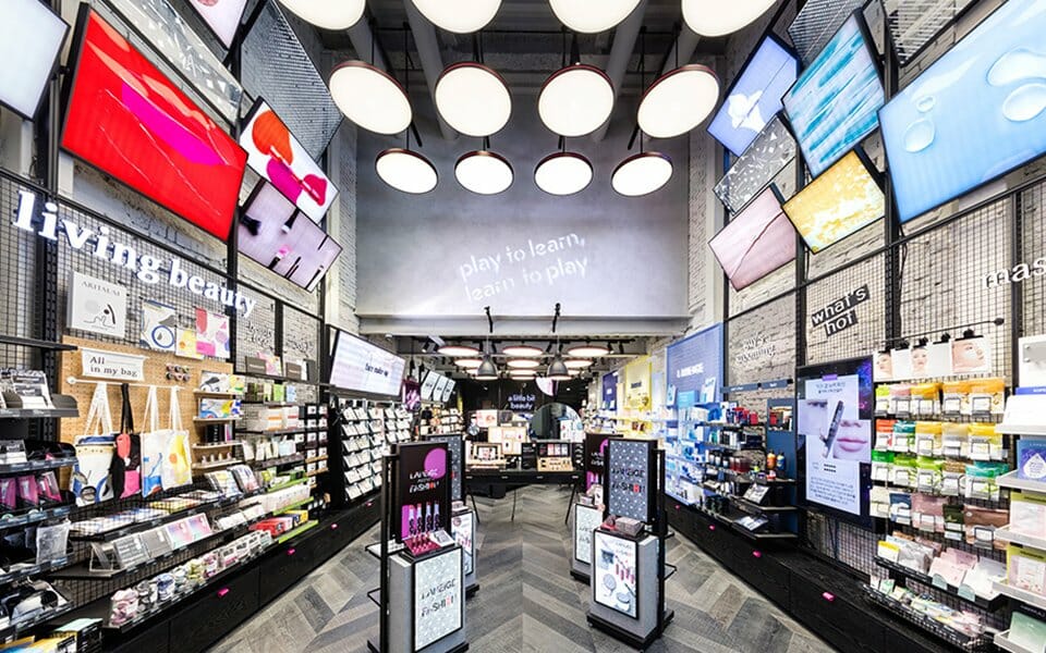
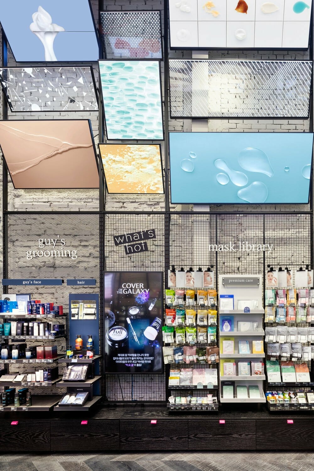
아리따움 브랜드의 KEY CONCEPT을 ‘MY BEAUTY ATELIER’로 잡았으며, Live하고, Playful한 공간으로 다양한 텍스쳐와 컬러들을 경험해 볼 수 있는 공간을 구현하였습니다. 기존 아리따움 SI는 제품을 파는 판매공간의 성격을 강하게 띄었다면, 새로 개발된 아리따움 신SI는 고객이 체험하고, 즐기고, 공유하는 체험공간의 성격이 더욱 부각되어 고객에게 뷰티의 영감과 가이드라인을 제시하는 공간으로 만들었습니다. 또한, 상품의 구매만을 위한 공간을 넘어선 다양한 가능성을 열어두기 위한 시도입니다. '공간'을 주된 매체로 사용하여, 사람과 제품들 사이, 사람과 사람 사이의 유동적인 상호작용을 야기하고, 더불어 다양한 체험과 행위를 유발시켜 궁극적으로 Only 아리따움 이라는 특별한 '경험'을 창출하려 합니다. 이러한 ‘특별한 경험’은 곧 아리따움이라는 브랜드로 인지될 것입니다.
‘MY BEAUTY ATELIER’ is selected as a KEY CONCEPT of the ARITAUM brand, and a Live, Playful space is realized for customers to experience various textures and colors. If the ARITAUM SI had the characteristic of a space that sells products, the newly developed ARITAUM New SI has the characteristic of a space that provides inspiration and guideline on beauty by highlighting an experience-oriented space where customers can experience, enjoy, and share. In addition, it is an attempt to open up various possibilities beyond a simple space where customers can purchase products. By using “space” as the main medium, it attempts at ultimately creating a special “experience” called “Only ARITAUM” by inducing various experiences and acts, along with fluidic interactive actions between people and between people and products. Such special experiences will soon be perceived as ARITAUM.
Concept
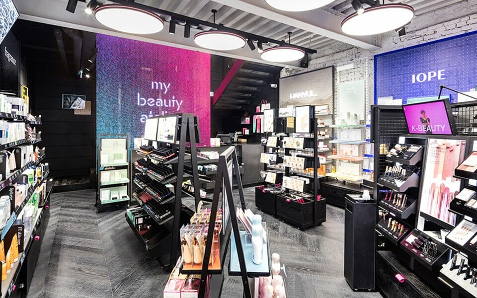
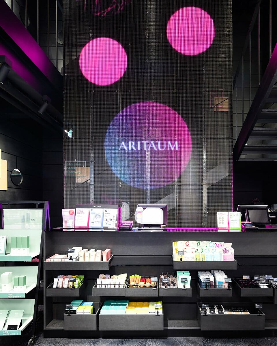
FACADE: 비워쌓기 공법으로 켜켜이 쌓아 올린 Black Brick이 만들어 내는 사이공간, 그 공간에서 보여지는 Mirror는 Black Brick이라는 텍스쳐 강한 소재와 자연광에 의해 반짝이는 반사소재인 Mirror의 강한 대비를 통해 트렌디한 뷰티매장이라는 본연의 모습에 ‘아뜰리에’라는 디자인 컨셉을 녹여내고자 하였습니다. 기존에 게이트로 표현되었던 BI컬러인 핑크는 100헤베에 달하는 넓은 파사드에 마치 캔버스 삼아 흩뿌려진 물감처럼 표현하였습니다. 아리따움이 가지는 블랙과 핑크라는 브랜드 컬러를 Black Brick이라는 텍스쳐가 강한 소재와 반짝이는 Mirror, 그리고 흩뿌려진 핑크를 오버랩하여 익숙한 듯 새로운 이미지로 디자인 하였습니다.
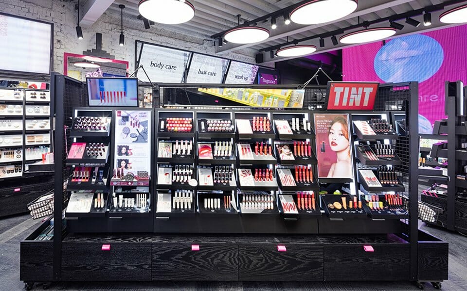
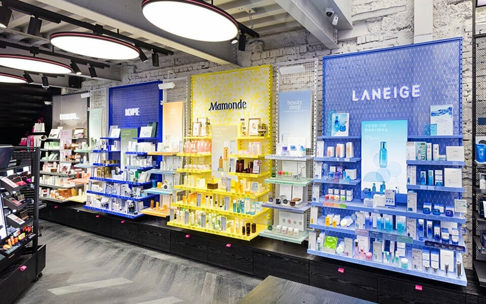
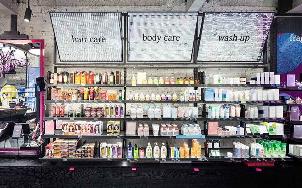
COMMUNICATION (Pattern, Visual, Package): 공간 안에서 이루어지는 고객과의 모든 커뮤니케이션은 아리따움 만의 디자인 로직을 정립하여 공간전체의 VMD디자인을 구성하였습니다.
*Pattern: 아리따움에서 다루는 다양한 뷰티제품들의 물성을 그래픽화하는 로직으로 패턴화하였습니다. 피부결, 헤어, 네일제품의 글리터 등의 다양한 텍스쳐를 단순하면서도 규칙적인 1도 패턴으로 그래픽화하였고, 이를 컬러/조합/도형 등으로 변형하여 다양한 그래픽으로 확장하여 사용하였습니다.
*Visual: 아리따움 제품의 다양한 제형, 물성을 아뜰리에 컨셉을 투영한 시각으로 촬영하였습니다. 메이크업과 네일 제품을 컬러링하여 아트웍을 만들어내기도 하고, 에센스와 크림을 캔버스에 발라 그 제형을 직관적이고 아트적으로 표현하였습니다. 모델의 메이크업 또한 각 제품의 특성을 직관적이며 과감하게 체험하는 수위로 표현해 제형컷과의 발란스를 유지하였습니다. 이러한 시도는 고객이 공간안에서 아리따움의 새로운 브랜드 컨셉과 감성을 공감하고 적극적인 체험을 시도할 수 있는 연결고리가 될 것이라 기대합니다.
*Package: 아리따움의 새로운 패턴과 T.O.V(Tone of voice)와의 조합으로 완성된 패키지는 기존보다 편리한 지기구조의 접이식 박스와 브랜드를 강조한 쇼핑백, TPO에 따라 교체가능한 띠지 등의 결과물로 완성되었습니다. 특히 투명비닐백의 패턴과 컬러 그라데이션의 그래픽, 스티커의 조합은 New 패턴의 활용성을 높인 예로 다양한 제품을 담아내는 아리따움의 공간을 상징하기도 합니다.
EXPERIENCE: 아리따움의 체험공간인 아뜰리에 테이블은 마치 개인 작업실을 디자인 하듯 설계하였습니다. 부담스럽지 않으며 자연스럽게 고객의 체험을 유도하고, 제품 테스팅 또한 하나의 놀이처럼 이루어 질 수 있도록 디자인하였습니. 뷰티팁과 튜토리얼과 같은 영상콘텐츠와 화구박스안의 테스팅제품들은 무심히 얹혀놓은 듯한 연출로 아뜰리에라는 디자인 컨셉을 담아내고자 했습니다. 아리따움의 시그니쳐 거울은 독특하게 디자인되어 형태적 상징성을 지니는 동시에 마치 파우더룸을 연상시키듯 다양한 헤어테스팅 콘텐츠들을 배치하여 체험적인 뷰티 공간을 느낄수 있도록 기획하였습니다.
FURNITURE: 서포트 구조체와 브라켓의 결합이라는 단순하고 직관적인 로직으로 다양한 사이트에도 유연하게 대응할 수 있는 모듈가구를 설계하였습니다. 서포트 구조체에는 배전 및 하중에 대한 기능적 요소를 집약적으로 녹여냈으며, 브라켓에 선반 및 매쉬바구니등 사용성에 맞는 다양한 요소들을 결합시켜 다양한 제품에 유연하게 대응 할 수 있도록 디자인하였습니다.
LIGHTING: 아리따움만의 고유한 디자인 조명을 설계하였습니다. 전반적으로 쓰여진 원형 조명은 원형이라는 기하학적 형태에 아리따움만의 핑크엣지를 더함으로써, 아리따움만의 디자인 언어로 형상화되었습니다. 시각적으로 소외되었던 천장이라는 영역을 적극적으로 디자인영역으로 끌어들여 보는 이로 하여금 시각적 확장성을 부여하였습니다. 뷰티 공간의 특성에 맞게 눈부심이 최소화되고 높은 광원을 사용하여 제품의 색조가 가장 본연의 색상으로 보일 수 있도록 설계하였습니다. 조명의 색온도와 밝기를 뷰티매장이라는 특성에 맞게 최적화하여 설계 함으로써, 어떤 공간에서보다도 아름답게 연출될 수 있도록 조명을 디자인 하였습니다. 조명이 가지고 있는 기본적인 기능(빛)에 형태적인 아름다움까지 더하여 특화된 조명으로 탄생시켰습니다.
FACADE: The gap is created by Black Bricks stacked one by one with an emptying-stacking method. The mirror that’s visible in the space is designed to express a design concept called “atelier” over the appearance of a trendy beauty store through the strong contrast of mirror -- a reflective material that sparkles by natural light -- against a strong-textured material called Black Brick. The BI color pink, which used to be expressed as a gate, is expressed like sprinkled water color on the wide façade as if on a canvas, reaching 100m2. ARITAUM’s brand colors -- black and pink -- are designed into a new yet familiar image by overlapping a strong-textured material, Black Brick, and the sparkling Mirror and sprinkled pink.
COMMUNICATION (Pattern, Visual, Package): All communications with customers occurring within the space establish a design logic unique to ARITAUM and compose a VMD design for the entire space.
*Pattern: The physical properties of ARITAUM’s various beauty products are expressed into patterns with graphics. Various textures of skin, hair, and glitters of nail products are expressed as simple yet regular patterns and changed into color/combination/figures and expanded to various graphics.
*Visual: The various textures and physical properties of ARITAUM products are videotaped into visuals that project the atelier concept. Makeup and nail products are colored to create artwork, and essence and cream products are applied on canvases to express textures intuitively and artistically. The model’s makeup is also used to express the feature of each product intuitively and boldly while maintaining balance with texture cuts. Such attempts are expected to provide a link for customers to sense ARITAUM’s new brand concept and sensibility and to make an active attempt to experience products within the space.
*Package: The combination of ARITAUM’s new patterns and TOV (Tone of voice) is made into a more convenient, foldable packaging box compared to the existing one and into a shopping bag that emphasizes the brand and a paper band that can be changed depending on the TPO. In particular, the combination of the clear plastic bag’s pattern, color gradation’s graphic, and the sticker has increased the usability of new patterns, symbolizing the space of ARITAUM that offers various products.
EXPERIENCE: As an experience space of ARITAUM, the atelier table is designed to be similar to an individual’s studio. It is intended to induce customers’ experiences naturally and to make product testing feel like play. Video contents on beauty tips and tutorials and trial products in the painting tool box are presented naturally to deliver the design concept of atelier. ARITAUM’s signature mirror is uniquely designed into a symbolic shape, and various hair testing contents are arranged to make the space look like a powder room and produce a feeling of an experience-oriented beauty space.
FURNITURE: The simple, intuitive logic of combining support structures and brackets can flexibly design modularized furnishing at various sites. The support structures are designed to have functional elements regarding electric distribution and load and to respond to various products flexibly by combining various elements suitable for use on shelves and mesh baskets on brackets.
LIGHTING: Lighting design unique to ARITAUM is used. ARITAUM’s pink edge is added to the geometric form of round-shaped lighting to embody ARITAUM’s design language. The area of the ceiling -- which has been neglected -- is included in the design to expand the space visually. Glare is minimized to be suitable for the characteristic of beauty space, and high source of light is used to express the true color of products. The color temperature and brightness of lighting are optimized for the characteristics of a beauty store to present lighting beautifully in any space. Specialized lighting is created by adding formative beauty to the basic function of lighting.
전체 New 아리따움 공간의 베이스가 되는 영역은 날것 그대로의 물성이 가지는 고유의 텍스쳐가 드러날 수 있도록 초기 디자인방향성을 잡았습니다. 그에 맞게 벽도장 및 바닥플로링 등 재질이 가지고 있는 특성을 가장 잘 드러날 수 있는 소재를 찾던 와중 철거현장에서 인테리어 마감을 다 걷어낸 조적건물 그대로의 모습이 우리가 표현하고자 하는 있는 그대로의 고유의 모습이라고 생각되어, 당초 인테리어 벽 마감재로 표현하고자 했던 것을 기존 건축이 가지고 있는 모습을 그대로 유지하는 방향으로 변경하였습니다. 철거 작업자들이 현장에서 최대한 건축물의 본연의 모습을 살릴 수 있는 모습으로 하나하나 정으로 쳐서 깎아내었고, 덕분에 훨씬 더 디자인 방향성에 맞는 공간으로 탄생되었습니다.
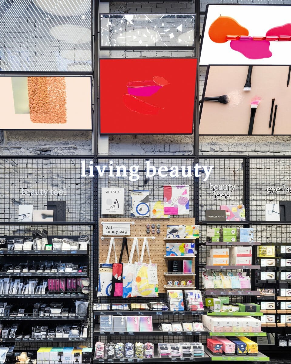
그리고 이번 아리따움 오픈에 맞춰 Artist Proof와의 협업으로 리빙뷰티의 다양한 아이템을 신규 개발하였습니다. 아티스트 프루프 (ARTIST PROOF)는 판화가 최경주의 프린팅 레이블입니다. 실크스크린, 에칭, 페인팅 등 회화 작업에서 파생된 디자인 방식으로 개발된 리빙뷰티 아이템들은 고객에게 아뜰리에 감성을 더 직접적으로 전달하는 매개체가 되었습니다.
그리고 이번 아리따움 오픈에 맞춰 Artist Proof와의 협업으로 리빙뷰티의 다양한 아이템을 신규 개발하였습니다. 아티스트 프루프 (ARTIST PROOF)는 판화가 최경주의 프린팅 레이블입니다. 실크스크린, 에칭, 페인팅 등 회화 작업에서 파생된 디자인 방식으로 개발된 리빙뷰티 아이템들은 고객에게 아뜰리에 감성을 더 직접적으로 전달하는 매개체가 되었습니다.
The initial direction of the overall design for the base of the New ARITAUM space is to reveal the unique texture of physical property. In the process of searching for a material that can reveal the characteristics of materials such as wall coating and flooring material, however, we discovered that the appearance of brick-layered structure -- which was revealed after removing the interior finishing at the demotion site – could serve as a unique expression of our design; thus, we decided to keep the original appearance of the existing architecture instead of using interior wall finishing. Demolition workers tidied up the bricks one by one with chisel to restore the original appearance of architecture on the site, and a space suiting the direction of our design was born.
In time for the opening of ARITAUM, various items of living beauty are newly developed through cooperation with Artist Proof as the printing label of print artist Choi Gyeongju. The living beauty items developed in a design method derived from painting work -- such as silk screen, etching, and painting -- have become media that deliver the sensibility of atelier to customers more directly.
In time for the opening of ARITAUM, various items of living beauty are newly developed through cooperation with Artist Proof as the printing label of print artist Choi Gyeongju. The living beauty items developed in a design method derived from painting work -- such as silk screen, etching, and painting -- have become media that deliver the sensibility of atelier to customers more directly.
- Amorepacific Creatives