espoir Brand Identity Renewal
Summary
In 2019, Espoir made a bold transformation to appeal to a younger target audience and strengthen the brand’s communications across multiple customer touchpoints and digital media. Whereas the brand’s professionalism was previously emphasized by a chic black sensibility, the brand is now embracing a contemporary woman who expresses herself with confidence, making it easier and more intuitive to design, and making the brand more real and vibrant.

Concept
The new logo, which represents the transformed brand image and allows for more proactive and bold expression, carries three key meanings and roles.
First, the simplified typeface conveys a young and lively brand image. While retaining the curved form reminiscent of French pronunciation, it has been modernized with a stronger and more concise silhouette, capturing a youthful sensibility.
First, the simplified typeface conveys a young and lively brand image. While retaining the curved form reminiscent of French pronunciation, it has been modernized with a stronger and more concise silhouette, capturing a youthful sensibility.

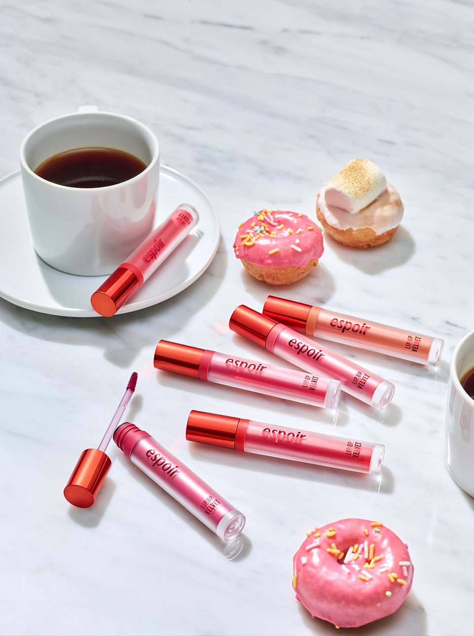
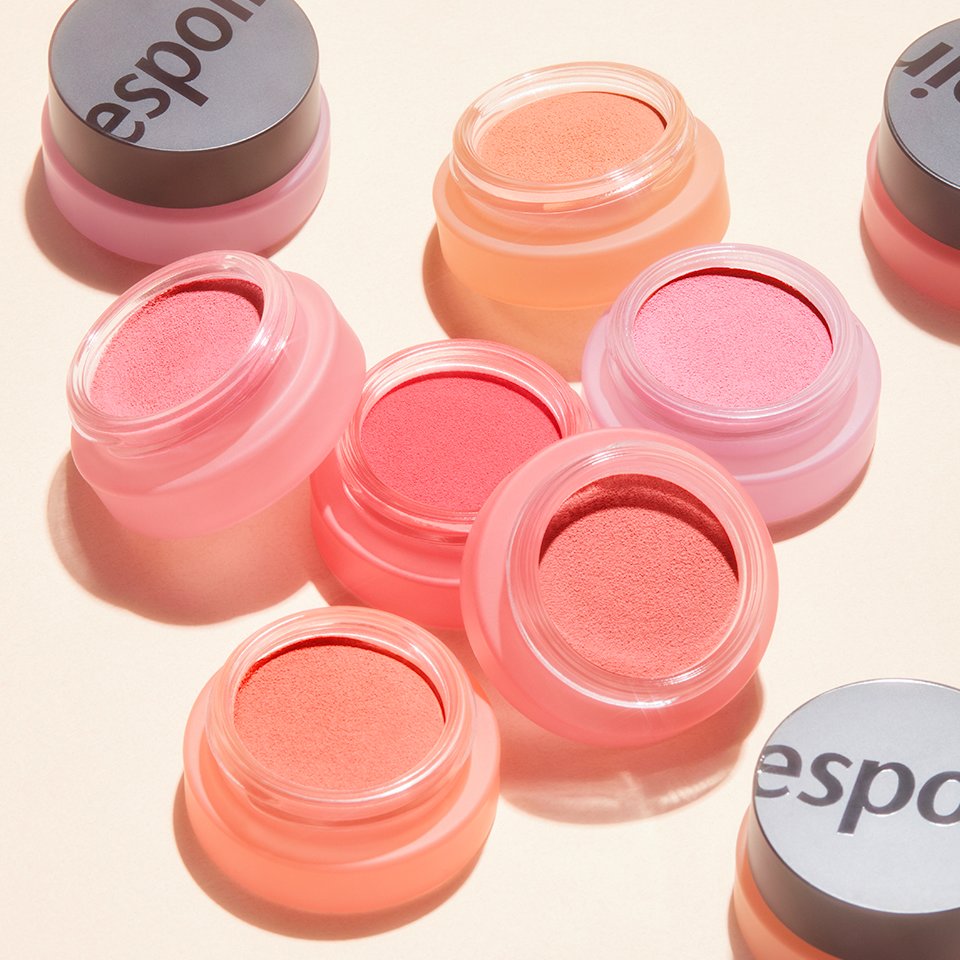
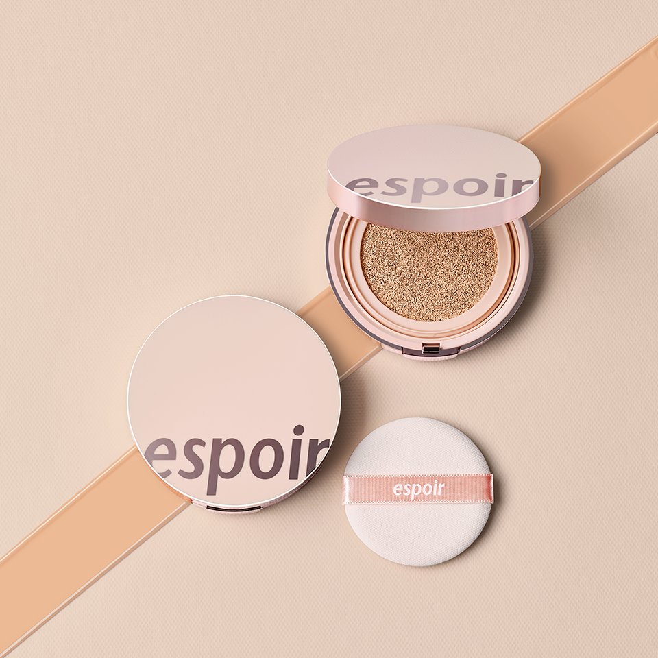
Second, the logo can be flexibly applied as a graphic element. Its bolder design allows for both subtle and striking expressions depending on the application. For product types where intuitive color representation is important, the logo can even showcase the color of the contents, enhancing both its functionality and versatility.

Third, it visually embodies our proactive approach to change and the pace of our evolution. The sense of direction expressed in the new logo lends the brand a more dynamic character and reflects a forward-looking female image, effectively communicating the brand’s renewed identity.

Going forward, not only the products but also the spaces and all brand identity touchpoints will present more vibrant and diverse imagery, evolving into a brand that resonates deeply with young millennials.
- Amorepacific Creatives