Aritaum Magazine, March+April Issue
아리따움 매거진 3+4월호
Summary
아리따움 매거진 3+4월호는 봄을 맞아 춘몽春夢 콘셉트의 룩북으로 첫 페이지가 시작됩니다.
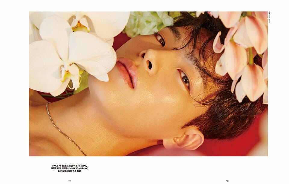
이번 호의 룩북은 2017 S/S 뷰티 트렌드로 손꼽히는 ‘Natural Glow Skin’, ‘Neutral Color Makeup’, ‘Wet Hair Style’ 등을 봄날의 감성을 담아 뷰티스타일의 화보로 표현했습니다.
이번 호의 룩북은 2017 S/S 뷰티 트렌드로 손꼽히는 ‘Natural Glow Skin’, ‘Neutral Color Makeup’, ‘Wet Hair Style’ 등을 봄날의 감성을 담아 뷰티스타일의 화보로 표현했습니다.
ARITAUM magazine’s March+April issue begins with the first page in the form of a look book based on the concept of spring dream. The look book of this issue depicts the beauty styles of spring days, such as “Natural Glow Skin,” “Neutral Color Makeup,” and “Wet Hair Style” as the 2017 S/S beauty trends with the pictorial of beauty styles.
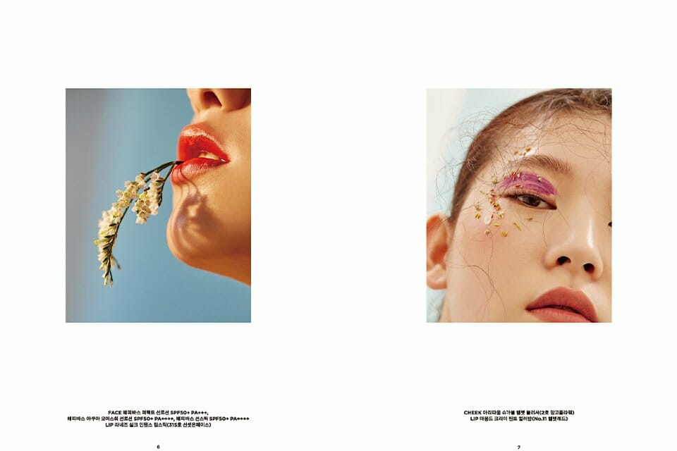
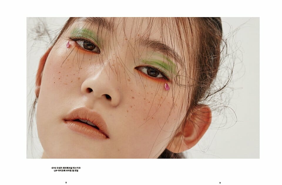
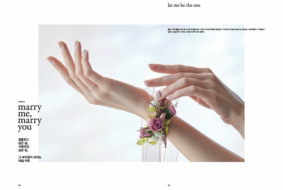
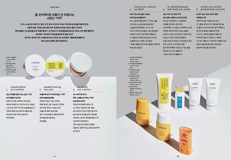
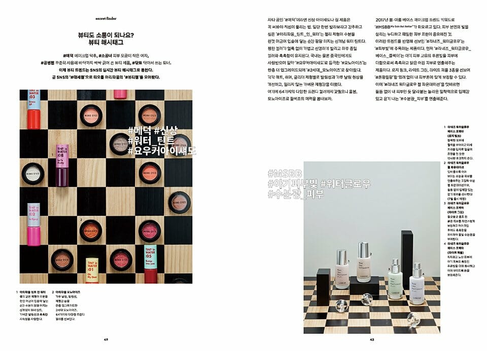
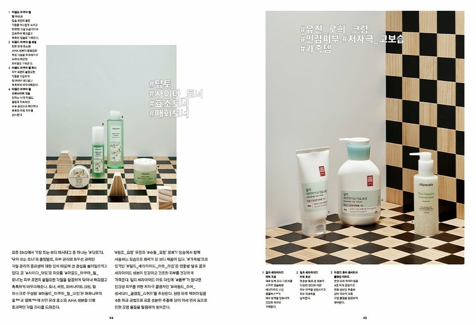
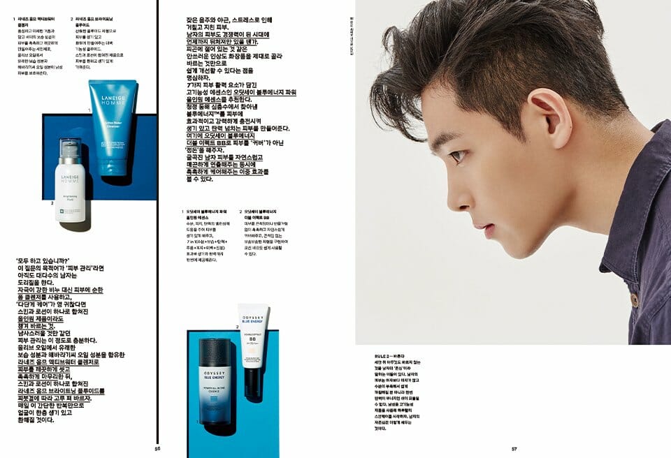
룩북에서 달라진 점은 기존의 카탈로그 형식의 제품명 노출에서 벗어나, 독자가 제품을 직관적으로 파악할 수 있도록 해당 룩에 사용한 제품들을 각각 FACE, CHEEK, LIP, HAIR 등으로 구분 · 정리하여 친절하게 소개한 것입니다. 제품 정보를 담은 텍스트는 이미지와 분리하여 ‘화보를 감상하는 즐거움’을 더욱 높이고자 했습니다. 이 밖에도 주목해야 할 제품 파트에서는 신제품의 사용성과 제품의 속성을 잘 반영할 수 있도록 콘셉트에 디자인을 녹여 표현했습니다.
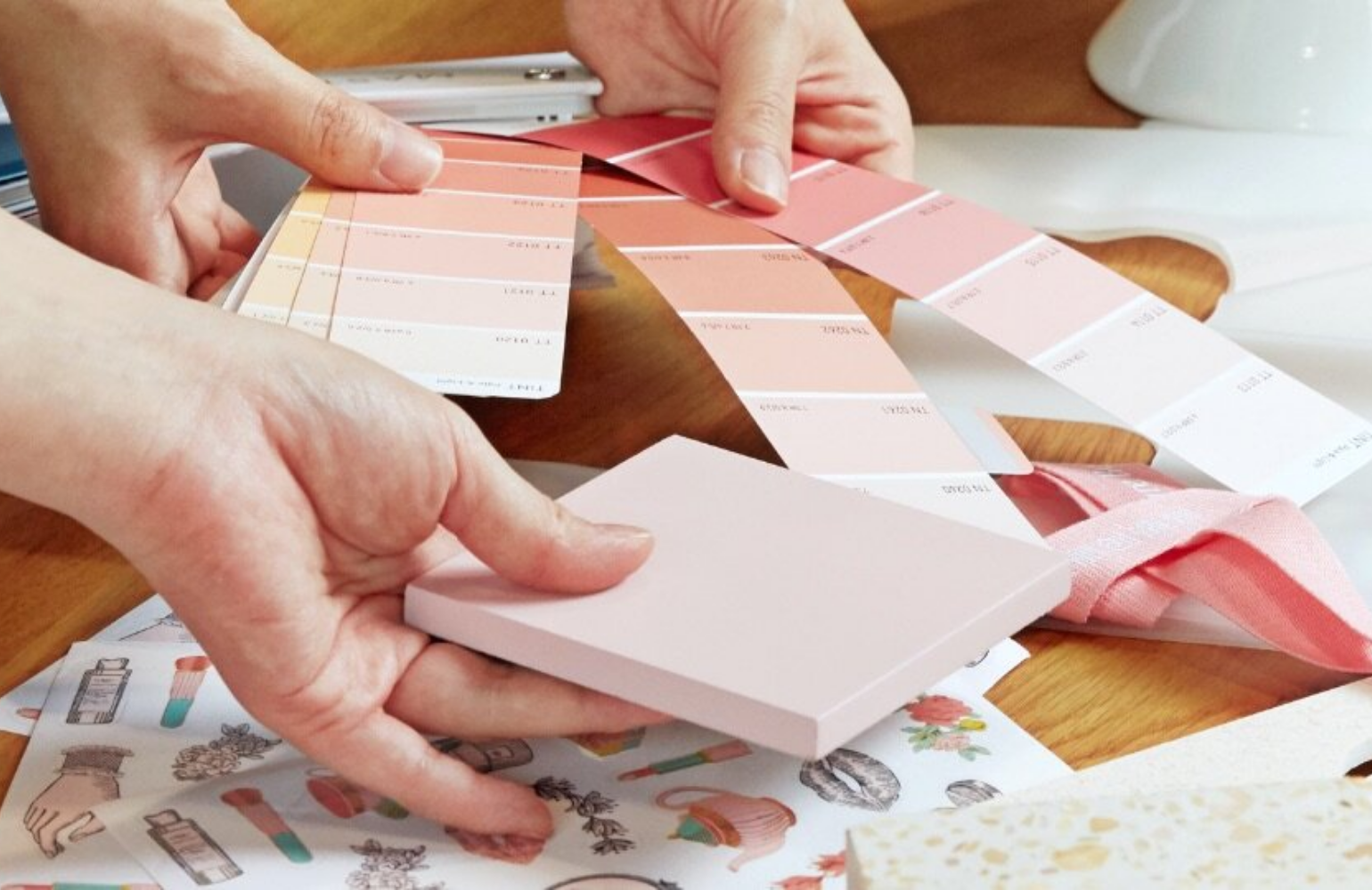
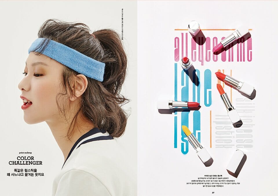
아리따움 매거진은 제품을 단순히 상품으로 보는 게 아니라 ‘제품=콘텐츠’로 보는 브랜드 아리따움의 시각을 편집디자인의 관점으로 풀어냈습니다. 매거진에 소개하는 다종다양한 제품들의 콘셉트와 슬로건, 브랜드 컬러를 재해석하고, 이를 통일성 있게 보여줄 수 있도록 모던하고 일관된 톤의 디자인 레이아웃을 유지했습니다. 이외에도 제품의 특장점이 한눈에 이해되도록 SNS #해시태그를 타이포그래피, 소제목 등으로 표현해 즉흥적으로 아이캐칭 하는 요소로 활용해 제품 정보를 전달했습니다.
아리따움 매거진은 제품을 단순히 상품으로 보는 게 아니라 ‘제품=콘텐츠’로 보는 브랜드 아리따움의 시각을 편집디자인의 관점으로 풀어냈습니다. 매거진에 소개하는 다종다양한 제품들의 콘셉트와 슬로건, 브랜드 컬러를 재해석하고, 이를 통일성 있게 보여줄 수 있도록 모던하고 일관된 톤의 디자인 레이아웃을 유지했습니다. 이외에도 제품의 특장점이 한눈에 이해되도록 SNS #해시태그를 타이포그래피, 소제목 등으로 표현해 즉흥적으로 아이캐칭 하는 요소로 활용해 제품 정보를 전달했습니다.
Unlike the existing catalogue style, which presents product names, the look book introduces products used for a look by classifying and organizing them into FACE, CHEEK, LIP, and HAIR, so that readers can understand the products intuitively. The texts on the information about the products are separated from images to enhance the enjoyment of appreciating pictorials. In addition, for the part of products that need attention, the concept of the products is reflected on the design in order to depict the use and property of new products effectively.
ARITAUM Magazine presents the viewpoint of the brand ARITAUM, which interprets “Product=Contents” from the perspective of edited design instead of simply looking at products as products. It reinterprets the concept and slogan of various products and the color of the brand and keeps the tone of the design layout consistent and modern. In addition, to visualize the feature of products and to deliver product information with instant eye-catching elements, SNS #hash tag is expressed with typography and subtitles.
ARITAUM Magazine presents the viewpoint of the brand ARITAUM, which interprets “Product=Contents” from the perspective of edited design instead of simply looking at products as products. It reinterprets the concept and slogan of various products and the color of the brand and keeps the tone of the design layout consistent and modern. In addition, to visualize the feature of products and to deliver product information with instant eye-catching elements, SNS #hash tag is expressed with typography and subtitles.
- Amorepacific Creatives