Pleasia Dental Brand Launch
플레시아 덴탈 브랜드 런칭
Summary
플레시아는 안전은 기본으로 하되, 각각의 구강질환에 도움이 되는 천연성분으로 만들어진 다양한 치약을 고르는 즐거움을 준다는 브랜드 컨셉으로 개발된 덴탈 브랜드입니다. 즉, 브랜드 가치인 ‘천연에서 오는 다양한 맛과 향’을 BI와 패키지 전반에서 즐겁고 밝고 다채로운 행복감으로 나타낼 수 있도록 디자인 톤&매너를 구성하였습니다.
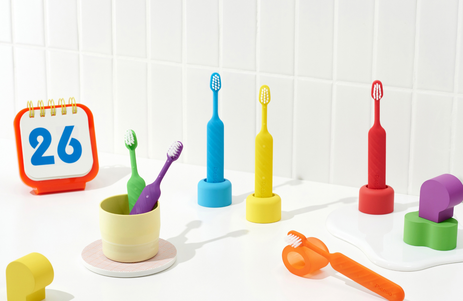
Pleasia is a dental brand that values safety. It is developed under the brand concept of offering customers the enjoyment of selecting from various toothpaste products made of natural ingredients that promote dental health. The design tone & manner are used on the entire package and BI to express the brand value of “various flavors and aromas from nature” and to express various happy feelings.
Concept
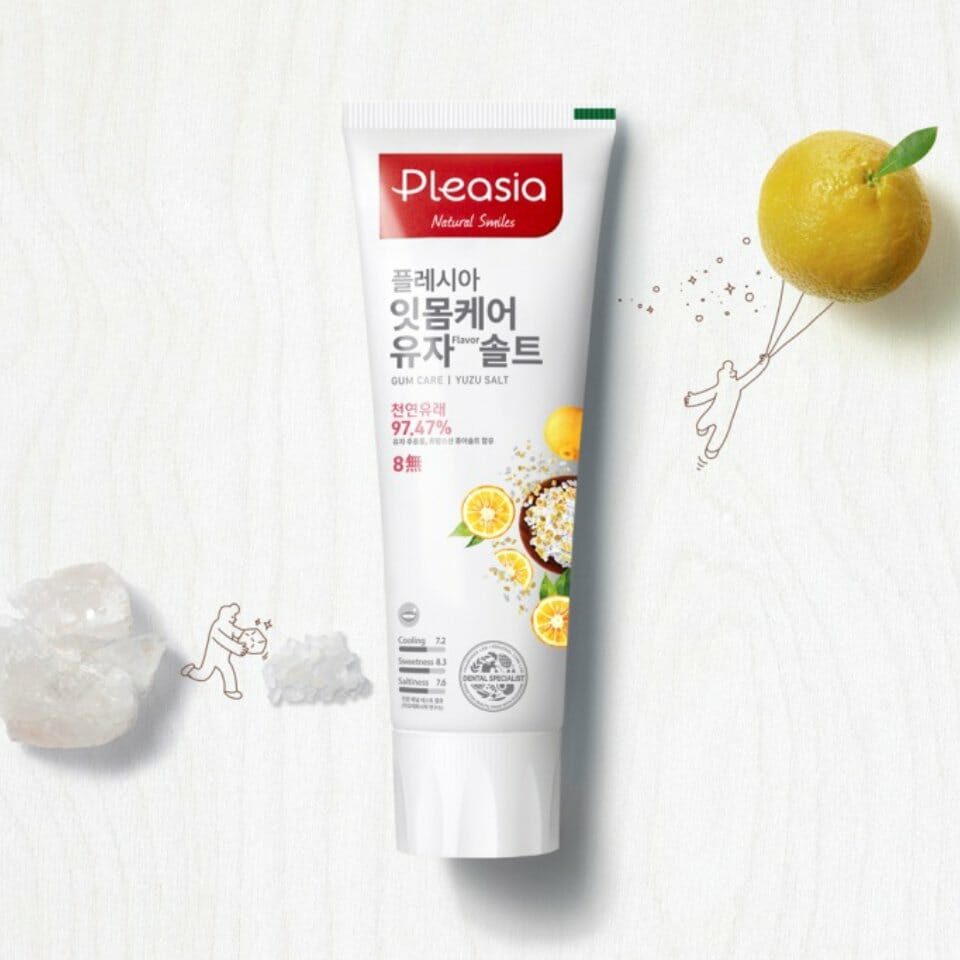
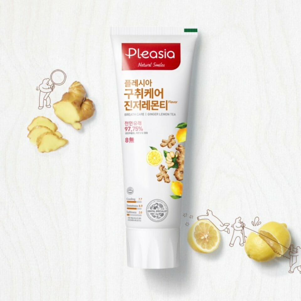
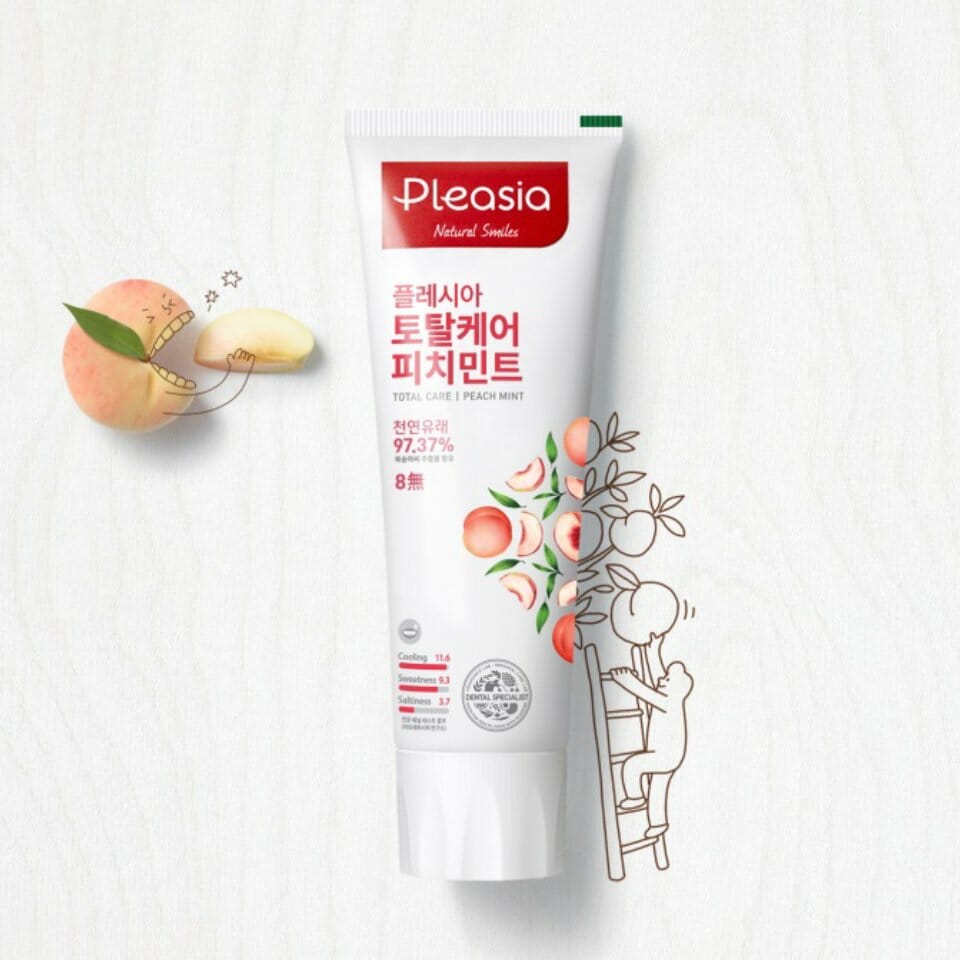
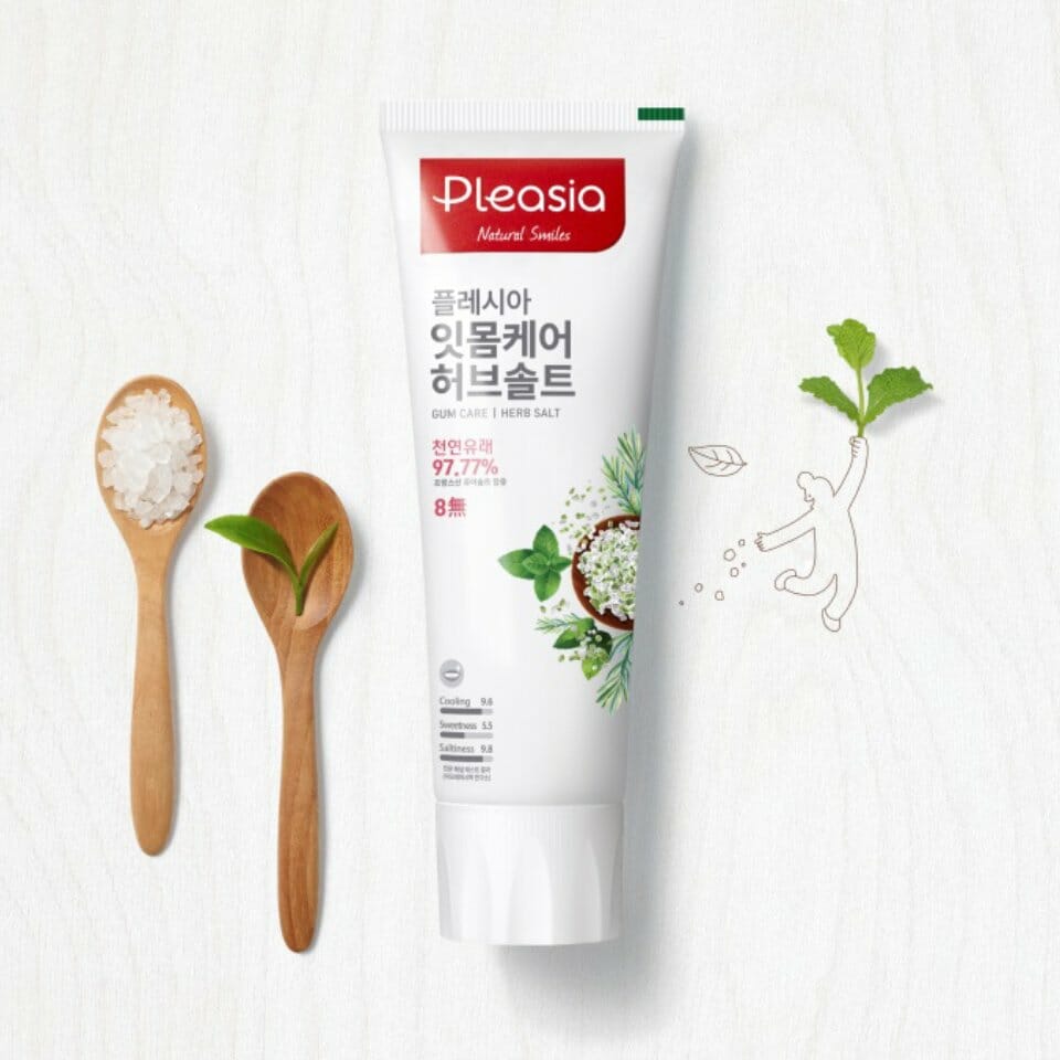
BI의 로고타입과 홀딩쉐입은 치약의 형태를 연상시킬 수 있도록 하였습니다. 여유로운 공간을 담은 둥근 모양의 서체는 즐겁고 밝은 플레시아 브랜드 퍼스낼리티를 나타내며 다양한 종류의 치약을 고르는 즐거움 또한 함께 표현하고 있습니다. 또한 BI의 강력한 메인 레드 컬러는 ‘Pleant Healty’의 의미와 부합하여 생동감있는 즐거움을 나내는 동시에, 기존 블루/그린 중심의 덴탈 카테고리 시장 내에서 타사 제품과 차별화를 두며 플레시아만의 임팩트있는 브랜드 가시성을 높이는 데에 큰 역할을 하도록 하였습니다.
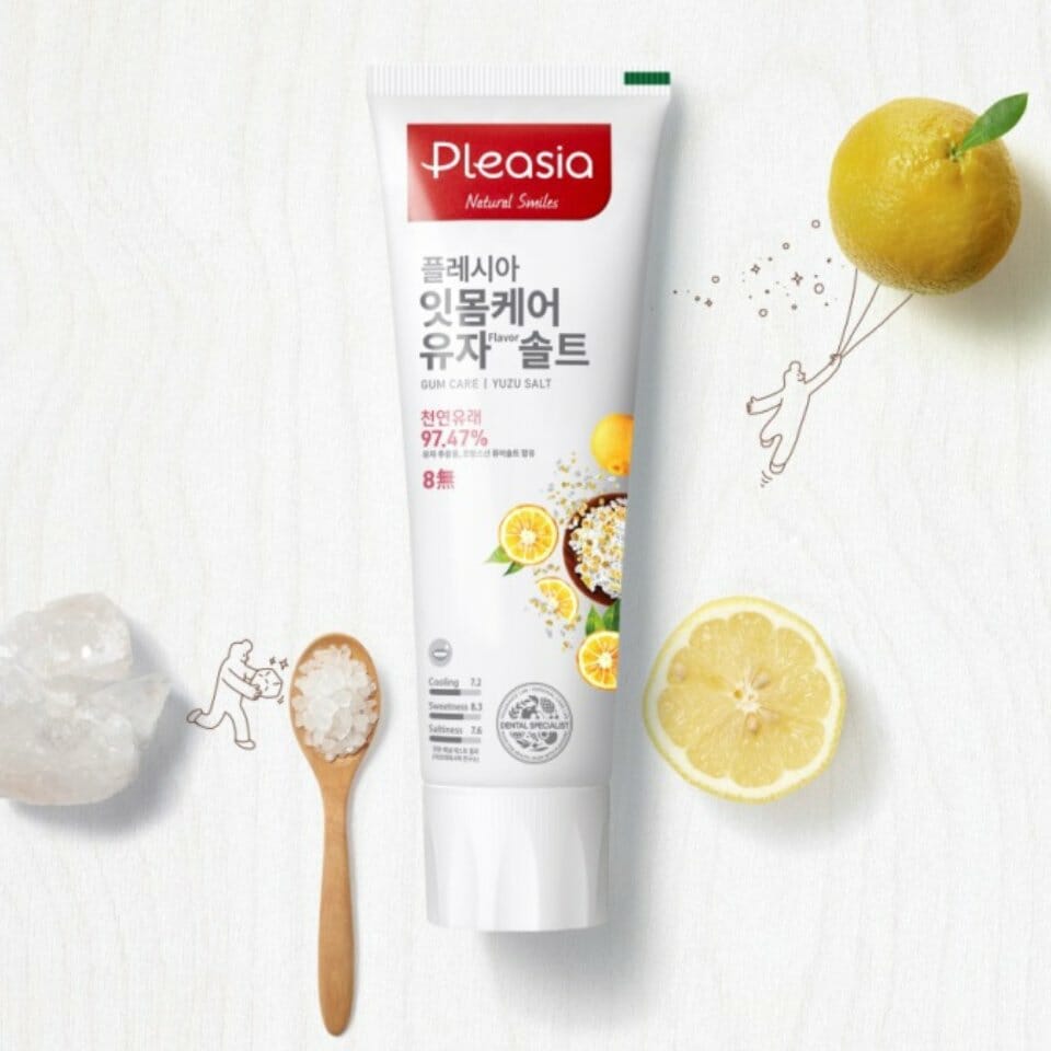
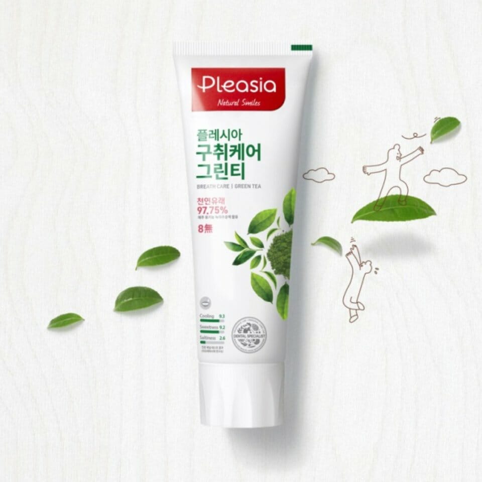
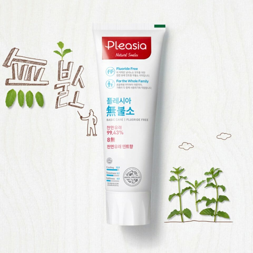
패키지는 플레시아만의 강력한 삼각패턴은 제품 성분들의 콜라쥬 형태로 구성되어 있습니다. 성분 일러스트레이션 스타일은 내추럴하지만 어느정도 현실감이 있는 룩을 구현하며, 플레시아의 브랜드 이미지가 즐겁고 다이나믹하며 다양해 보일 수 있도록 하는데에 중요한 역할을 하고 있습니다. 사용감과 다양성의 즐거움에서 오는 감성적인 측면과 동시에 치약 본연의 기능적인 속성이 충분히 전달될 수 있도록 안전성/맛지수/처방 중심의 기능성 강조 픽토그램 또한 개발하여 패키지 전면에서 함께 커뮤니케이션 될 수 있도록 하였습니다.
패키지는 플레시아만의 강력한 삼각패턴은 제품 성분들의 콜라쥬 형태로 구성되어 있습니다. 성분 일러스트레이션 스타일은 내추럴하지만 어느정도 현실감이 있는 룩을 구현하며, 플레시아의 브랜드 이미지가 즐겁고 다이나믹하며 다양해 보일 수 있도록 하는데에 중요한 역할을 하고 있습니다. 사용감과 다양성의 즐거움에서 오는 감성적인 측면과 동시에 치약 본연의 기능적인 속성이 충분히 전달될 수 있도록 안전성/맛지수/처방 중심의 기능성 강조 픽토그램 또한 개발하여 패키지 전면에서 함께 커뮤니케이션 될 수 있도록 하였습니다.
The logo type and holding shape of BI are selected to remind users of the shape of toothpaste. The round-shaped font, which symbolizes a leisurely space, is intended to depict the pleasant, bright personality of the Pleasia brand, and it also expresses the enjoyment of choosing various toothpastes. The strong red color of BI coincides with the meaning of “Pleasant Healthy” and expresses revitalizing joy. Within the existing blue/green color-centered dental market, it is used to differentiate itself from competitors’ products and to increase the visibility of the Pleasia brand.
The package consists of strong triangular patterns unique to Pleasia and expresses the ingredients of the product in collage style. The style of ingredient illustrations looks natural, but it expresses a realistic look and also makes the brand image of Pleasia look pleasant and dynamic. To deliver the sensitivity aspect by emphasizing the enjoyment of product use and diversity as well as the functional property of toothpaste itself, pictograms that emphasize safety, flavor index, and formula-centered functionality are also developed and expressed on the front side of the package to communicate them to users.
The package consists of strong triangular patterns unique to Pleasia and expresses the ingredients of the product in collage style. The style of ingredient illustrations looks natural, but it expresses a realistic look and also makes the brand image of Pleasia look pleasant and dynamic. To deliver the sensitivity aspect by emphasizing the enjoyment of product use and diversity as well as the functional property of toothpaste itself, pictograms that emphasize safety, flavor index, and formula-centered functionality are also developed and expressed on the front side of the package to communicate them to users.
- Amorepacific Creatives