Miseenscene Botanical Line
미쟝센 보태니컬 라인
Summary
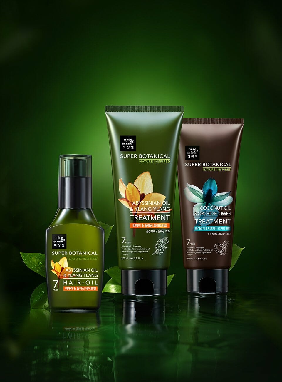
뛰어난 퍼포먼스와 패셔너블한 감각을 아우르는 헤어토탈케어 브랜드 미쟝센에서 처음으로 선보이는 내추럴 라인인 슈퍼보태니컬 라인입니다. 내추럴 브랜드들은 많지만, 미쟝센이 추구하는 브랜드의 성격을 담아내기 위해 있는 그대로의 내추럴한 이미지를 사용하지 않고, 한 번 더 가공된 아름다움을 표현함과 동시에 투명성 있게 원료를 분석해내는 기능적인 느낌을 살릴 수 있도록 엑스레이 기법이 연상되는 이미지를 활용하여 디자인했습니다.
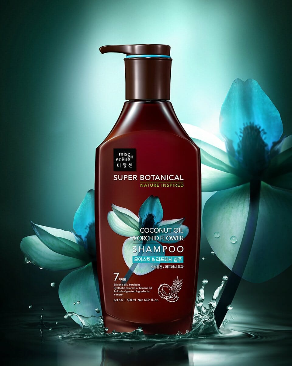
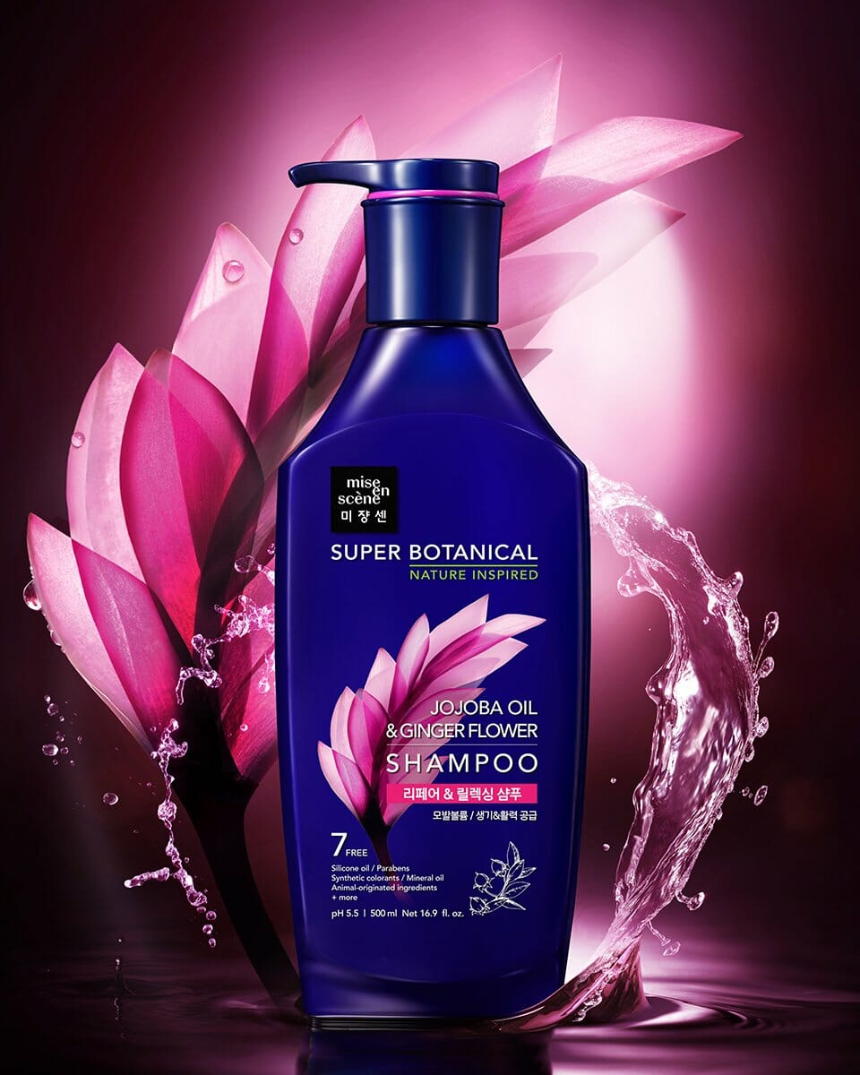
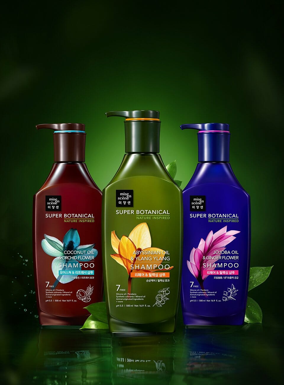
또한, 내추럴하고 딥한 색상의 용기와 대비되도록 포인트컬러를 원료의 밝고 화려한 색상과 동일하게 가져가서 매대에서 아이캐칭을 할 수 있도록 했습니다.
슈퍼보태니컬을 영어로 표기한 로고를 미쟝센의 정사각형 로고와 어우러질 수 있는 레이아웃으로 디자인하였습니다. 정사각형 로고 바로 아래에 좌측정렬로 길게 가로로 문안을 배치하고, 제품 문안은 우측 정렬하여 보다 정리된 레이아웃으로 브랜드로고와 문안이 각자의 위치에서 모두 주목도를 끌 수 있도록 디자인하였습니다.
Super Botanical is the first natural line introduced by mise en scène, a total hair care brand known for its outstanding performance and fashionable sensibility. While many natural brands exist on the market, this line was designed not by using raw natural imagery, but by expressing a refined beauty. To convey a sense of functionality and transparency in ingredient analysis, visuals reminiscent of X-ray techniques were utilized.
To create contrast with the deep, natural tones of the container, bright and vivid colors inspired by the ingredients themselves were used as point colors, allowing the product to stand out and catch the customer’s eye on the shelf.
The Super Botanical logo, written in English, was designed to harmonize with the mise en scène square brand logo. A horizontally long brand message is placed directly below the square logo, left-aligned, while the product message is right-aligned. This creates a clean, well-organized layout that allows both the brand logo and the textual content to attract attention in their respective positions.
- Amorepacific Creatives