AMORE YONGSAN RENEWAL PROJECT
Summary
The starting point of the AMORE YONGSAN Renewal Project was not simply to redesign a retail store.
The first question we asked was, “What role should AMORE YONGSAN, the store located within Amorepacific Headquarters, play?”
Although AMORE YONGSAN had long operated as a sales-oriented space, its physical environment and customer experience no longer fully reflected the present and future of the company, despite the symbolic significance of its location within Amorepacific Headquarters.
Amorepacific’s diverse brand portfolio, innovative products, personalized services, and research facilities were all clearly present. However, there was no single journey through which customers and partners could experience them as one connected story.
This project therefore began by redesigning that very point of connection.
The first question we asked was, “What role should AMORE YONGSAN, the store located within Amorepacific Headquarters, play?”
Although AMORE YONGSAN had long operated as a sales-oriented space, its physical environment and customer experience no longer fully reflected the present and future of the company, despite the symbolic significance of its location within Amorepacific Headquarters.
Amorepacific’s diverse brand portfolio, innovative products, personalized services, and research facilities were all clearly present. However, there was no single journey through which customers and partners could experience them as one connected story.
This project therefore began by redesigning that very point of connection.
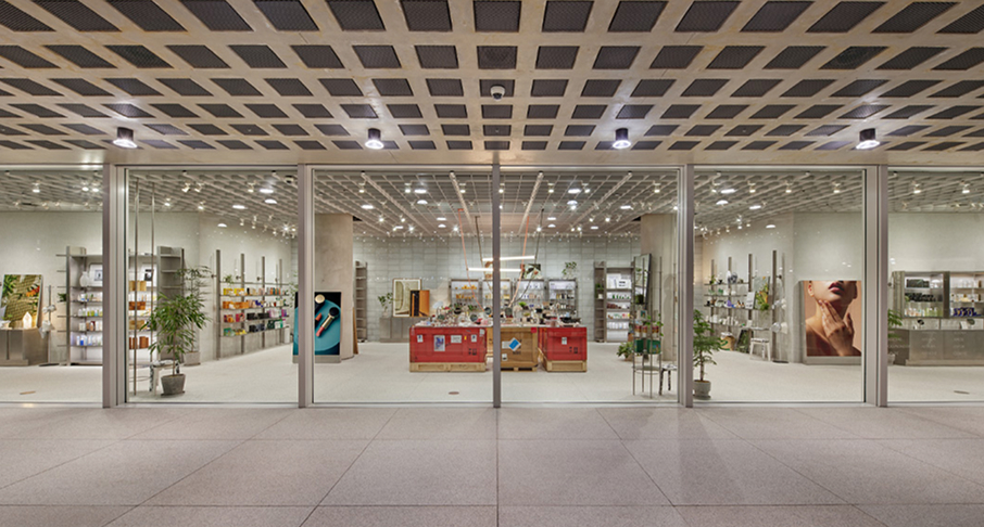
* AMORE YONGSAN before the renewal
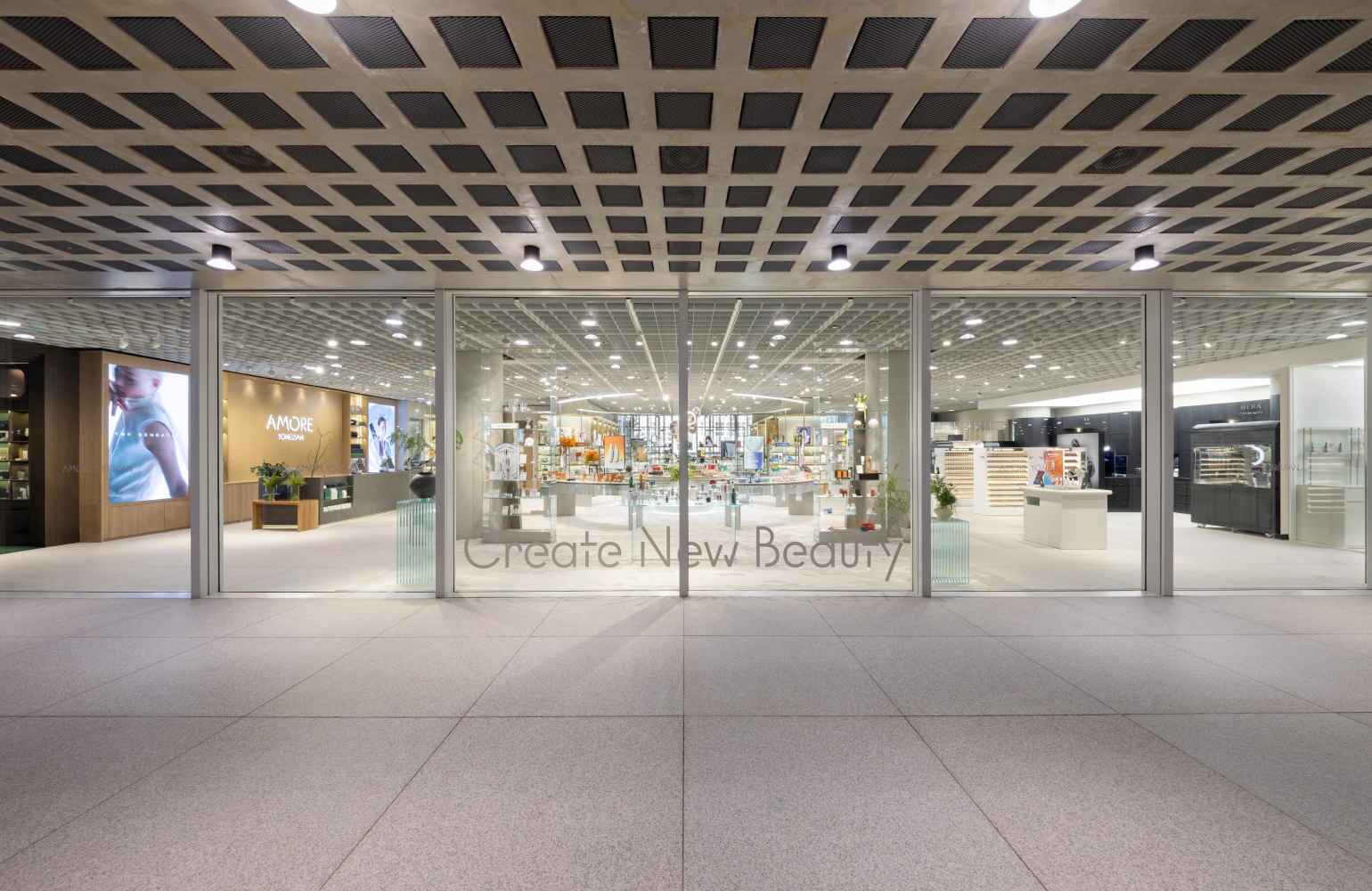
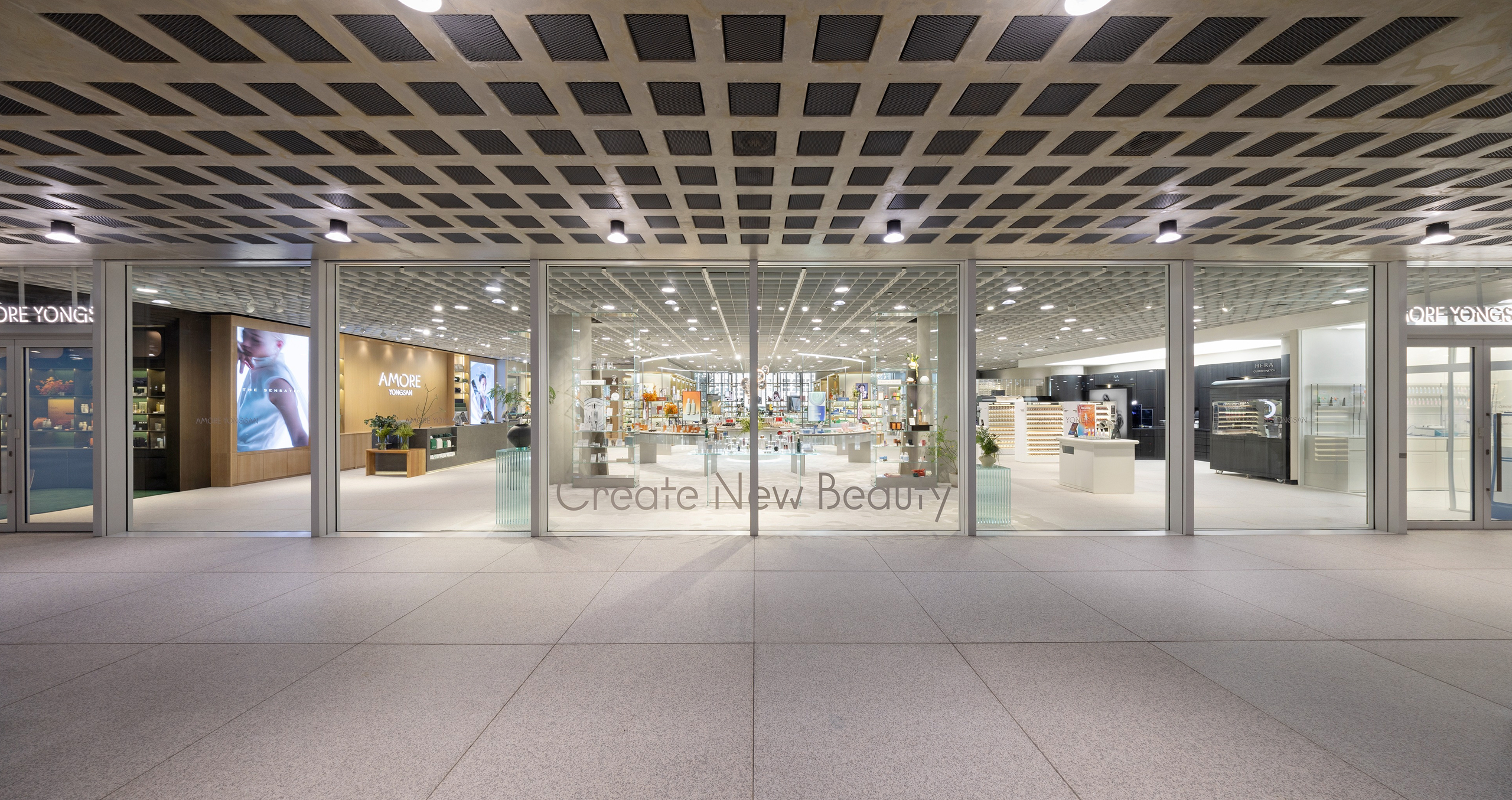
The existing 47-pyeong space was completely rebuilt and expanded into a 150-pyeong brand- and service-focused environment.
The former Customer Research Center and City Lab were integrated into the new space, while dedicated areas for meetups and events were added, transforming it into a unified environment of more than 350 pyeong.
This was not simply an expansion in size, but a transformation into the House of New Beauty—a space where Amorepacific’s vision, “Create New Beauty,” is expressed through both the environment and the customer experience.
Going beyond the role of a retail store, the space was reimagined as a headquarters platform where brands, future beauty, research, and collaboration are seamlessly connected within a single framework.
The new AMORE YONGSAN was therefore conceived not as a collection of separate functions, but as an integrated experience built around a single concept.
This was not simply an expansion in size, but a transformation into the House of New Beauty—a space where Amorepacific’s vision, “Create New Beauty,” is expressed through both the environment and the customer experience.
Going beyond the role of a retail store, the space was reimagined as a headquarters platform where brands, future beauty, research, and collaboration are seamlessly connected within a single framework.
The new AMORE YONGSAN was therefore conceived not as a collection of separate functions, but as an integrated experience built around a single concept.
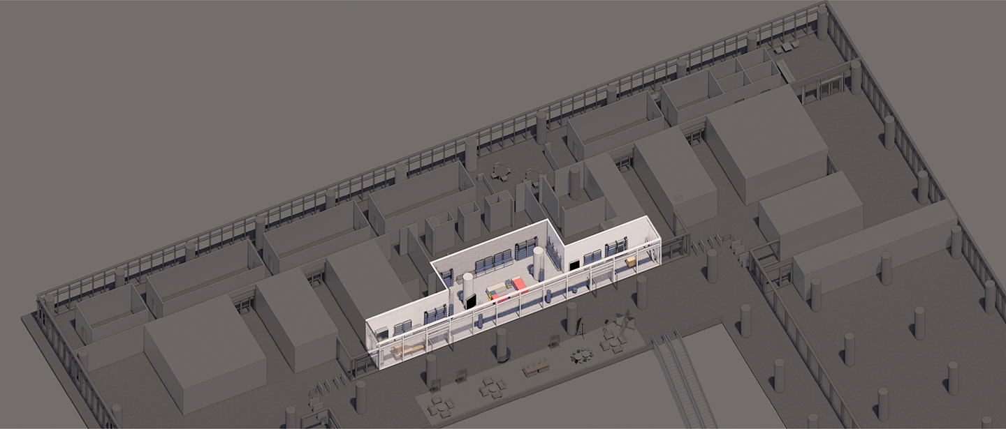
Before the Expansion
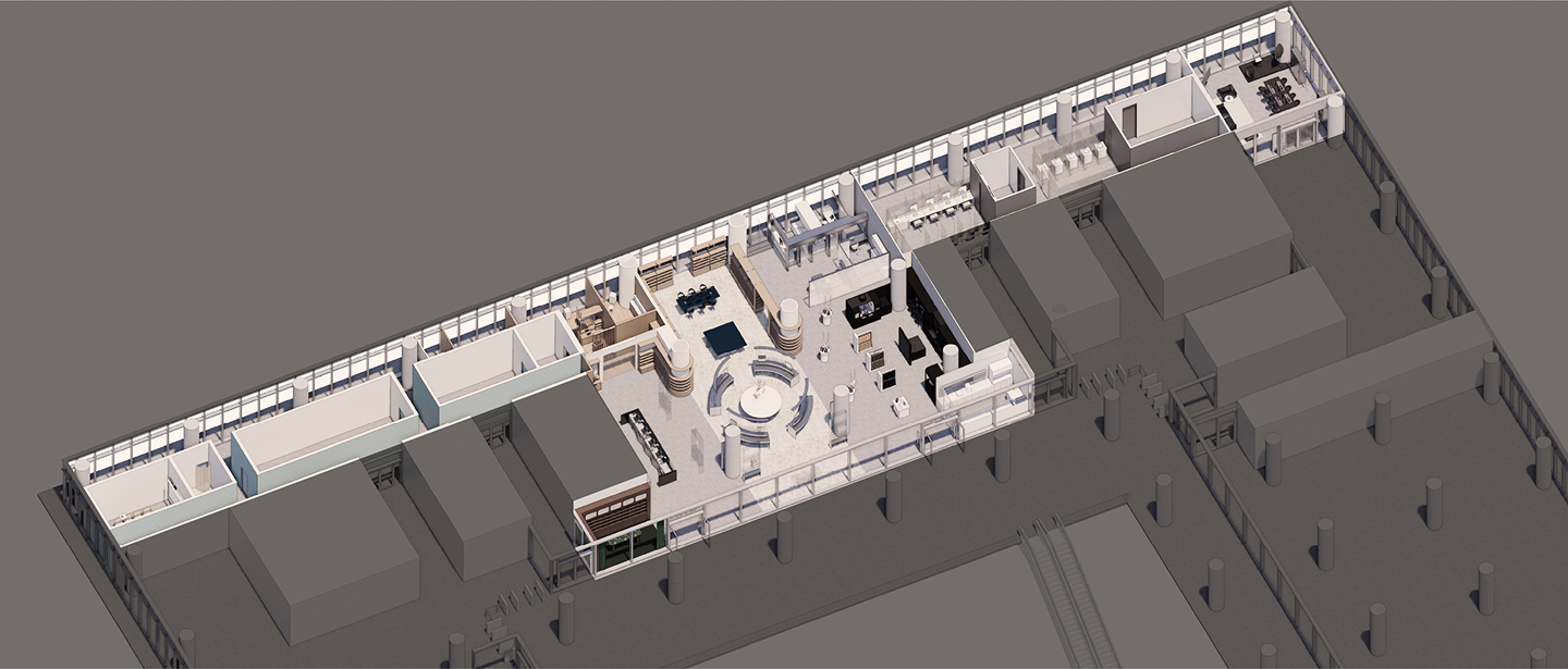
After the Expansion

From the architectural language of Amorepacific Headquarters
to a spatial design that evolves with flexibility.
to a spatial design that evolves with flexibility.
In the interior design, it was important to naturally extend the identity and atmosphere of Amorepacific Headquarters into the retail space.
By translating the headquarters’ restrained architectural expression, refined materiality, and contemporary architectural language into the retail environment, the space was designed to embody the distinctive character of Amorepacific throughout.
Through this approach, the AMORE YONGSAN Renewal Project became more than just a store within the headquarters.
It was realized as a continuous spatial experience where the brand philosophy and the experience of the space are seamlessly connected.
Different Spaces, One Continuous Journey
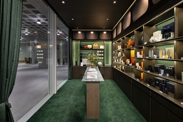
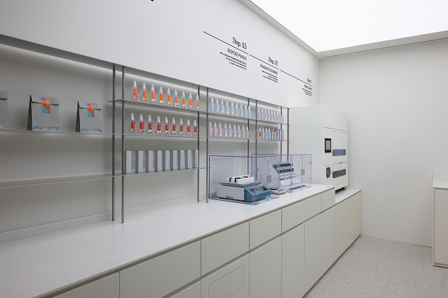
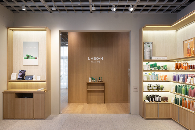
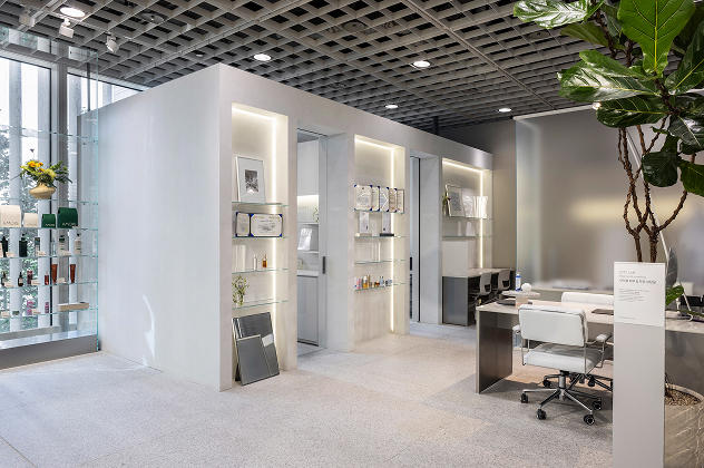
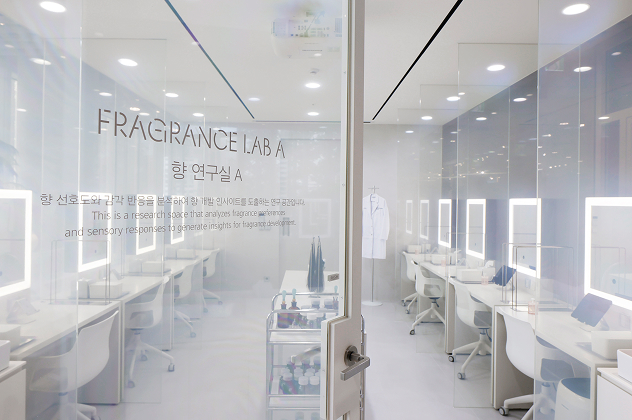
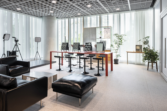
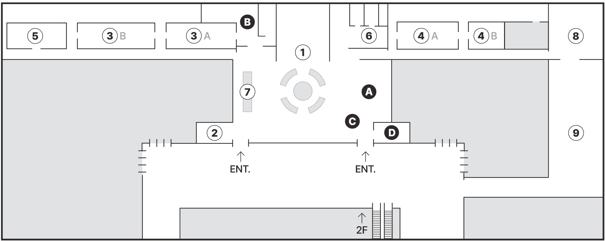
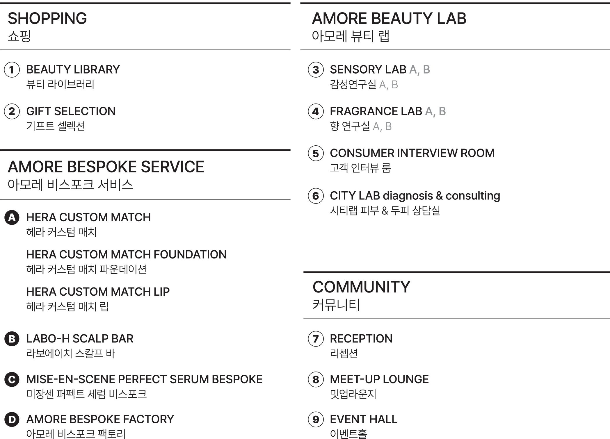
(From top left) ① Gift Shop ② AMORE Bespoke Factory Formulation Lab ③ LABO-H Scalp Bar ④ AMORE Beauty Lab – City Lab Skin & Scalp Consultation Room ⑤ AMORE Beauty Lab – Fragrance Research Lab ⑥ Meetup Lounge
Rather than giving every space the same expression, the AMORE YONGSAN Renewal Project was designed so that each area would have its own distinct atmosphere, shaped by its role and the experience it offers.
The Gift Selection features a warm, dark wood palette, creating an intimate and richly layered atmosphere. AMORE BESPOKE FACTORY adopts a bright, clean white palette to emphasize a futuristic and refined identity. LABO-H SCALP BAR introduces a comfortable wood-toned environment that brings a sense of warmth and stability, while CITY LAB Diagnosis & Consulting uses glass blocks to create a transparent and experimental atmosphere. The Fragrance Lab within AMORE BEAUTY LAB incorporates smart glass mirrors, allowing the space to transform when research is not in progress. By opening the laboratory to visitors during these times, it was designed to feel more approachable and welcoming while demonstrating a flexible use of space. The MEET-UP LOUNGE, where a variety of business activities take place, incorporates repurposed furniture to reflect sustainability while creating an environment that feels both comfortable and impactful.
Although each space has its own distinct materials and atmosphere, they were carefully orchestrated to come together within a single spatial language. As visitors move through the environment, they encounter a sequence of unique experiences that reveal the character of each brand and service more clearly. In this way, spaces with different identities are connected through one continuous journey, creating the distinctive experience of AMORE YONGSAN.
The Gift Selection features a warm, dark wood palette, creating an intimate and richly layered atmosphere. AMORE BESPOKE FACTORY adopts a bright, clean white palette to emphasize a futuristic and refined identity. LABO-H SCALP BAR introduces a comfortable wood-toned environment that brings a sense of warmth and stability, while CITY LAB Diagnosis & Consulting uses glass blocks to create a transparent and experimental atmosphere. The Fragrance Lab within AMORE BEAUTY LAB incorporates smart glass mirrors, allowing the space to transform when research is not in progress. By opening the laboratory to visitors during these times, it was designed to feel more approachable and welcoming while demonstrating a flexible use of space. The MEET-UP LOUNGE, where a variety of business activities take place, incorporates repurposed furniture to reflect sustainability while creating an environment that feels both comfortable and impactful.
Although each space has its own distinct materials and atmosphere, they were carefully orchestrated to come together within a single spatial language. As visitors move through the environment, they encounter a sequence of unique experiences that reveal the character of each brand and service more clearly. In this way, spaces with different identities are connected through one continuous journey, creating the distinctive experience of AMORE YONGSAN.
The Central Showroom at the Heart of the Space
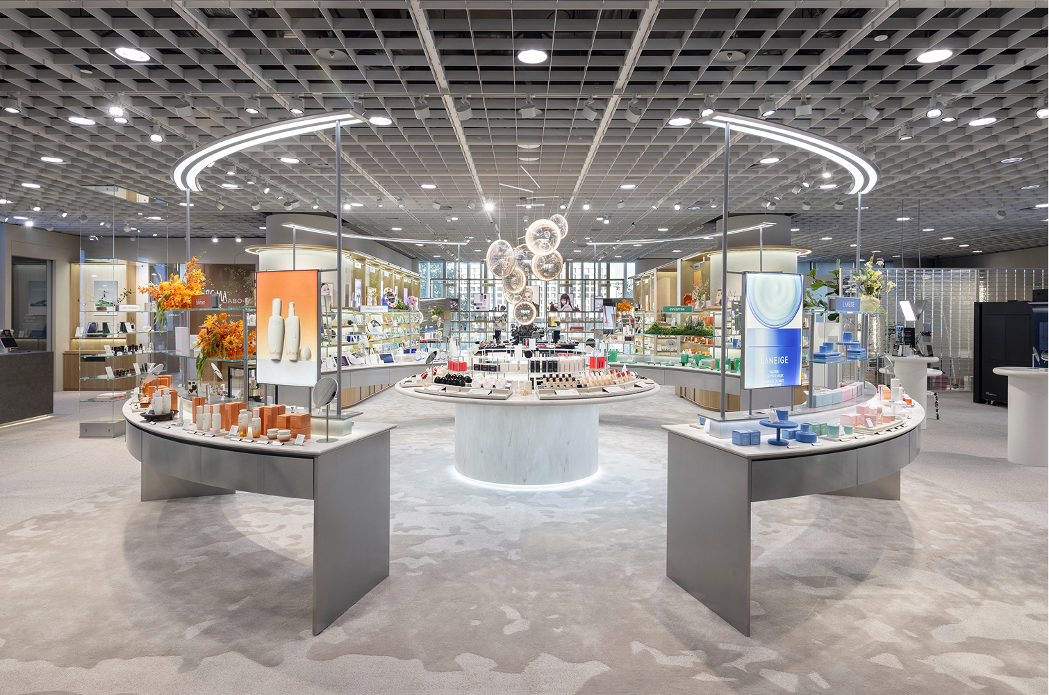
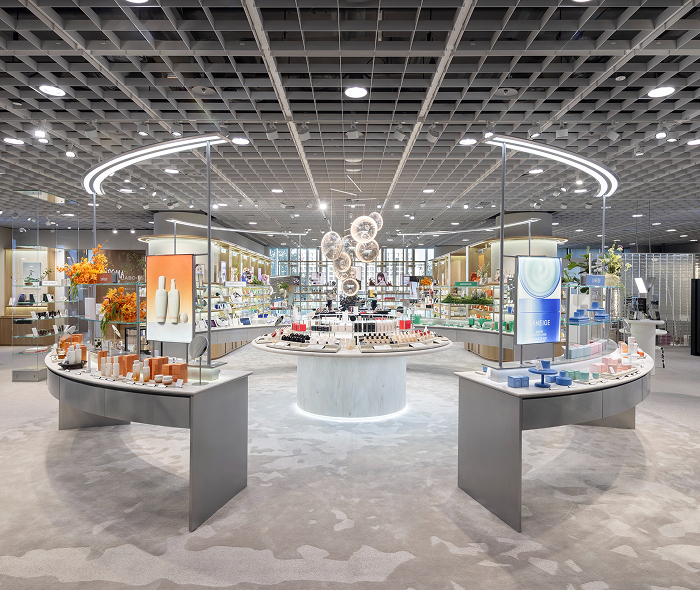
The Central Showroom is where this design direction is expressed most clearly.
As the Golden Zone of AMORE YONGSAN and the heart of the project, a circular curation zone was planned within the four-column axis, making it easily accessible from every direction.
Rather than serving as a display dedicated to a single brand, it was designed as a flexible stage capable of accommodating a wide range of programs, including new product launches, beauty device experiences, and customer participation activities.
The circular lighting feature at its center also goes beyond functioning as a simple lighting fixture.
It was designed as a key architectural element that brings rhythm and symbolic meaning to the entire space.
Through this approach, the Central Showroom becomes more than an exhibition area—it serves as the defining focal point that leaves visitors with the most memorable impression of AMORE YONGSAN.
A Brand Experience Space Designed for Operational Flexibility
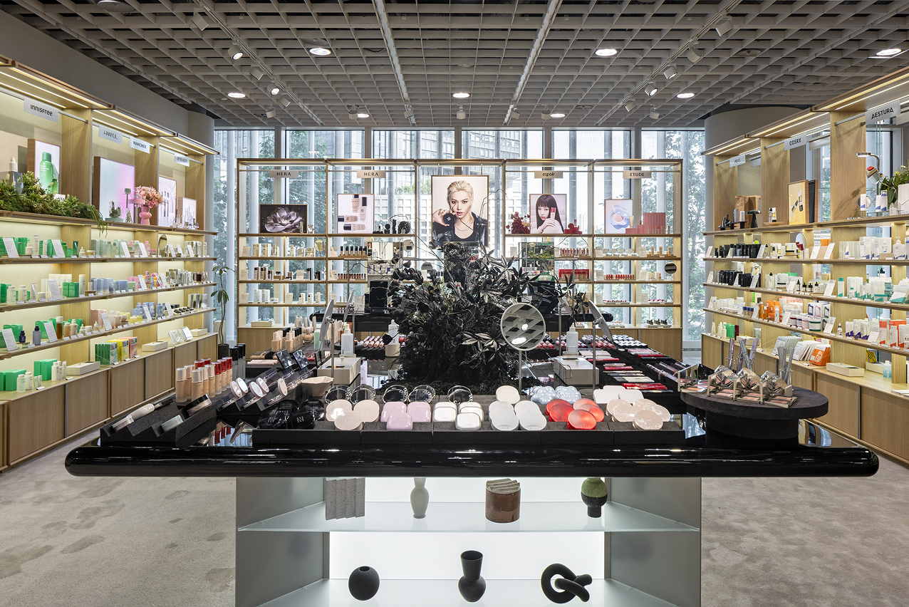
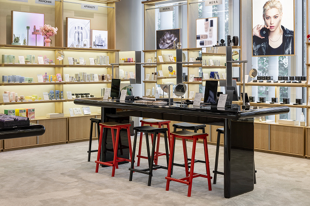
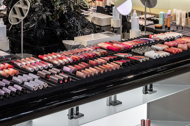
The brand experience area at the rear of the space was designed not to be fixed to a specific category, but to continuously evolve in response to emerging market trends and products gaining public attention.
At its center, a flexible demonstration area was created for makeup presentations, while the surrounding wall display system was designed to showcase each brand’s key messages and hero products, allowing product experiences and exhibitions to coexist within the same environment. Through this approach, visitors move beyond simply viewing products—they can test, experience, and engage with them directly, gaining a deeper understanding of each brand. Creating a space that can adapt flexibly to changing market trends was therefore one of the key design principles behind the AMORE YONGSAN Renewal Project.
At its center, a flexible demonstration area was created for makeup presentations, while the surrounding wall display system was designed to showcase each brand’s key messages and hero products, allowing product experiences and exhibitions to coexist within the same environment. Through this approach, visitors move beyond simply viewing products—they can test, experience, and engage with them directly, gaining a deeper understanding of each brand. Creating a space that can adapt flexibly to changing market trends was therefore one of the key design principles behind the AMORE YONGSAN Renewal Project.
Beyond Personalized Services, Toward a Global Headquarters-Level Beauty Experience
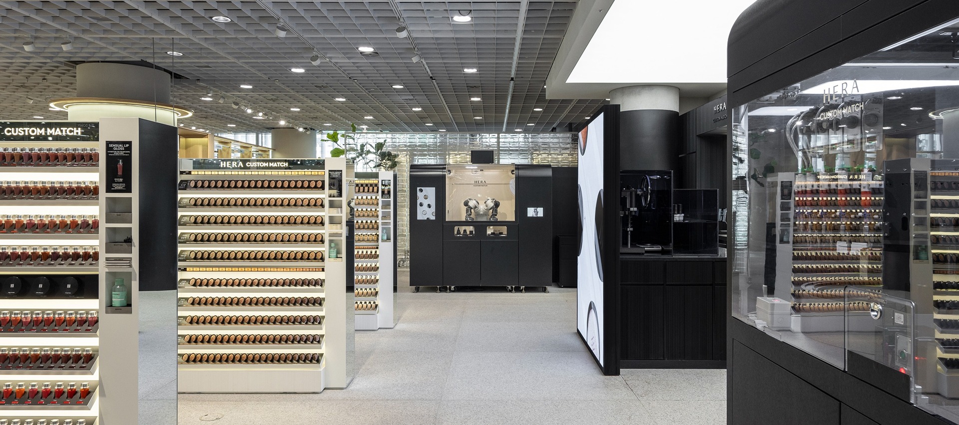
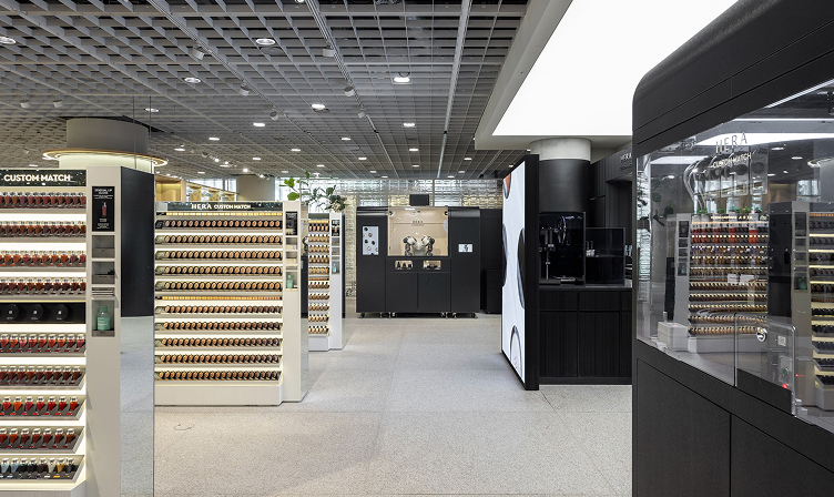
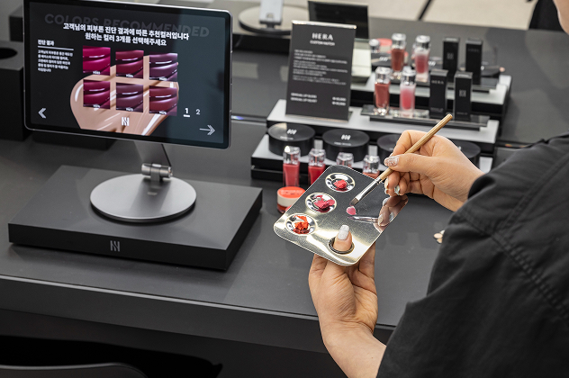
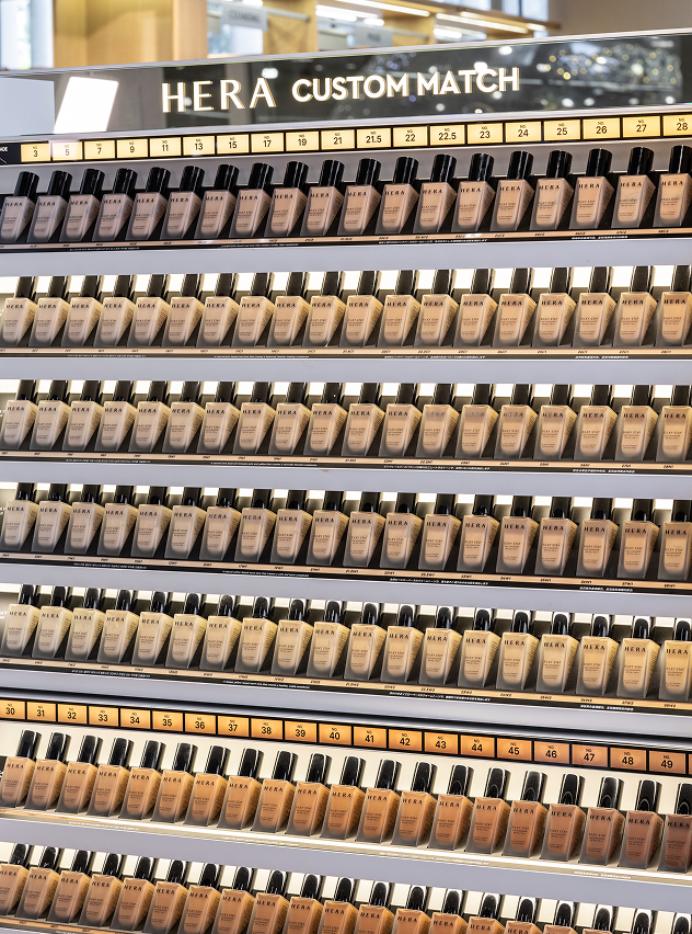
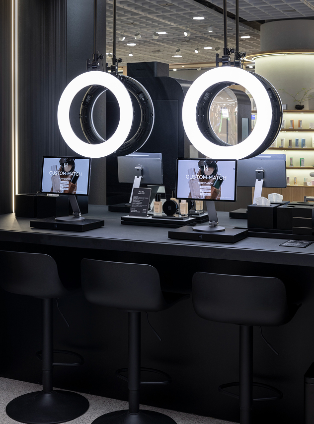
Designing the HERA personalized service area was one of the project’s most challenging tasks.
Within a limited footprint, the circulation of reservation-based customers and walk-in visitors needed to be clearly separated, while the formulation area and testing area also had to be organized efficiently.
The key objective was to preserve the professionalism and privacy of the personalized service while allowing customers to naturally experience HERA’s technology and products through both spatial design and carefully planned customer circulation.
The self-testing area, in particular, required customers to easily navigate HERA’s extensive range of foundations, cushions, lip products, and countless color variations without feeling overwhelmed. To achieve this, we repeatedly refined the proportions of the display fixtures and the testing environment, seeking the most effective way to present products and colors within a minimal spatial framework. Clearly communicating HERA’s extensive color spectrum and technological expertise became one of the project’s most important design criteria.
HERA’s formulation equipment was also conceived as more than a functional piece of machinery—it was planned as a symbolic expression of the brand’s technological capabilities. Customers can experience the precision of HERA’s technology by watching the robotic formulation process in real time, while the self-testing area encourages them to explore products firsthand, creating a more active and immersive beauty experience. Through this approach, the new HERA personalized service space at AMORE YONGSAN was designed to seamlessly connect the professional, reservation-based consultation experience with the freedom of self-guided product exploration, all within a refined spatial design and an efficient circulation system. As a result, HERA’s technology, color expertise, and personalized service are brought together as one integrated brand experience.
The self-testing area, in particular, required customers to easily navigate HERA’s extensive range of foundations, cushions, lip products, and countless color variations without feeling overwhelmed. To achieve this, we repeatedly refined the proportions of the display fixtures and the testing environment, seeking the most effective way to present products and colors within a minimal spatial framework. Clearly communicating HERA’s extensive color spectrum and technological expertise became one of the project’s most important design criteria.
HERA’s formulation equipment was also conceived as more than a functional piece of machinery—it was planned as a symbolic expression of the brand’s technological capabilities. Customers can experience the precision of HERA’s technology by watching the robotic formulation process in real time, while the self-testing area encourages them to explore products firsthand, creating a more active and immersive beauty experience. Through this approach, the new HERA personalized service space at AMORE YONGSAN was designed to seamlessly connect the professional, reservation-based consultation experience with the freedom of self-guided product exploration, all within a refined spatial design and an efficient circulation system. As a result, HERA’s technology, color expertise, and personalized service are brought together as one integrated brand experience.

A VMD That Responds to Change with a Refined Aesthetic
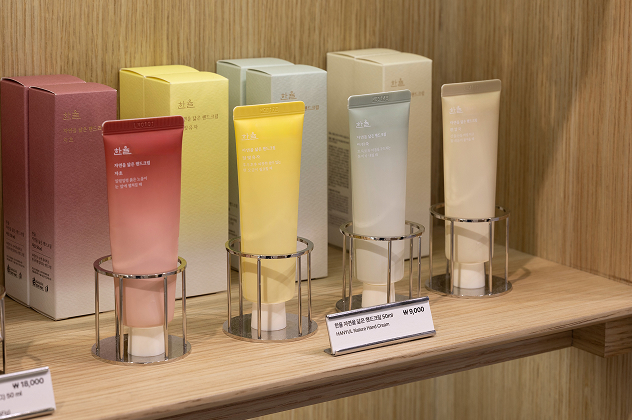
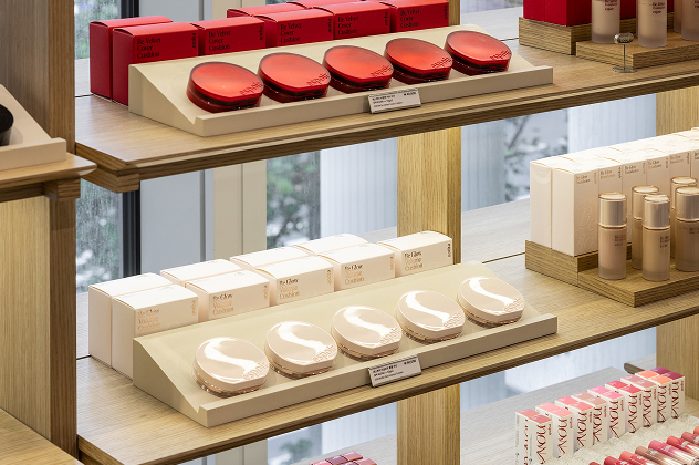
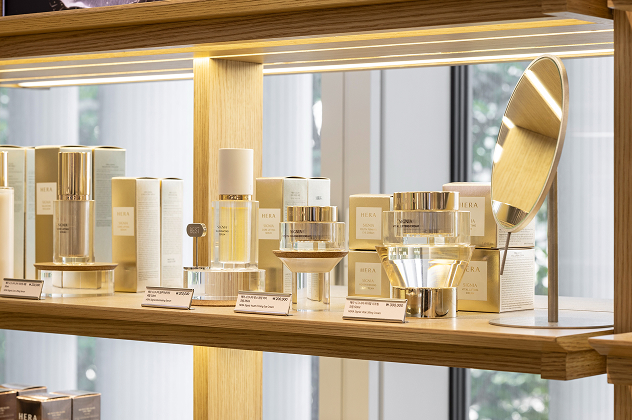
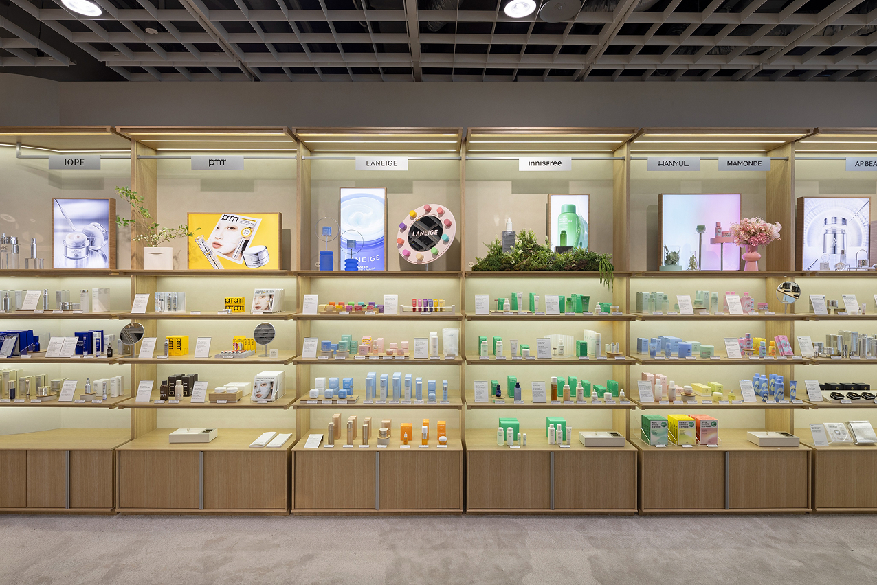
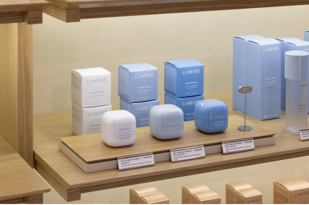
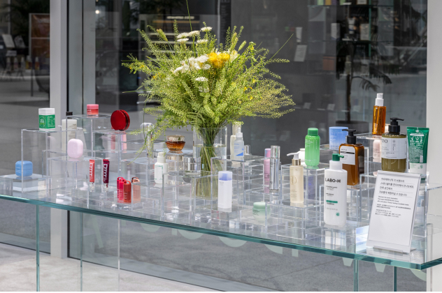
The VMD design for the AMORE YONGSAN Renewal Project focused not on adding eye-catching decorative elements, but on creating a structure that delivers a timeless impression while remaining flexible enough to accommodate change.
The key objective was to establish a sense of stability through restrained proportions, clean silhouettes, and display compositions centered on negative space, while ensuring that seasonal updates and product changes could be implemented without disrupting the overall identity of the space.
This approach was reflected throughout both the form and operation of the VMD system. Rather than creating highly stylized product displays, products were carefully organized on low, wide display plates to emphasize clarity and balance. The proportions of trays, bases, and modular fixtures were standardized to maintain a consistent spatial rhythm throughout the environment. Elements that require frequent updates were concentrated in upper display zones or smaller feature areas, allowing the space to respond efficiently to seasonal campaigns and changes in hero products without affecting the overall composition.
The CMF strategy followed the same philosophy. Transparent materials enhance openness and improve the clarity of product communication, while warm wood tones introduce a natural sense of balance and comfort. Light stone finishes, charcoal, black, and restrained metallic textures provide structural order and visual stability, while low-sheen matte finishes were selected over glossy surfaces to create a calm and refined atmosphere.
Ultimately, the VMD design for the AMORE YONGSAN Renewal Project was shaped not by decorative expression, but by the quality of its proportions, materials, structure, and operational flexibility—creating a retail environment that reinforces trust in both the brand and the space itself.
This approach was reflected throughout both the form and operation of the VMD system. Rather than creating highly stylized product displays, products were carefully organized on low, wide display plates to emphasize clarity and balance. The proportions of trays, bases, and modular fixtures were standardized to maintain a consistent spatial rhythm throughout the environment. Elements that require frequent updates were concentrated in upper display zones or smaller feature areas, allowing the space to respond efficiently to seasonal campaigns and changes in hero products without affecting the overall composition.
The CMF strategy followed the same philosophy. Transparent materials enhance openness and improve the clarity of product communication, while warm wood tones introduce a natural sense of balance and comfort. Light stone finishes, charcoal, black, and restrained metallic textures provide structural order and visual stability, while low-sheen matte finishes were selected over glossy surfaces to create a calm and refined atmosphere.
Ultimately, the VMD design for the AMORE YONGSAN Renewal Project was shaped not by decorative expression, but by the quality of its proportions, materials, structure, and operational flexibility—creating a retail environment that reinforces trust in both the brand and the space itself.
Enhancing the Brand Experience Through Curated Objects
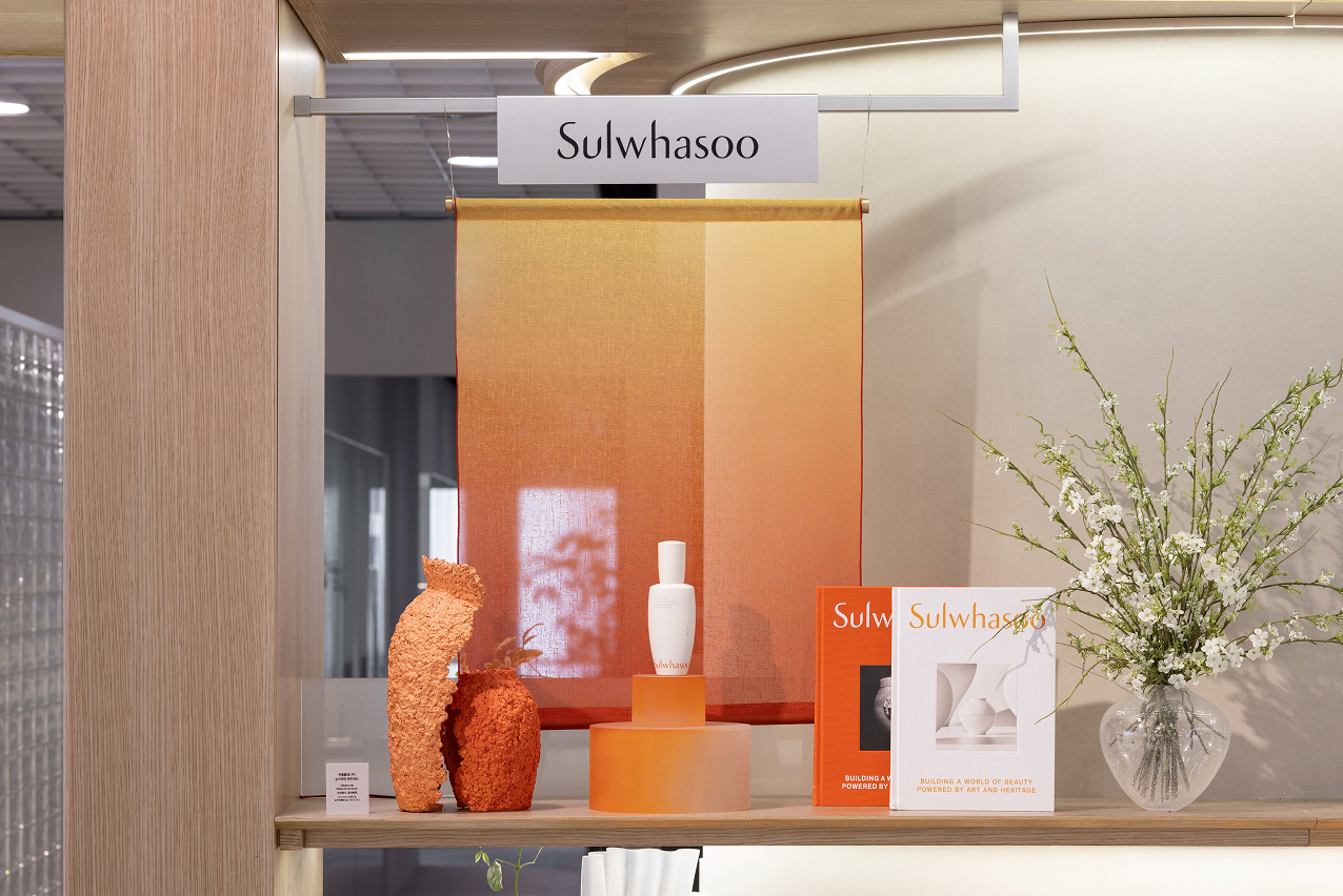
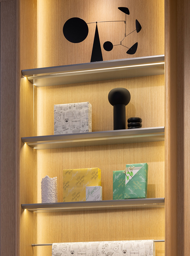
For the brand display walls, the products were intended to remain the focal point, while carefully curated objects placed on the upper shelves added another layer of identity, creating more memorable visual moments.
A range of objects—including pieces created by the Creative Center, upcycled objects, and collaborations with artists—were explored as part of the design process.
Rather than serving as decorative elements alone, these objects were intended to naturally convey Amorepacific’s creative sensibility and its perspective on sustainability throughout the space.
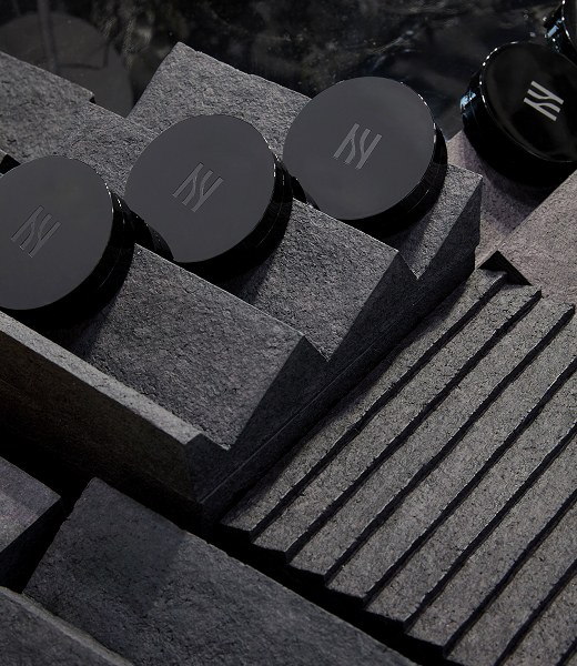
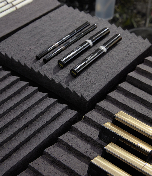
Particular attention was given to the display fixtures on the makeup tables.
While harmonizing with the high-gloss black tabletops, they were developed in a matte black finish to allow the colors of the various makeup products to stand out more vividly.
The fixtures were created using production offcuts generated during the manufacturing of packaging cartons.
In collaboration with artist Woojae Lee, these discarded materials were transformed into custom display fixtures, giving new life to Amorepacific’s own production waste and extending it into objects unique to AMORE YONGSAN.
In addition, a new modular display system was developed to suit a space that showcases a wide variety of brands and products.
Designed to balance sculptural quality with functionality, the system enables customers to test products more comfortably while also improving operational efficiency.
Modular Display Fixtures Inspired by the Headquarters’ Architectural Language
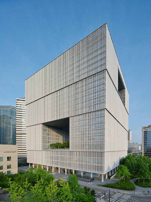
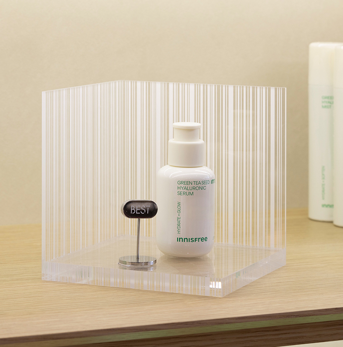
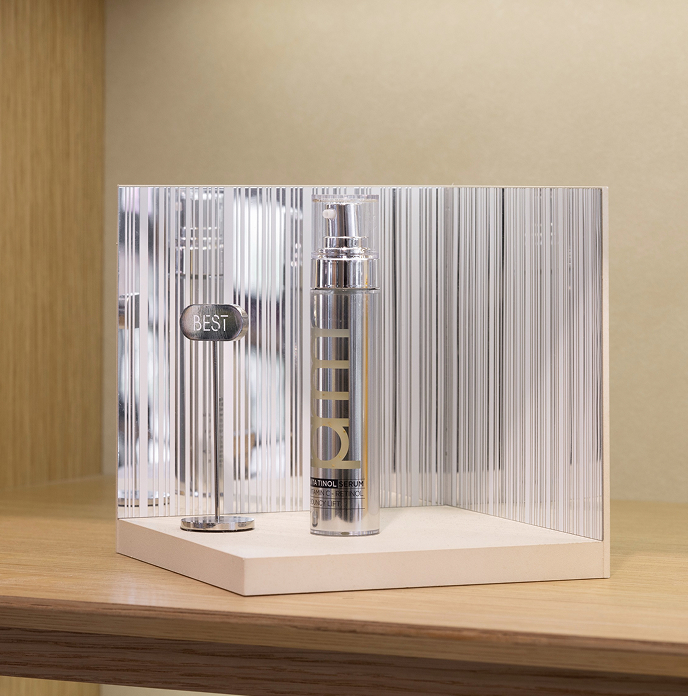
The highlight display cubes shared across all brands were conceived as an extension of the architectural language of Amorepacific Headquarters into the retail environment.
Reinterpreting the headquarters’ rhythmic vertical louvers and refined cubic massing as compact display objects, the fixtures were designed so that the architectural identity naturally continues through the product presentation.
Transparent acrylic and mirrored acrylic were combined to enhance the interplay of light through reflection and transmission, while the repeated vertical lines create a backdrop that not only highlights the products but also introduces visual depth and rhythm to the display.
The base platform was designed to accommodate each brand’s signature color, allowing the fixtures to express the unique identity of different brands while remaining easily interchangeable and reconfigurable.
In this way, the system provides both visual consistency and operational flexibility throughout the retail space.
A Central Display Table Designed to Guide Customer Choice
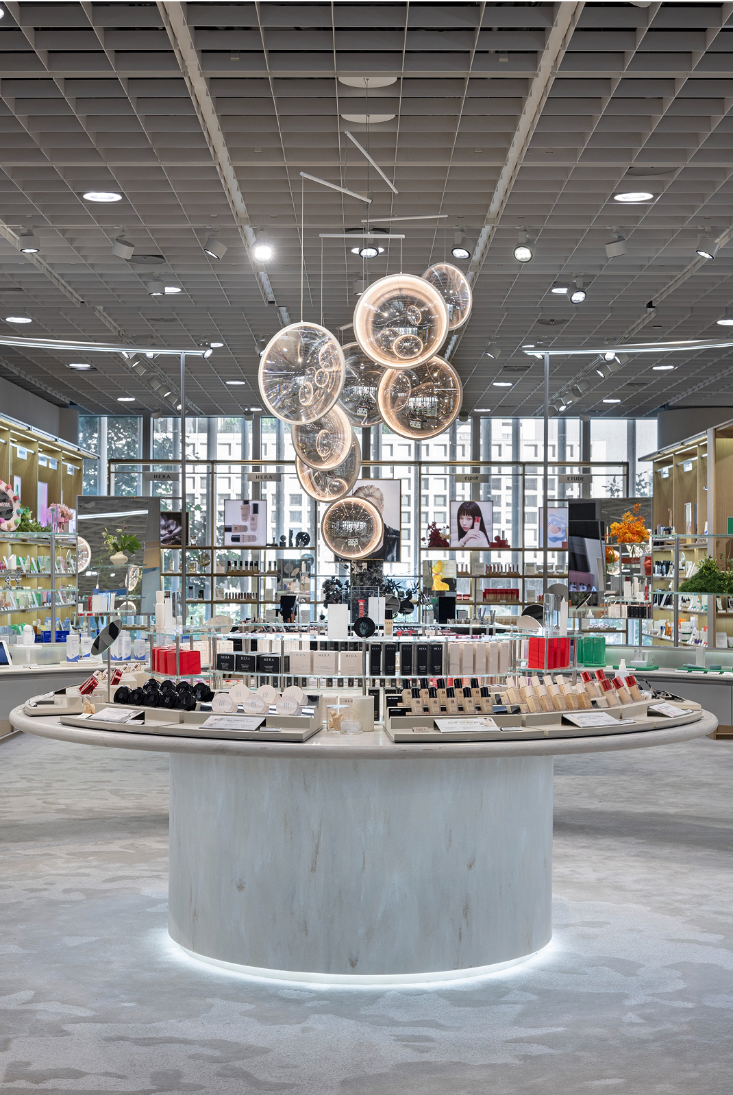
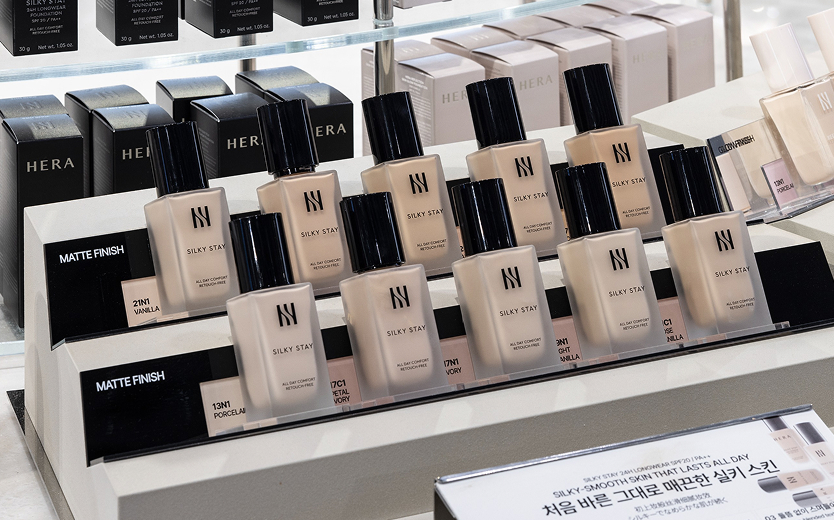
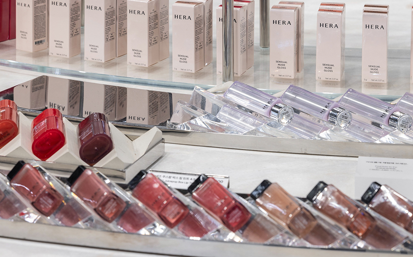
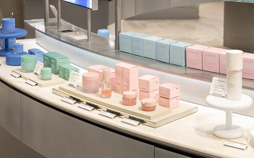
The central circular table was conceived not simply as a sales fixture, but as a key VMD element that naturally guides customers’ attention and purchasing decisions.
For categories where comparison and selection are essential—such as cushions and base makeup products—the displays were organized so that product ranges and shade variations could be understood at a glance.
Following the curve of the table, the layout creates a natural visual flow that encourages customers to move intuitively through the assortment.
Through this approach, customers can compare products more easily and make informed choices with greater confidence.

Graphic Design That Brings Order to the Space Beyond Function
Signage, POP materials, graphics, and packaging were treated not as secondary elements separated from the space, but as essential components of a unified brand experience.
As a flagship environment where brands, services, products, and information coexist, any inconsistency in naming conventions, information hierarchy, materials, or form could easily weaken the overall impression.
For this reason, the design focused on establishing a cohesive visual system that enables customers to navigate the space quickly and intuitively while maintaining the refined and orderly character that defines Amorepacific.
This approach ensured that every graphic element contributes not only to functionality, but also to the overall identity and spatial experience of AMORE YONGSAN.
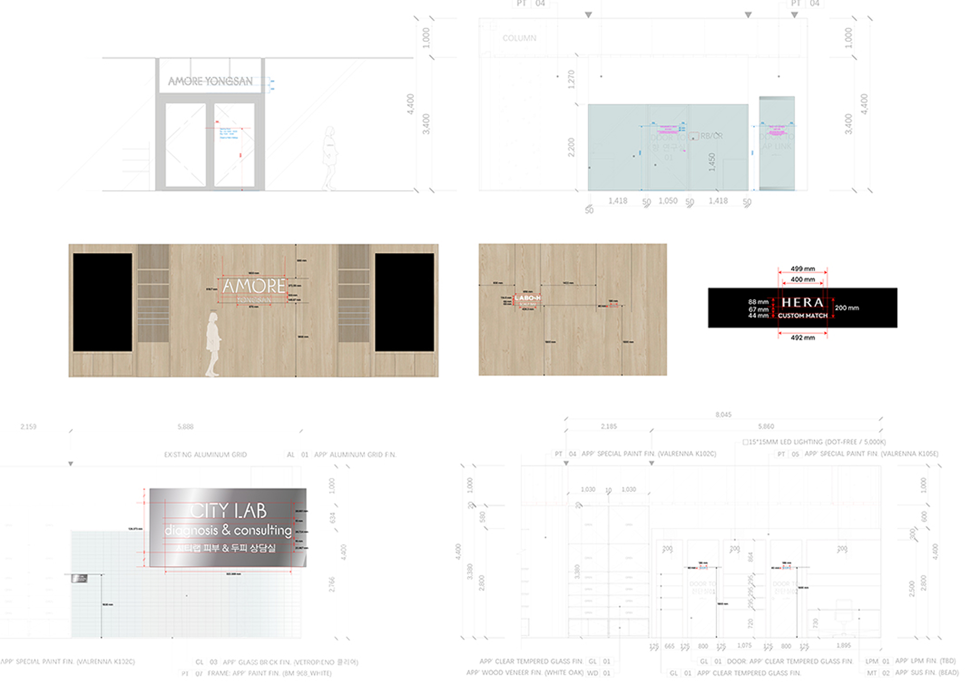
Signage
Brand and category signage was designed with operational flexibility in mind.
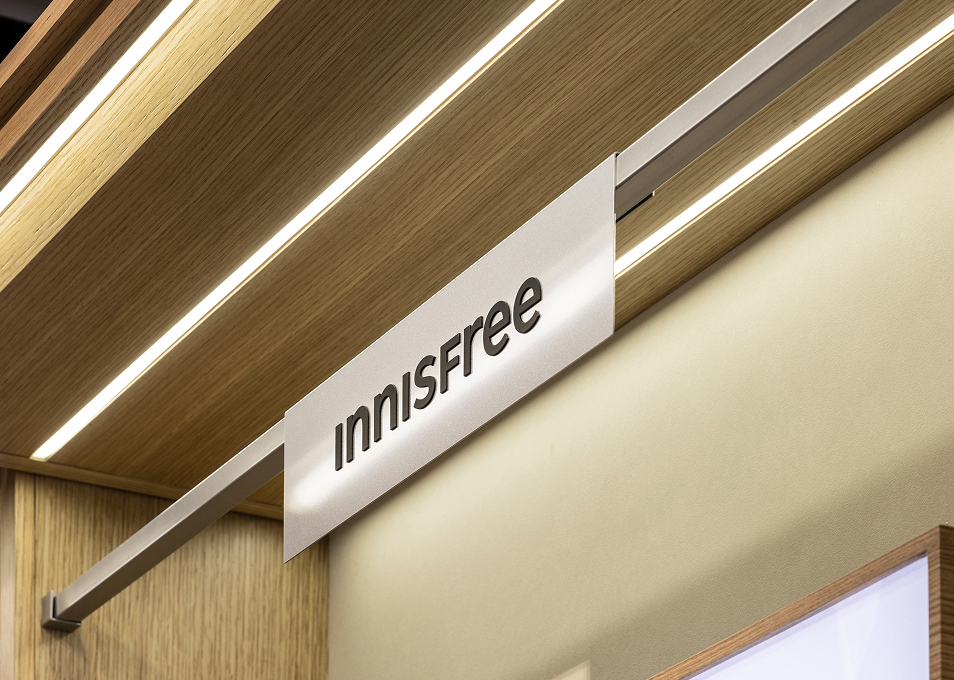
Recognizing that brand locations may change over time, hanging signage was introduced above the display walls for easy repositioning, while freestanding signage was developed for tables and shelves, allowing it to be freely arranged according to changing operational needs.
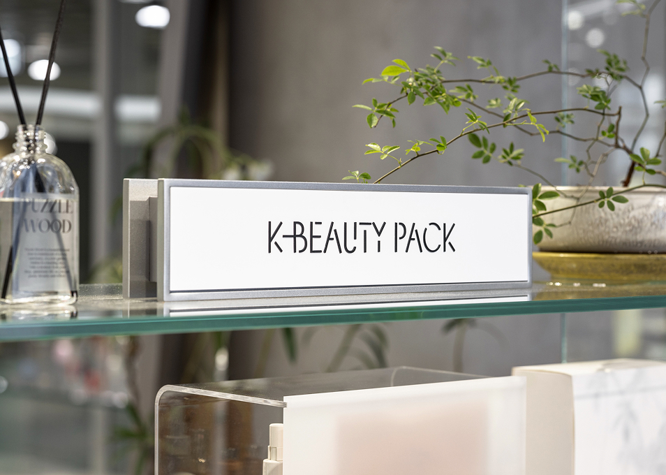
The freestanding signage used on shelves was designed to function in both single-sided and double-sided configurations.
A replaceable center panel allows brand names and category names to be updated easily according to operational needs.
The hanging signage was designed to hook onto the metal rod system of the display shelving with an L-shaped bracket, making installation and replacement simple and efficient.
Finished with a slim metal frame and dimensional lettering, it presents a lightweight yet refined appearance.
In this way, the brand signage was conceived not merely as a wayfinding element, but as a flexible system that maintains a consistent visual order and brand identity within an ever-evolving retail environment.
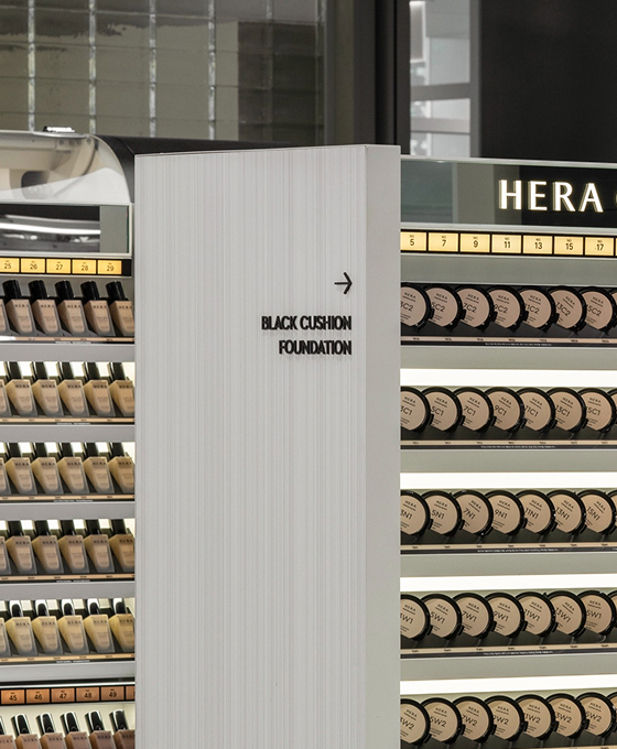
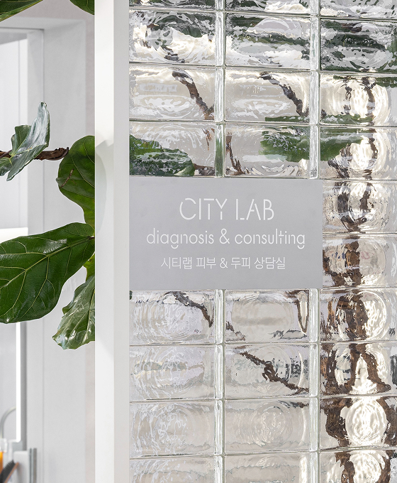
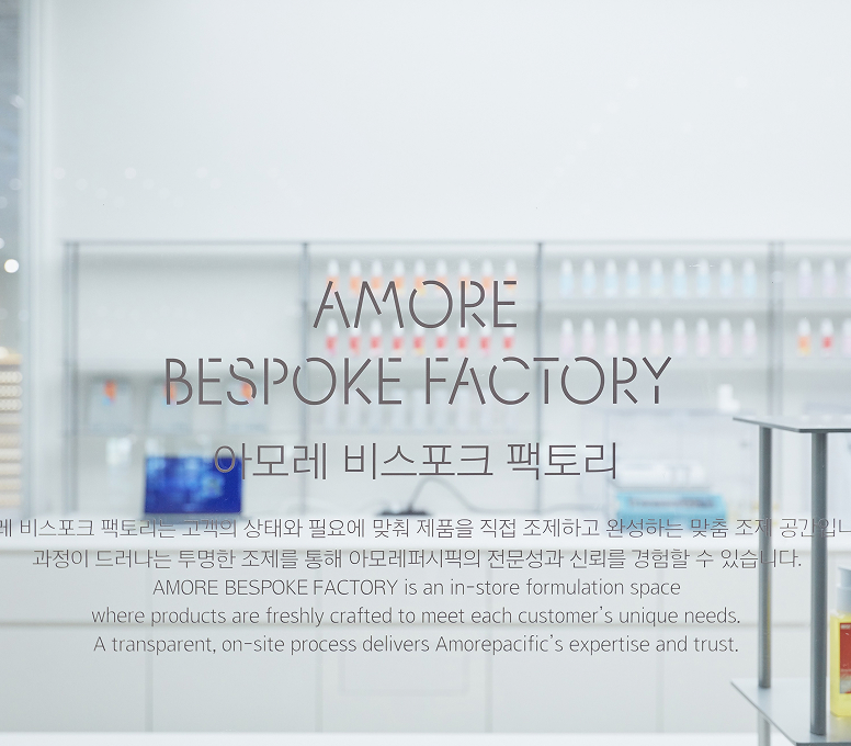
Built upon restrained typography and a clean, organized layout, the graphic system was designed to communicate essential information clearly without overpowering the spatial experience.
Materials and graphic expressions were also tailored to the character of each space.
CITY LAB features metal plate signage that complements the glass-block walls, reinforcing the transparent and experimental identity of the research and consultation environment.
AMORE BESPOKE FACTORY applies typography directly onto glass surfaces, expressing the openness and credibility of the formulation process.
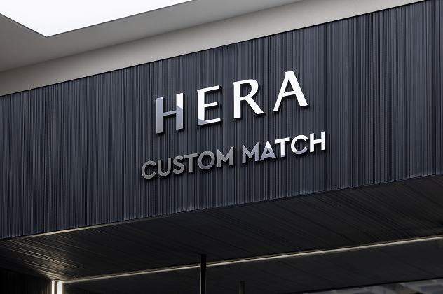
Service areas such as HERA Custom Match were designed to clearly communicate the brand’s identity and expertise, while directional signage and room identification were carefully integrated to guide visitors intuitively without disrupting the overall flow of the space.
A POP System Designed for Multilingual Operations
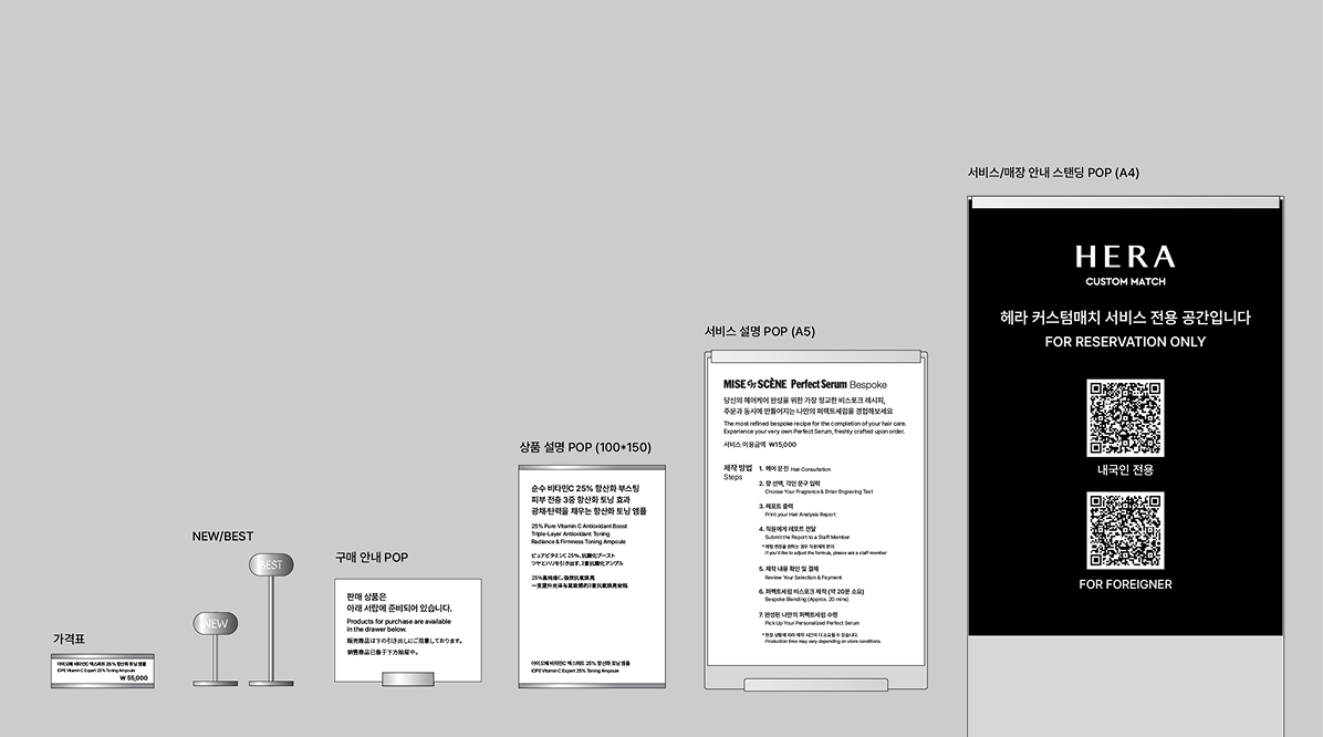
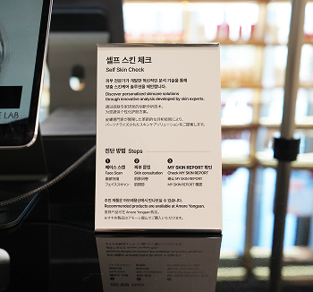
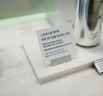
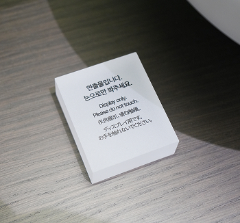
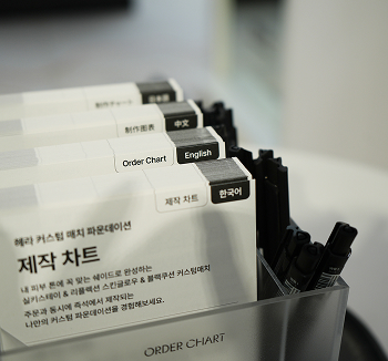
POP materials—including price tags, purchasing guides, product and service information, and labels such as NEW and BEST—were organized into a clear classification system.
Their sizes, formats, and materials were standardized to ensure consistent use throughout the entire space.
In particular, the POP system was developed around a metal-based material palette, creating a clean and refined visual impression while allowing printed inserts to be replaced easily for efficient day-to-day operations.
To support a global customer experience, the system was also designed with four language options—Korean, English, Japanese, and Chinese—enabling international visitors to access essential shopping information more clearly and intuitively.
A Packaging Experience That Extends Beyond the Purchase
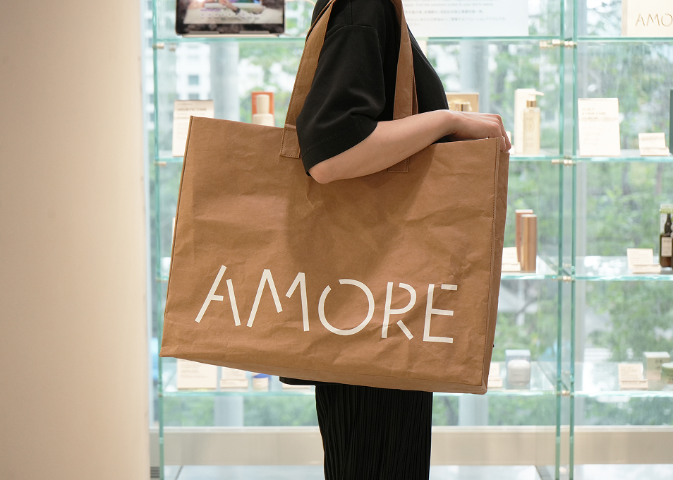
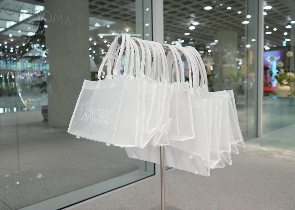
Packaging and shopping bags were approached not as disposable items, but as elements that complete the final impression of the brand experience.
The reusable bag for sale was developed as an extension of the existing Kraft paper shopping bag, retaining the distinctive identity of AMORE YONGSAN while adding a playful quality and offering a more practical experience. Made from transparent mesh, the shopper bag allows the products inside to remain naturally visible, while its lightweight and comfortable construction enhances usability.
The reusable bag for sale was developed as an extension of the existing Kraft paper shopping bag, retaining the distinctive identity of AMORE YONGSAN while adding a playful quality and offering a more practical experience. Made from transparent mesh, the shopper bag allows the products inside to remain naturally visible, while its lightweight and comfortable construction enhances usability.
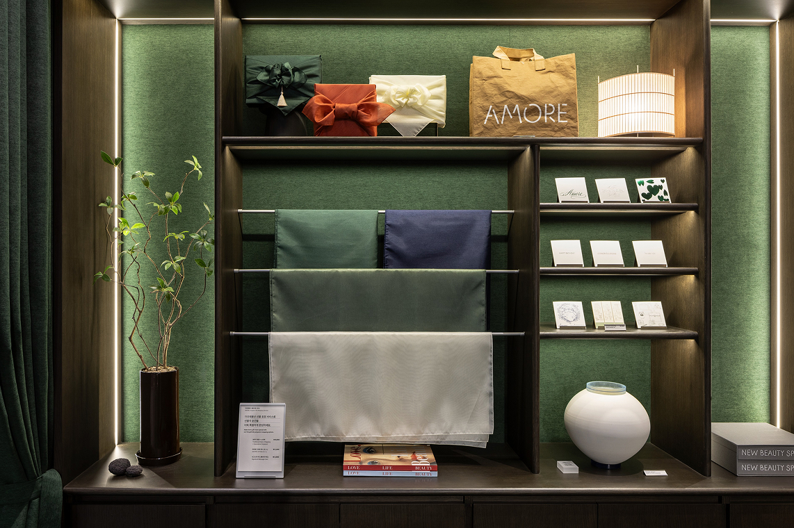
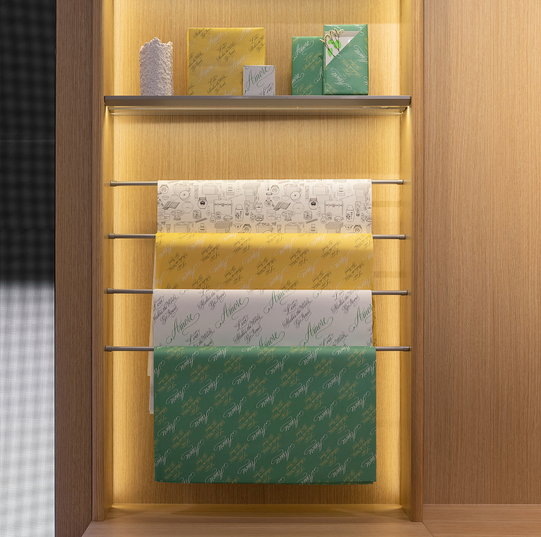
To accommodate a wide range of gifting needs, multiple packaging options were also developed, including gusseted envelopes, wrapping paper, and traditional bojagi wrapping.
This approach goes beyond simply containing and presenting products, allowing customers to select the most appropriate experience according to the purpose and occasion of their purchase.
More than ten message card designs were also created to reflect different preferences and occasions, with the collection planned to evolve through ongoing updates.

From a Store Renovation to a New Flagship Model
The goal of this renewal was never simply to create a new store.
More importantly, it was to establish a new benchmark for how an Amorepacific flagship should connect the brand with its customers.
We believed that a flagship could deliver a stronger message and a more complete experience only when the brand, spatial design, VMD, graphics, and services operate as one integrated system rather than as separate elements. Through this holistic approach, the AMORE YONGSAN Renewal Project became not only a space that represents the present of Amorepacific, but also one that proposes the future of beauty experiences.
The question we returned to most throughout the project was not, “How do we create a great store?” It was, “How do we create a space that represents where Amorepacific is heading?” The answer became clear. The new AMORE YONGSAN is more than a well-designed retail store. It is the House of New Beauty at Amorepacific Headquarters, where research, personalization, curation, gifting, and connection come together as one integrated experience. Rather than a place people simply happen to visit, it is a destination they intentionally seek out to experience both the present and the future of Amorepacific. That is the creative story we set out to create for AMORE YONGSAN.
The question we returned to most throughout the project was not, “How do we create a great store?” It was, “How do we create a space that represents where Amorepacific is heading?” The answer became clear. The new AMORE YONGSAN is more than a well-designed retail store. It is the House of New Beauty at Amorepacific Headquarters, where research, personalization, curation, gifting, and connection come together as one integrated experience. Rather than a place people simply happen to visit, it is a destination they intentionally seek out to experience both the present and the future of Amorepacific. That is the creative story we set out to create for AMORE YONGSAN.
- Amorepacific Creatives
- Creative Direction
- Heo Jungwon, Yi Sangjae
- Design
- Shin Noah, Oh Jooyeon, Shin Jeongsik,
Shim Mijung, Yim Seyeun, Kim Hyunhee - MD
- Park Minkyu, Hong Hyemin
- Operations / Training
- Mun Jaein, Choi Yura, Park Jinju
- Customer Experience Elements
- Kim Taehyun, Choi Ree, Jeon Chaerin
- Fragrance Lab
- Jeong Soomin, Lee Junho
- HERA Custom Match
- Kim Seungjin, Hyoung Jihye, Lee Hwasun,
Han Euddeum
- LABO-H Scalp Bar
-
BM Jeong Yunhwa, Lee Yoonju /
Training Park Hyeonseon, Park Jonghyuk - Mise-en-scène Perfect Serum Bespoke
-
BM Yoo Inhoon, Kim Gayoung /
Development Ahn Jiyeon, Kim Kyungtae - City Lab
-
Clinical Lab Kim Eunjoo, Ko Eunbi,
Kim Jihye, Kang Jiye, Ko Soojung, Cho Min - AMORE Beauty Lab
-
Beauty Research Team Kim Youngkyung,
Brand Product Innovation Team Sohn Kyunglae - Store Photography
- CFC(Hong Kiwoong), STUDIO 13
- Sustainable Objects
-
Lee Woojai, Kim Jiwon, Kim Yunmi(Re:Shaped),
Kim Haneul(Fiberglass Furniture) - Plant Styling
- Chungrokhwa, Sikginange (iam_so_lazy), Buddle Flowers
- Production & Installation
- Full Design, Hermes Design,
WOOIN DESIGN, R3