Meet Your Beauty Campaign Identity
Summary
Logo planning and usage guideline development for Meet Your Beauty, a CSR campaign aimed at improving perceptions of beauty.
Concept
Meet Your Beauty is a CSR campaign created to support the 2030 sustainability commitments.
It was designed as a campaign to improve awareness of beauty, encouraging teenagers to critically reflect on the distorted perceptions and standardized ideals of beauty commonly accepted in society, and to develop a healthy sense of beauty that is true to themselves.
Concept
Meet Your Beauty is a CSR campaign created to support the 2030 sustainability commitments.
It was designed as a campaign to improve awareness of beauty, encouraging teenagers to critically reflect on the distorted perceptions and standardized ideals of beauty commonly accepted in society, and to develop a healthy sense of beauty that is true to themselves.
When I first read the proposal, I immediately connected with the campaign’s purpose—not only as a designer, but also as a parent of a teenager. I wanted the design to serve as a guide for those who are already beautiful, but have yet to recognize it themselves.
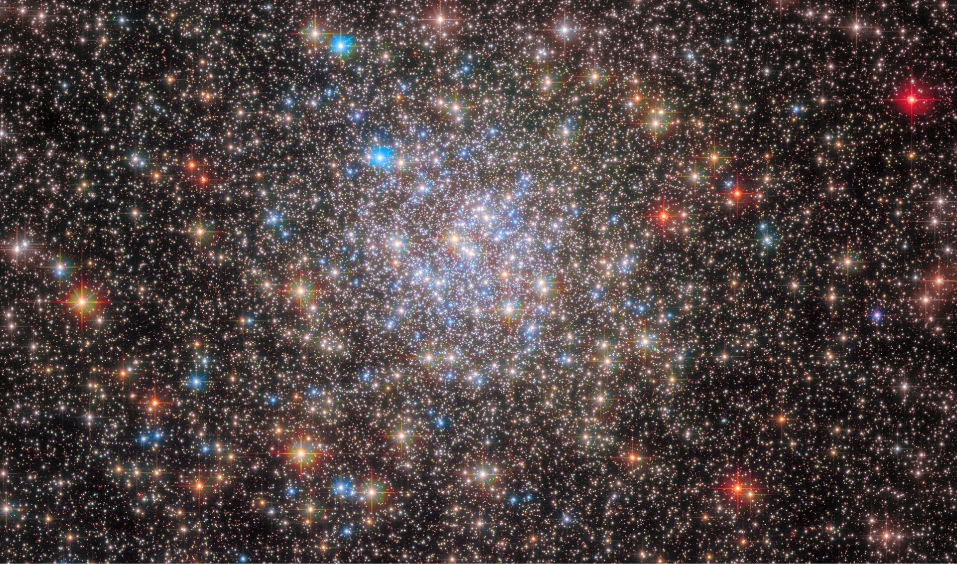
Around that time, I happened to visit an observatory, where I found unexpected inspiration. On a dark winter night, after watching the sky for a while, faint white stars gradually began to appear. Looking through the telescope, I saw that each star shone brilliantly in its own unique way. Every one of them was shining. The light they emitted had traveled for tens, even hundreds, of light-years before finally reaching Earth—reaching me. I wanted to capture that overwhelming sense of wonder and emotion through the design.

Countless stars across the vast universe.
Different in substance, size, and form,
yet all of them shine.
Different in substance, size, and form,
yet all of them shine.
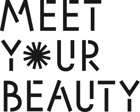
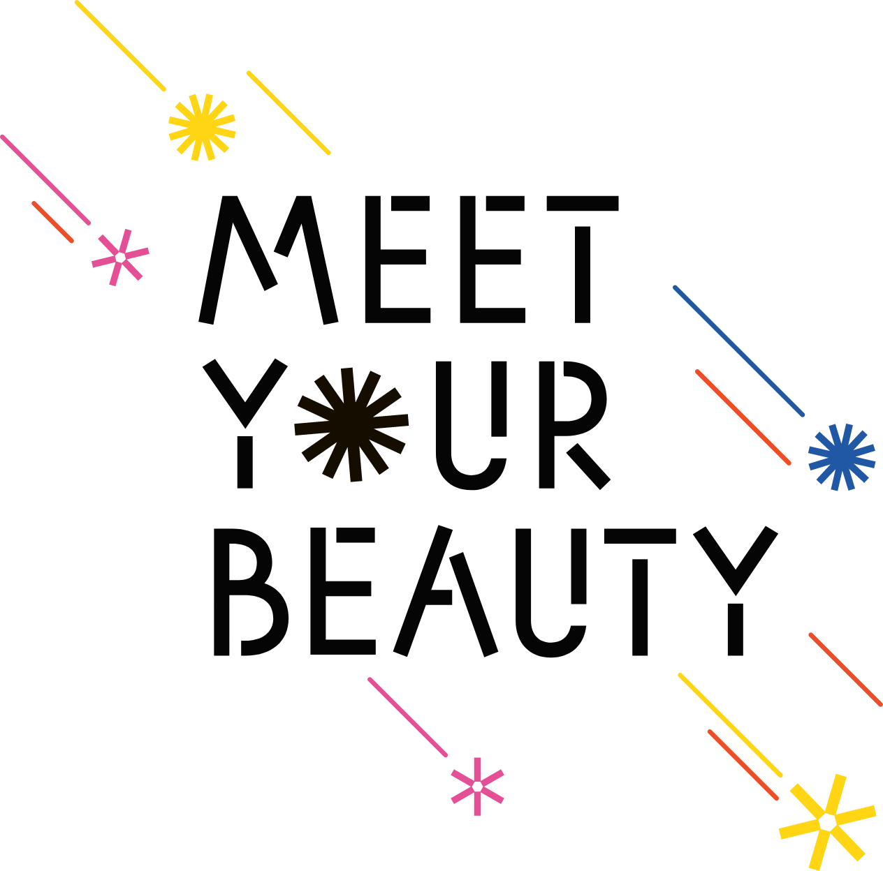
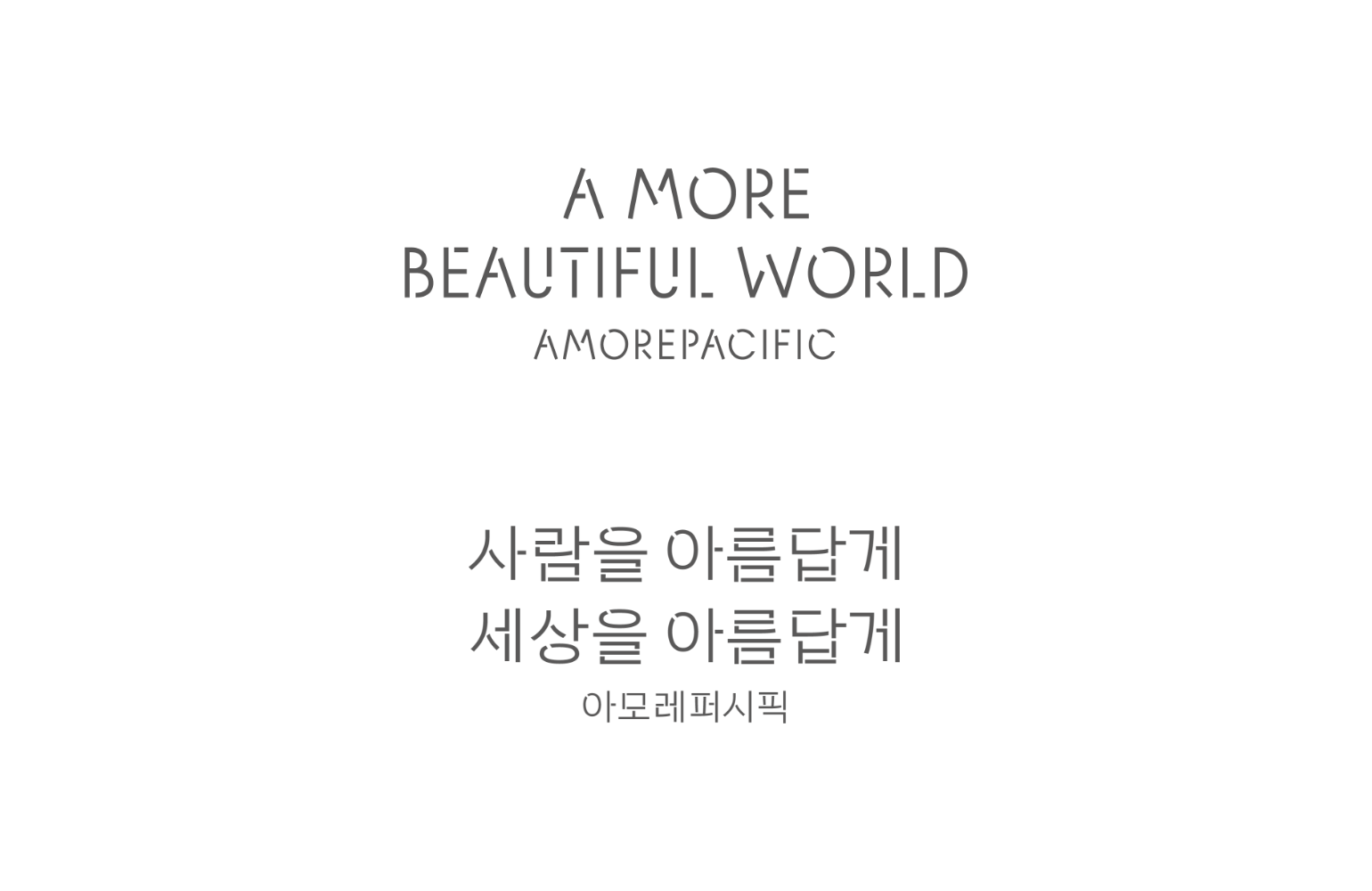
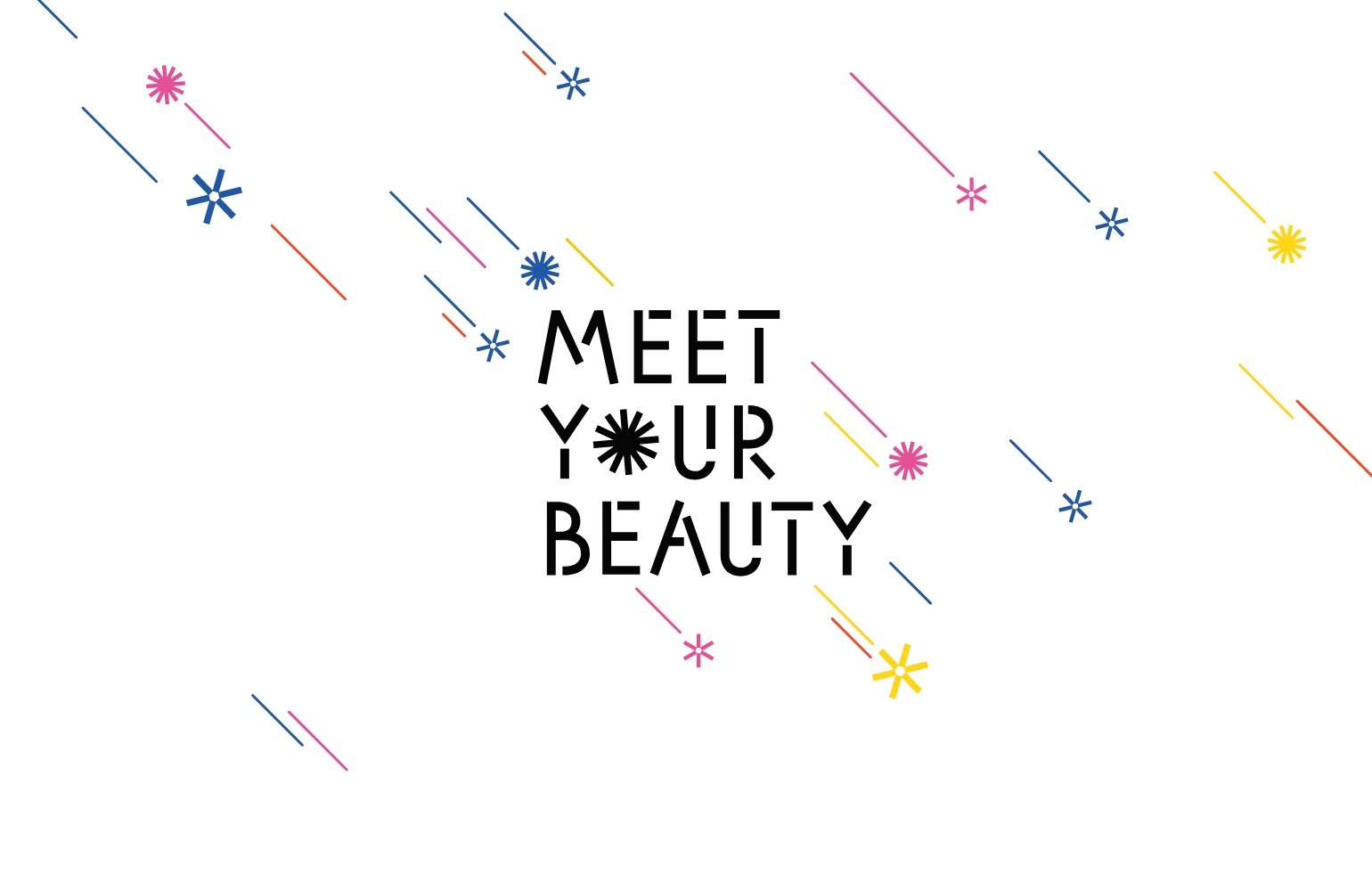
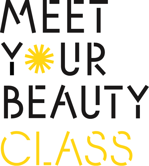
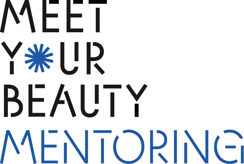
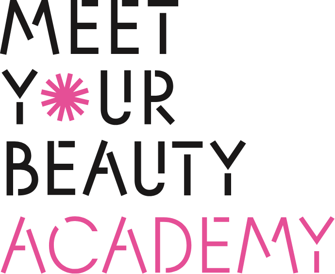
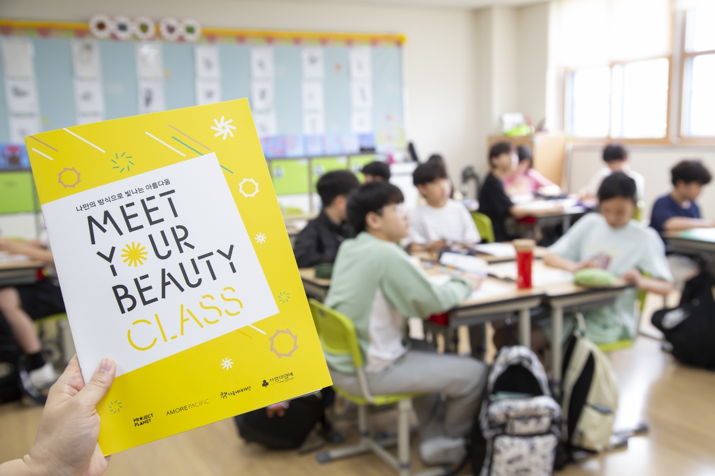
Based on APHQ, the typeface that symbolizes the company, we created a star-inspired icon for the “O,” replacing the letter with a symbolic mark.
Considering that the logo would be used across a wide range of online and offline applications, the typeface was carefully fine-tuned to create a clear and distinctive impression.
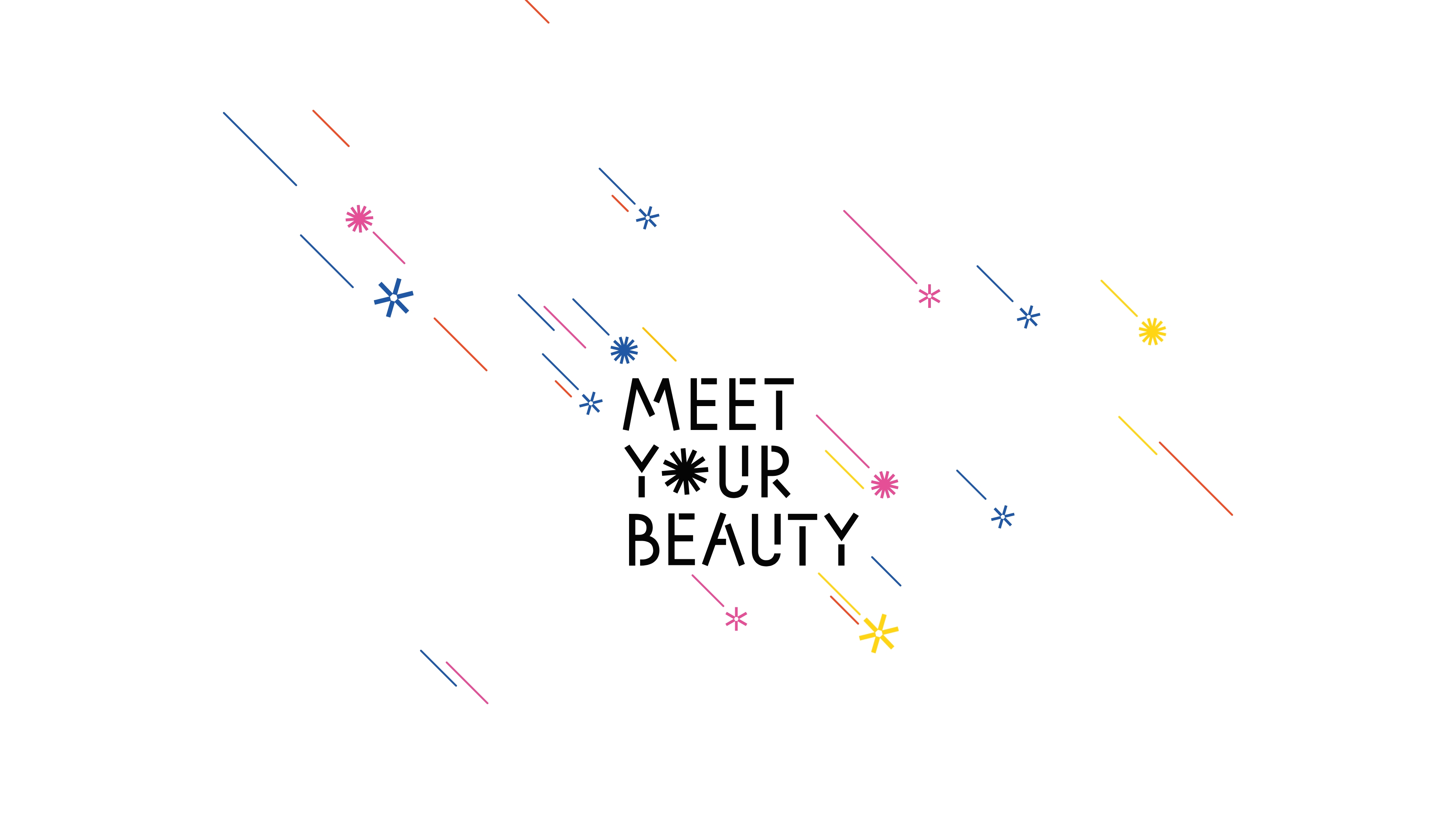
For the vertical version, additional decorative elements were added to further emphasize the image of a star.
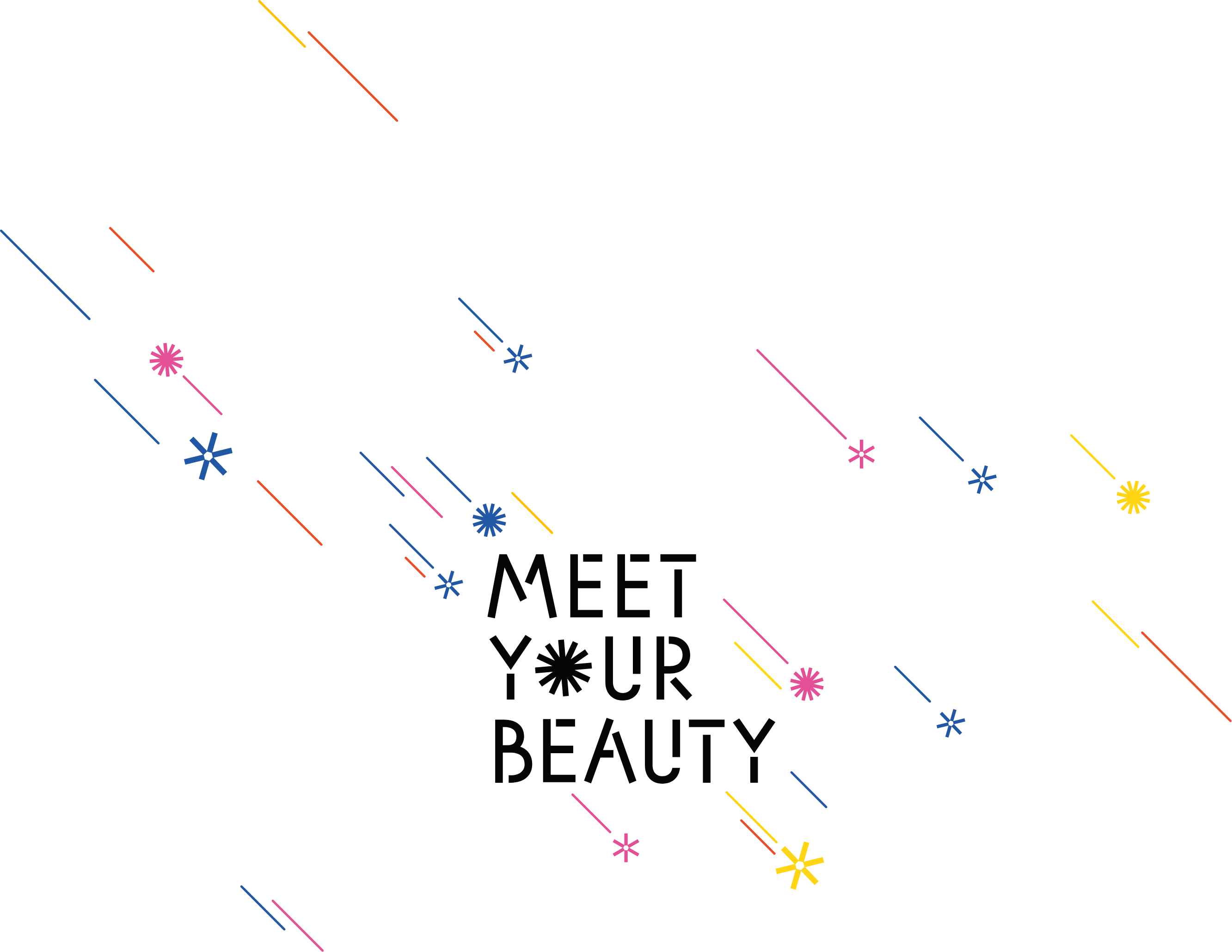
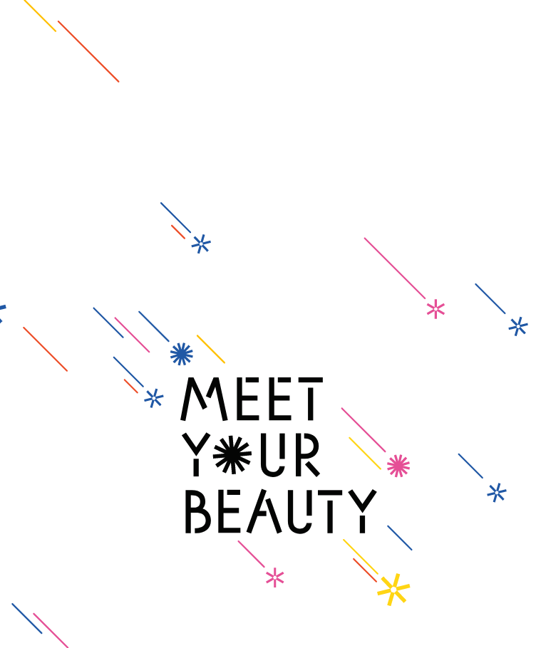
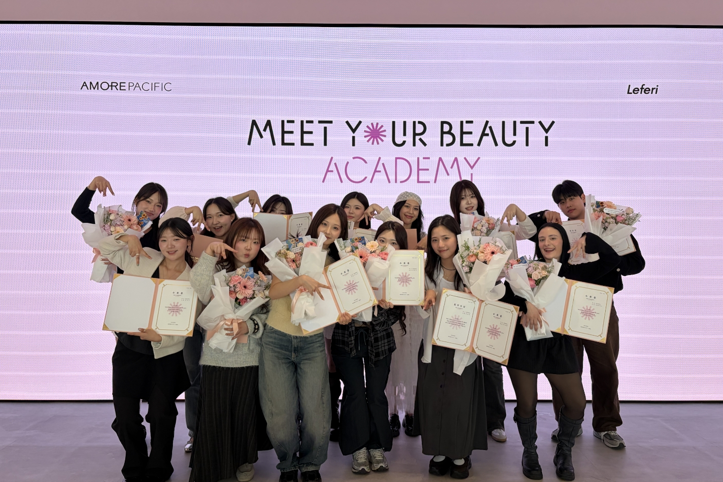
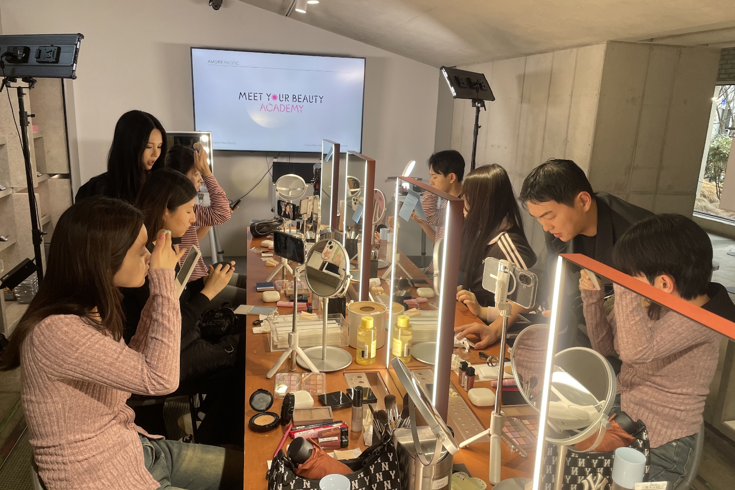
As the campaign continues to grow, its reach has gradually expanded—from teenagers to people of various age groups, and from Korea to overseas audiences.
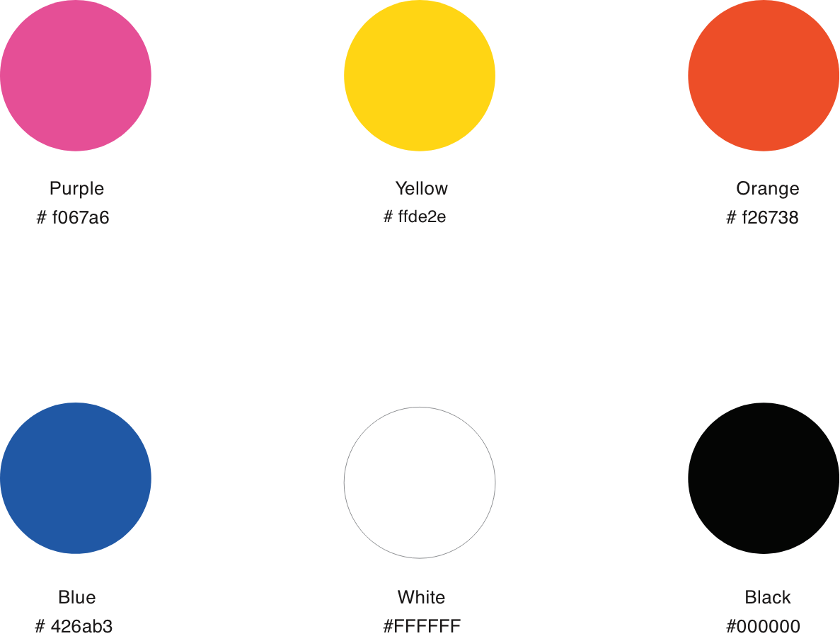
As sub-brands such as mentoring programs, classes, and academies were introduced, the color system was reorganized accordingly.
For the decorative logo, colors used across the sub-brands were evenly incorporated, allowing the expanded campaign identity to be expressed in a unified yet diverse way.
There was something I learned later.
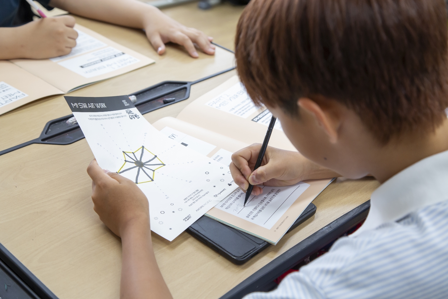
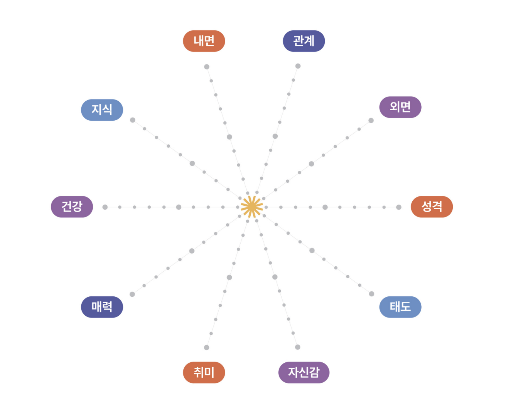
When the Meet Your Beauty workshop begins, the first activity is said to start with a worksheet called the MYB Decagon.
Through this process, participants connect each point to complete a star of their own.
The language of the campaign and the language of design speaking in the same voice—this was the kind of design I had always hoped for.
The project, which began in 2023, has continued to expand and is still ongoing as of 2026.

The light we see in tonight’s sky actually began its journey tens, perhaps even hundreds, of years ago.
It traveled without stopping to finally reach us here.
I hope the light launched by this campaign will continue to spread without pause, reaching one person after another and carrying forward.
And I hope that light becomes a small guide for young people on their journey to discovering their own beauty.
- Amorepacific Creatives
- Concept & Graphic Design
- Kang Yoosun
- Graphic Design
- Jeong Jiyun
- Design Directing
- Han Jeongmin, Lee Ohkyung