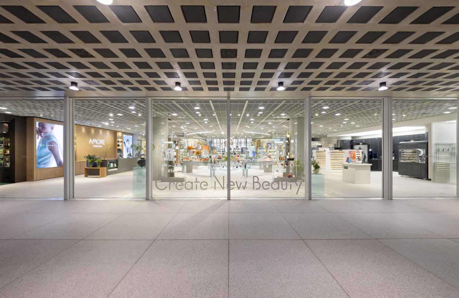
US OLIVE YOUNG PRMR, IOPE VMD
Summary
To coincide with the launch of the first and second OLIVE YOUNG stores in the U.S., regular fixtures for PRMR and IOPE were designed and produced.
This project focused on building a brand experience optimized for the shopping environment and product exploration behavior of local customers in the U.S. While maintaining each brand’s identity, display structures and design systems suited to the U.S. retail environment were applied to strengthen both product readability and brand recognition.
This project focused on building a brand experience optimized for the shopping environment and product exploration behavior of local customers in the U.S. While maintaining each brand’s identity, display structures and design systems suited to the U.S. retail environment were applied to strengthen both product readability and brand recognition.
PRMR
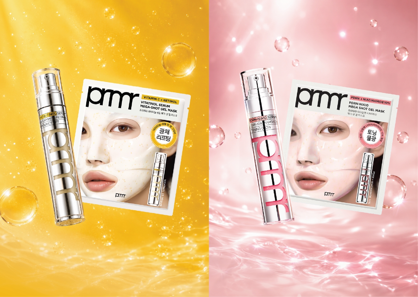
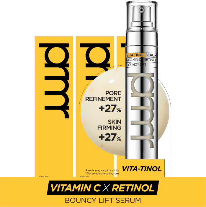
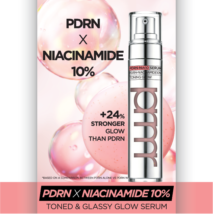
The PRMR zone at OLIVE YOUNG U.S. was planned as a space to present Vita-Tinol, the brand’s representative line, alongside the new PDRN line.
The goal was clear: to help customers encountering PRMR for the first time understand the brand and intuitively recognize the differences between its two key lines.
As OLIVE YOUNG U.S. is a retail environment where a wide range of global brands compete, enabling quick brand recognition was a key point.
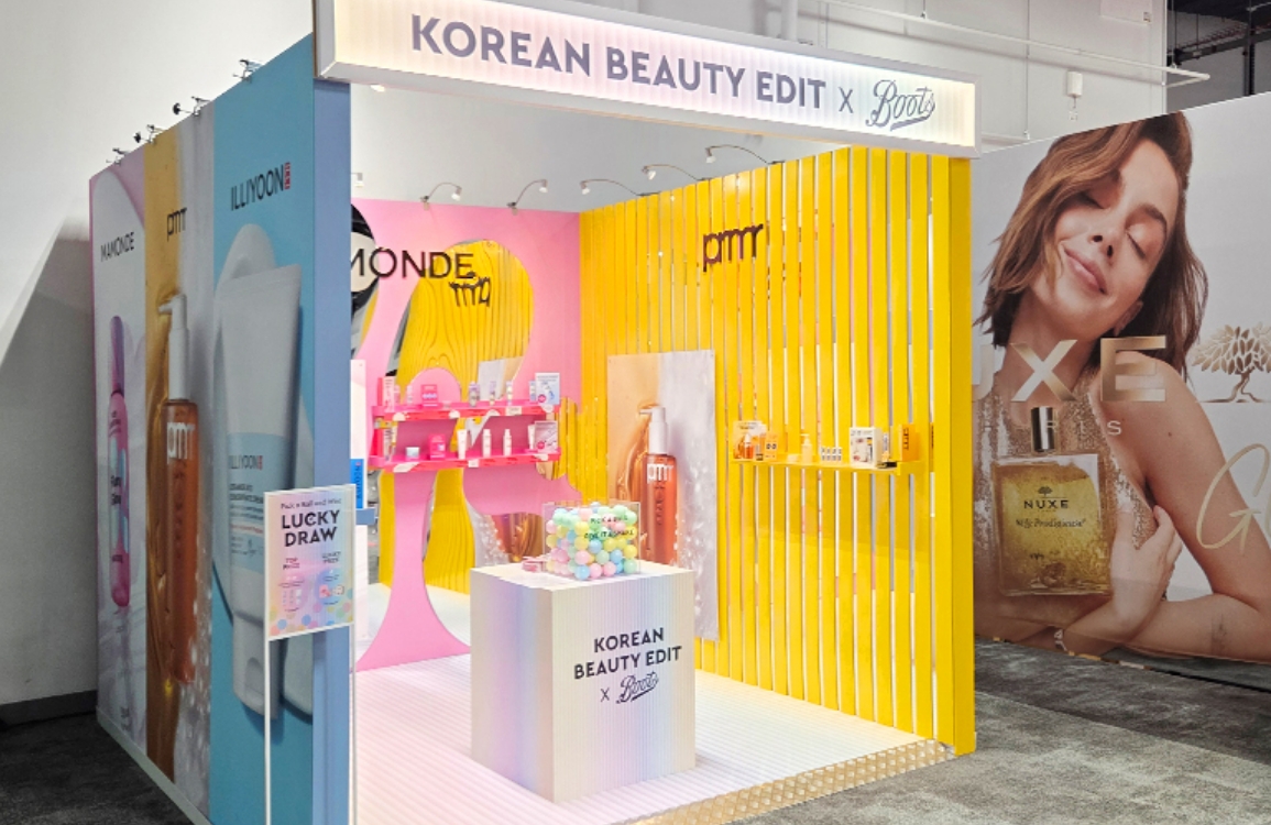
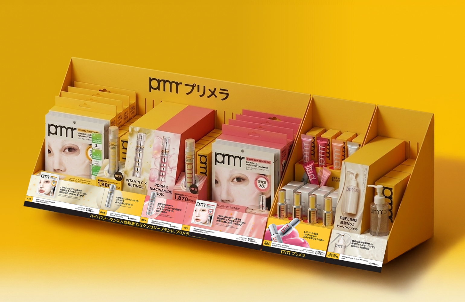
PRMR built a visual system that makes the brand zone recognizable even from a distance by actively using the brand’s signature yellow together with the pink color of the new PDRN line.
In addition, typography and color-blocking elements used on the packaging were expanded throughout the space to strengthen the brand identity.
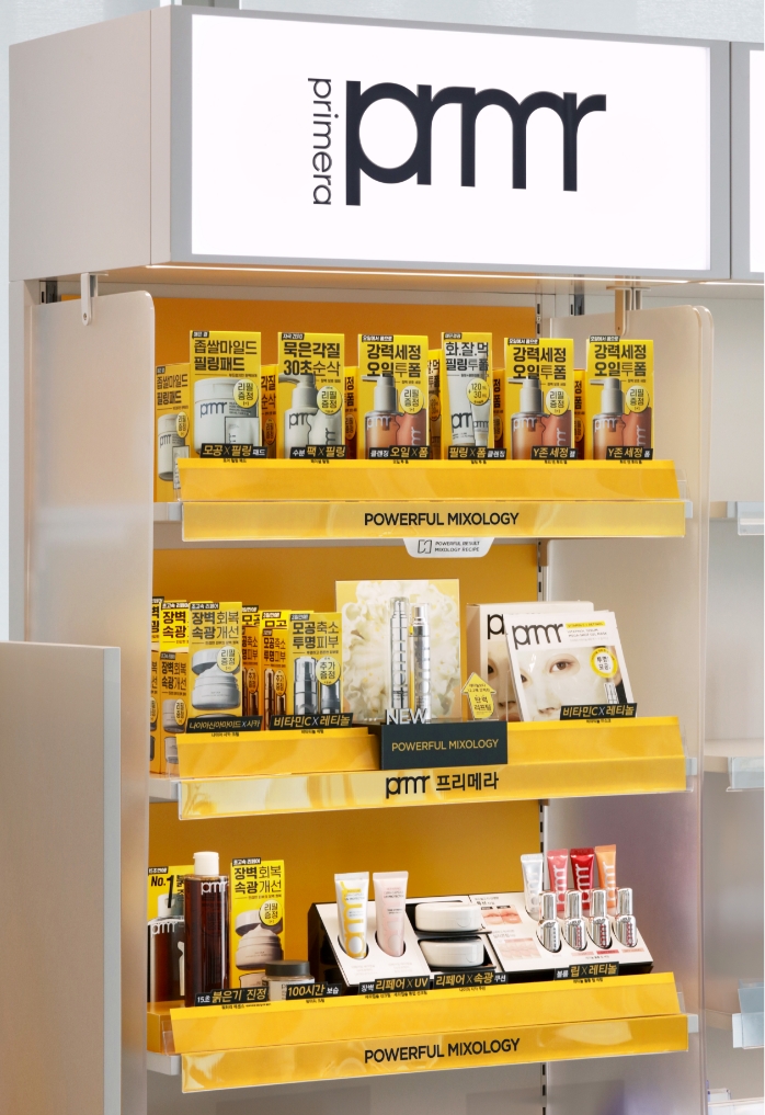
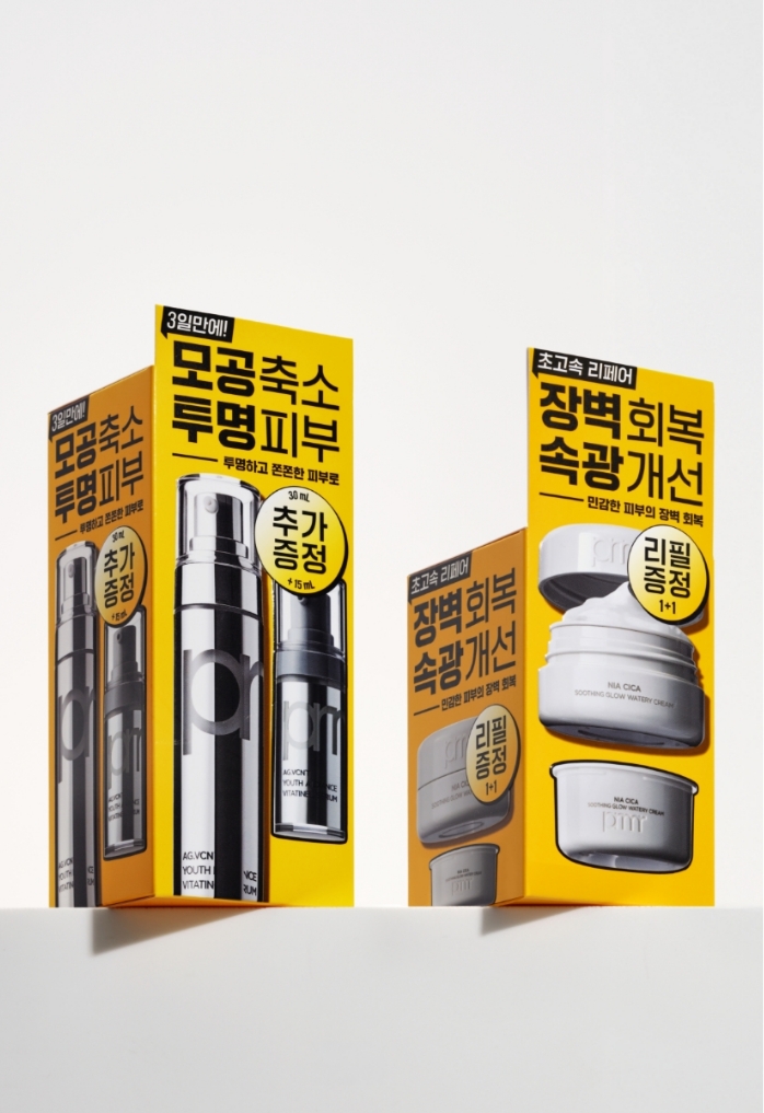
For OLIVE YOUNG stores in Korea, PRMR is currently applying a design that strengthens the presence of the brand zone through the brand’s main yellow color, while adopting a product-centered display structure to enhance visibility from a distance and improve product accessibility.
In addition, VMD elements connected to the package design and a promotion zone centered around hero products are used to reinforce brand consistency and product visibility.
Based on this domestic design strategy, the VMD for OLIVE YOUNG U.S. aimed to newly adapt product communication and display methods by taking into account the U.S. retail environment and customer flow.
The OLIVE YOUNG fixtures in the U.S. are, like the stores in Korea, environments where various brands and products are densely displayed.
Rather than using decorative objects, we chose to strengthen the presence of the products themselves.
In particular, we determined that the Vita-Tinol Serum and PDRN Serum could lose visibility depending on the display environment due to their slim package forms. To address this, risers were used to secure product height, while the hierarchy with surrounding display elements was adjusted so that the products could naturally become the focal point.
In addition, excessive POP elements that might cover the products were minimized, prioritizing accessibility so that consumers could easily view and pick up the products themselves. Through this approach, the customer experience from product discovery to purchase was designed to feel more intuitive.
In particular, we determined that the Vita-Tinol Serum and PDRN Serum could lose visibility depending on the display environment due to their slim package forms. To address this, risers were used to secure product height, while the hierarchy with surrounding display elements was adjusted so that the products could naturally become the focal point.
In addition, excessive POP elements that might cover the products were minimized, prioritizing accessibility so that consumers could easily view and pick up the products themselves. Through this approach, the customer experience from product discovery to purchase was designed to feel more intuitive.
U.S. customers understand products and make purchase decisions within a short amount of time.
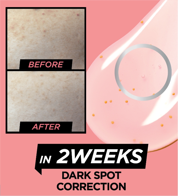
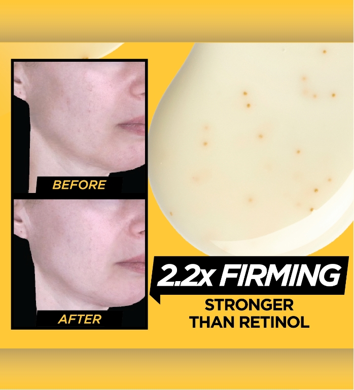
This project focused on creating a communication structure where product benefits are delivered first, rather than relying on complex explanations. The key benefits of Vita-Tinol and PDRN were reorganized around numbers and key messages, while Before & After images were actively used to help consumers intuitively understand the visible changes.
Simple information, clear messaging.
The hierarchy of information and visual flow were carefully designed so that customers could quickly understand the strengths of each product, even within a brief moment.
This project focused on creating a communication structure where product benefits are delivered first, rather than relying on complex explanations. The key benefits of Vita-Tinol and PDRN were reorganized around numbers and key messages, while Before & After images were actively used to help consumers intuitively understand the visible changes.
Simple information, clear messaging.
The hierarchy of information and visual flow were carefully designed so that customers could quickly understand the strengths of each product, even within a brief moment.
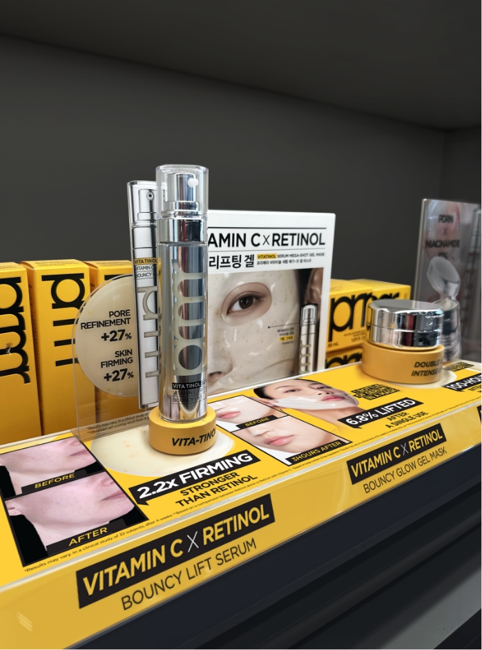
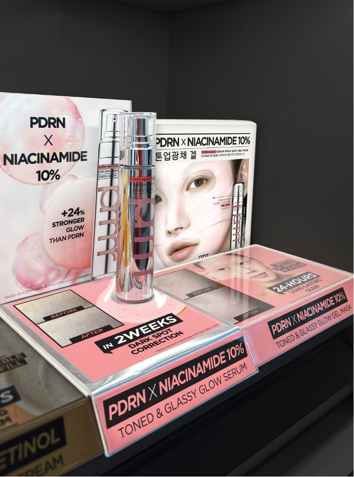
PRMR’s brand color, yellow, creates a strong brand presence, while the pink of PDRN expresses the distinctive character of the new line.
A color system was designed to maintain consistency within a single brand while clearly communicating the differences between the two lines.
Through this approach, customers can recognize the brand from a distance and naturally understand the characteristics of each line up close.
A color system was designed to maintain consistency within a single brand while clearly communicating the differences between the two lines.
Through this approach, customers can recognize the brand from a distance and naturally understand the characteristics of each line up close.
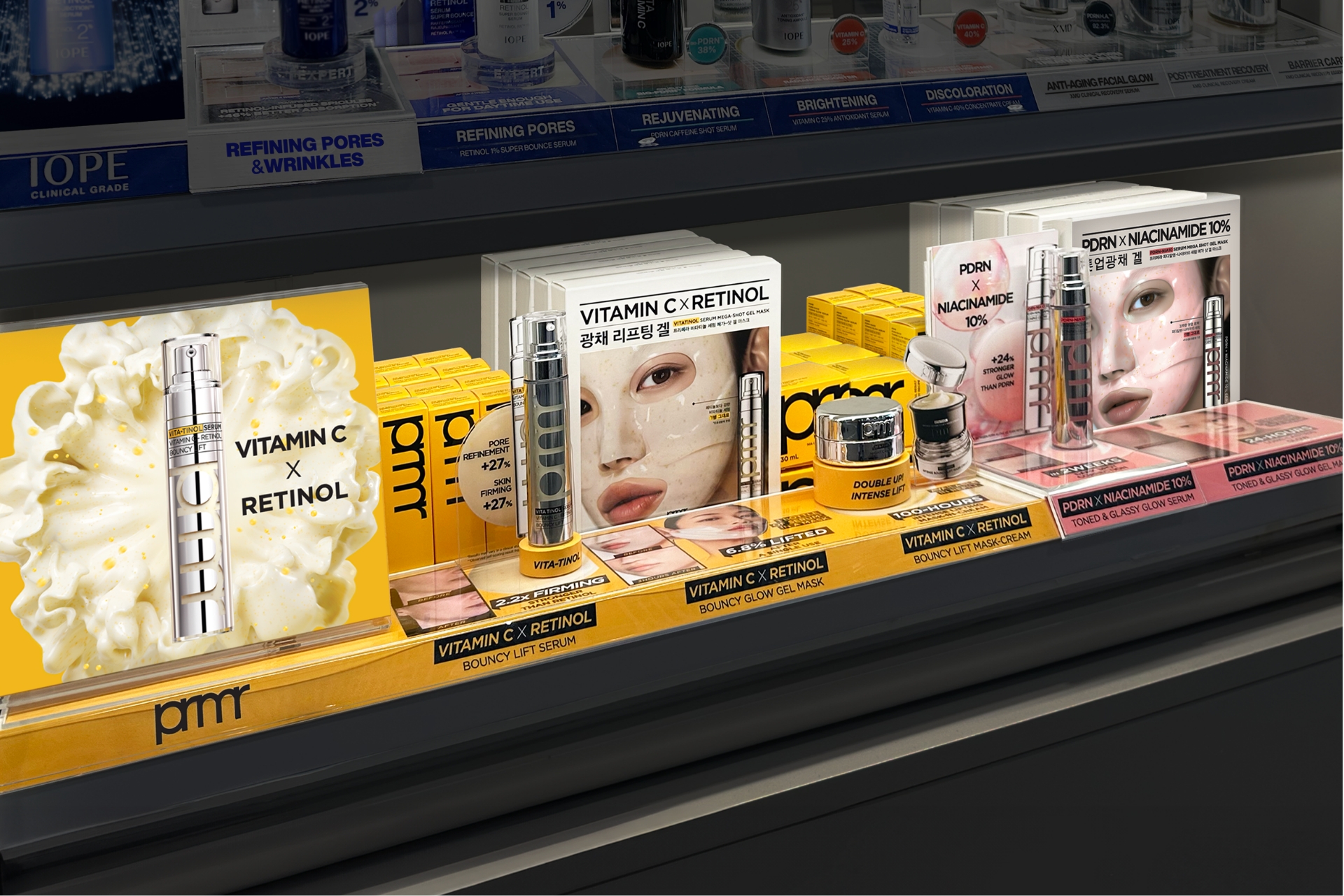
In a space where
countless brands compete,
PRMR was designed to be seen first
and understood most easily.
countless brands compete,
PRMR was designed to be seen first
and understood most easily.
IOPE
VMD Development for OLIVE YOUNG’s U.S. Expansion
In line with OLIVE YOUNG’s expansion into the U.S. market, VMD content was developed by researching the U.S. beauty retail market and case studies of competing brands, while analyzing how local consumers explore product information.
In particular, U.S. consumers tend to place importance on functional benefits and objective evidence when making product purchases. Rather than directly applying the information structure used in OLIVE YOUNG stores in Korea, the content was reorganized to communicate brand credibility and product efficacy more intuitively.
In line with OLIVE YOUNG’s expansion into the U.S. market, VMD content was developed by researching the U.S. beauty retail market and case studies of competing brands, while analyzing how local consumers explore product information.
In particular, U.S. consumers tend to place importance on functional benefits and objective evidence when making product purchases. Rather than directly applying the information structure used in OLIVE YOUNG stores in Korea, the content was reorganized to communicate brand credibility and product efficacy more intuitively.
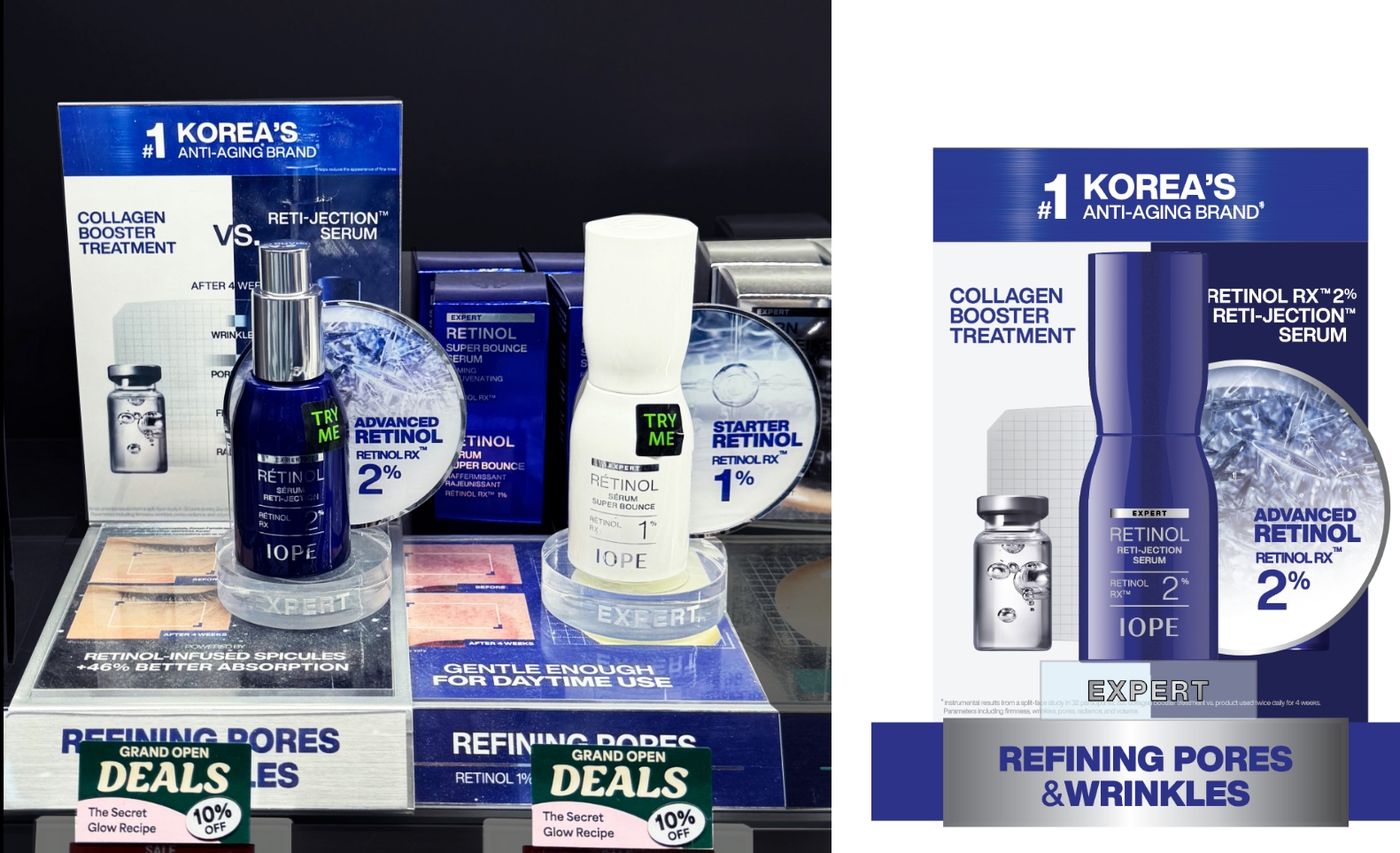
In the U.S. market, clearer and evidence-based communication is required so that customers can understand product efficacy and build
trust within a short amount of time. Accordingly, the content was designed around product benefits, efficacy data, and ingredient information.
A visual communication strategy was established to allow customers to naturally explore the brand and products within the store.
trust within a short amount of time. Accordingly, the content was designed around product benefits, efficacy data, and ingredient information.
A visual communication strategy was established to allow customers to naturally explore the brand and products within the store.


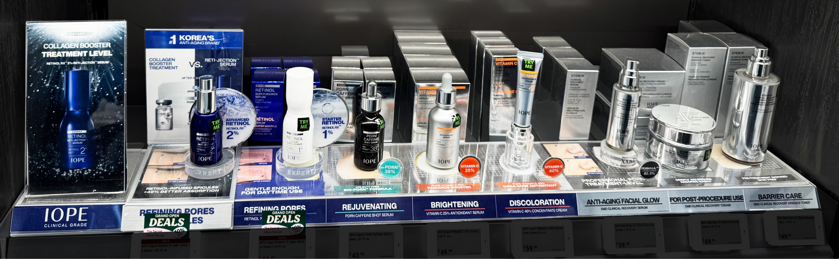
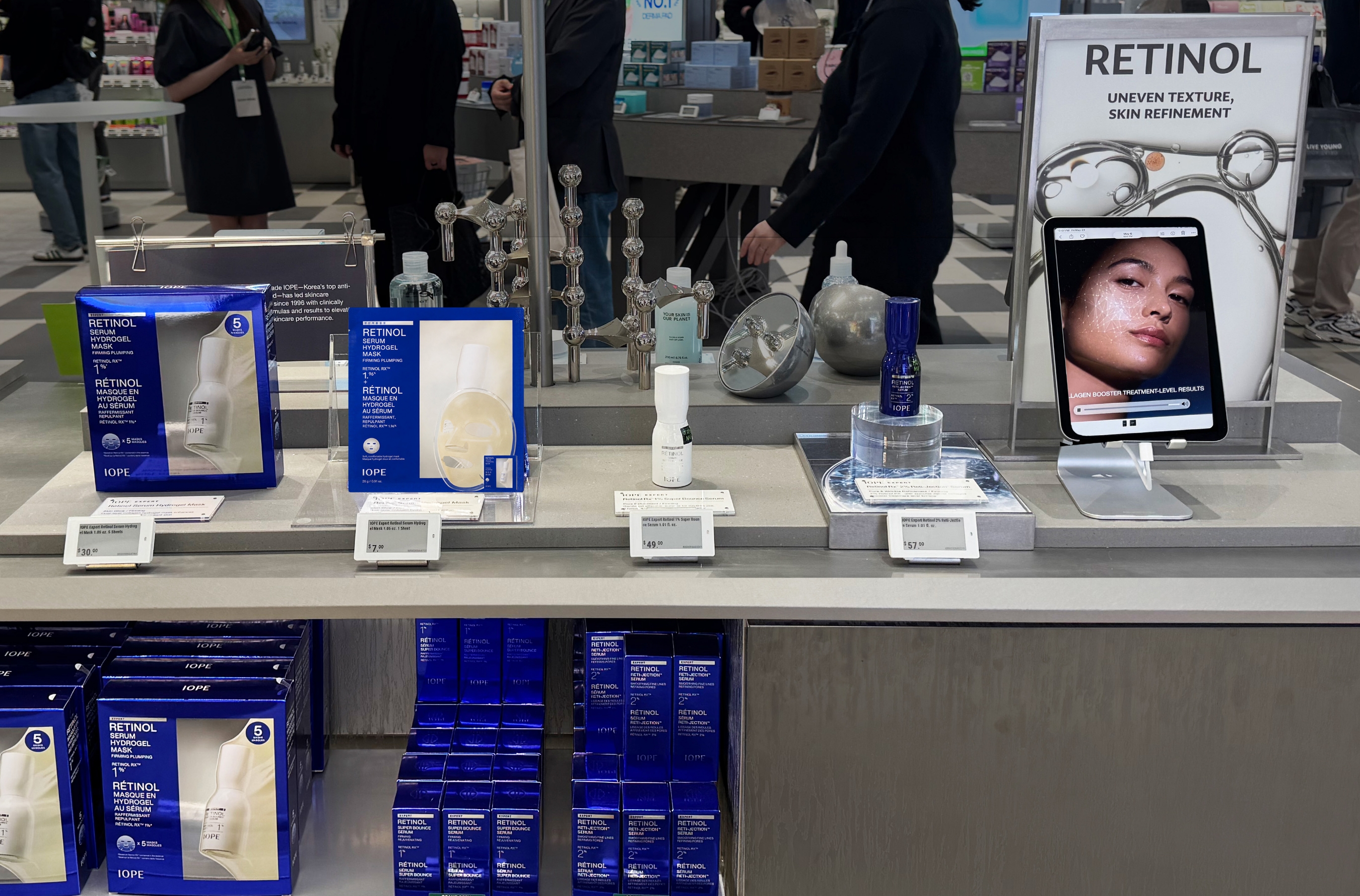
The visual language of derma-cosmetic and clinical skincare brands was analyzed, and expression methods that could strengthen the brand’s professionalism and credibility were applied. Within a limited space, a large amount of information needed to be communicated, including product names, benefits, ingredients, clinical result figures, texture images, and Before & After images. The design was developed with careful consideration of logic and efficient layout so that customers could understand the information effectively. The most fundamental information, such as product benefits and product names, was placed on the shelf strips. Considering the relatively low height of the three-tier display structure, the lower area was also used to present product information in a rich and dense way.
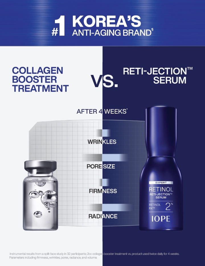
Clinical result numerical graph
Clinical result numerical graphs were actively used in the visuals to intuitively communicate the product’s technology and efficacy.
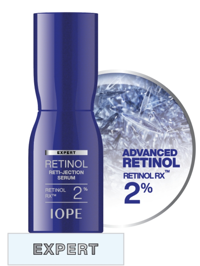
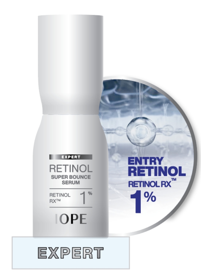
Mechanism Visualization
Mechanism visuals that express each product’s attributes were used as representative backboard images for each product. Retinol content levels were also displayed, allowing customers to compare and choose products at a glance.
Clinical result numerical graphs were actively used in the visuals to intuitively communicate the product’s technology and efficacy.
Mechanism Visualization
Mechanism visuals that express each product’s attributes were used as representative backboard images for each product. Retinol content levels were also displayed, allowing customers to compare and choose products at a glance.
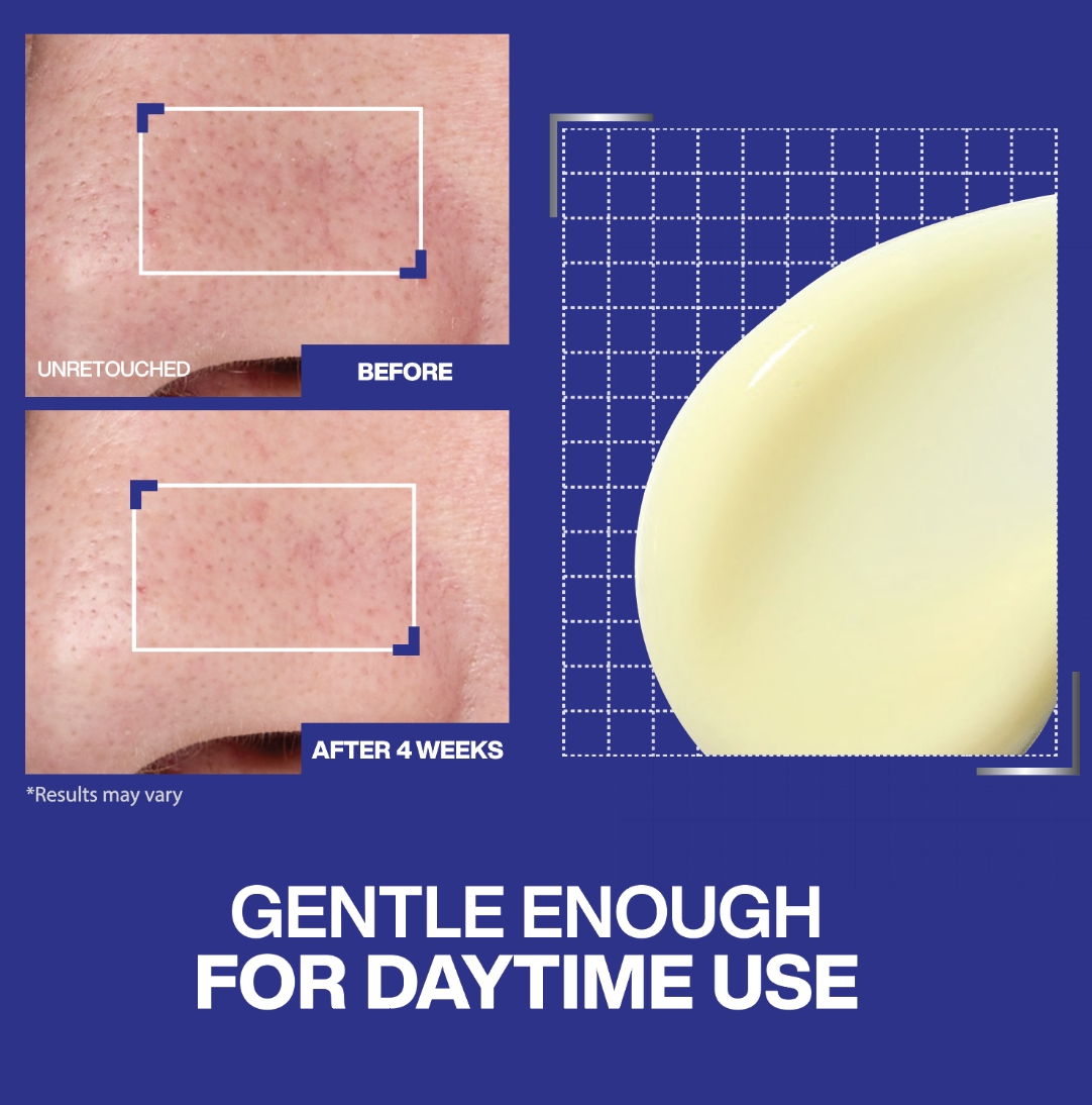
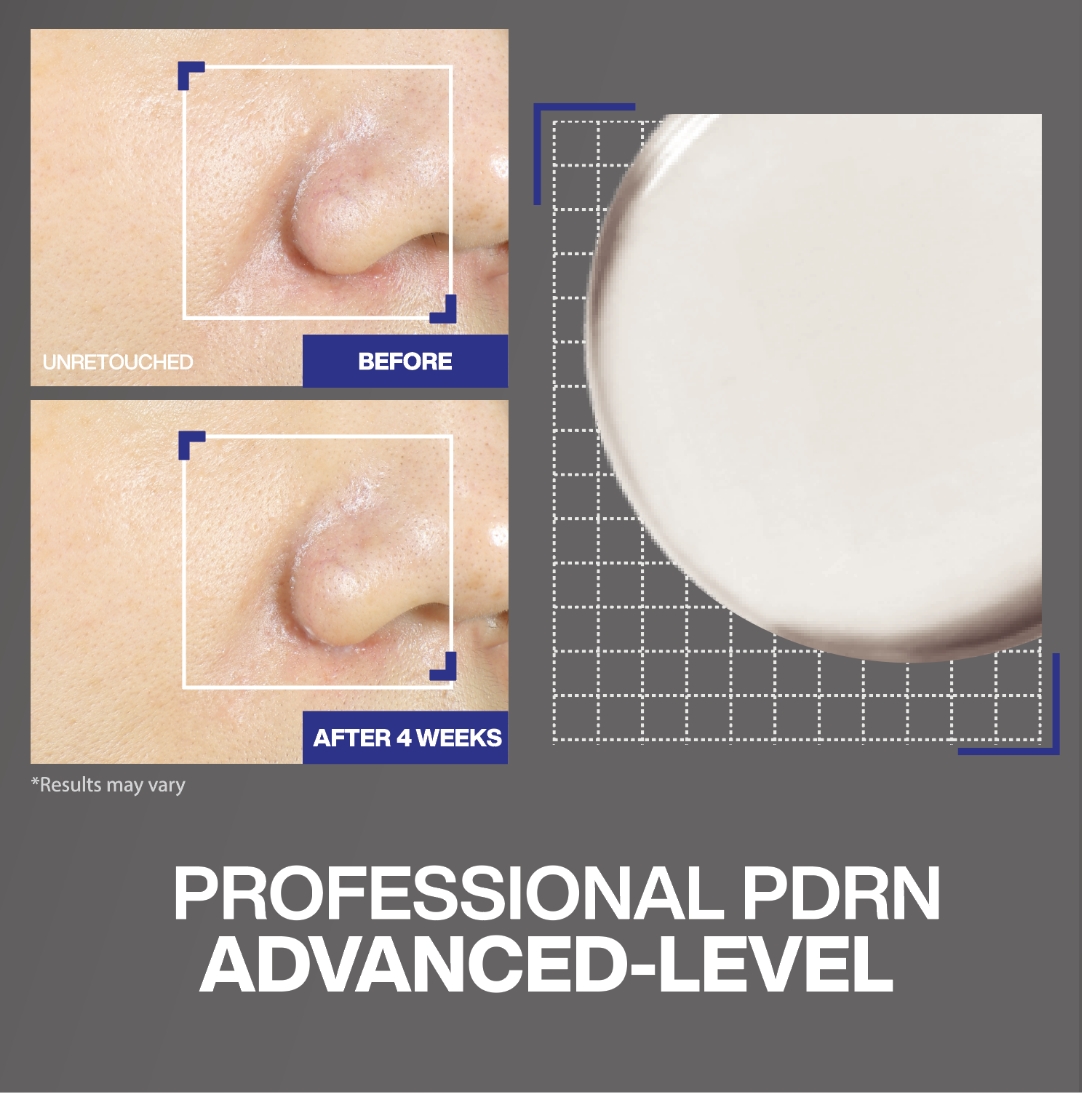
Before & After Visual
Reflecting the characteristics of the IOPE brand, Before & After information was applied as large as possible to intuitively communicate product efficacy.
Classification of Key Ingredients
The key active ingredients of each product were classified using colors that intuitively connect to their benefits. Color identifiers for ingredients such as Vitamin, PDRN, and Retinol were used to help customers recognize them more effectively.
Product texture shot
Texture shots, which are essential in the U.S. retail environment, were placed so that customers could clearly identify the texture of each product.
Reflecting the characteristics of the IOPE brand, Before & After information was applied as large as possible to intuitively communicate product efficacy.
Classification of Key Ingredients
The key active ingredients of each product were classified using colors that intuitively connect to their benefits. Color identifiers for ingredients such as Vitamin, PDRN, and Retinol were used to help customers recognize them more effectively.
Product texture shot
Texture shots, which are essential in the U.S. retail environment, were placed so that customers could clearly identify the texture of each product.
IOPE VMD was restructured from the
perspective of U.S. consumers
and
developed into a VMD communication
system that intuitively conveys
product
efficacy and brand credibility.
perspective of U.S. consumers
and
developed into a VMD communication
system that intuitively conveys
product
efficacy and brand credibility.
In this project, the content and design were localized based on existing OLIVE YOUNG VMD assets, adapting them to the information-seeking patterns and purchase behavior of U.S. consumers. While maintaining brand consistency through the materials, expression methods, and color combinations of OLIVE YOUNG VMD, the project focused on creating a visual experience optimized for the U.S. market. Through this approach, we developed VMD that enhances customers’ understanding of the products and more clearly communicates the professionalism and competitiveness of K-beauty in the global market.
- Amorepacific Creatives
- VMD
- Kim Jungyea(PRMR), Lee Jihye (IOPE)
- Creative Director
- Lee Ohkyung
- GTM
- Shin Dongjoon
- Channel Sales
- Lee Jaemin
- BM
- Kim Minkyoung, Park Soojin