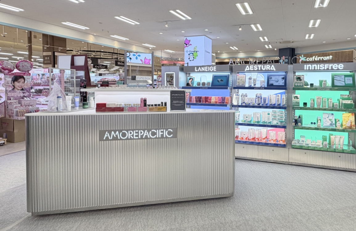
Aritaum’s first move into China’s beauty market
Amore’s first multi-brand store, Aritaum, has made its debut in Shanghai, China.
Featuring millennial pink as its signature color, the store aims to break away from
its existing identity and capture the attention of Chinese consumers. We spoke with
designers Baek In Woo, Hwang Sun Young, and Mun Hui Jeong, who were involved in the
Aritaum Shanghai launch project, to hear their stories.
Words by Urbanbooks Ho Eun Hye /
Photographs by NSMGOONGSUN STUDIO Nam Goong Sun
Photographs by NSMGOONGSUN STUDIO Nam Goong Sun
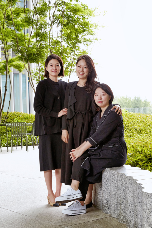
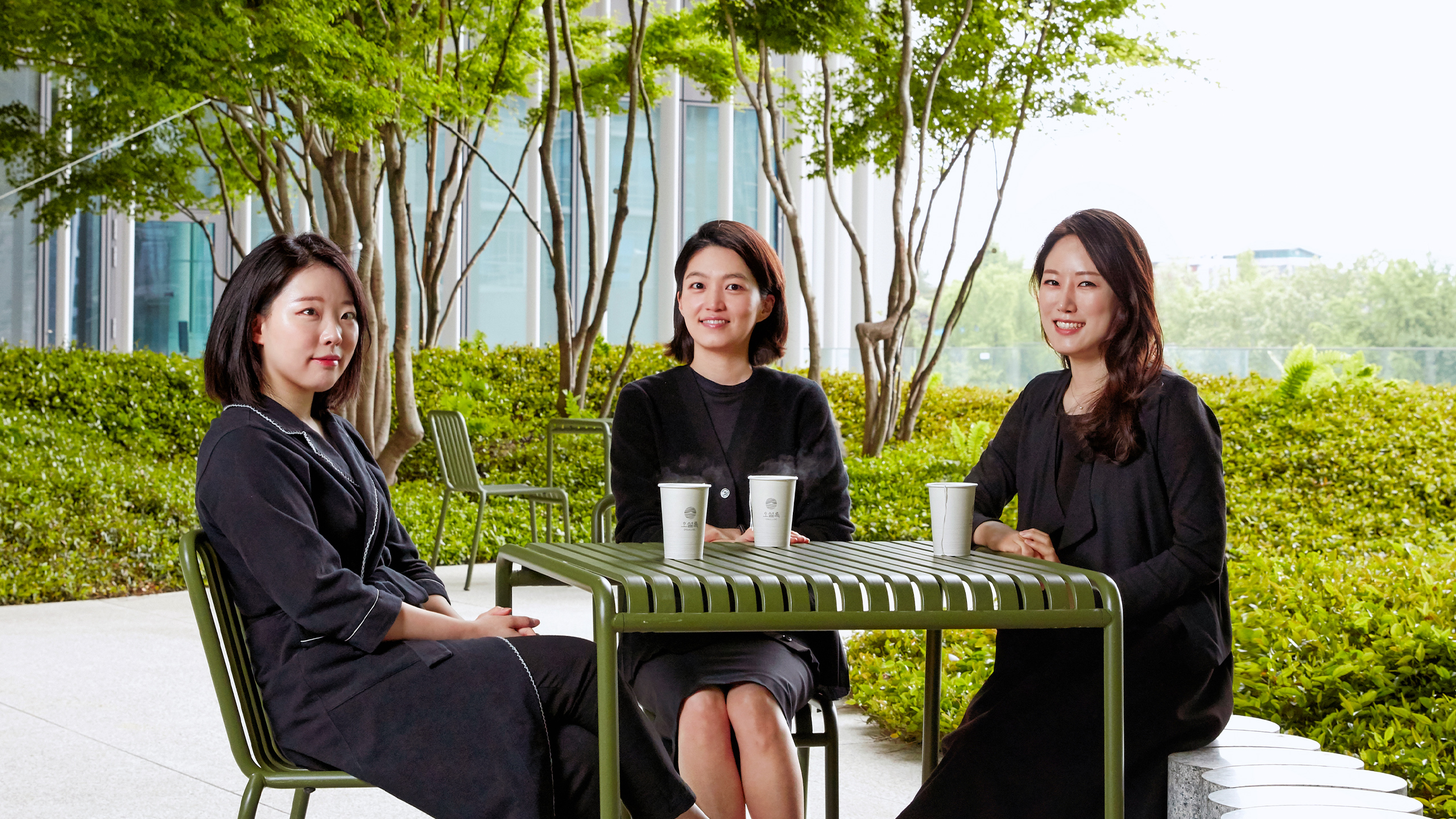
From left: Designers Baek In Woo, Hwang Sun Young, and Moon Hui Jeong
Please introduce yourself.
Baek In WooI’m Baek In-woo, responsible for VMD on the Amorepacific Retail Design Team. For the launch of the Aritaum Shanghai store in China, three designers collaborated on planning and design, and I served as the design project manager.
Hwang Sun YoungI’m Hwang Sun-young from the Premium Brand Design 1 Team. I was in charge of the VMD aspect of the project.
Mun Hui JeongI’m Mun Hui-jeong from the Luxury Brand Design 1 Team. Since 2017, I’ve been responsible for the retail sector and was part of the team that worked on Aritaum Live, the brand’s first multi-brand store, as well as the Shanghai store. In this project, I was responsible for the interior design.
Please provide an overview of the launch project for the Ariettaum Shanghai store in China.
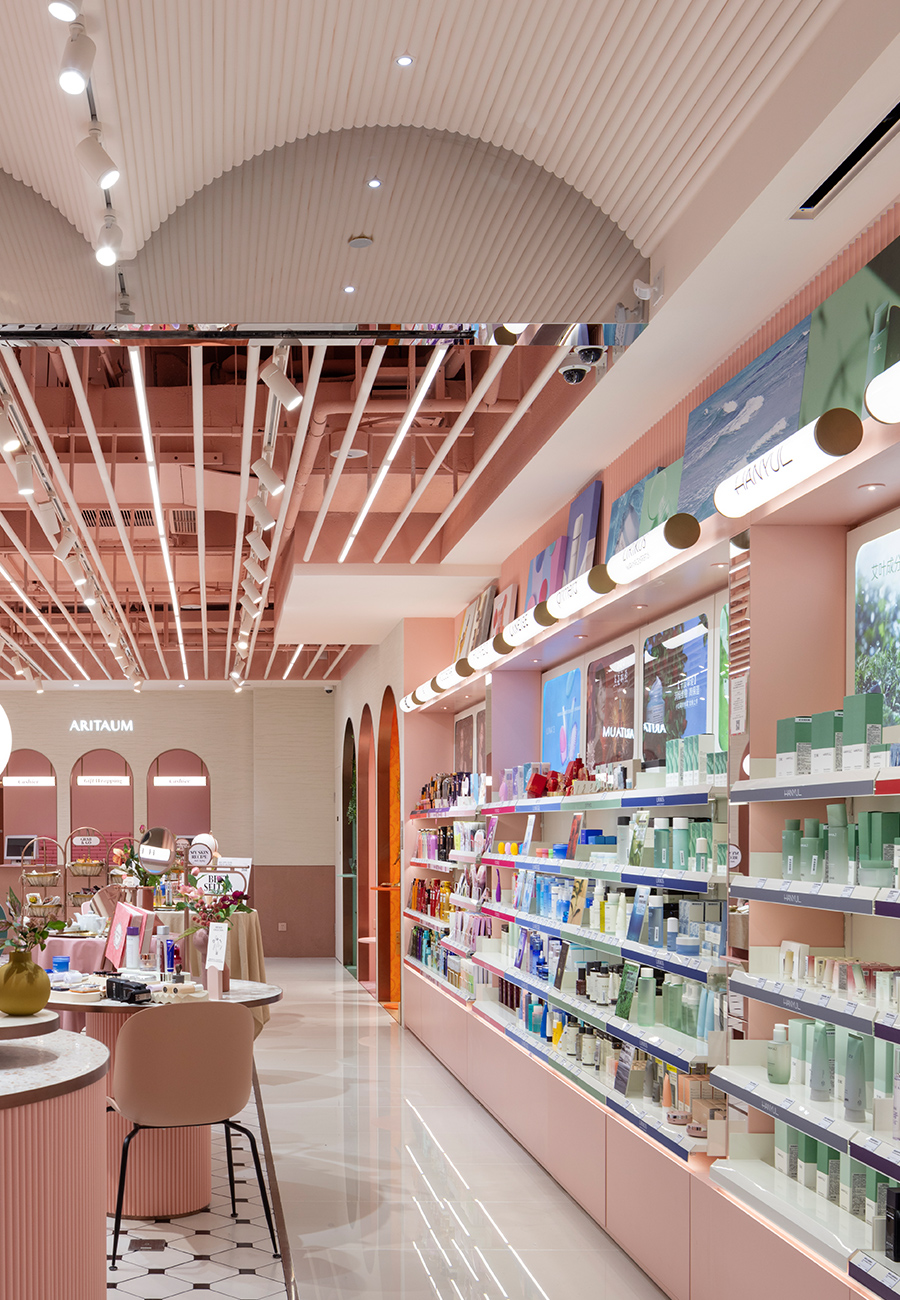
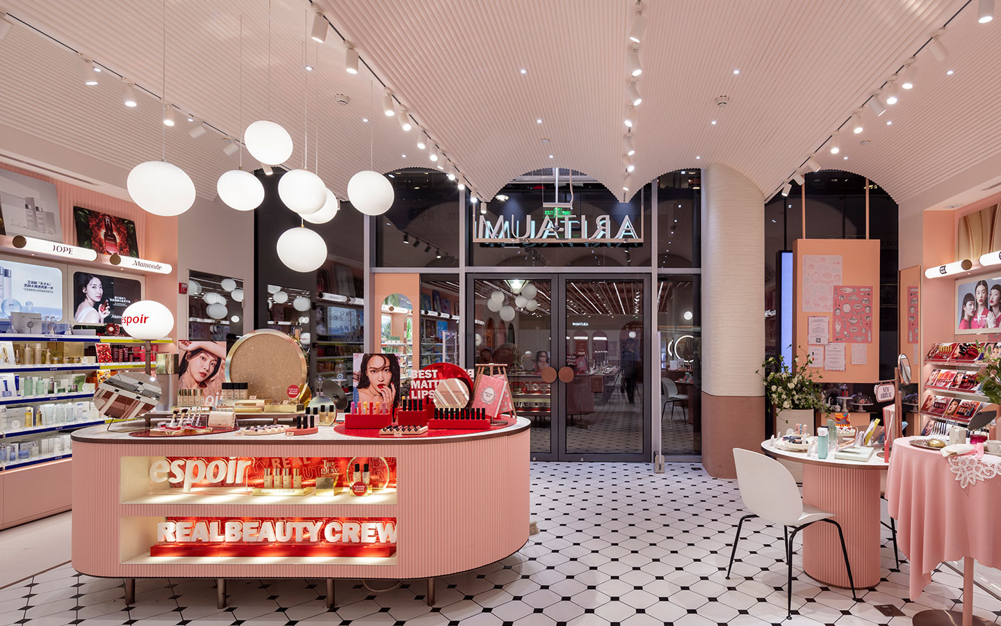
Baek In WooThe Aritaum Shanghai store is Amorepacific’s first multi-brand store introduced to Chinese customers. It is approximately 56 pyeong (158 m²) in size and is located on Nanjing Road in Jing’an District, the heart of Shanghai. Our primary focus during the launch was localization. Although Aritaum has consistently updated its design over the past 10 years and now operates multiple stores in Korea, this was its first entry into the Chinese market, so a brand concept tailored to Chinese consumers was essential. Based on local research, we determined that simply replicating the domestic design wouldn’t be effective. Instead, we reinterpreted the store’s graphics, color palette, interior mood, and overall design—retaining only the logo type—to better suit the Chinese market.
“We focused on creating a store tailored to the Chinese market, aiming to incorporate the trends of Shanghai, China.”
“We focused on creating a store tailored to the Chinese market, aiming to incorporate the trends of Shanghai, China.”
Ariake store in Shanghai, China
As your first overseas multi-brand store, what were your key considerations when planning the space?
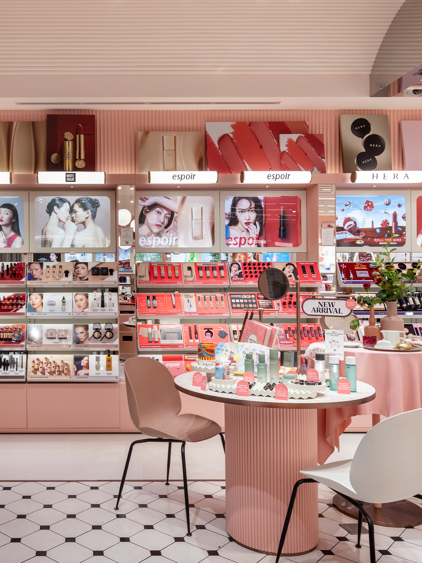
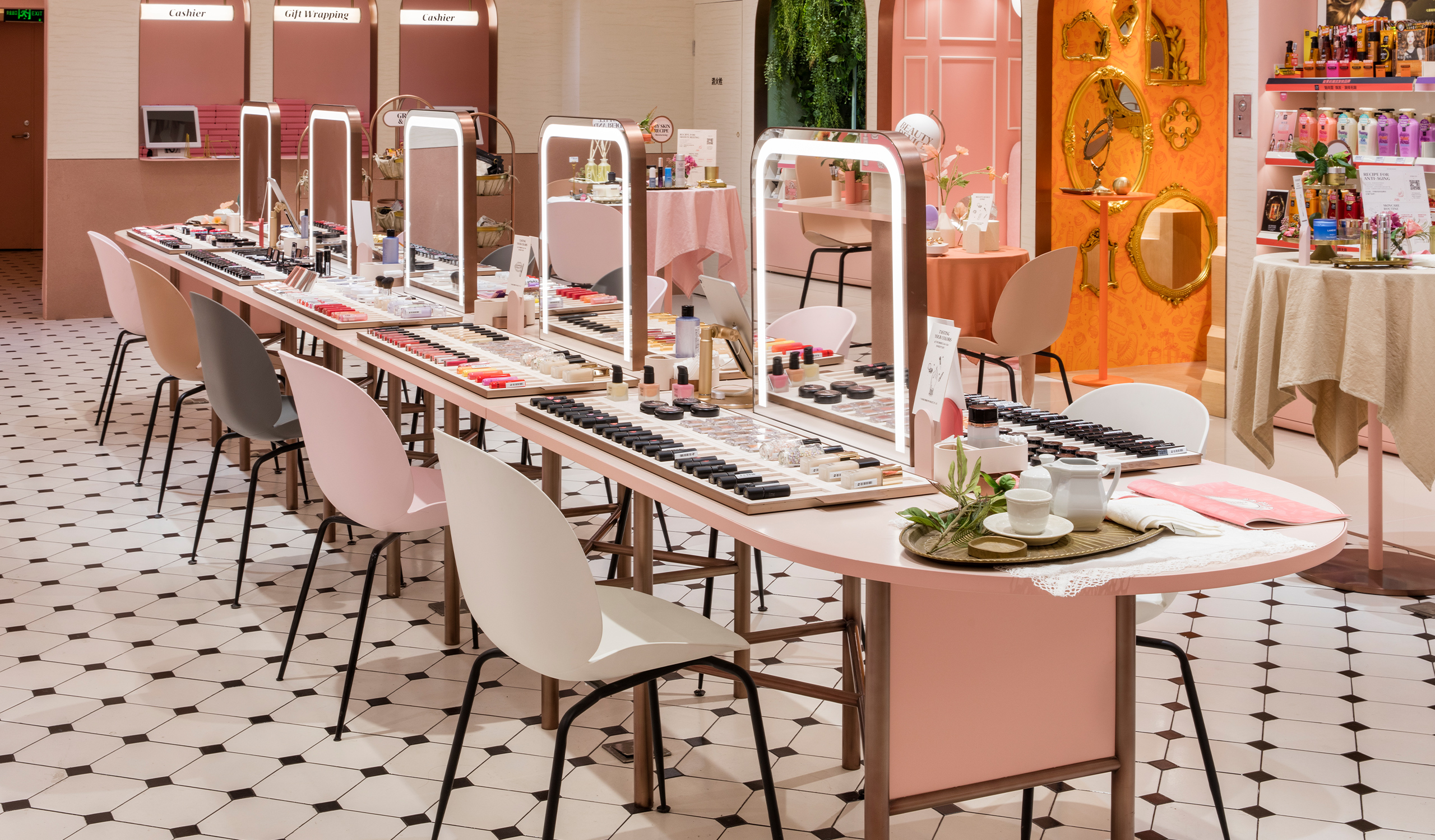
Baek In WooIt was very important to study Chinese customers. To this end, we arranged interviews with millennial employees working at Amorepacific China to gain a deeper understanding of Chinese consumers. It was an opportunity to learn a great deal about Chinese culture, tastes, and tendencies that we hadn’t previously known. The store layout was also a key focus. We created a central space where customers could intensively test products, allowing them to view all 40 brands at a glance while enjoying a comfortable and immersive product experience.
Hwang Sun YoungThe Chinese market is already saturated with multi-brand stores like Watsons and Sephora. However, these stores tend to follow a consistent concept regardless of location. Rather than catering to Chinese consumers, they often emphasize the brand’s identity. That’s why we focused on creating a store that aligns with the Chinese market and reflects the trends of Shanghai.
Mun Hui JeongWhile some brands have successfully entered the Chinese multi-brand store market, there are also many cases where brands have underperformed. We analyzed the social media platforms frequently used by Chinese millennials, such as Xiaohongshu and Weibo, and made efforts to reflect their preferences and tastes in the store space. Additionally, we worked with the operations team to explore practical solutions for continuously updating the store’s concept.
What are the characteristics of Chinese customers identified through the study?
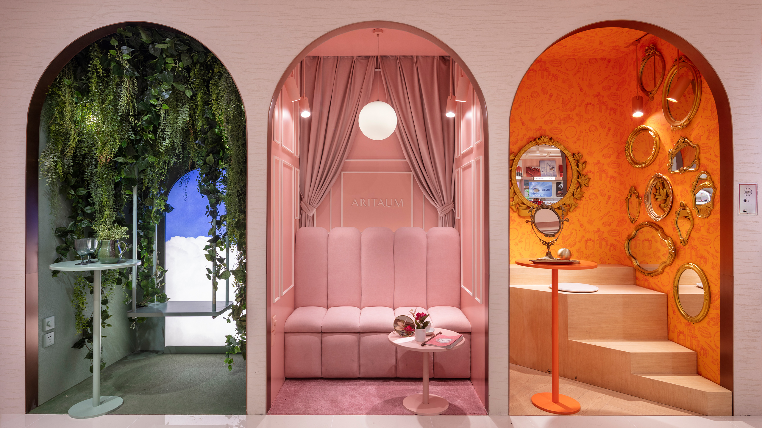
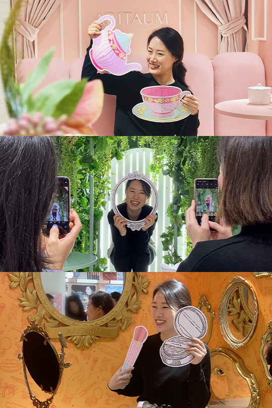
Baek In WooI believe the beauty industry is heavily influenced by YouTubers and influencers. Chinese Wang Hongs are also very active, and what we found interesting was that many of them would go live on social media right in the store if there was even a small space available. So, we thought it would be a good idea to create an area in the store that could serve as both a photo spot and a space for social media live streaming. We set up three booths in areas with low spatial utilization, each with a different design to add an element of fun. After the store opened, seeing visitors take photos at the booths made us feel very proud.
Hwang Sun YoungChinese millennial customers seem to enjoy taking photos in front of beautiful backdrops, often striking poses that highlight themselves. They also actively seek out unique photo spots. Additionally, they prefer spending time with friends rather than being alone, which was particularly noticeable.
“What I found interesting while observing was that many people would go live on social media right in the store if even a small space was available. So, I thought it would be a good idea to create a space in our store that could serve both as a photo spot and for live streaming. We ended up setting up three booths in underutilized areas of the store.”
What sets this project apart from other projects you have done in Korea?
Mun Hui JeongThe Shanghai store was created through careful consideration of the role of offline stores in the evolving retail market. While experiential content is an important element in retail, it can quickly become outdated if not updated regularly. Since this is a relatively small-scale multi-brand store, we aimed to minimize experiential features added solely for variety. Instead, we focused on creating a space where customers can genuinely enjoy their time and leave with positive memories. This approach is what sets the project apart from others.
Perhaps that is why the store’s objects, the distinct atmosphere of each booth, and the comfortable chairs remind one of a café.
Baek In WooTraditionally, multi-brand stores have focused on maximizing space efficiency. However, from an experiential perspective, we considered that customers tend to engage more when seated rather than standing, much like how people naturally sit down upon entering a café. With this in mind, we provided seating and used café-inspired objects—such as teacups, cake trays, teaspoons, and floral decorations—to convey the concept. We also incorporated actual beauty products into these displays, placing items like makeup pads or cotton swabs in the objects to create a harmonious arrangement. Our hope was that shopping in the store would feel like a pleasant “tea time” experience.
One of the most important elements in Chinese beauty stores is the counseling space and tools. While counseling is also essential for Ariettaum, our main target audience—millennials—tend not to prioritize it. We faced challenges in determining how to allocate and organize the space, and the café concept emerged from that ideation process. We thought that placing chairs throughout the store would allow customers to naturally sit down and receive counseling from staff, creating an efficient and inviting layout. Moreover, cafés offer broad design flexibility. The abundance of details—such as accessories, graphics, and uniforms—also contributed to the concept, making the space one that Chinese customers would enjoy photographing.
Mun Hui JeongSince this was our first venture into China, we felt that simply leaving a strong, positive impression on customers would be meaningful. We thoughtfully considered elements such as color, objects, and seating, hoping customers would enjoy spending time in the store. The café concept was the most fitting way to bring all of these elements together.
“From our experience, we found that customers tend to engage in a wider range of activities when seated rather than standing, and this insight came from observing how people naturally sit down when they enter a café.”
“From our experience, we found that customers tend to engage in a wider range of activities when seated rather than standing, and this insight came from observing how people naturally sit down when they enter a café.”
The central area of the store is designed for intensive product testing. What impact do you expect this layout to have?
Baek In WooWe wanted customers to feel more comfortable using the space. We placed a large table and about 20 seats in the center of the store to create an area where customers can freely try out products or receive simple touch-up services. Keeping in mind that young people prefer to interact only when necessary, we designed all interior fixtures to be self-service. We also placed regularly updated product information leaflets on tables in the new product zone, bestseller zone, and cross-border zone so customers can browse the information as if choosing from a menu.
Mun Hui JeongDuring workshops with Chinese millennials, we realized that customers want a sense of independence when testing products. Many preferred to test products on their own but wanted to be able to ask staff for help if needed. While there was some concern that a testing space in the center of the store might feel awkward, we emphasized the convenience of being able to sit and test products, aligning with the café concept. We increased the number of seats and arranged comfortable chairs to make the space more inviting. We believed that once customers sat down, we were already halfway there. In fact, many customers did sit and test the products, and we believe this setup will be a convenient approach for both customers and BAs moving forward.
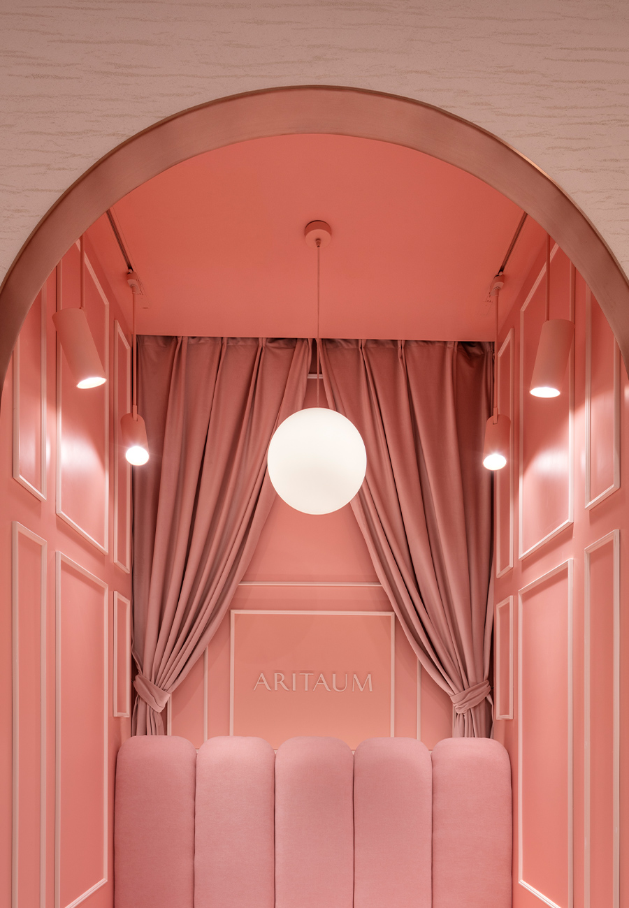
The arched ceiling and walls are also eye-catching architectural features.
Hwang Sun YoungWhen placed in a large space, arches can appear as substantial architectural elements, but they also help make the space feel cozy and delicate. When applied to small items like Pio Pio, they can even create a cute mood. We wanted to use arches in various forms to enrich the space, taking full advantage of these qualities.
Mun Hui JeongInternally, we asked ourselves, “Where should customers take memorable photos in our store?” Photos shared on social media need a beautiful background that makes the subject stand out, without overpowering their face. After considering various design elements, we concluded that nothing was as visually striking yet harmonizing as the arch. So, we first applied the arch shape to structural elements like ceilings and walls, then expanded it to furniture and POP displays, establishing it as a core design element throughout the space.
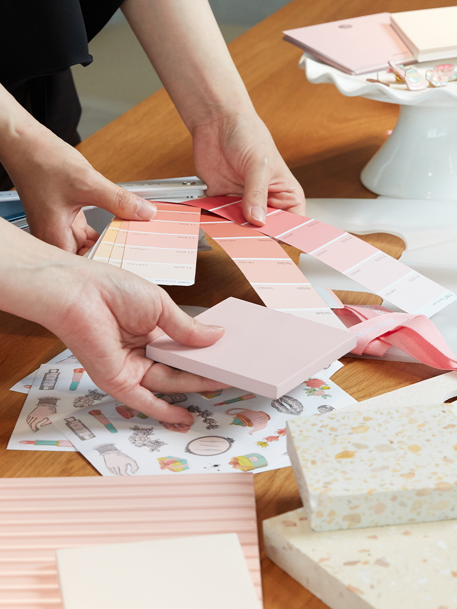
“At first, we considered using neutral beige tones, but to better understand things from the customer’s perspective, we tested various colors using camera filters on Meitu and Xiaohongshu. Among them, pastel pink looked especially appealing through the filters and was also visually attractive, so we chose it as the key color.”
On the other hand, we cannot leave out the story behind the key color. Why was pastel pink chosen as the main color?
Baek In WooWhile researching popular spaces in China, we noticed that although there were many different styles, spaces that used pastel colors as their main color scheme made up a significant portion of the market, regardless of industry or business type. We believed that design elements using a unified color throughout the store could leave a strong impression on visitors, and pastel pink aligned well with the chosen café concept.
Hwang Sun YoungDuring my first meeting with the representative of the Chinese branch, they mentioned that they wanted the Aritaum Shanghai store to be a space where customers could feel like a “princess.” At first, I was a bit puzzled, but after several months of researching the Chinese market and consumers, I understood what they meant. We considered designs that would highlight each customer’s uniqueness, and among the final café concepts, we decided that the lovely and charming atmosphere of a dessert café was most appropriate. We chose pink as the main color because we felt it would greatly contribute to creating that ambiance.
Mun Hui JeongWhen you look at the social media accounts of Chinese MZ-generation influencers, most of the photos are filtered. Initially, we considered neutral beige tones, but to see the space from the customer’s perspective, we tested colors using filters from apps like Meitu and Xiaohongshu. Among these, a pastel pink shade stood out for its compatibility with the filters while also being visually appealing on its own, which led us to select it as the key color.
In addition to Amorepacific brands, other global brands popular among Chinese millennials are also available in the store. I’m curious about the background behind the decision to collaborate with other brands.
Baek In WooI believe that having multiple brands in the store allows for a variety of voices to be heard. The New Business Team, which was in charge of bringing in global brands, selected popular Chinese brands such as Venus Marble, Mono Chris, and Pop Kit to collaborate with in order to convey this diversity.
Mun Hui JeongJust two or three years ago, “K-Beauty” had a strong impact on its own in China, but now there are differing opinions that it has become somewhat stale. Given the current landscape, I think clinging too tightly to the Korean Wave wouldn’t reflect current trends. That’s why I believe they aimed to bring in a broader range of brands and products, including C-Beauty. The C-Beauty brands I’ve tried personally are quite appealing, and I think they’ve enhanced the overall shopping experience.
Do you have any memorable episodes from the Shanghai store launch project?
Baek In WooOne day, as I was leaving work, I said, “You two should hurry up and go home too!” But the next morning, I found both of them sitting at their desks wearing the same clothes as the day before—it really surprised me. I think it was that kind of dedication that led to the successful completion of a store we were proud of. Despite the heavy workload, this was a project where the synergy among the three of us really shined.
Hwang Sun YoungIn a previous brand launch project, the focus was on incorporating the brand’s BI, so I went on two or three business trips organized by headquarters. But for this project, we held many meetings to gather input from the Chinese branch, and we had to continuously monitor the local market, so starting in January of last year, I ended up traveling to China almost every month. To make local payments easier, I had to set up WeChat Pay, which involved visiting a local agency, using gestures to communicate, getting a local SIM card, and opening a bank account. It was a challenging process, but it proved extremely useful on later trips.
Mun Hui JeongI also have a memorable anecdote from our business trips. Every time we traveled, it seemed like we had all agreed in advance to wear black outfits. From head to toe, we exuded a dark, serious vibe—ironically so, since we were promoting a store designed around a cheerful pastel pink theme. It’s a humorous contrast that I’ll never forget.
Since this is a launch project overseas, I’m sure there were some challenges.
Baek In WooThe language barrier was sometimes difficult and frustrating. However, because of that, the moments when I was able to exchange ideas with the construction site workers using a translation app—though awkward—were also enjoyable experiences.
Hwang Sun YoungI couldn’t speak Chinese at all either, so communicating with the workers during the on-site setup was very challenging. We had to give instructions through gestures, facial expressions, and drawings. There were many frustrating moments due to the communication gap. However, all the workers were passionate about their work and told us the store looked beautiful, which really encouraged us. It felt like a space we all completed together with joy.
Mun Hui JeongContrary to the original plan, we were informed during the later stages of the project that we couldn’t change the facade. The store is located on Nanjing West Road, often referred to as the “Myeongdong of China,” with a high volume of foot traffic, especially during weekdays. It was challenging but rewarding to install mirrors and lighting in a way that made passersby stop for a moment in front of our store, despite the uniform facades along the street.
What personal or professional achievements do you think you gained through this project?
Baek In WooAmorepacific has launched several brands in China, with stores in department stores, shopping malls, and standalone locations. However, many brands still do not have their own standalone stores, and there had been no space where multiple brands could come together. The most meaningful achievement was that we were able to create a platform through the Aritaum Shanghai store to introduce a wider range of Amorepacific products to Chinese customers.
Hwang Sun YoungPersonally, I overcame my fear of using color. In my previous design work, I rarely had the opportunity to use pink. But through this project, I explored a wide variety of pink shades, created samples, and experimented with different combinations, which helped expand my color palette. I also had the privilege of working closely with two invaluable colleagues for an entire year, immersing myself in the project and enjoying every moment of it.
Mun Hui JeongI had the opportunity to participate in both the domestic version of Amorepacific’s first multi-brand store, Aritaum Live, and the global version, Aritaum Shanghai. Both were first-time experiences for me, so there were many challenges, but I believe I achieved significant growth through the process of understanding the business context beyond just design.

Aritaum was born from Changseong Shop, a place where people shared stories of beauty over 80 years ago. This space is a modern reinterpretation of those warm relationships. We believe that beauty is not just about looking good, but about living a happy and meaningful life.
Aritaum’s first move into China’s beauty market
As a major platform in China for introducing Amorepacific’s new brands and products—and as its first brand store—it also serves as a channel for showcasing cultural elements such as beauty culture and standards of beauty through Korean cosmetics. A 2.7-meter-long promotional table is placed at the front entrance of the store, providing ample space for brand activities and information on new products.
Design Key Points
To give all customers visiting Aritaum China the feeling of being in a café, pastel pink was designated as the key color, and the overall concept was designed around the idea of a “new experience through a café concept.” A variety of material textures are introduced through the placement of café-related objects and the use of paint finishes reminiscent of oil paintings. To create a structurally refined and delicate spatial atmosphere, arched forms were incorporated into parts of the ceiling and walls. Inside the store, uniquely designed booths were installed to attract customers, especially millennials who enjoy taking photos and live streaming on social media.
- Amorepacific Creatives