Please introduce yourself and describe your role and responsibilities in the Sienu launch project.
Hello, I am Lee Sang Ah, a product designer. I was responsible for the Sienu brand and product design for this project.
Could you provide an overview of the Sienu brand?
Sienu is a new brand that officially launched in March 2020. It targets young customers aged 25 to 34 in the growing Chinese luxury anti-aging skincare market. The brand focuses on satisfying the Chinese market’s preference for vibrant aesthetics.
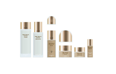
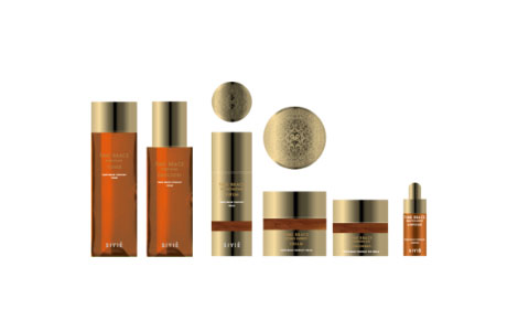
Final product designs that competed with other concepts were developed using gold as the base to convey a luxurious yet elegant feel, tailored to local preferences.
Sienu is inspired by modern adventurers in search of solutions to anti-aging. Could you tell us about any unique ideation processes that set this project apart from conventional approaches?
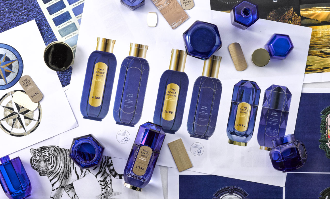
In this project, the container design was developed even before the brand name or story was decided. A task force team consisting of marketers, designers, engineers, post-processing experts, and researchers collaborated to build the brand concept together—an approach that set it apart from conventional methods. The adventurer concept was inspired by the idea of a traditional Asian botanical garden called Jangwonseo, which was proposed by the marketer. In luxury brands, rare ingredients often serve as key selling points, and Sienu embraces the spirit of adventure, symbolizing the ongoing pursuit of precious ingredients, like treasures.
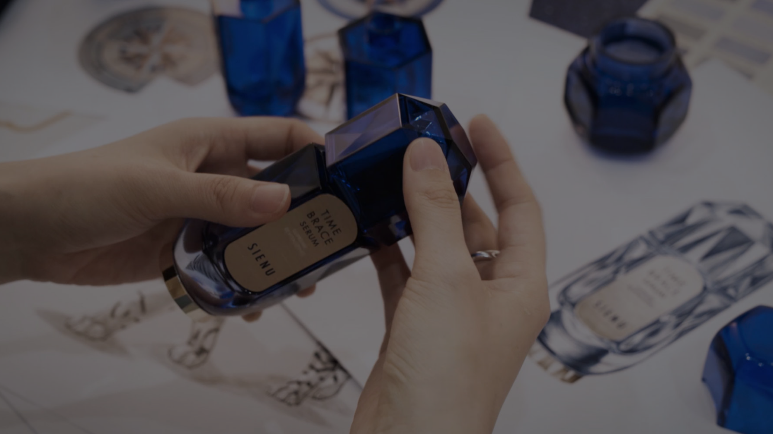
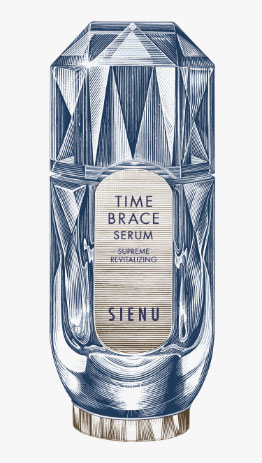
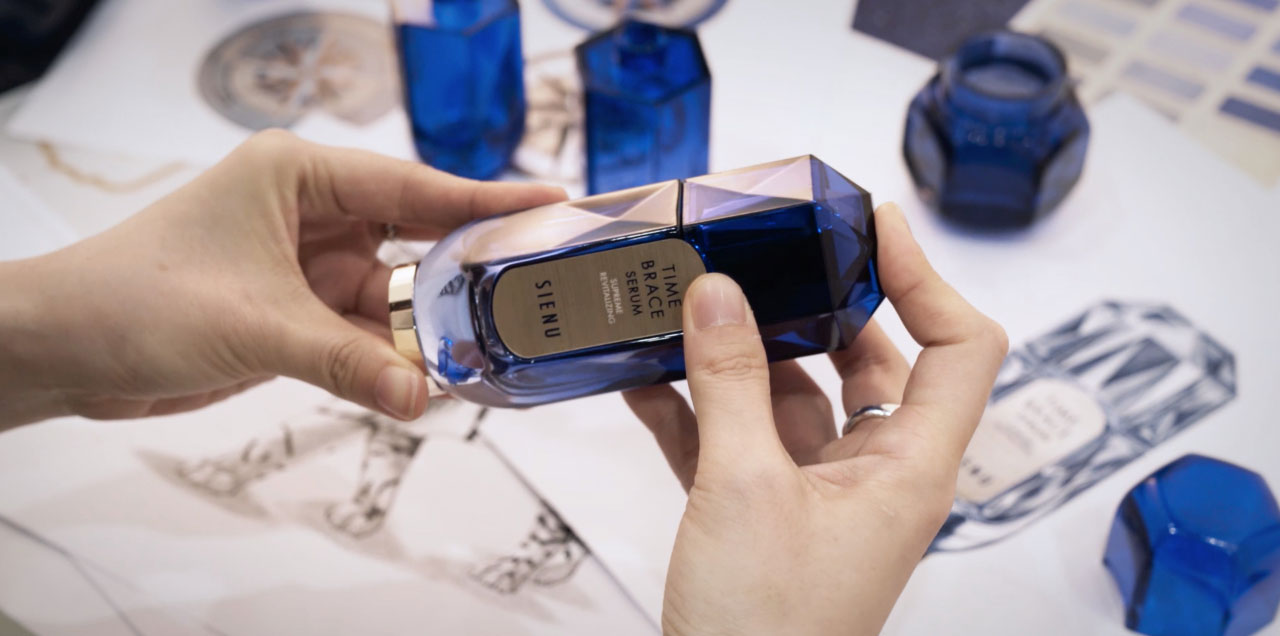
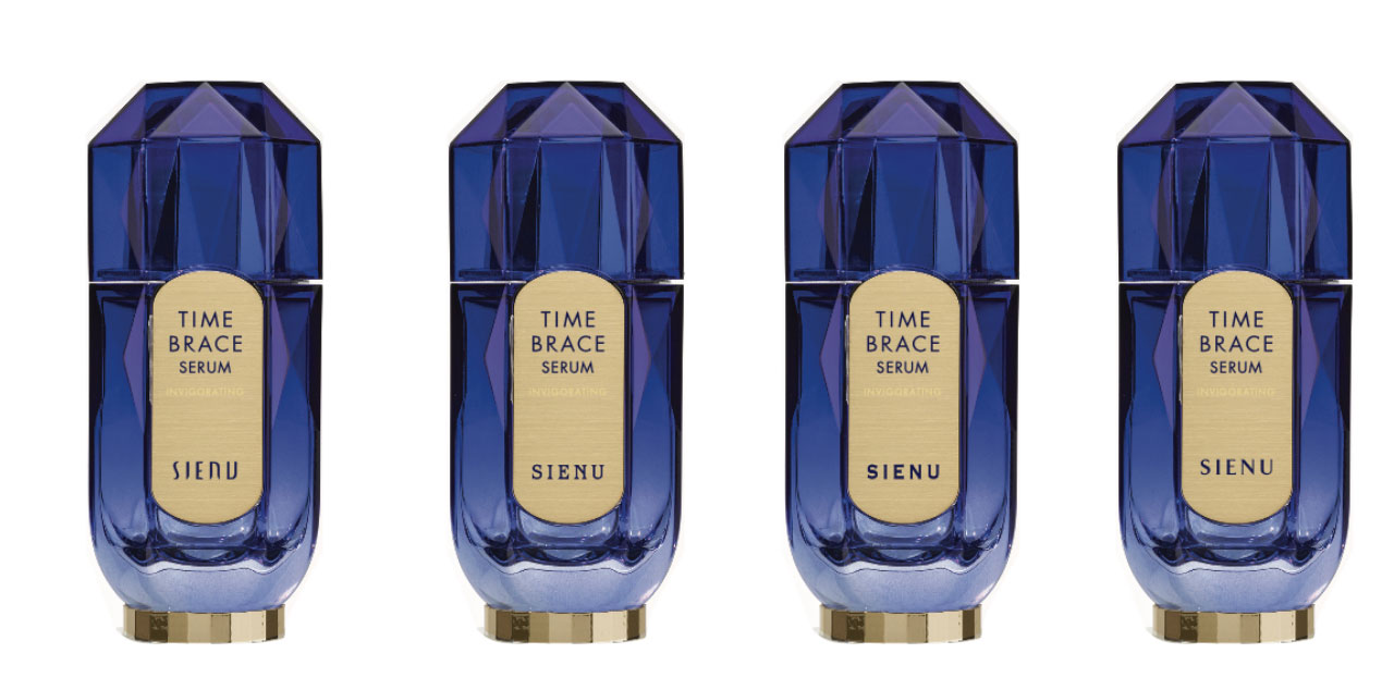
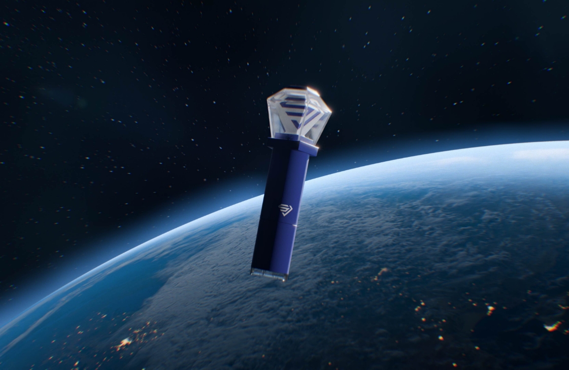
Sketch of the Time Break Serum, which is shaped like a jewel (top), and the actual product (video below)
The combination of navy and gold seems to reinforce the image of a luxury brand. Why did you choose these two colors as the main colors?
We felt that navy was a color capable of expressing both a sense of mystery and advanced technology. To add a softer touch, we selected a blue shade with a hint of purple. We learned that Chinese customers often refer to products by nicknames rather than their exact names, so we named this blue color “Sapphire” and gave our main product, the serum, the nickname “Blue Diamond Serum,” combining the color and the key ingredient. We chose gold to add a warm tone that harmonizes with the blue, and because it is an essential color for a luxury brand targeting the Chinese market.
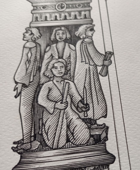
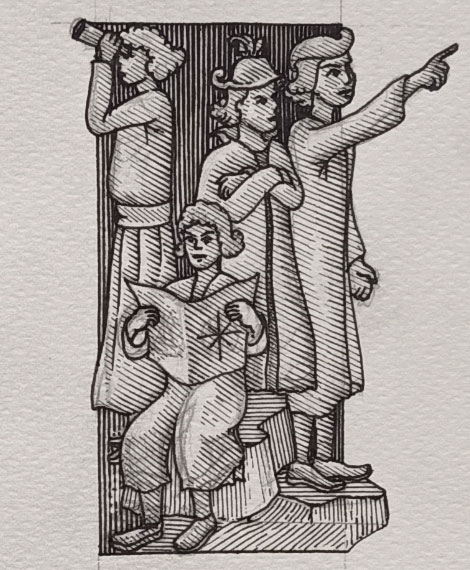
We wanted to create a sense of mystery that would make it unclear at first glance which country the brand originates from, so we developed an illustration that blends Western architectural elements, such as arches, with Eastern decorative motifs.
The arched banner, which blends Eastern and Western aesthetics, is also striking. What was your inspiration when sketching it?
During the ideation process, I came across a book of Eastern patterns illustrated by Owen Jones, a British painter and architect, and was drawn to the way Eastern and Western colors seemed to harmonize. Sienu also aimed to evoke a sense of mystery—one that made it difficult to identify the brand’s origin at first glance. To achieve this, we developed an illustration that blends Western architectural elements, such as arches, with Eastern decorative motifs. The work was created in collaboration with a Thai illustrator, and we continued to incorporate key elements—such as a compass—to reinforce the image of an explorer and their journey, ultimately completing the design.
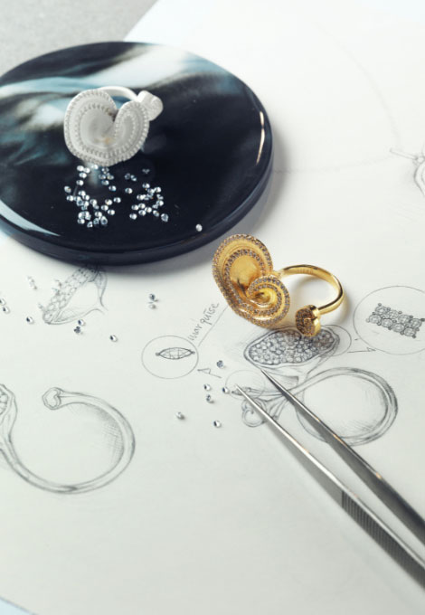
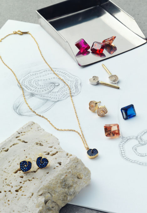
For our first art collaboration, we worked with a jewelry designer to create jewelry.
Depending on the set composition, the image on the package may vary. Each image—such as the tiger or the diamond—carries its own meaning. The slogan for the newly released special set, “The Explorer’s Journey to the Unknown World,” captures Sienu’s narrative of exploration while introducing a sense of freshness not found in the existing brand. By incorporating diverse landscapes, flora and fauna, and treasure imagery into the emblem, we aimed to visually express the journey of an explorer.
We hope you enjoy the experience of watching different images come together to tell a single story through the four unique combinations in the special set.
The art collaboration with jewelry designers is also eye-catching. I’m curious about how the collaboration process unfolded.
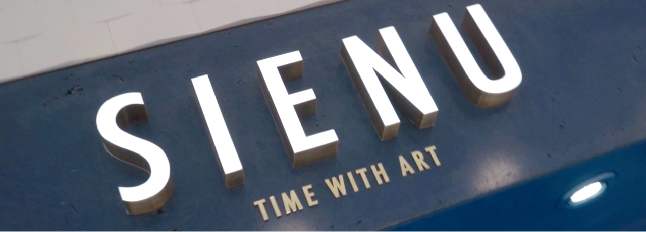
As Sienu’s slogan is “Time With Art,” we wanted to create jewelry that would reflect our identity as a brand engaged in artistic endeavors. Of course, the final pieces needed to be beautiful, but more importantly, we wanted to convey this message through the jewelry-making process itself. We asked the jewelry designer to thoroughly document each step—from initial sketches to the final product—using photos and videos. I believe this aspect was executed well, leading to a satisfying result. The Instagram posts sharing this process also received a positive response. We plan to continue collaborating regularly with various artists moving forward.
What personal or professional achievements do you think you gained from this project?
I feel that I gained a deeper understanding of the people I work with from other fields—such as marketers, engineers, researchers, and external partners—and I believe they gained the same insight about me. It was also a meaningful experience to learn in detail how the cosmetics we produce are actually sold, and how the brand is perceived by customers through various activities.
What are your future plans for Sienu?
We plan to continue pursuing new ideas and delivering innovation. Our design strategy will remain focused on the Chinese market while creating designs that resonate well across digital channels.
What brand values do you hope customers experience when using Sienu products?
We hope customers experience something new or enjoyable that they haven’t felt before.
A high-end skincare brand inspired by explorers who sought anti-aging solutions for royal families throughout Asian history. The brand uses rare plants from traditional botanical gardens and luxurious gemstones discovered by adventurers as key ingredients.
Sienu Launch Project
Amorepacific’s 70 years of research and development have culminated in Epiactive Technology™, which safely delivers essential anti-aging benefits to the skin—creating a timeless complexion that embodies the pinnacle of art. Targeting the Chinese market, the first store has opened at Lotte Duty Free, establishing an offline connection with customers.
Design Key Points
The treasure map essential for exploration, the mysterious flora, fauna, and landscapes encountered along the journey, the unknown world finally reached, and the precious gems discovered there—Sienu distinguishes itself with a consistent concept of “the explorer’s journey.” Targeting young luxury customers in China, the brand presents a refined yet opulent beauty through its signature navy and gold color palette. At the heart of the Sienu identity is the motif of “jewels,” which is seamlessly woven into every element of the brand, from products and videos to VMD and spatial design.