Please introduce yourself and describe your role and responsibilities in the Sienu launch project.
My name is Shin Jung Hui, and I’m part of the Retail Design Team at Amorepacific, specializing in spatial design. I was responsible for the interior design of Sienu stores.
Please give us an overview of the Sienu brand.
It is the first high-end brand that Amorepacific has officially launched in a long time. The launch project was carried out by a task force composed of specialists from various fields, rather than the existing brand design team.
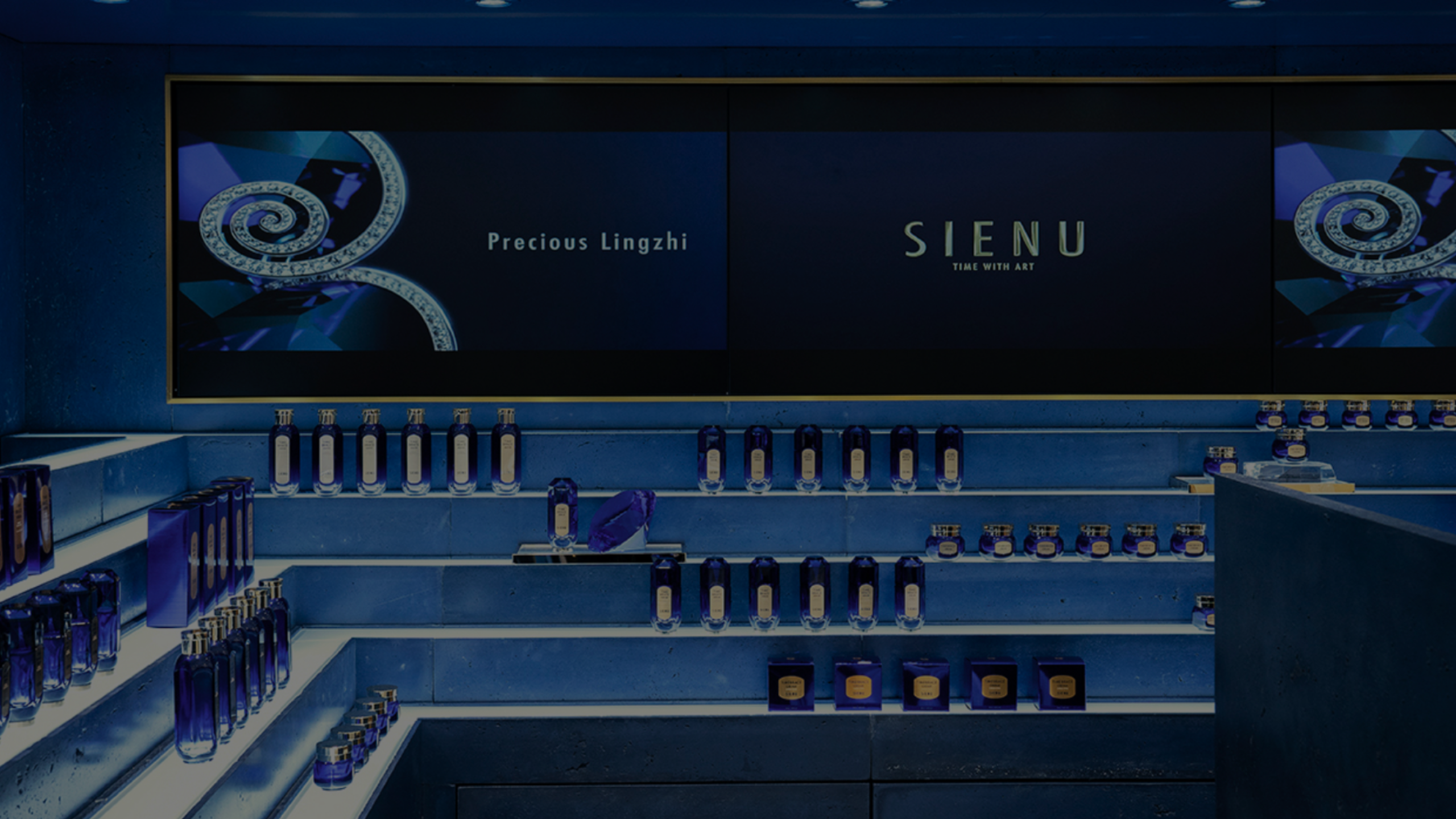
The interior of the Sienu store in Lotte Duty Free. The navy and gold colors create a gorgeous yet sophisticated atmosphere.
Please introduce Sienu’s first store.
Sienu’s first store is located in Lotte Duty Free, an urban duty-free store. Duty-free shops are generally divided into airport duty-free and urban duty-free stores, each with different target customers. Urban duty-free customers tend to be more purpose-driven — they visit the store with a clear intent to purchase, rather than just to browse. As such, they often spend considerable time testing products, which frequently leads to a sale. With this in mind, we designed the customer flow to allow for a relaxed experience, even within a compact space, enabling visitors to fully immerse themselves in the Sienu brand once they enter the store.
Sienu is inspired by modern adventurers in search of anti-aging solutions. Could you share how the ideation process behind the space design differed from conventional approaches?
For purpose-driven consumers, it’s easier to envision clear actions and movement patterns. For example, when you take the escalator to the 11th floor and turn your head, you see the store in the distance, its striking blue color catching your eye. As you approach, the sparkling products and sophisticated VMD gradually come into view. This naturally sparks curiosity about the brand and makes you wonder about the price range. Upon entering the store, you take a small amount of the main product and apply it to the back of your hand. You smell it and check for any unusual sensations. If you like the product, you might glance at the staff’s attire and the overall display of the store while making your purchase. In this way, you begin to visualize the story and imagine the key elements to highlight in each scene. For instance, in the first scene, you might ask, “What kind of finish should I use to make the color that catches the eye stand out at first glance?” “Should we use natural stone to convey a sense of luxury?” or “Would introducing new objects like lighting fixtures make it sparkle more?” I tried to align as many of these elements as possible for each scene, piecing them together like a puzzle to complete the ideation process. I believe this approach helps create spaces that offer a richer and more diverse customer experience.
It was difficult to fully grasp the perspective of an adventurer, so I approached it from a design standpoint. I conducted ideation by imagining myself as a consumer entering the store from the outside and visualizing the various situations I would encounter inside.
It’s impressive how you envisioned specific situations and matched them with appropriate elements. What was the main concept behind the Sienu space?
If the core concept of the brand is a modern adventurer searching for the secret to anti-aging, then the space was designed to evoke the image of a third world—an unknown realm that the explorer finally reaches after completing their journey. I wanted to create an unpredictable environment reminiscent of a mysterious world. To achieve this, I layered raw stones to resemble rugged cliffs, expressing the brand’s gravity and spatial depth. In addition, since Sienu represents the pinnacle of art that transcends time, we aimed to interpret this concept spatially and present a unified vision using materials and components that reflect this image.
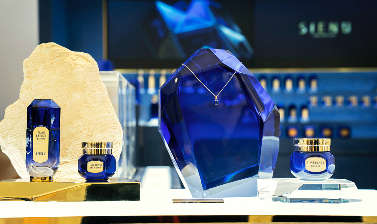
The display stands are decorated with elements rarely seen in other brands, such as sculptures representing Sienu’s core technology, Epiactive, and jewel-like forms. Were there any difficulties in producing the display stands and accessories?
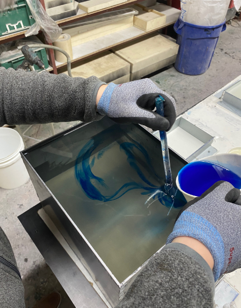
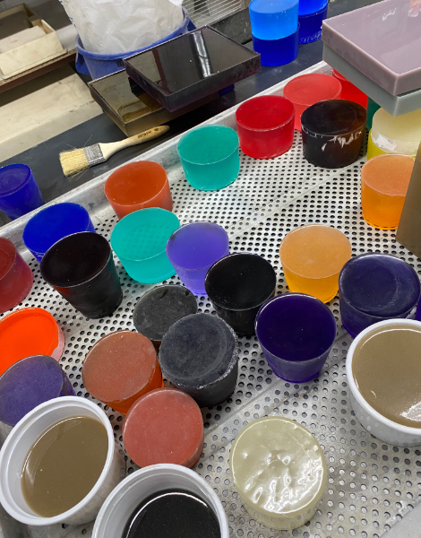
I think every aspect we attempted to visualize was a challenging and demanding process. Not only myself, but also the VMD team that collaborated on the spatial design, conducted extensive research on various materials and worked with numerous suppliers to bring our envisioned imagery to life.
We researched a wide range of materials, colors, and suppliers to express the desired imagery.
How was the collaboration process with partner companies and subcontractors?
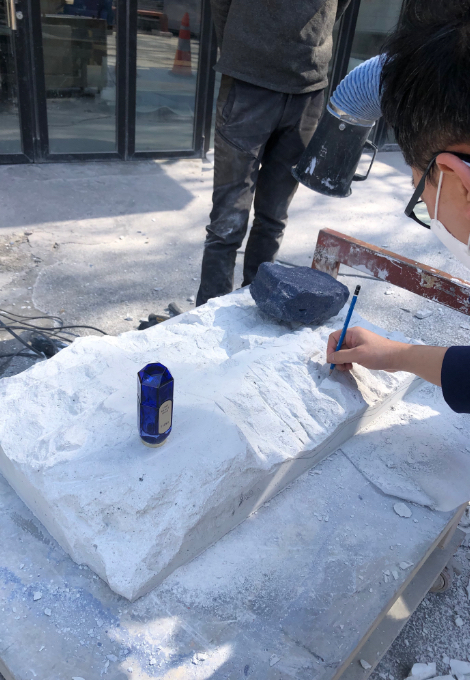
We received a lot of support from Decrite, a company specializing in concrete finishing materials. We were looking for a material that felt raw yet luxurious—something that could express the brand color without relying on paint, while preserving the natural texture of the concrete. Decrite helped us resolve this challenge. At their factory, we sculpted the concrete ourselves and carefully adjusted every detail—from the product’s placement and orientation to the angle of light as seen from the customer’s perspective. It was a demanding process, but we approached it with excitement, as it was a new and meaningful experience for us.
What is your favorite design element of the Sienu space?
The concrete object at the front of the main display is the highlight of the space. Its tactile, rough texture contrasts beautifully with the sleek products, creating a balanced harmony of raw weight and refined luxury. Since I shaped it myself, it feels like an extension of my own hands—making it especially memorable and dear to me.
If you were to open a standalone Sienu store in the future, are there any new space design elements you would like to try?
I hope to explore the brand on a deeper level and translate that into a visual experience. Rather than focusing solely on fixtures, I want to design a space that communicates Sienu’s message holistically—from the floor to the ceiling, including the lighting and hardware.
What brand values do you hope customers will feel when experiencing Siyenu’s space design?
I hope that as customers engage with the products, every element of the store reaches them as a sensory experience—something they can intuitively feel and understand.
What personal or professional achievements do you think you have made through this project?
Personally, I gained valuable experience by being involved in every aspect of launching a new brand. Professionally, I believe my greatest achievement was unifying the brand concept and spatial design to present a cohesive vision for Sienu.
What projects or goals would you like to pursue in the future?
Rather than creating a store that simply attracts large crowds, I want to design a space where each individual customer can deeply connect with, experience, and explore the brand. I believe that such a space can establish a distinctive origin—one that stands apart from the trend-driven, chaotic environments that follow.
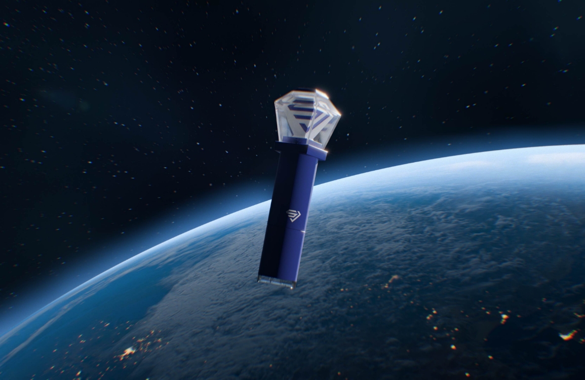
A high-end skincare brand inspired by explorers who sought anti-aging solutions for royal families throughout Asian history. The brand uses rare plants from traditional botanical gardens and luxurious gemstones discovered by adventurers as key ingredients.
Sienu Launch Project
Amorepacific’s 70 years of research and development have culminated in Epiactive Technology™, which safely delivers essential anti-aging benefits to the skin—creating a timeless complexion that embodies the pinnacle of art. Targeting the Chinese market, the first store has opened at Lotte Duty Free, establishing an offline connection with customers.
Design Key Points
The treasure map essential for exploration, the mysterious flora, fauna, and landscapes encountered along the journey, the unknown world finally reached, and the precious gems discovered there—Sienu distinguishes itself with a consistent concept of “the explorer’s journey.” Targeting young luxury customers in China, the brand presents a refined yet opulent beauty through its signature navy and gold color palette. At the heart of the Sienu identity is the motif of “jewels,” which is seamlessly woven into every element of the brand, from products and videos to VMD and spatial design.