The centerpiece of Primera, the Organiance Barrier Repair line, is back after a 12-year hiatus with a powerful barrier repair upgrade powered by
new SEED TECHTM. The Organiance Barrier Repair line helps to repair and maintain the skin barrier’s elasticity to promote healthy skin.
organic + science
Primera is a skin barrier solution brand that has been studying the power of seeds since 1986. For years, Primera has been beloved in Korea as an eco-friendly, natural, and “kind” brand. To actively respond to the changing global market, we have rebranded it as a high-efficacy brand offering advanced skin barrier care solutions. To shift from its long-held image as a gentle, natural brand to one that is more functional and proactive, we have renewed the brand wordmark and product design. While maintaining the heritage built over the years, the brand is evolving to focus on its technological confidence and its commitment to sustainability. This new direction is embodied by the Organience Barrier Repair line—the core of the rebrand—which helps repair a compromised barrier and maintain elasticity for healthy-looking skin.
confidence + technology
To instantly convey the confidence born from the brand’s technology, we made the bold decision to shorten the original ‘primera’ wordmark (created in 2010) to the new ‘prmr’. The logo’s development began with the form and structure of the original wordmark, which was designed 12 years ago in the Century Gothic typeface. The process started by straightening the slanted forms of the ‘r’ and ‘m,’ which gave the original a softer feel. We then refined the typography by testing variations in the descender length of the ‘p’ and applying the character strokes of the ‘m’ to the ‘r’. This resulted in the final ‘prmr’ mark, where all letters are connected with an organic quality. This bold and impactful wordmark was perfected for flawless scalability, allowing it to be used as a primary graphic element at any size. This new wordmark maintains a visual connection to the original logo but appears more intuitive and impactful in all retail environments, including digital. Its bold application on product packaging further enhances its iconic presence.
The product container’s shape was designed to showcase the brand’s evolved technology and confidence, drawing inspiration from laboratory reagent bottles and the new ‘prmr’ wordmark. The bold, rounded shoulders characteristic of lab bottles were applied to the container to intuitively convey technical expertise, while the straight and curved elements from the ‘prmr’ wordmark were used to refine the silhouette. During this process, the lines and proportions of each bottle were adjusted to improve usability based on how the product is used. The bold cap, developed to both complement the rounded shoulders and ensure ease of use, features a debossed ‘prmr’ wordmark on top, enhancing its iconic quality. The typography on the container takes its motif from the layout of a laboratory research chart, which improves the readability of the relatively long product names and reinforces the brand’s functional aesthetic.
The Organience Barrier Repair line exclusively uses glass containers to reduce plastic usage. By removing unnecessary decorative elements, we emphasized the bottle’s bold and clear form while creating a sustainable design. The color palette—a combination of metallic silver, deep brown, and a healthy beige—expresses the harmony between the deep technology of seeds and the look of healthy skin. The metallic silver represents Primera’s advanced technology, the deep brown signifies the barrier-repairing properties of seeds, and the beige tone evokes a healthy complexion. Together, this combination highlights the core strength of the Organience (Organic + Science) line: functional, yet comfortable. The secondary packaging uses an uncoated paper stock to convey a natural and comforting ‘repair’ concept. The boldly sized ‘prmr’ wordmark, finished in glossy silver foil, reflects the brand’s clear and confident attitude.
AMORE YONGSAN POP UP
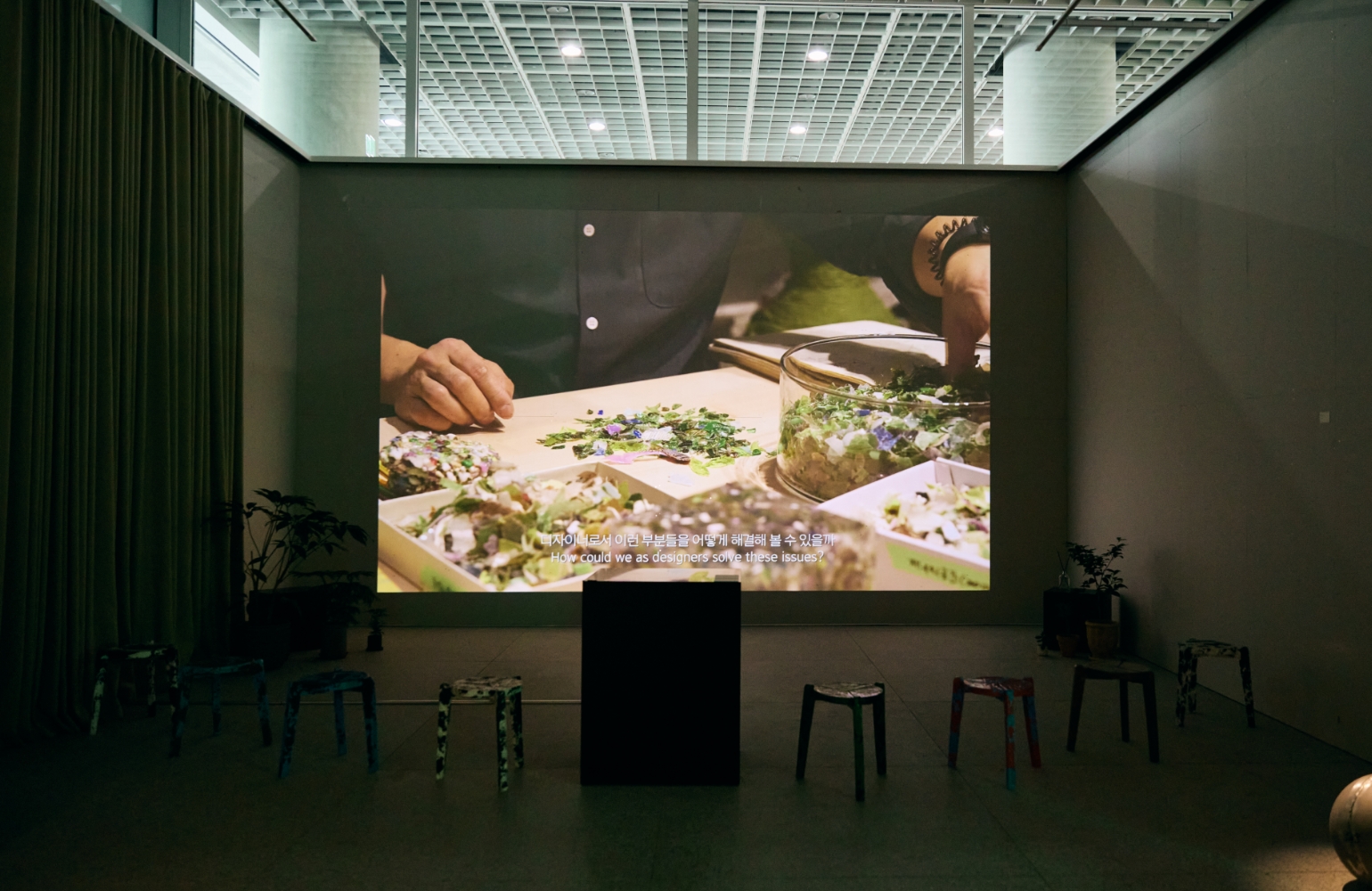
We designed the pop-up space to express the concept of a technology-oriented ‘Seed Tech Lab.’ This was achieved by prominently featuring Primera’s new brand color, ‘Seed Yellow,’ and creating a visual representation of a ‘Primera Seed Archive.’ Repetitive product displays were used to create a visual metaphor for a strong, solid skin barrier. We also infused the space with the brand’s modern aesthetic by highlighting the transparency and metallic elements of the product packaging.